Watercolor paper is an active part in the creation of a painting, for watercolor artists paint with their paper rather than simply upon it. For this reason, which watercolor paper an artist selects influences both the painting process and the finished painting. Paper choice can be as personal as color palette and subject, and it is not unusual for a painter to have a favorite paper surface from a specific manufacturer. Other painters might change the paper depending upon the subject to be painted, for the paper’s qualities impact the painting process.
Good Watercolor Paper
Archival watercolor paper is stable, durable, evenly textured, and stands up to the abuse of brush and paint. Most artist-grade paper is 100% cotton and manufactured on cylinder mold machines, although it is possible to pay a bit more for handmade paper of equal or superior quality. There is an international standard for the ‘weight’ or thickness of a paper, and the most commonly used weight is 140 lb / 300 gsm (pounds per ream, or grams per square meter). Depending upon how ‘wet’ an artist paints, the paper might or might not need to be stretched to prevent cockling or buckling as the moist fibers expand during application.
Sizing and Texture
Next to fiber content and thickness, sizing and surface texture have the greatest impact upon both the process of painting and the look of a finished watercolor.
Sizing – Internal sizing is often added to the paper pulp before a sheet is made, strengthening the paper and increasing its durability. However, it is the external sizing applied to the paper sheet toward the end of its manufacture, which is most important.
Sizing keeps paper from soaking up paint like a paper towel soaks up spilled coffee. The surface sizing on a sheet of well-sized watercolor paper allows the paint to flow fluidly from the brush and keeps the paint on the surface. This in turn provides time for the artist to manipulate the paint through creation of washes, glazes, and brushstrokes as needed. External sizing also helps with creating hard edges and maintaining brilliance when the watercolor paint dries. Most watercolor papers are “hard sized” to provide an optimal amount of sizing for the application of watercolors. Too much sizing and the surface will resist paint. Too little sizing and the paint will feather and sink into the surface, instantly creating soft-edged splotches of dulled color.
The traditional sizing for watercolor paper is animal gelatin, for it provides the perfect balance between absorbance of and resistance to the paint. Paper mills like Arches® continue to use gelatin sizing. However, alternate materials are also being used, and the Fabriano® paper mill advertises that they use no animal-based products in their watercolor papers. Even under the umbrella of “hard sized,” the amount of surface sizing and therefore the way a paper reacts to watercolor paint differs from company to company, even between different paper types from a single paper mill.
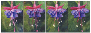
Surface texture – Texture also directly influences how the paint acts on the surface and unlike sizing, is an easily seen difference. Traditionally, watercolor painters are provided with three options: hot pressed, cold pressed, and rough. Hot pressed is the smoothest surface, cold pressed has a medium ‘tooth’ or texture, and rough is, well, the roughest. The images below were painted on cold pressed, hot pressed, rough, and handmade rough papers. The hot pressed paper allowed for sharper detail in the blossom, while the tooth and bumpiness of the cold pressed and rough surfaces created a more varied petal surface.
With paper texture, the great variety provided by paper mills becomes both most exciting and most confusing: exciting because there are so many options to choose from and confusing because those options are very subjective and there is no standard marker of what makes a hot pressed, cold pressed, or rough texture other than tradition and the label provided by the paper mill. A ‘hot pressed’ from one paper mill might be close in texture to a ‘cold pressed’ from another, or a ‘cold pressed’ similar to a ‘rough’ surface. In addition, since it is possible to paint on either side of good watercolor paper, each sheet provides two textures from which to select. It is more important for the painter to pay attention to the way texture and sizing interact with his or her painting process than to become obsessed with labels.
Texture and the Nature of the Paint
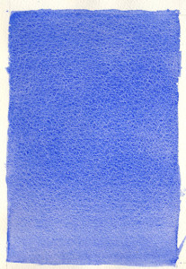
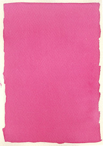
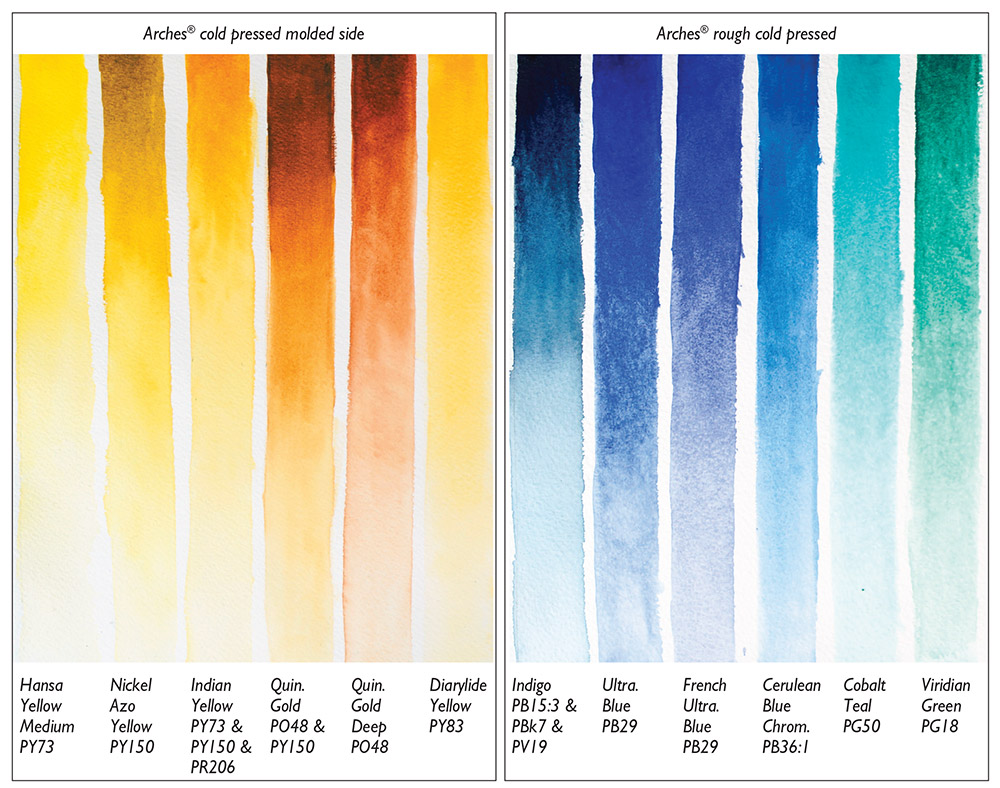
The absence or the presence (and depth) of the hills and valleys of surface texture also interacts with the liquid paint in particular ways that vary depending upon the nature of the pigment and the application process. Transparent paints react less with paper texture, creating a smoother appearance. On cold pressed and rough papers, sedimentary colors will granulate, collecting in denser pools in the ‘valleys’ and creating dapples. Tapping the paper while the paint dries encourages this separation. These differences can be seen in the example above, where Ultramarine Blue (PB29, semi-staining, semi-transparent, and granulating) gathered in greater density in the paper’s valleys while Quinacridone Magenta (PR122, staining, transparent and non-granulating) did not. Both examples were painted on Fabriano cold pressed traditional white watercolor paper. When a mixture of transparent and granulating pigments is used, the results can be even more unexpected and beautiful.
Texture Variety from Different Mills
Since each paper company has its own processes and recipes for paper, products across production lines are not identical. The examples below provide comparisons between rough-surfaced papers from Lanaquarelle®, Twinrocker™ (handmade), and Arches watercolor papers. The layers of glazing were created with QoR Quinacridone Magenta (PR122, transparent, staining) and Viridian Green (PG18 semi-transparent, semi-staining). The Lana rough has an overall evenly rough texture, and was the least heavily sized of the examples. For this reason, edges of washes are a little softer and color layers more muted. The hard sizing on the Twinrocker allows the paint to remain clearly separate even with multiple layers, creating sharp edges and the most vibrant color of the three. The Arches rough provides the clearest textural variety of these three examples, and color more intense and edges sharper than in the Lana. This indicates it is also hard sized, but not to the extent of the Twinrocker. The slightly granulating Viridian paint is settling into the valleys on the paper surfaces and creating dappled optical mixtures of the red and green that highlights the rough textures of these papers.
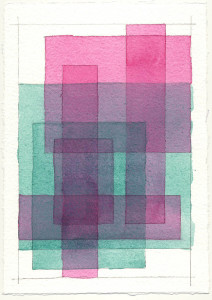
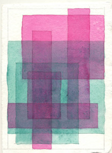
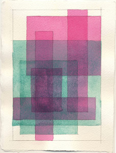
Some basic differences can help guide paper explorations. The smooth surface of hot pressed paper takes linear strokes and tight detail beautifully. However, it also encourages paints to bloom and puddle, and large flat washes can be harder to create on hot pressed paper. In addition, a hot pressed surface might have small areas on its surface that absorb paint more heavily, creating a widely spread speckle. Rough surfaces have the greatest texture, perfect for broken washes and fluid expressive approaches and styles that encourage paint separation like that in the glaze example. However, rough surfaces can be unfriendly toward tightly rendered smoothly contoured forms, or heavy detail.
Falling between hot pressed and rough, cold pressed paper has a medium texture with enough ‘tooth’ to allow controlled washes yet not so much that it interferes with tight details and linear brushwork. Cold pressed provides the most flexibility in terms of what it offers a painter, which is perhaps why it is the most popular surface today.
Sizing Gives a Little More Time
The traditional approach to creating a smooth wash is for a bead of paint to flow down from a previous brush stroke to the bottom of a new brush stroke as the wash progresses down the paper. This repeatedly creates a temporary puddle of paint across the paper. Staining paints may create streaky washes as the pigment stains the paper twice where paint strokes overlap or the puddle sits. Sedimentary or granulating paints also can become streaky in a wash as the pigment has more time to settle at the bottom of each stroke while the wash progresses down the paper. A “hard sized” surface allows the painter a tiny bit more time when applying a wash, lessening these striations. In the same way, if lifting paint is necessary to reclaim a lighter area, the transparent layer of sizing between the paint and the paper will help the painter do so. Each movement of a wet brush over the surface, however, loosens the surface sizing and reduces the barrier between paint and paper.
Take Out Your Watercolors and Play!
There are a variety of subtle differences under the umbrella of “hard sized,” and “hot pressed” or “cold pressed” or “rough.” Painting with a paper is the only way to truly know which paper’s surface sizing and texture best merges with your own individual painting rhythms and processes.
About Cathy Jennings
View all posts by Cathy Jennings -->Subscribe
Subscribe to the newsletter today!
No related Post
