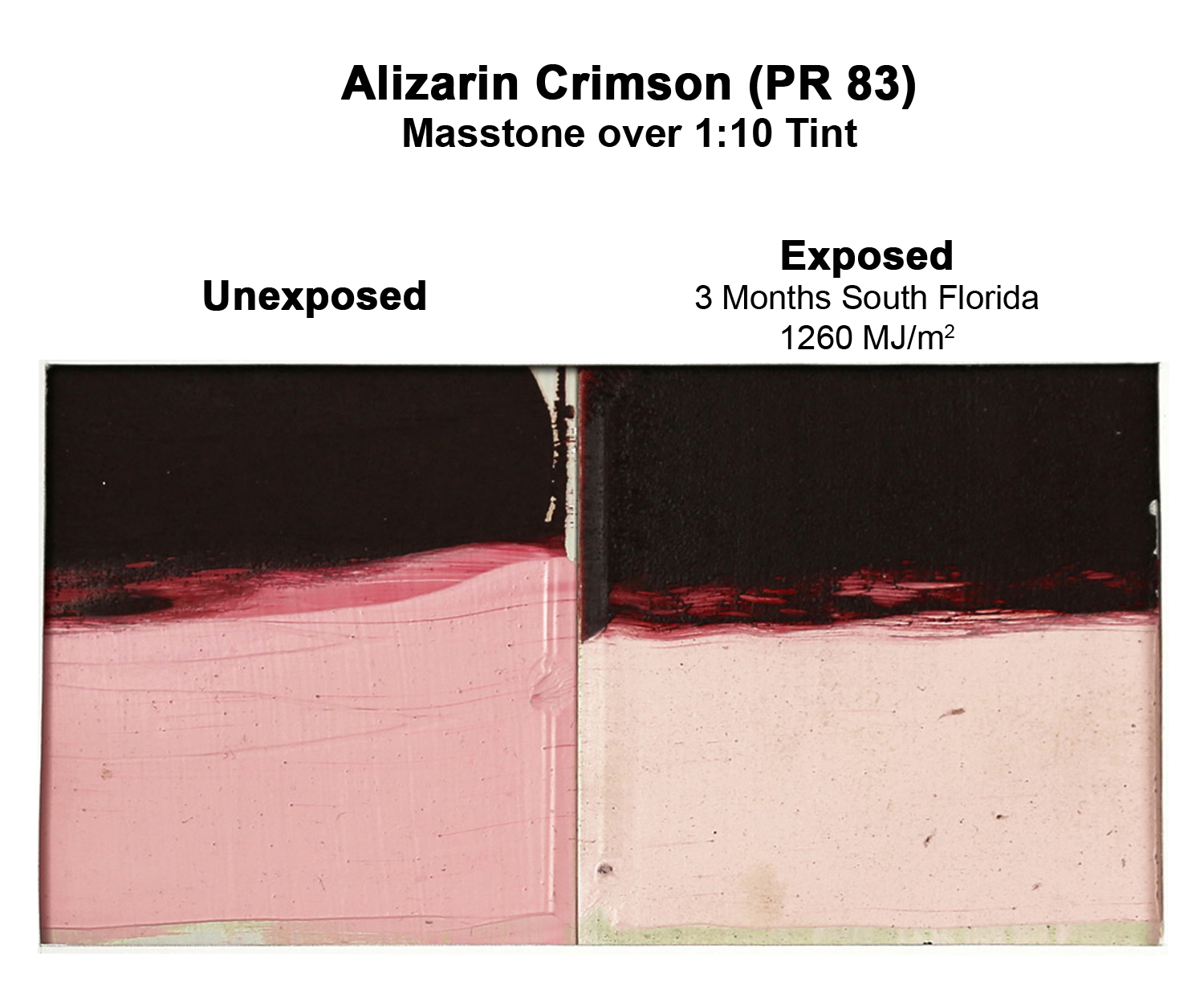
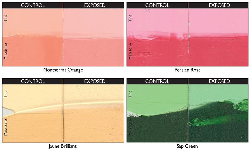
If a single color embodies the dividing line between pigments considered suitable for permanent works of art, and those that are suspect and poor in lightfastness, Alizarin Crimson (PR 83) would be it. And yet it is still used by many artists who are drawn to it in spite of its many problems. Some of … Weiterlesen
Home>Color> Uncategorized > Alizarin Crimson: Now You See It…..
About Sarah Sands
View all posts by Sarah Sands --> Archive |  Sarah Sands
If oil paint was just now being invented, and had to sell itself to the marketplace as a new medium, it would probably have an incredibly difficult time – especially if we knew beforehand that its list of problems would include yellowing, cracking, wrinkling, flaking, embrittlement, hydrolysis, fatty acid crystallization, protuberances and delamination caused by … Weiterlesen
Es ist schon seit Langem ein Problem. Das besagen zumindest die historischen Aufzeichnungen. Flecken. Einschlagen. Matte Stellen. Ölmalern sind all diese Begriffe wohl bekannt, die Bilder von Hautkrankheiten ebenso heraufbeschwören wie die bemalter Oberflächen. Doch welche Bezeichnungen man auch wählt, was sie bedeuten, ist klar – ein unerwünschtes Ärgernis, einen widerlichen Eindringling im kreativen Prozess. Was Gegenmaßnahmen … Weiterlesen
Oil painters concerned with fat over lean will often turn to information about the oil absorption values for particular pigments as a way to compare how oily or lean certain colors might be. However this has led to many misconceptions and outrightly wrong conclusions which seem to persist in various forums and articles. In what follows … Weiterlesen
Wir sind umgeben von Maßeinheiten, denen wir selten einen zweiten Gedanken schenken; gewöhnliche Maßstäbe und Lineale, die die Welt in Einheiten von Zentimetern, Zoll, Metern und Kilometern aufteilen. Aber daneben gibt es noch andere, die wir selten verwenden oder die wir nicht so leicht und präzise erklären könnten, wie Centipoise und Mols, Dezibel und Pascal. … Weiterlesen
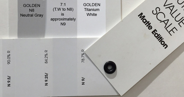
If comparing GOLDEN’s Neutral Gray series to the Munsell® Grey Scale that they are based on, you might quickly realize that one step is missing – namely N9, the Munsell® gray that is one step below pure white. And clearly the natural question is why? When the Neutral Grays were first created it was felt … Weiterlesen
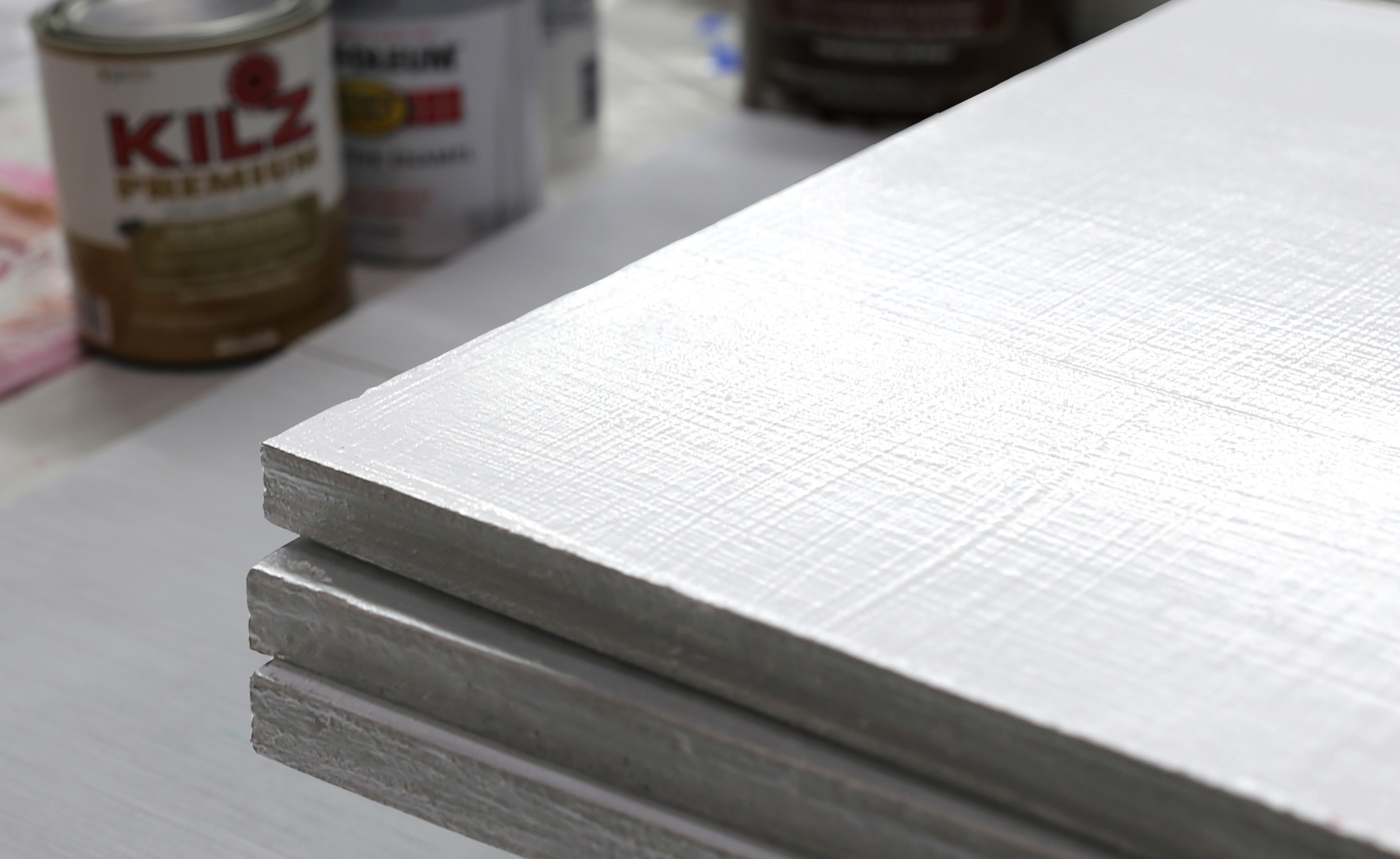
Most painters have a sense of how to prepare panels for oil and acrylic paintings when they are meant to be shown indoors, and we even published a couple of Just Paint articles on the topic: Understanding Wood Supports for Art – A Brief History Plywood as a Substrate for Painting However for both Muralists … Weiterlesen
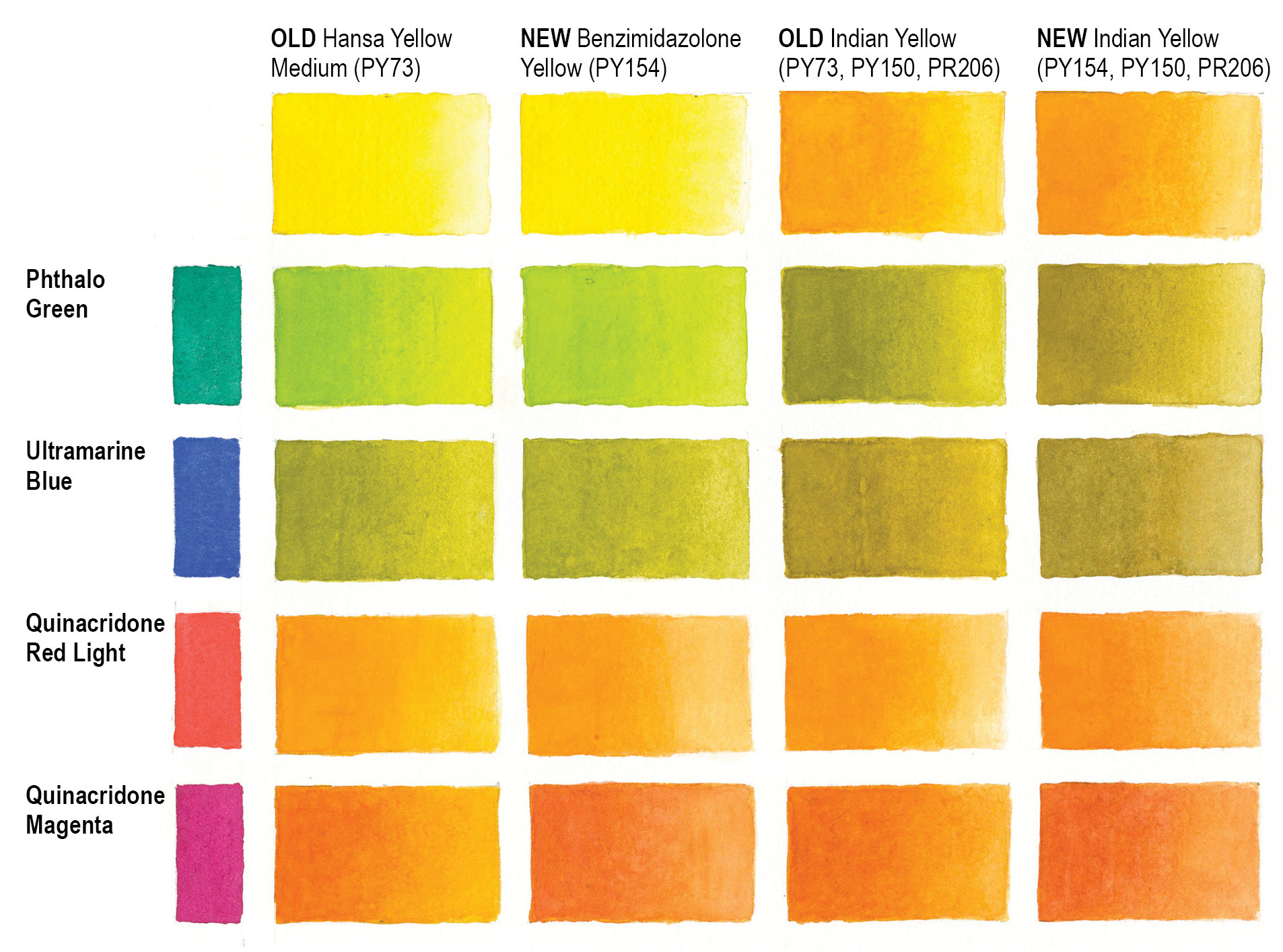
Changes are difficult. As much as you want decisions to be based on facts and facts alone, there is still a wrestling that can happen. Paints, and especially color, escape being easily tied down to just quantifiable clean choices. Rather, one can be caught having to choose between love and lightfastness, between beauty and … Weiterlesen
Introduction In the last issue of Just Paint we discussed why some QoR Watercolors had a Lightfastness rating of NA, or Not Applicable, while most carried the familiar ASTM Lightfastness ratings of I and II. Essentially this came about because some of the pigments being used at that point were not currently rated by the … Weiterlesen
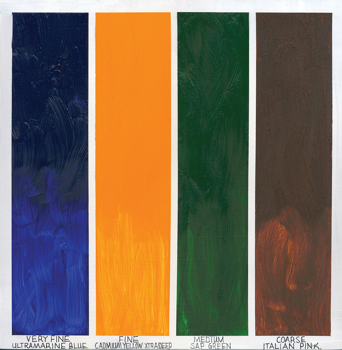
“Do you like oil paint?” It’s a seemingly, almost deceptively simple question, and one that I use at the start of almost every Williamsburg lecture and demo. It’s adapted from an anecdote in The Writing Life by Annie Dillard, where a young student, wanting to know if they could become a writer, is asked: “do … Weiterlesen

