Carl Plansky’s excitement around the discovery of unique colors had expressed itself in the incredibly wide range of pigments within the Williamsburg Handmade Oil Colors line. Included are many of the standard colors, interesting and unique blends and families of pigments like Cadmium and Cobalt that excel far beyond most manufacturer.s ranges. The Williamsburg Oils also include significant historical colors that are becoming more scarce and rare, iridescents, interference colors, and some of the most exciting and interesting earth colors that our natural geology across our planet could produce. For us, once that pigment or color space has been selected, our dedication lies in achieving an expression of that paint that is unique to each color. While first formulating to obtain the highest pigment load, and a consistency that tunes the working property of the color, our attention is given to achieving the specific grind for each pigment. Pigment grind has much more to do with thresholds and undertones than texture and grit. Texture and grit may at first seem like quirky traits that give the brand a much more handmade quality but once the paint is brushed out and more specifically mixed and glazed with, these colors reveal that the texture and grit are the bearers of the paint’s individuality and eloquence. Pigment grind informs undertones, what lies beneath, it is what draws you closer and imparts a veil of color removed from the opacity that comes out of the tube and onto your palette. Every pigment excels at its own certain grind and each pigment has its own limit or sweet spot. Go too far, grind too hard or too fine and one gets a plain and good pigment but that is all. It can even exhibit itself as dull when the particles are too small and too close together. Grind the pigments to their own individual threshold and one introduces its secret and allows it to reveal its true nature in the spaces in between the particles.
It has been an exciting journey to both maintain the high standards of quality of the Williamsburg brand as well as to continue its tradition of actively searching for new and unique pigments. The mission of Williamsburg is to provide painters with the best quality pigments that serve as a connection to the past while continually expanding the depth and scope of the colors painters depend on. In keeping with that tradition we are very proud to introduce 18 new colors. Two of the 18 are old favorites that had been discontinued in the past, 3 are additions to families of pigments that help round out their spectrum of hues and the remaining 13 are earth colors from the oldest operating mine and pigment supplier in France.
A Homecoming
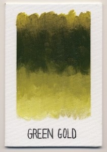
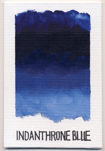 The two colors we want to reintroduce back to Williamsburg are Green Gold and Indanthrone Blue. These are great colors that help to expand the color choices, offer properties that are unique, are useful in glazing and mixing and were greatly missed as awesome colors.
Indanthrone Blue, PB60, is a very dark, semi-opaque, highly staining color that was discovered in 1901. Sometimes referred to as Anthraquinone Blue, it has an ASTM Lighfastness rating of I, making it a good alternative to the fade prone natural Indigo which it was originally meant to replace. Both have a deep blue violet hue that is not overly-saturated and lends itself as a component for making a ‘blackless’ black. Indanthrone is a strong mixing color that does not overpower the way Phthalo Blue can. The tint it produces is strong in saturation of color but is muted in brightness lending itself to an earthier feel.
Expanding Families
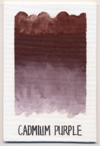
 The next 3 colors are additions to currently strong families of pigments. While these familiar families are already expansive in their spectral range, the opportunity to widen that space is always invited, especially when the pigment occupies a void not yet filled or able to be achieved by its familial members. Our concentrated Cadmiums have extremely high pigment loads and possess a brilliance that travels from a pale but bright Cadmium Lemon through the oranges and reds, and currently comes to a rest with Cadmium Red Purple. We now lengthen that line with Cadmium Purple, whose masstone is like an opaque bing cherry, existing somewhere in between Cadmium Red Purple and Quinacridone Violet. Its color does exhibit an opaque richness that is unapologetic and determined while its tint shows its inorganic nature in the form of a dusty lavender.
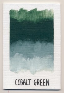
The next family of pigments receiving a new addition is our Cobalts. Long a point of pride, we offer these in one of the widest selections available anywhere, grinding them to create a velvety matte quality that imparts a true glow and brilliance. Cobalt Green, PG26, is a dark valued opaque blue green. At first sight Cobalt Green and its accompanying tint are reminiscent of a pine forest of silvery needles. This color makes a useful dark middle green addition to a landscape palette especially when painting pine or oak tree foliage. Cobalt Green was the first modern cobalt paint made in 1780 by Swedish chemist Sven Rinman. The varieties of Cobalt pigments are made by calcining a mixture of cobalt oxide with an alkaline carbonate and other metals to make the varying shades.
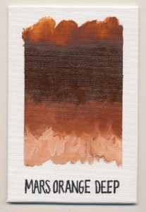
The third major group to welcome a new member is the synthetic iron oxides. Often referred to as Mars, these colors offer unique properties by remaining clean and crisp and can mix to bright pastels while providing excellent opacity, coverage and high tinting strength. The latest addition falls somewhere in the middle of Mars Orange and Mars Red Light. Mars Orange Deep, PR101, is a velvety matte color when its masstone is viewed straight on. View the color at an angle and it has a bronze like shimmer that speckles the entire surface. Like the other Mars colors, Mars Orange Deep is opaque, bright and clean with a natural tooth. It mixes very cleanly and its tint is strong and brilliant like the color of raw salmon. The straight color of Mars Orange Deep is rust, autumn leaves and wet terra cotta.
Historical Pigments Made Present
As an oil painter I take great comfort in the seduction of history and tradition. In countries like Italy, Spain and France there is a deep connection between painting and the mining for pigments. Countries that are steeped in a tradition of painting have taken great pains and pride in mining and producing colors that while ubiquitous throughout the world, impart a subtle or particular shade that is specific and inherent to that region and subsequently prized by artists for their uniqueness. Natural earth pigments are becoming more scarce and rare all the time. Often mines are shut down and colors are discontinued and replaced by more generic, synthetic versions. Williamsburg has a line of Native Italian Earth Colors that are indicative of a range of pigments found in Italy. While many of their common names can be found in our regular earth colors, what they offer is a slight departure from that norm. Italian Burnt Sienna has a pinkish glow and greater transparency than the regular Burnt Sienna while the Italian Raw Umber is more matte and yellow than its domestic counterpart. Building off of this grouping of earth colors from countries rich with paint history, we looked to France and found a pigment supplier that has been mining, cooking, processing and importing pigments for over a hundred years. To understand the earth pigments it helps to know that most are Iron Oxides. The source from which the iron oxide derives is iron ore. Iron oxides can be brown, red, yellow or green and when modified by a secondary material such as manganese oxide, calcium, limestone or silica, can produce an even wider range of colors. This already large combination of variables can be further expanded by calcining or cooking the pigment at high temperatures, producing two very different colors from the same source, one raw and one burnt. Just as in fine wines, the terroir defines the specific soils, geology, minerals and climate that create the unique qualities of each wine, so do the various minerals in these very unique soils of oxides produce a very specific note of color, undertone and transparency.
When one thinks of the Provence region, one thinks of fine herbs, lavender and fields of color but Provence is home to great ochres as well. Ochres are beautiful rich matte colors whose pigment grind offers a depth that is atypical of pigments with similar opacity. Most mixes and tints made from these ochres tend to deliver a subtle and clean reliability. These ochres would be a wonderful addition to a portrait palette.
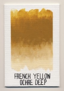
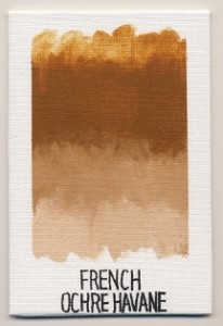 French Yellow Ochre Deep, PY43, is deeper than our other Yellow Ochres. It has that earthy yellow ochre color but it seems to be trying to disguise itself as Raw Sienna by putting on a more orange hue. Its color is like caramel while its tint is cream. French Yellow Ochre Deep is not a strong staining color and tints very lightly but cleanly.
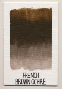
French Brown Ochre, PY43, is a warm brown somewhere in between milk chocolate and dark chocolate. Like the others, it has a similar matte sheen and softness due to the pigment grind. Its tint is a mushroom color and like the other ochres, mixes well without overpowering.
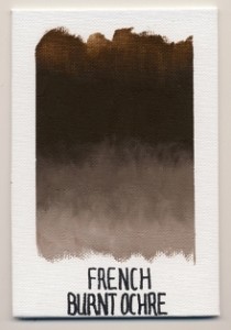
French Burnt Ochre, PBr7, is the color of dark chocolate and unlike the other ochres, has an extremely dry matte finish. While the texture of these paints is usually described as velvety, French Burnt Ochre is suede; dry and soft. It is difficult to not touch it or stroke the dried paint, as its surface beckons fingers. French Burnt Ochre has similar mixing and tinting strengths to the other ochres.
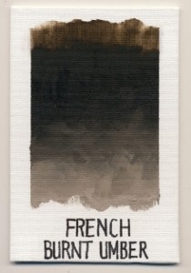
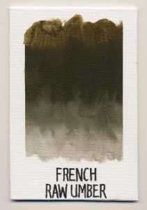
The last umbers that we are introducing are French Burnt Umber and French Raw Umber. While these are being introduced alongside the other French Earth Colors, they also serve to extend a growing and interesting family of umbers.
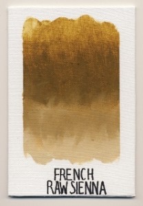
French Raw Sienna, PY43, natural hydrated iron oxide has the same dry and soft suede like quality of French Burnt Ochre. In color it is a deeper and richer tone than our regular Raw Sienna and in masstone is similar to Italian Raw Sienna but with a slightly less warm and slightly more gold/green characteristic. Its tint is pale but warm and exhibits much of the same gold yellow quality found in the masstone.
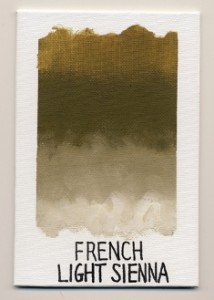
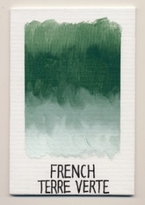 French Light Sienna, PY43, natural hydrated iron oxide, is a satiny greenish sienna. In comparing French Light Sienna to the Williamsburg palette of earth colors it shows itself as very unique. It fits nicely in between the earthy greens and the warmer earth colors that have a greenish tint although it is a far departure from the colors most similar to it. It appears to occupy a space somewhere between Bohemian Green Earth and Brown Ochre. Its burnt olive color is straight out of the garment racks of a second hand army navy surplus store and its tint is the color of cool sand untouched by the light of the sun.
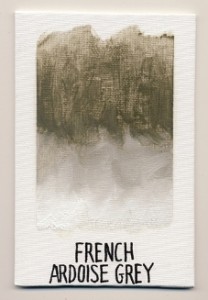
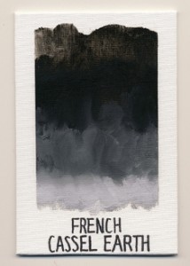 French Ardoise Grey, PBlk19, powdered slate is another beautifully transparent pigment. Its tint is extremely light and manages to give the white just a slightly cooler and greener tone. In comparing French Ardoise Grey to our other slate gray with the same pigment designation, Davy’s Grey Deep, the French variety is much lighter, much more transparent and has a satiny sheen which is unique next to the very matte quality of Davy’s Grey Deep. Both the French Ardoise Grey and Davy’s Grey are warm grays and offer unique properties useful in glazing and also offer a smooth quality that is difficult to achieve when diluting black pigments to similar transparency.
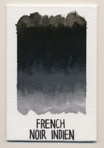
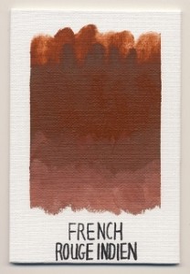 The last two colors we are introducing to the French Earths are French Rouge Indien and French Noir Indien. Both are natural iron oxides containing no synthetic pigments. It is less and less typical today to find natural iron oxides, definitely making these rare and unique.
French Rouge Indien, PR102, is natural red iron oxide that falls in between Mars Red Light and Italian Rosso Veneto. The rarity of a natural indian red makes it unique in comparison to synthetic counterparts made elsewhere. The attractiveness of utilizing natural pigments is the individuality and uniqueness that only that color can possess because it is as authentic as the region that it is a part of. It has a satin sheen with a fine to medium grind and is very opaque. It does not create a strong or a weak tint but falls in the middle in strength. Its tint is a dusty orange pink but not dull or dirty. French Rouge Indien mixes clean and is a very bright and full ruddy color. Like many of the other earth colors, it lends itself well to portrait and landscape palettes.
History has handed us painters, paintings and pigments from countries and regions each as unique as the next. At Williamsburg, attention is paid to source, color, strength, sheen, opacity, transparency, durability and grind. It is these qualities that determine whether or not paint will be made but it is also these qualities that remind one of a painting of the side of a stone building bathed in sunlight or that conjure a nostalgia for a skin tone seen in a portrait years ago or that live in the brushstrokes of a branch on a tree in a forest in a landscape that beckoned the viewer to paint themselves. These same pigments that were made into paints that graced the palettes of the very artists whose slides were studied in art history class and whose paintings we learned from, gives the painter an opportunity to exist in a historically rich trade. It also opens the door to find new pigments in new regions; in countries steeped in a classical art history, areas rich in folk and tribal art, lands west and east, north and south and ones under our feet.
About Amy McKinnon
View all posts by Amy McKinnon -->Subscribe
Subscribe to the newsletter today!
No related Post


