
A pastel painting radiates color from a matte pigment-rich surface. This distinctive medium is also incredibly fragile, so pastel works are typically displayed behind glass. Fixative coatings provide stabilization, keeping the delicate dry pigment particles from falling off the surface and landing on the glass or frame.
We often receive questions from artists regarding fixatives for use with PanPastel. An artist’s unique requirements determine which fixative is the right choice. The following is an initial evaluation focused on commercially available spray fixatives for maintaining the exquisite pastel surface.
Defining the Medium and Our Scope
Fixative is applied to dry media to create “a final weak film … used to adhere the particles of pastel to each other, and somewhat to the support, to prevent their being jarred loosed or falling off.”1
The dissimilar refractive indices of air and dry media cause light rays to scatter when they strike the dry media particles. This contributes to the apparent color of those media and often results in a velvety sheen. The refractive index of a resin is usually closer to that of dry media than air. Thus, if dry medium particles are coated with a resin – such as fixative, varnish, or gel – the transmission of light around the particles will be altered. The scattering of light may be reduced. A shift of apparent color and texture is likely. Some colors darken or become translucent when coated. Fixatives are applied lightly to minimize these changes and avoid forming a visible film.
Fixatives typically have a high solvent-to-binder ratio for less film build, whereas topcoats and varnishes have a lower solvent-to-binder ratio to establish protection by way of film thickness. Adjusting application method to lighter coats might make a topcoat work well as a fixative, blurring categorization. We hope to dig deeper into such ideas in future writings.
We selected seven spray fixatives readily available at art retailers in the United States. These products were applied to PanPastel on both White and Charcoal Pastelmat™ paper by Clairefontaine. This substrate was chosen due to its broad acceptance in the pastel arts community. Our assessments will focus on color shift, texture shift, smudge-resistance, and “workability.” Fixatives labelled “workable” might be erasable or add a bit of “tooth” for additional color layering. Of our test group, only Krylon Workable Fixatif™, Krylon Fine Art Fixatif™, and SpectraFix Degas™ advertise workability.
Spray Method
Most of the fixatives in this survey have similar usage directions, while some offer little instruction. We standardized our approach by choosing a single application method common to the most specific recommendations, taking care not to work counter to any one recommendation.
Each fixative was applied in two light coats fifteen minutes apart, 11” from the vertical PanPastel surfaces. SpectraFix’s Degas was the one exception to this method since we followed the manufacturer recommendation to spray from a minimum distance of 18”. Degas is the only fixative of this group that is not sold in an aerosol “rattle” can, instead using a pump-style spray device that tends toward larger droplet sizes. We chose to apply this product with the superior ultra-fine mist refillable Flairosol™ spray bottle also offered by SpectraFix.
The ambient conditions for all applications were 70°F/21°C 40% RH.
Group 1: Color Shift and Smudging
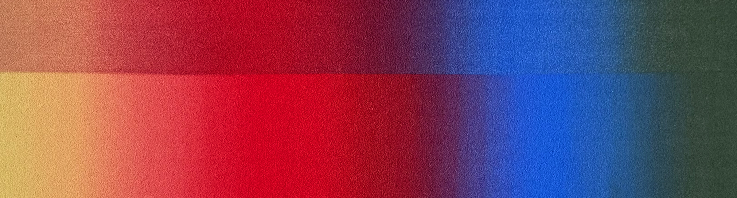
The first group of tests assesses color impact and smudge-resistance of the fixatives applied to four-color gradients of PanPastel Diarylide Yellow Tint, Permanent Red, Ultramarine Blue, and Permanent Green Extra Dark PanPastel on both White and Charcoal Pastelmat paper. This color range was chosen for the inclusion of two intense single-pigment colors (Permanent Red, Ultramarine Blue), a color containing PW6 Titanium White (Diarylide Yellow Tint), and a color containing PBk7 Carbon Black (Permanent Green Extra Dark). Pastelmat is our chosen substrate due to its broad acceptance in the pastel arts community.
PanPastel was applied with Sofft Tools 2-Angle Slice Flat sponges, working from light to dark, immediately blending each color into the next. Application continued until the paper felt “loaded,” that is, unreceptive to more PanPastel.
We will focus on color shifts that might collapse the hard-won transitions of our gentle gradients. We will also assess smudging from a single long stroke from dark to light with a clean 2-Angle Slice Flat sponge. Control examples with no fixative are on the left-hand side of each image.
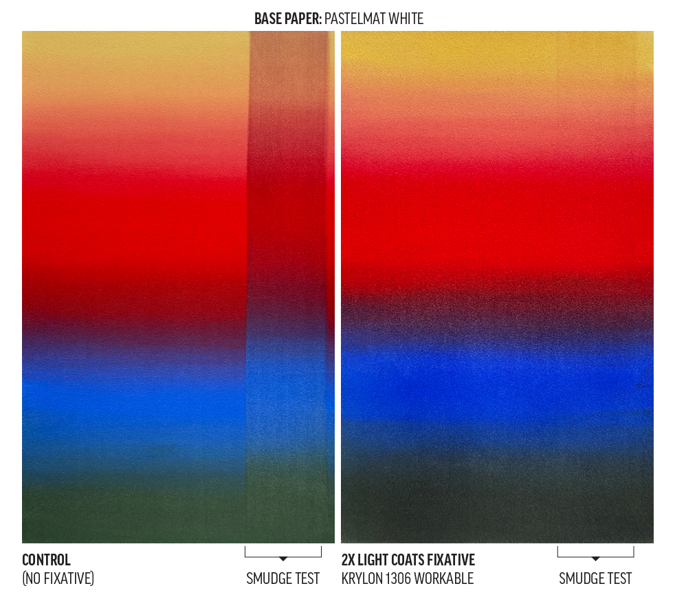
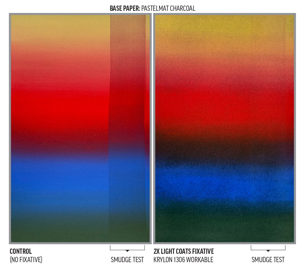
- Krylon Workable Fixatif 1306™
- Some darkening in the blue, green, and yellow.
- Some translucence in the red and yellow.
- Some loss of gradient smoothness.
- The light application method led to variable saturation across the surfaces, creating a visual “graininess.” A thicker application would be required to make the surface a consistent darkened tone.
- The Charcoal Pastelmat has a visually-apparent coating.
- Pretty good smudge resistance.
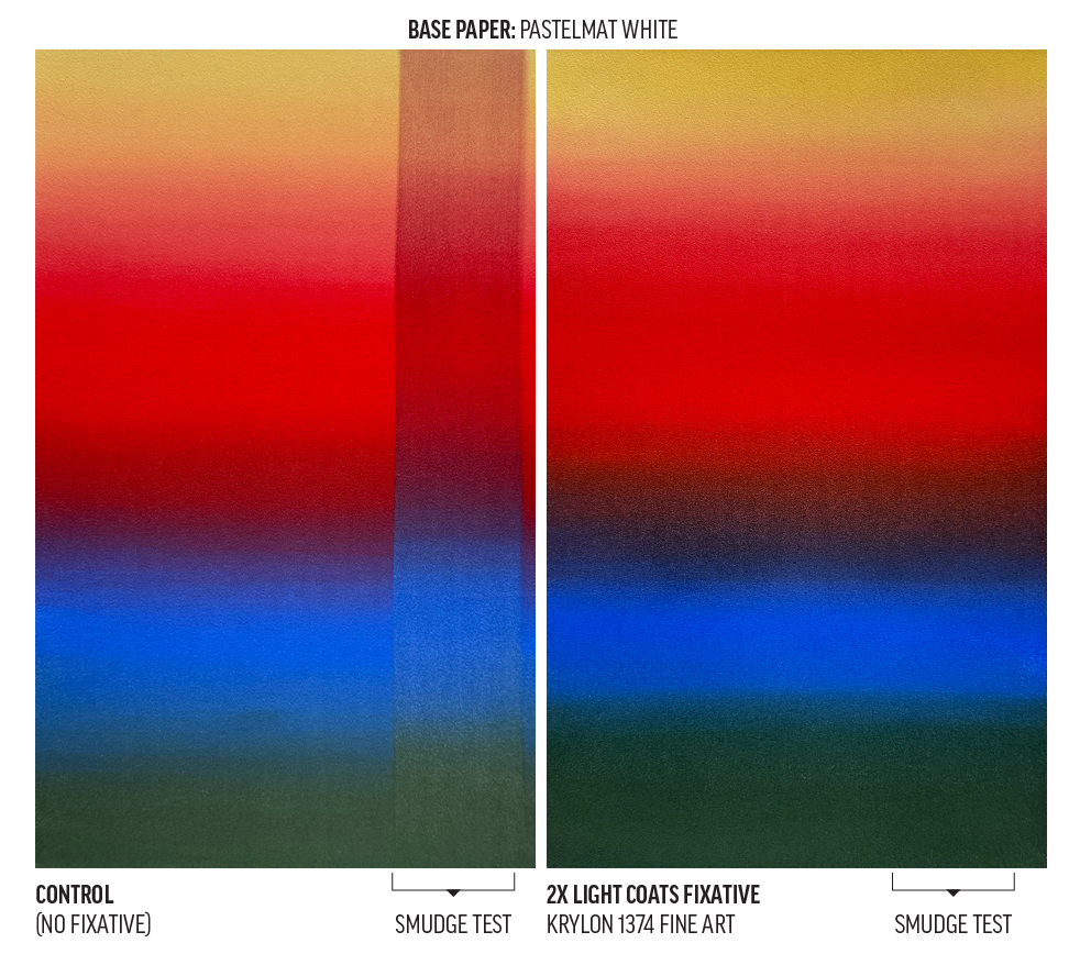
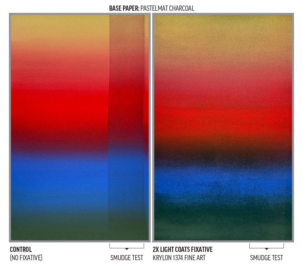
- Krylon Fine Art Fixatif 1374™
- Some darkening in the blue, green, and yellow.
- Some translucence in the red and yellow.
- Some loss of gradient smoothness.
- Some graininess due to variable saturation across the surface.
- Both paper types have a visually-apparent coating.
- Excellent smudge resistance.
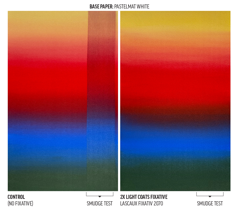
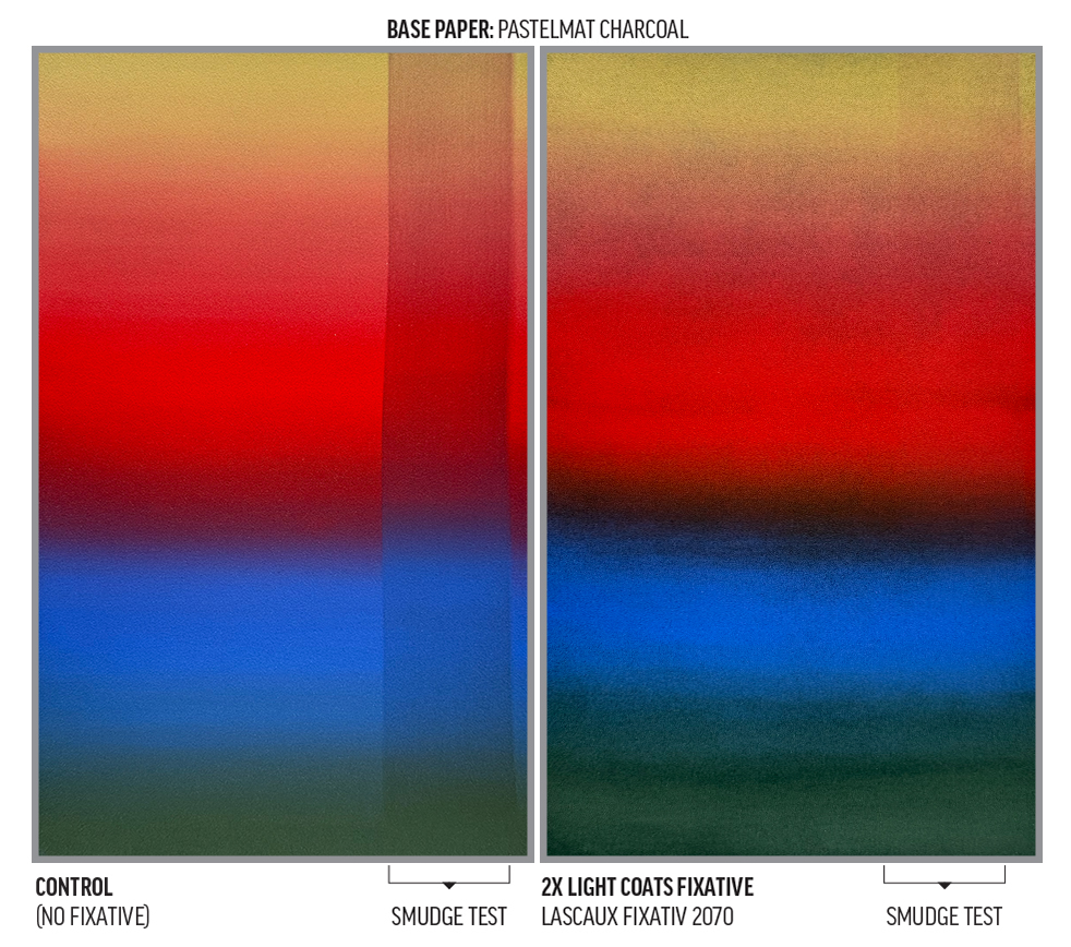
- Lascaux Fixativ 2070™
- This spray provided an even, light coating with slight darkening in blue, green, and yellow.
- Some translucence in the red and yellow.
- A slight light-colored graininess is visible in the blues and greens.
- There was some loss of gradient smoothness, especially on Charcoal Pastelmat.
- There is no visually-apparent coating on the surfaces.
- Excellent smudge resistance.
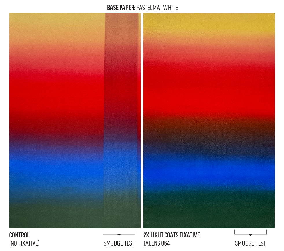
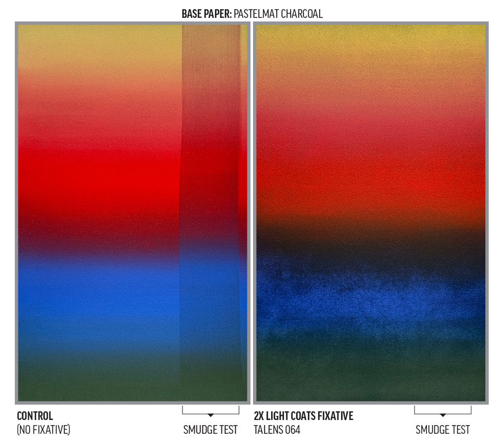
- Talens 064 Concentrated Fixative™
- We think the “Concentrated” descriptor in the name means this coating is more binder-rich. It has a strong spray that resulted in a significant darkening in the blue and green and some darkening of the yellow. The most darkening was apparent on Charcoal Pastelmat.
- Translucence in the red and yellow.
- Significant loss of gradient smoothness.
- Some “graininess” due to variable saturation across the surface.
- There is a visually-apparent coating on both paper types. Still, variable saturation across the surface would require even more fixative to eliminate the resulting color variation.
- We have the sense that much greater distance from the surface during application could alter these results.
- Excellent smudge resistance.
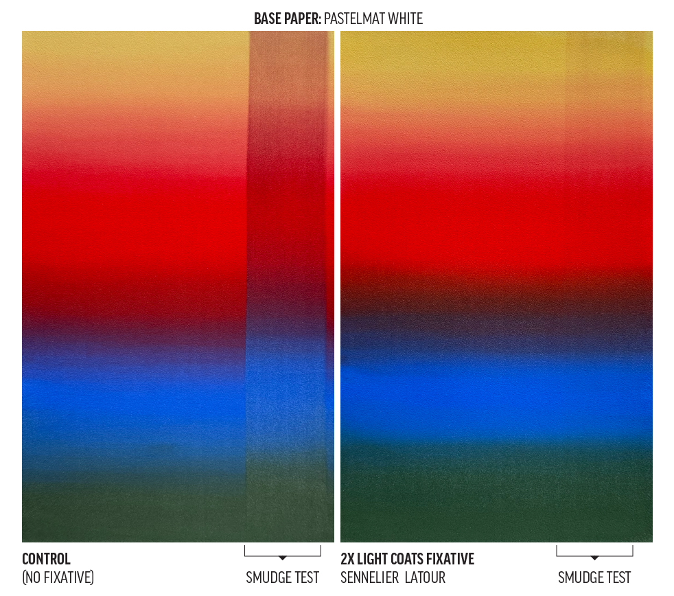
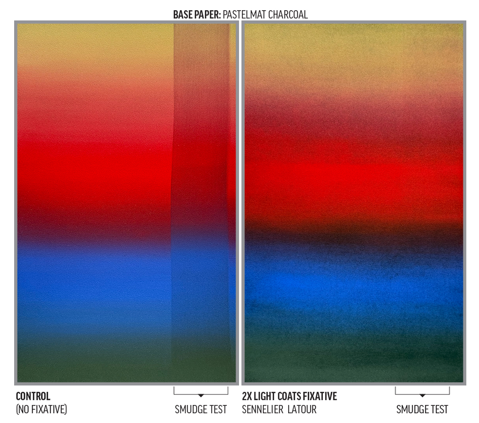
- Sennelier Latour™
- This spray provided a light coating but still slightly darkened the blue, green, and yellow.
- Some translucence in the red and yellow.
- A slight light-colored graininess is visible in the blues and greens.
- There was some loss of gradient smoothness, especially on Charcoal Pastelmat.
- There is no visually-apparent coating on the surfaces.
- Pretty good smudge resistance.
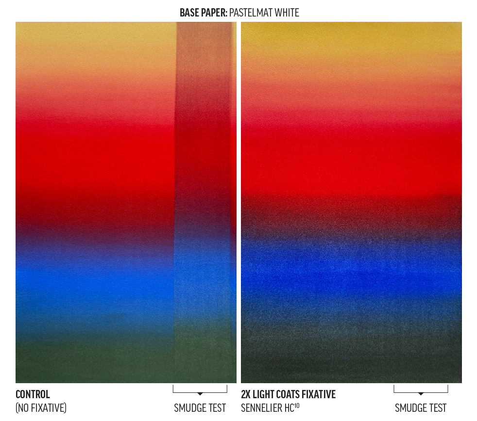
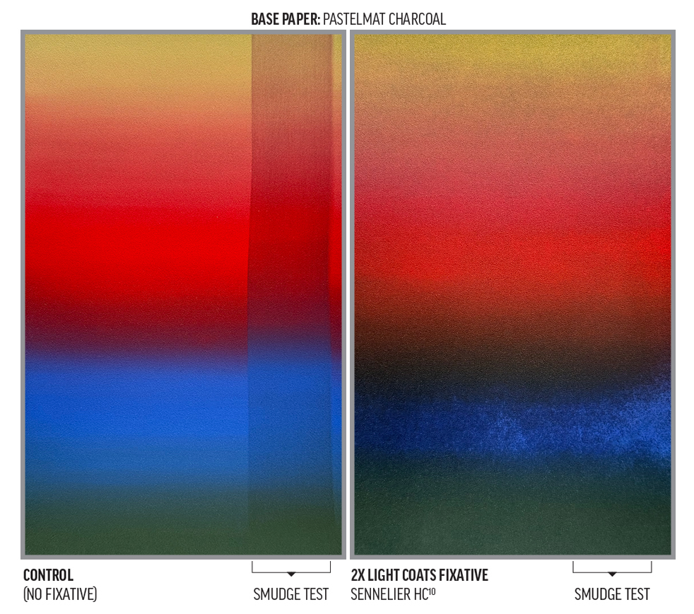
- Sennelier HC10™
- We think the “Concentrated” descriptor in the name means this coating is more binder-rich. It has the strongest spray of all materials tested and resulted in deep darkening in the blue, green, and yellow. This effect is most pronounced on the Charcoal Pastelmat.
- Translucence in the red and yellow.
- Greatest apparent loss of gradient smoothness.
- There is a visually-apparent coating on both paper types. Still, variable saturation across the surface would require even more fixative to eliminate the resulting color variation.
- We have the sense that much greater distance from the surface during application could alter these results.
- Excellent smudge resistance.
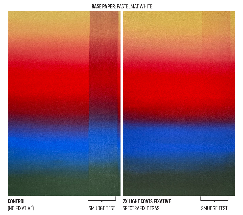
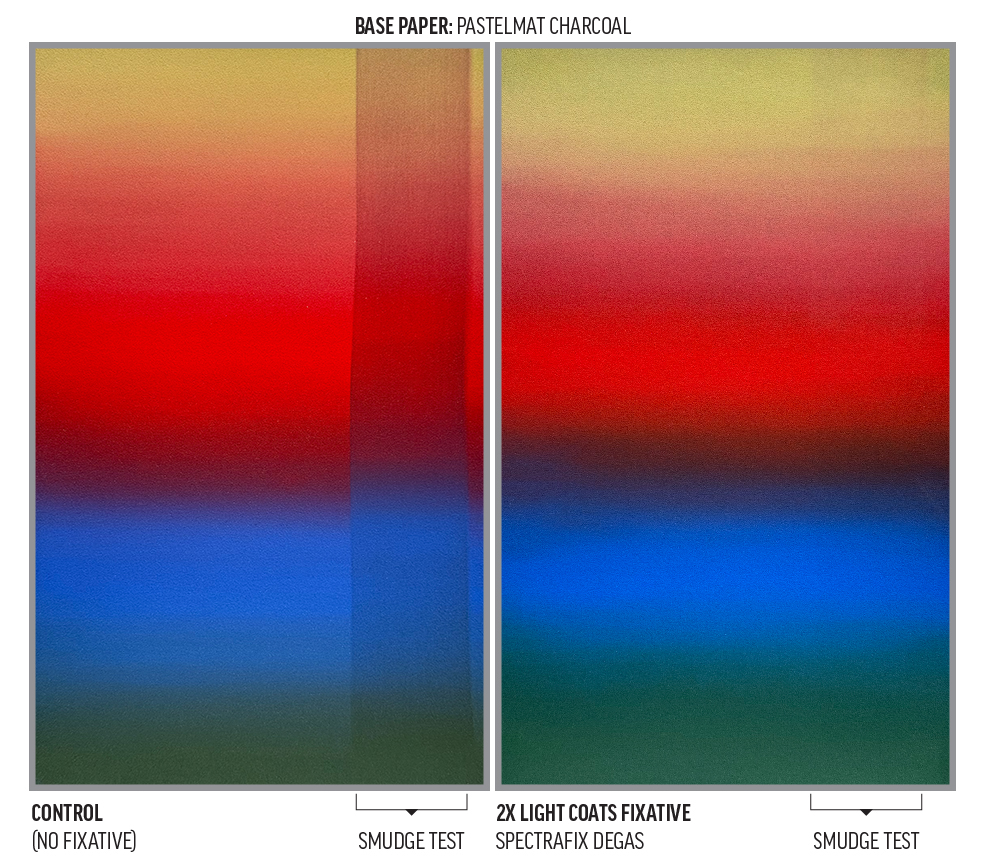
- SpectraFix Degas™ in an ultra-fine mist Flairosol™ bottle
- This fixative exhibited the least color shift of any fixative tested.
- Some loss of gradient smoothness, most pronounced on the Charcoal Pastelmat.
- There is no visually-apparent coating on the surfaces.
- Pretty-good-to-fair smudge resistance.
Group 2: Workability
Our second group of tests assesses workability after fixative application on a dense field of Black PanPastel applied to White Pastelmat paper. Black was chosen as a most-challenging scenario for clean color overlay and for its strong contrast with the white paper beneath.
We wanted to see if bright Diarylide Yellow PanPastel strokes applied with Sofft Tools 2-Angle Slice Flat sponges would be swallowed or discolored by the Black PanPastel below. Since one of PanPastel’s strengths is its erasability, we also attempted to erase the Black PanPastel back down to the white Pastelmat surface. The Black PanPastel surface is so dark and matte that we could easily assess texture and sheen changes caused by each fixative. Control examples with no fixative are on the left-hand side of each image.
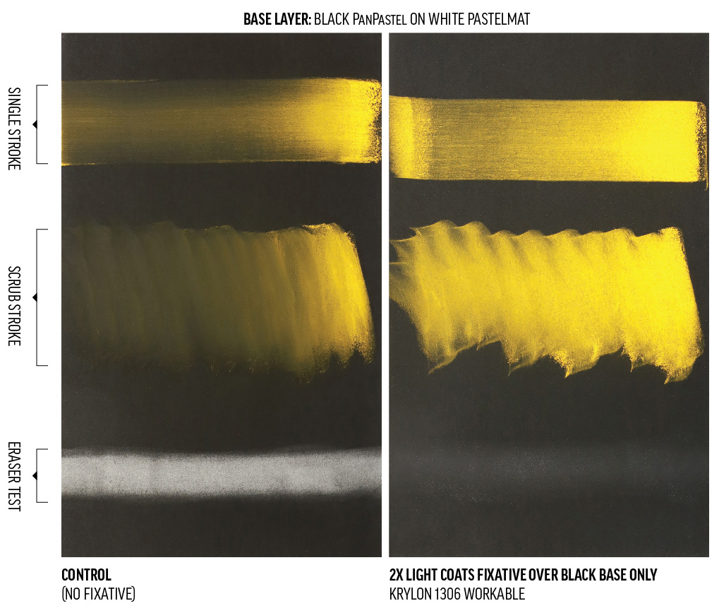
- Krylon Workable Fixatif 1306
- Excellent color clarity in both Diarylide Yellow strokes.
- Only slightly responsive to erasure.
- Some lightening of the Black PanPastel.
- Some off-axis sheen increase is apparent.
- This is the only fixative tested that added a noticeable “tooth” to the surface. This could be useful for artists who want a bit more texture for additional dry media layering.
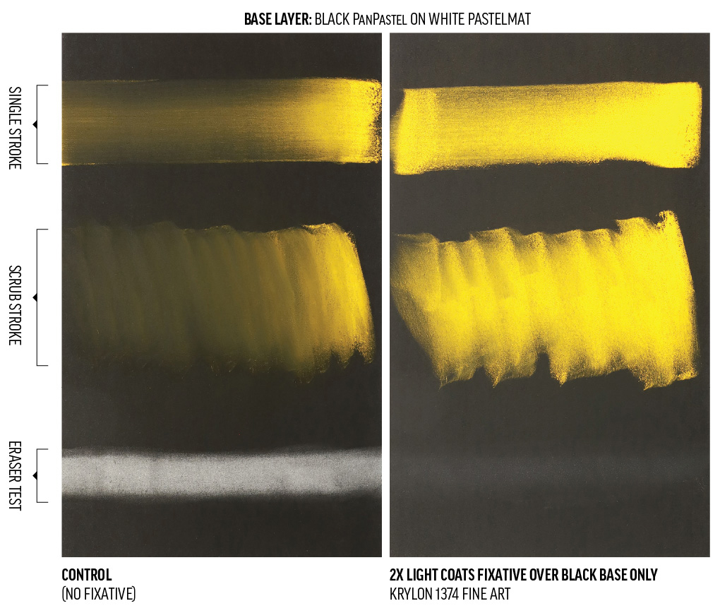
- Krylon Fine Art Fixatif 1374
- Excellent color clarity in both Diarylide Yellow strokes.
- Not responsive to erasure.
- Some lightening of the Black PanPastel.
- Some off-axis sheen increase is apparent.
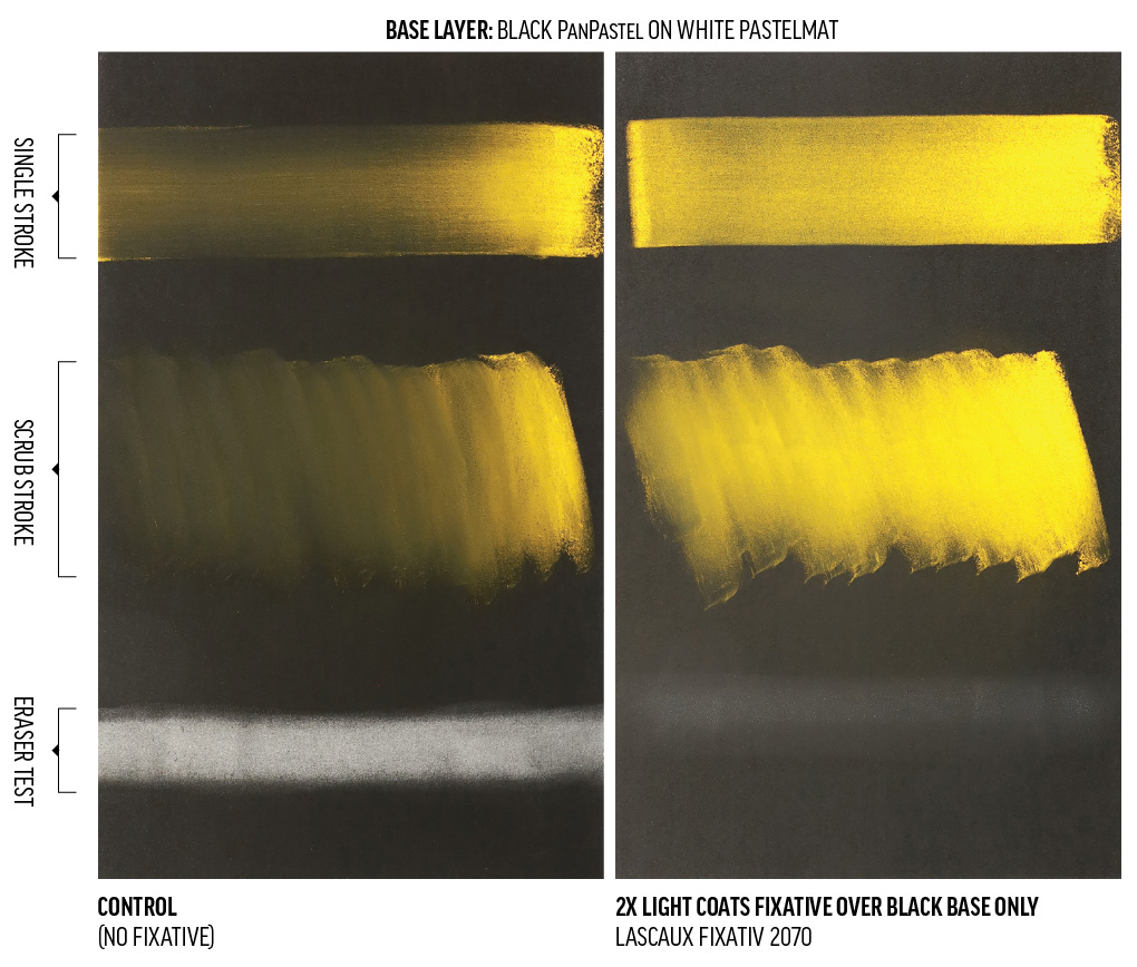
- Lascaux Fixativ 2070
- Pretty good color clarity in both Diarylide Yellow strokes.
- Somewhat responsive to erasure.
- Noticable lightening of the Black PanPastel.
- Off-axis sheen increase is apparent.
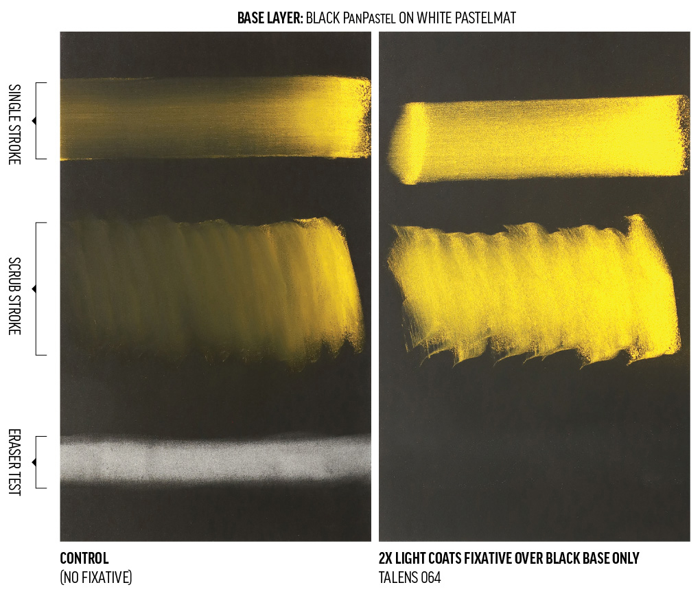
- Talens 064 Concentrated Fixative
- Excellent color clarity in both Diarylide Yellow strokes.
- Not responsive to erasure.
- Minimal lightening of the Black PanPastel.
- A slight off-axis sheen increase is slightly visible, but this test also had the most even sheen of all our tests, making it less noticeable as a coating.
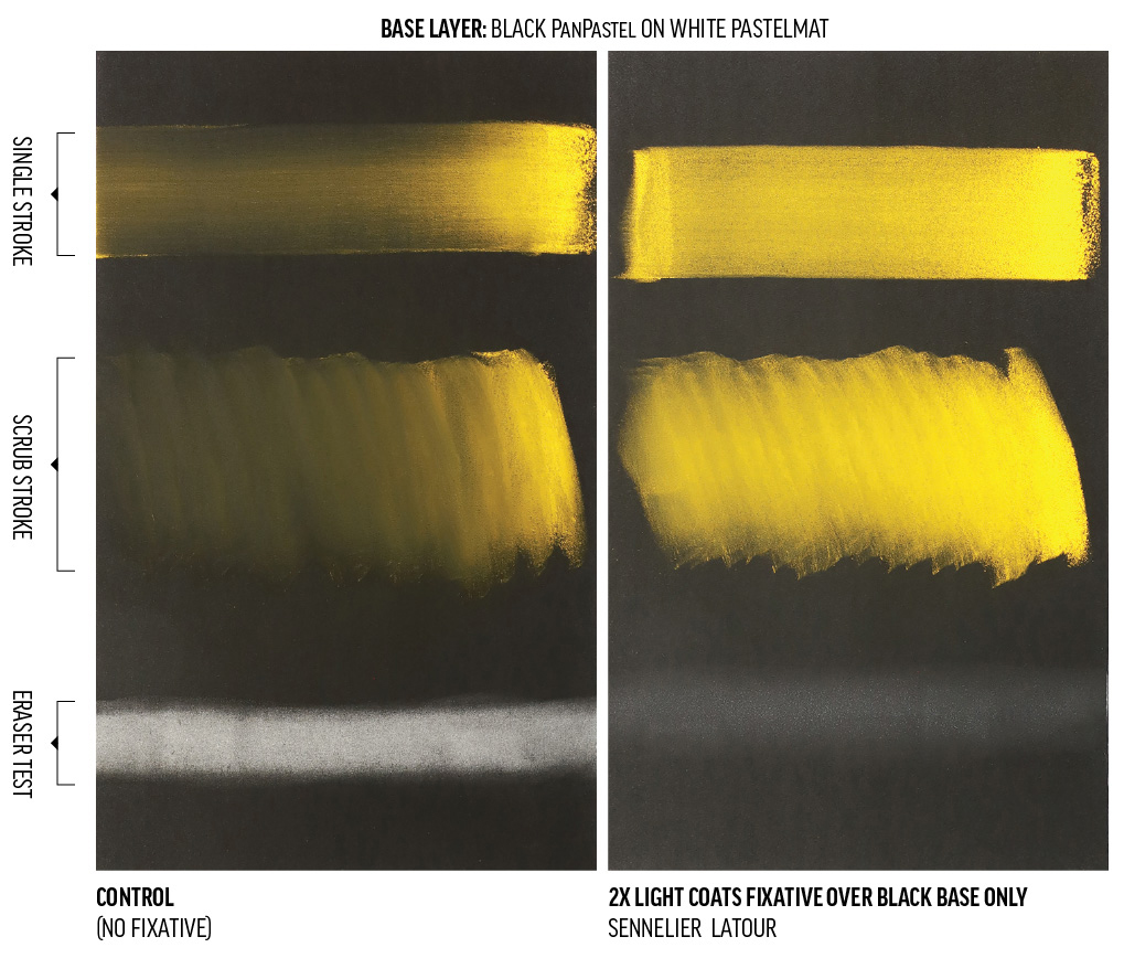
- Sennelier Latour
- Excellent color clarity in both Diarylide Yellow strokes.
- Somewhat responsive to erasure.
- Some lightening of the Black PanPastel.
- Off-axis sheen increase is apparent.
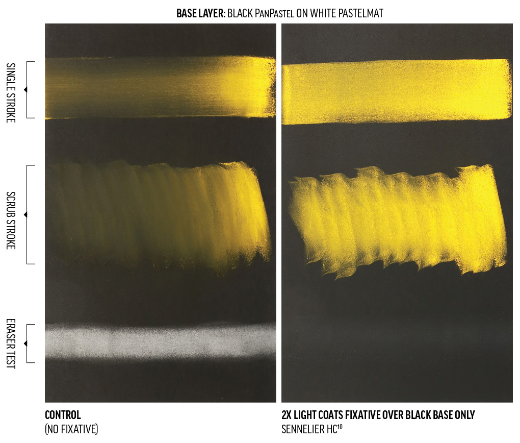
- Sennelier HC10
- Excellent color clarity in both Diarylide Yellow strokes.
- Not responsive to erasure.
- Minimal lightening of the Black PanPastel.
- Off-axis sheen increase is very apparent.
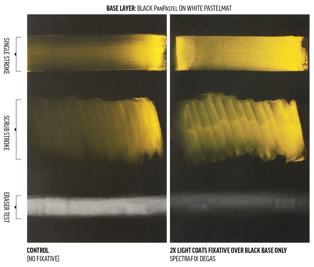
- SpectraFix Degas in an ultra-fine Flairosol bottle
- Fair color clarity in both Diarylide Yellow strokes.
- Fairly responsive to erasure.
- The least lightening of the Black PanPastel of all fixatives tested.
- No off-axis sheen increase is apparent, but the overall sheen is slightly inconsistent and mottled.
Beyond these Tests
We encourage you to inspect this limited survey and try alternative application methods to see if you can use a fixative that might be preferable for non-visual attributes such as availability, cost, or low toxicity. In your own applications, you may see different results due to number of coats, thickness of application, substrate material, positioning, or environmental conditions.
Heavier fixative applications increase the potential for color and texture shift. Some artists may prefer to apply single light coats of fixative between PanPastel layers and no fixative after final details rather than a single, heavy, final coating. If an artist expects to apply significant amounts of fixative for travel stability or glass-free display, they may want to add extra white to their lighter colors. These methods may help counteract the translucence that could occur in light colors after fixing.
To preserve unique qualities of the pastel surface, some pastel artists use alternative or homemade fixatives, pressure or steam fixing methods, or no fix at all. We hope to explore these ideas in future writings.
Fixatives hold material in place, but do not provide protection like varnishes. If a work is not going to be varnished, we recommend that fixed PanPastel on paper be mounted behind glass for greater longevity, much like any work on paper. Our article “How Do I “Seal” It?” covers some ideas for further protection without glass.
Learning from Each Other
This article could be seen as a narrow expansion of the excellent work done by Jackson’s Julie Caves in her comprehensive article, “Fixatives Are Not All the Same.” We are also indebted to all the artists who contact us to discuss their experience with our materials. Feel free to share your insights in our comment section below or in one-on-one conversation via [email protected].
1Gottsegen, Mark David, The Painter’s Handbook, (Watson-Guptill Publications, 1993), 223.

Subscribe
Subscribe to the newsletter today!
Since college, fixing my pastel work has always ended in a slight glitch I came to expect. I’m really glad to have seen your work here and can look into another product-or none at all. I really appreciate your thoroughness. I think I would have like to have known a little art history thrown in such as what Degas did or didn’t use and what condition they are in currently in gallery; they’ve held up to the test of time which is a common care. Best,
Thanks, Sharon. You may be interested to know that Spectrafix claims to have based their fixative formula upon Degas’ own recipe. We’d also love to know more about those related histories and the current state of historical works. Omissions of these topics are driven by our intention to stick to our core competency. We hope that conservators and historians continue to improve access to their work so we can all benefit from authoritative research.
I’d love to see “Brush and Pencil” brand workable fixative and final fixative in this lineup.
Great pick, Michelle. We aggressively limited our scope in this first article on the topic of fixatives to stay on-time and within budget, so we avoided any materials that weren’t specifically advertised for pastels or readily available locally. We hope to build out our exploration of this topic in the future. Most importantly, we believe a wide range of materials could work for fixing dry media if artists adjust their method to suit their aesthetic requirements.
Great research so thank you for doing al this work. I am curious as to what you think about building on top o the fixative with mixed media. I use the fixative to secure the pastel, pan pastel and or charcoal and then continue to layer on top with acrylic paint and mediums. I have not had any issues as of yet. I am also curious if there is any difference between Workable and Final Fixative. I would love to know you thoughts on this. Thanks!
Thanks, Stacy! We think many light layers applied throughout your process is preferable to a single, thick fixative layer at the end. Workable fixatives usually (but not always) have some transparent particles added to the formula to impart a bit of tooth to the dried film. Final fixatives are often (but not always) too glossy or slick to allow easy layering on top of the fixative. Adjusting the thickness of your application may make a wide variety of fixatives suitable for your needs.