Although it will be my intention to present a stand-alone essay relating to the perception, use and technology of color and color reproduction, it is inevitable that references will be made to the Just Paint 22 article The Subtleties of Color as it serves as not only the conceptual starting point for this article, but as the catalyst for an odyssey of color exploration that continues to this day. It should not be required reading for the comprehension of what I am about to share, but I believe it will be helpful to read this article as well.
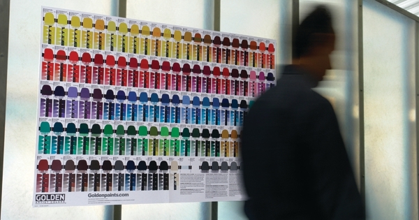
Sarah Sands’ article set off a series of events that led to the printing of the Tint & Glaze Poster that was first made available to GOLDEN customers in February of 2010. The second edition of this poster began appearing in stores late in the summer of 2010. Beyond the Tint & Glaze Poster, other ideas and applications of the color exploration that started with this article have been in the works.
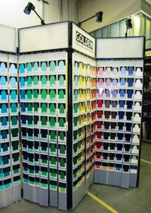
The genesis of the poster was the color studies with tints and glazes created by GOLDEN Technical Support Services as research for the article in the spring and summer of 2009. In the fall of 2009 the few colors explored for the article inspired exploration through the entire palette of GOLDEN Heavy Body Colors. The painters in Technical Support found the idea of a huge hand-made swatch library of tints and glazes quite desirable. As quickly as we recognized the desirability of such an item, we also recognized the impracticality of it. The draw-downs 1 represented hundreds of hours of work, cutting them into pieces and then applying each of them in a logical order to some sort of binding or notebook page would multiply the hours and expense. Still, we were anxious to bring this concept to painters.
It is at this point that we hit a crossroad of culture, idealism, practicality and technology. This is the very busy intersection in which we ran the gamut2 only to find it as perilous as this tortured little analogy suggests: To reproduce the fantastic array of colors that the tint and glaze exploration produced we needed something more than typical commercial printing technology.
If you are reading this article in the printed newsletter, all the colors you see are built from a palette of cyan, magenta, yellow and black. Commonly referred to as CMYK, 99% of all the color you see in print is based on these four colors and likely include the printer attached to your computer. As ubiquitous and generally reliable as CMYK has become, it is also notoriously inadequate when it comes to representing the full spectrum of colors available to artists.
With CMYK the “subtleties of color” are bound to be lost. Orange, most greens and deep blues suffer the most because these colors fall between the three primary colors (cyan, magenta and yellow) into areas of compromise and mingling that never satisfies the true nature of these colors. For this reason a more advanced “hexachrome” 3 color system inserts an orange between yellow and magenta and a green between cyan and yellow. You might refer to this as “CMOYGK” color, or more easily remember it as SIX color process.
This six-color process solves some of the problems normally experienced when reproducing the orange and green spectrum in print. Even a casual observer would notice a significant difference in a color represented by CMYK compared to one represented in six colors. While typically 50% more expensive to print than CMYK, we hoped this six-color process would deliver an acceptable representation of the colors coming out of the draw-down research.
Unfortunately the challenge of faithfully representing colors from paint on a printed page is not solved with a single technology. The process of developing the Tint & Glaze Poster exposed some gaps in the perception of color and how it is reported on computer screens and in print.
Before going into a few technical details, we should make it clear that there is no way to sufficiently imitate all the colors on a painter’s palette. There is much more to a pigment than where it falls within the visible spectrum and even the best color measurement tools available only capture certain dimensions or characteristics of paint. The bottom line is: to see what a specific pigment looks like in paint, one must look at the paint. Similarly, looking at a lithograph or a jpeg image of a painting is not the same as seeing a painting in person.
So, we set out to explore exactly what the paints would look like by mixing each color precisely into five tints and four glazes, and then drawing them out onto test cards. The next step was to translate colors into data using a spectrophotometer, a scientifically calibrated digital device that measured each color as it appeared over white and black. Numerous color indexes were applied to the readings, like RGB (broadly, how color is reported on a computer, mobile or TV screen), sRGB, and L*a*b.
L*a*b readings are considered the most effective standard because they are based on how the human eye works, rather than how color is projected as with RGB or reflected CMYK. Developed in 1931 by the International Commission on Illumination [CIE], “L” spectrum indicates the brightness value from 0-100, with 0 being totally dark (black) and 100 being totally bright (white). “a” and “b” are a bit more complex as they represent curves in perception between magenta and green for *a, and perception between blue and yellow for *b. The numbers for *a and *b run from negative 128 to 127 – with magenta and blue at the negative end of the spectrum, green and yellow at the positive end of the spectrum.
While this all may seem academic, the reason for addressing color systems in the effort to create a Tint & Glaze Poster was very practical: None of the software available to us for creating the poster had a six-color process capability. The colors created in our lab would have to pass through software that was technically incapable of describing them, or the final six-color output. The computer monitors used for manipulating colors throughout this process have a smaller gamut than that which is possible from six-color process printing. The one bright spot among the technical challenges was the L*a*b capability of our layout software.
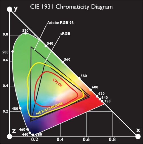
To get an idea of what you can and can’t see with each system, please refer to the figure below. This graphic representation of the visible spectrum shows the boundaries for the color systems referenced so far in this article. The L*a*b system covers the entire visible spectrum, it is not dependent on any device. However, as this chart shows, CMYK and RGB have limitations that force the exclusion of portions of the visible spectrum. Six color process, or Hexachrome, has a range that exceeds RGB in some places.

This meant that we had to manipulate colors beyond the color range of the computer monitor. Because of that, we depended on six-color proofs created using a specialized digital proofing system for each step of the process. Color was manipulated as data within the layout software, then processed by the imaging systems at the printing company. Each adjustment of color had to be validated with a digital proof to see how the color would be represented in the six process colors on press. This probably sounds very time consuming and expensive, because it is.
One benefit of working with a commercial printer is the color-controlled environment. Booths, more like large desks, with specialized lighting ensured that the six-color proofs and the original draw-downs were viewed in a consistent, balanced, neutral-color light. The walls of the booth are a photo gray and there are no windows to the viewing area, so comparisons could be made accurately.
Most people assume that “daylight” is somehow consistent, but as any artist knows, the color of daylight changes according to the conditions of the weather, atmosphere and time of day and year. Add to all those inconsistencies the influence of the colors reflected off the walls, floors, and ceiling, and any tinting in windows through which sunlight is passing, and you can see the need for the consistency created with these color-balanced lights and viewing booths.
With all of these tools and processes in place, we chipped away at the translation of colors to the Tint & Glaze Poster. Very few were accurate on the first pass. Most of the work involved preserving the nuance of the colors through minor adjustments. Colors were proofed, nudged, proofed and nudged again. The blue colors presented the greatest challenge, and we attribute this to the fact that the augmentation of CMYK with a process orange and green is less helpful within the blue space as most of the colors rely on cyan, magenta and black.
Very light and very dark colors had their challenges as seemingly minute shifts in color made dramatic differences. One has to develop a feel for the sort of “curve” of influence created by the various colors within the process. As with paint, dark colors more quickly influence mixtures than light colors, so adjustments in yellow and orange required a heavier hand than adjustments in cyan or black.
Even with the best color system we could find, compromises are inevitable. The luminosity and brilliance that define pigments like Cobalt Blue or Cadmium Red defy even the best printing processes, so you must accept the best approximation and find the best place for these colors relative to colors for which six-color process has a better approximation. The highest hope for the process we engaged in, and the tool produced, is to have a useful two-dimensional guide, a map to the luscious terrain of actual color brought forth by artists with our paint.
Ultimately, the Tint & Glaze Poster is an experiment in reference materials. The Technical Support Services Team and others within GOLDEN found the methodical extension of colors into a system of tints and glazes fascinating as each color demonstrated unique qualities and attributes.
A red that tints to a soft pink produced fiery glazes. Colors that appear nearly black from the tube, like Dioxazine Purple, reveal exceptional color range and strength. Colors one might never consider using based on a simple swatch, show surprising versatility or unique qualities when presented this way.
As a company that produces thousands of hand-painted color charts every year, our heart is certainly on the side of showing you just how exciting this exercise is with the actual tints and glazes. For now, the Tint & Glaze Poster is the most practical vehicle we could find to convey the idea. But, should you ever find yourself within reach of New Berlin, visit our factory and we will gladly show you the paint.
[1] “Draw-down” refers to a test card where a pre-mixed paint film of a specified thickness – GOLDEN uses .01″ – is applied for the purposes of examining color consistency, opacity and other qualities. Detailed color information at goldenpaints.com includes a scan of a draw-down.
[2] Gamut used here in reference to color indicates the extent of the range, either all that can be represented as in printing, or all that can be perceived, as in the visible spectrum.
[3] Hexachrome is a prorietary color printing system owned by the Pantone® corporation.
About Christopher Farrell
View all posts by Christopher Farrell -->Subscribe
Subscribe to the newsletter today!
No related Post

