
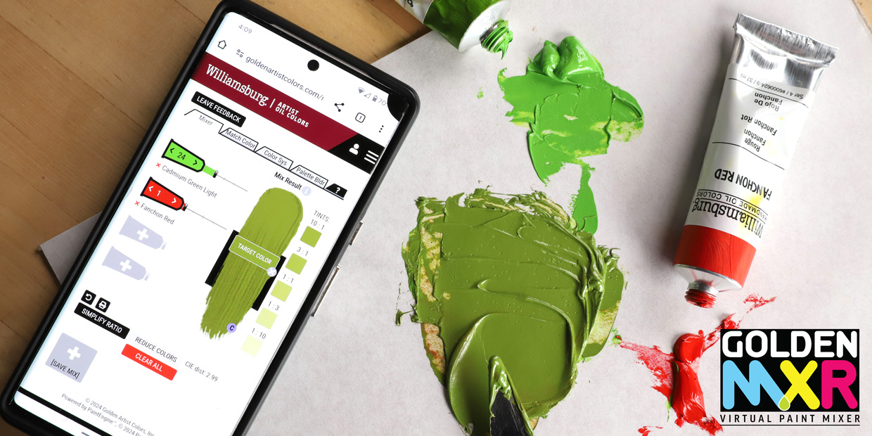
The Golden Virtual Paint Mixer (MXR) has been used by color enthusiasts to learn about GOLDEN Acrylics for more than 10 years. During that time, feedback from artists has helped us to improve the tool to be more accurate and useful in the studio. With these goals in mind, we have upgraded the MXR yet again, with some great new features. We have also launched the long-awaited Williamsburg Oil Paint MXR, which took about 2,000 color mixes, 11,000 spectrophotometer readings and over a year to develop! Both MXRs use an identical interface and only differ by way of the color palettes and data sets that run the program.
The GOLDEN and Williamsburg MXRs save time and money by helping artists find suitable color mixtures in the digital space before using actual paint in the studio, and offer the opportunity to try new colors before making a purchase. While the MXR is a valuable tool in the studio, it is also an incredible educational tool and you will find while playing with it….. incredibly entertaining.
Our MXRs are unique, because the data that runs the program are generated from physical colors that were mixed, scanned, and then used to build the software, as opposed to colors based solely on digital computations. This reduces the discrepancies that arise when translating between digital color and actual painted material. Even with the inherent limitations of screens and digital interface, the Virtual Paint MXR can provide opportunities to investigate tinting strength, color temperature, and mixing properties specific to the wide variety of GOLDEN and Williamsburg single pigment and blended colors. We hope you enjoy!

How to Use the MXR?
There are three ways to use these tools – mix colors, match to a photo, or match a color via RGB or CMYK values. We have created several tutorials for the new interface. To help you get started mixing and matching, you can read our primer or watch a short introduction video. If you get stuck while using the program, click the ? tab for a reminder of the MXR’s main functions.
New Features
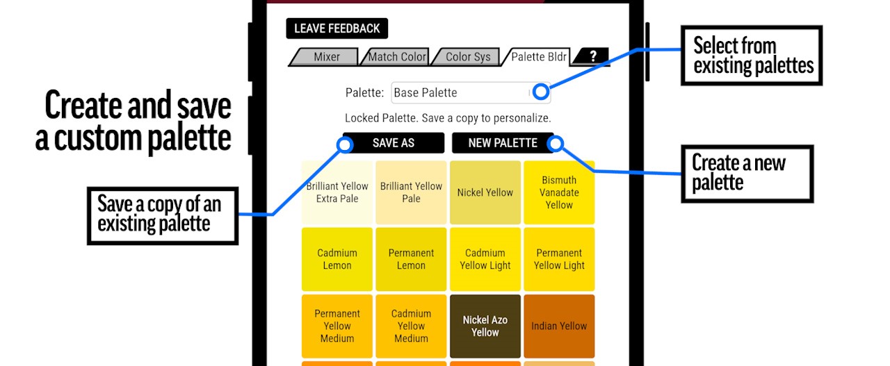
Custom Palette was suggested by many artists over the years and is likely the most helpful feature added with this upgrade. It allows the user to select and save palettes based on the colors used in the studio, which then restricts the MXR to only work from that group. It is possible to save several personal palettes for different projects. You can also adjust the palette as you go to see how the results change with different color additions. The palette selection can be used across the platform, so you always have control over which colors the tool is selecting from, regardless of the tab you are using. It should be noted, that palettes created in the oil or acrylic MXR are only accessible when using the MXR in which they were created.
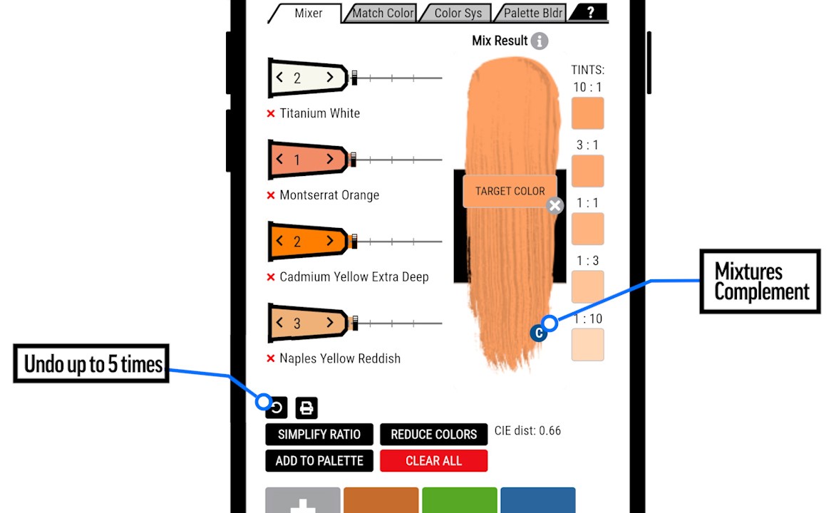
MATCH and TARGET COLOR – The MATCH button is located within the Match Color and Color System tabs. It represents the color the program is attempting to match based on user input via the picker or color values. It always coincides with the TARGET COLOR overlay that covers the vertical color swatch. When using the acrylic MXR, the TARGET COLOR represents dry acrylic color. Keep in mind, the MATCH and TARGET COLOR are not always the same as the resulting mixture expressed in the swatch, due to the limitations of physical color and/or the selected palette. You will notice that when the TARGET COLOR is different from the swatch, the CIE distance pops up below, showing how many units the target is from the mixture within the CIE color space.
The TARGET COLOR can be removed by clicking the X in the lower right, as it is not always helpful to see that comparison.

Mix Results – The vertical color swatch on the right represents the color mixture made from the quantities in each tube. Additional information about that mixture is available by clicking the information icon next to Mix Result above the swatch. This opens technical details about that mixture, showing RGB / CMYK values and the weight ratios of each color in the mix. The weight ratios are helpful when using a gram scale to make your mixtures.

Compliment Button is a colored circle with a C located on the lower right of the color swatch. If you click this, it will provide an estimated compliment to the current mix. Please note, if you click to the compliment, and then click it again to go back, it may not go back to the same results as before. It will provide roughly the same mixture, but it might be made from different colors or in different ratios. If you want to go back to the same exact mixture as before, then use the back button instead of pressing the compliment button twice.
Back Button / Undo – This button can prevent a lot of frustration if the MXR does something unexpected. It is the circular arrow button located below the color tubes, to the left of the print button. Use this to step back instead of clicking back on the browser. It can go back five steps regardless of the action you have performed.
When Matching and Saving Colors
The MXR will not always provide the same mix twice, even with all other factors being the same. This is a feature of the program because it works everything on averages, which may provide overlapping results from the same palette. This becomes apparent when matching to an image and clicking on what looks like the same color, only to get different mixtures every time. This can be reduced by limiting the number of colors in the palette, or by posterizing the image before bringing it into the MXR. Posterizing simplifies the image by grouping values and colors together. This can be especially helpful if your image has subtle transitions and color gradients. There are many free posterizing programs available online to help with this process.
Create an account. After creating an account you may save palettes and mixtures that will automatically load on return visits. Unfortunately, uploaded images are not stored in the MXR, so you will have to reload those each time you log on.
We are proud to offer the GOLDEN and Williamsburg MXRs with hopes that artists will be more successful in the studio, save time, money, and perhaps find some new colors in the process. Cross-referencing our online GOLDEN and Williamsburg color charts might be helpful. There you will find each color in masstone, tint and glaze with additional technical details including transparency/opacity, lightfastness and pigment info. It is our goal to continuously improve this tool. Please click LEAVE FEEDBACK at the top of the MXR to share your thoughts. You can also email [email protected] or call 800-959-6543 with any questions or comments.

Subscribe
Subscribe to the newsletter today!
No related Post
This seems like a great tool. How does one get it? It does not appear in Google Play on my phone.
Hello Keith, the mixers are accessible through our website. Here the links:
Acrylics: https://goldenartistcolors.com/mixer/acrylic
Oils: https://goldenartistcolors.com/mixer/oil
only as a web page, not an ios app?
thanks
Frank
…& would it work for Gouache paint colours too?
Hi again, Frank!
We do not manufacture a gouache, so our acrylic mixer would could only very roughly approximate such mixtures. Gouaches tend to be slightly desaturated in color due to the addition of chalk/whiting, so you may want to compensate for this difference if you attempt to use the Mixer in this way.
Thanks for all this Gordon. I’m ok with the nearest approximation of the desaturated matte colours of gouache (kinda like a matte acrylic). But being a newbie I could use some further advice on whether to select – match color> ‘heavy body’ or ‘high flow’ or’single pigment etc
And/or any other settings to get the best approximation.
Thanks
You got it, Frank. Those options of Heavy Body, High Flow, etc. are standard palettes based upon those color lines. If you’re comfortable with a little experimentation and fuzzy results, the best method for you may be to create a custom palette based upon your gouaches using the Palette Builder tab. You must be signed in to create and save your own palettes. Once you’re signed in, click on the Palette Builder tab then click “New Palette.” Populate this palette with your chosen colors or the nearest approximations. Check out our Heavy Body Pigment Data Chart for pigment codes that you can match to your gouaches. Add Zinc White as an imprecise semi-transparent white to approximate the chalk in your gouaches. Once this palette is built, you can select it in the Match Color tab to limit your mixtures to your custom palette colors. We hope this helps!
Hi Frank,
We do not have plans for a standalone app. We hope you’ll enjoy the mobile version of the webpage, as it is very app-like. You can add a shortcut for any web page on your homescreen for a nearly indistinguishable experience.
Thanks. That works.
This is a great program and I have been using it for years. I know from Golden that srgb mode is the best mode for accuracy, but would like to know what computer monitor Golden has used that has the best accuracry. My mixtures by volume have been a bit hit and miss. I know that the Greens have limited accuracy compared to other colours but a recommendation would help.
Hi Adam,
For greater accuracy in your mixtures, you might have better success using weights (with an accurate scale) than volumes. The weight ratio of your mixture can be found by clicking the “i” button next to Mix Result.
We do not have a particular monitor to recommend, as the market for such things is constantly shifting and we actually use a broad range of monitors here at the factory. If you are concerned about the accuracy of your monitor, you may want to consider calibration with built-in OS tools or a purpose-made colorimeter.
To avoid the subjectivity of monitor makes and models, we base all of the Mixer’s functions on data from many thousands of spectrophotometric readings of real paint mixtures. Significant approximations must be made to translate from the purely reflected color of real paint to the purely emissive color of screens. Therefore, the Mixer is best at general estimates, but cannot fully model the complex interaction of pigment particles. Some mixtures may seem more accurate than others, and this may be due to the subtleties of pigment particle size or transparency that are too complex for a lightweight online tool. The Mixer is an ongoing process of continuous improvement, so we hope that you notice ever-increasing accuracy with time.
Please feel free to let us know if you encounter errors with the Mixer. We will be most grateful for the feedback and the kernel of information that may lead to further improvements in the next update.
I do have a question regarding measuring by weight. I have some older fluid paints and some newer ones. Some of the older ones are slightly thicker as they are at least 5-10 years old. They are more viscous rather than dried and still usable. Does weight vary much if the paint has thickened in the bottle? If it doesn’t I could still use these paints as measuring by volume is difficult if the paint is not fluid enough enough to be poured or dropped out of the bottle.
Hello Adam,
As acrylics cure, they do reduce in weight slightly as liquids evaporate away. A lot of this evaporating liquid is water, but the amount of water in a small amount of thickening paint is likely also to be small. There are water weight calculators online which can give the weight of, for example, an ounce of water if you wish to get an idea of weight loss as water evaporates. It might be simplest, though, to test a mix based upon weight to see if the thickening of paint makes a serious difference in the color created.