
You reach for a tube of Cadmium Red or Ultramarine Blue and you intuitively trust that they contain the very pigments they are named after. It’s a trust formed over years and decades of personal use, along with an assumption, an almost blind belief, that paints must surely be labeled according to definite rules. Besides, you might think, these are well-known pigments prized for their particular qualities and mentioned or recommended by almost every teacher and book on painting. Given all that, would you feel cheated or misled if you found that the colors you purchased were actually made using different pigments? That the Cadmium Red wasn’t made from cadmium red at all? That the specific properties you expected, like opacity or dry time, were lost or compromised? Would you care? We believe you would and rightfully so.
Now, for an equally and perhaps more important question – would you continue to care if that color was Burnt Sienna or Raw Umber? Or any number of other natural earths? If you find that you hesitate or waver, that you think, well, with these there might be some wiggle room, we want to passionately try to convince you otherwise. These examples are not separate – the answer to one directly informs and impacts the answer to the other. Maybe not right away, but over time the trust between manufacturer and artist will get eroded, standards and conventions will be set aside or abandoned, and the connection between a color’s name and the pigments it contains will be lost.
A Growing Problem
The scenario outlined above, concerning natural iron oxides, is unfortunately not a hypothetical, not some far-off concern to be warded off, but something that is already far too common in the here and now. More and more paints labeled with names historically reserved for natural iron oxides are turning out to contain a host of synthetic pigments. Sometimes those pigments will be blended with a natural earth, but other times the paints are made solely from synthetic pigments with not a trace of a natural iron oxide to be found. While an anomaly here or there can perhaps be tolerated or written off, the situation has reached a point where we felt it was critical to raise awareness around these issues.
The problem has also grown so large that this article focuses on only one small aspect of it; namely the inclusion of synthetic pigments that are not based on iron oxides. These are materials no one would ever expect to find in an earth color. A follow-up article will look at the much larger and more complex issue of how pigments are ultimately classified by pigment manufacturers and the Color Index, and the use of synthetic iron oxides in colors historically made from natural ones. For example, the common use of synthetic transparent red iron oxide in place of natural Burnt Sienna, or Mars Yellow in place of natural Yellow Ochre. We hope to publish that piece early next year.
Praise Where Praise Is Due
Before sharing examples of paints labeled in problematic ways, some praise is due. Many companies actually do label their paints correctly, and they should be supported and applauded for their efforts. Also, all the tubes we looked at, even ones from minor brands, did list their pigments on the label, and the information could generally be found online as well. So ultimately nothing was being hidden; artists could easily discover which pigments were being used by simply turning the tube over, or doing a quick search on a retailer’s or company’s website. And that is important to acknowledge. Go back far enough in time, and even that basic level of disclosure was not always the norm, so this alone represents something to feel good about.
The Examples
As mentioned earlier, we are highlighting only the most egregious departures from what anyone would expect to see when purchasing Raw and Burnt Umber, Raw and Burnt Sienna, or Yellow Ochre. These examples all involve the use of synthetic organic, inorganic, and complex inorganic pigments that clearly do not belong in an earth color. Synthetic organics are a class of industrially produced carbon-based pigments like the Hansas, Quinacridones, Phthalos, etc. Synthetic inorganics, besides those based on iron oxide, include things like Titanium Dioxide and Zinc Oxide, while complex inorganics are usually based on mixed metal oxides. Well-known examples of these would include Chromium Oxide and Cobalt Blues, but there are also a host of ones with names like Zinc Iron Chromite and Chrome Antimony Titanate.
Below, under each color’s heading, you will find some notes on how to recognize genuine versions of that pigment from how it is listed on the tube or in color charts so you can recognize it when purchasing paints or checking your current stock. This is followed by a table showing mixtures that used pigments other than natural and synthetic iron oxides.
The information we collected came from the websites and online color charts of easily available brands, including all the major ones. We deliberately do not share the identity of the brand behind each listing. Our purpose in writing this article is not to single out companies but to raise awareness of a general trend that impacts the industry as a whole. Even more importantly, it is to educate and inform artists on what to look for and why it matters, for ultimately you are the ones that can effect change by making your voices known to the companies you do business with. If you don’t care, the companies won’t. It is as simple as that.
Guide to Reading the Tables
Each color includes a table showing the pigments we found listed on individual tubes of oil, acrylics, and watercolors. If there was more than one example, the entries are separated by a gray stripe. Pigments in red are the ones we want to highlight in this initial survey.
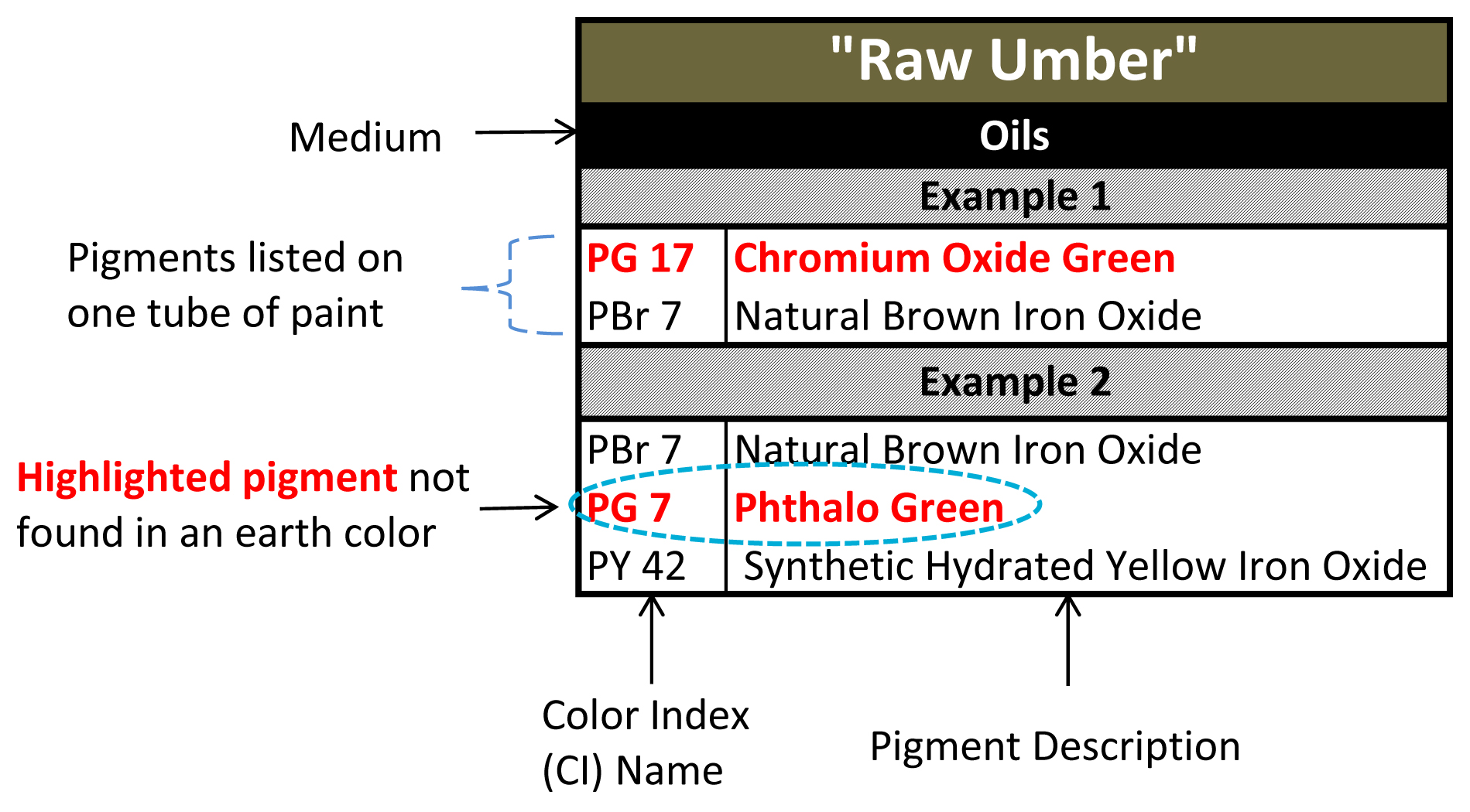
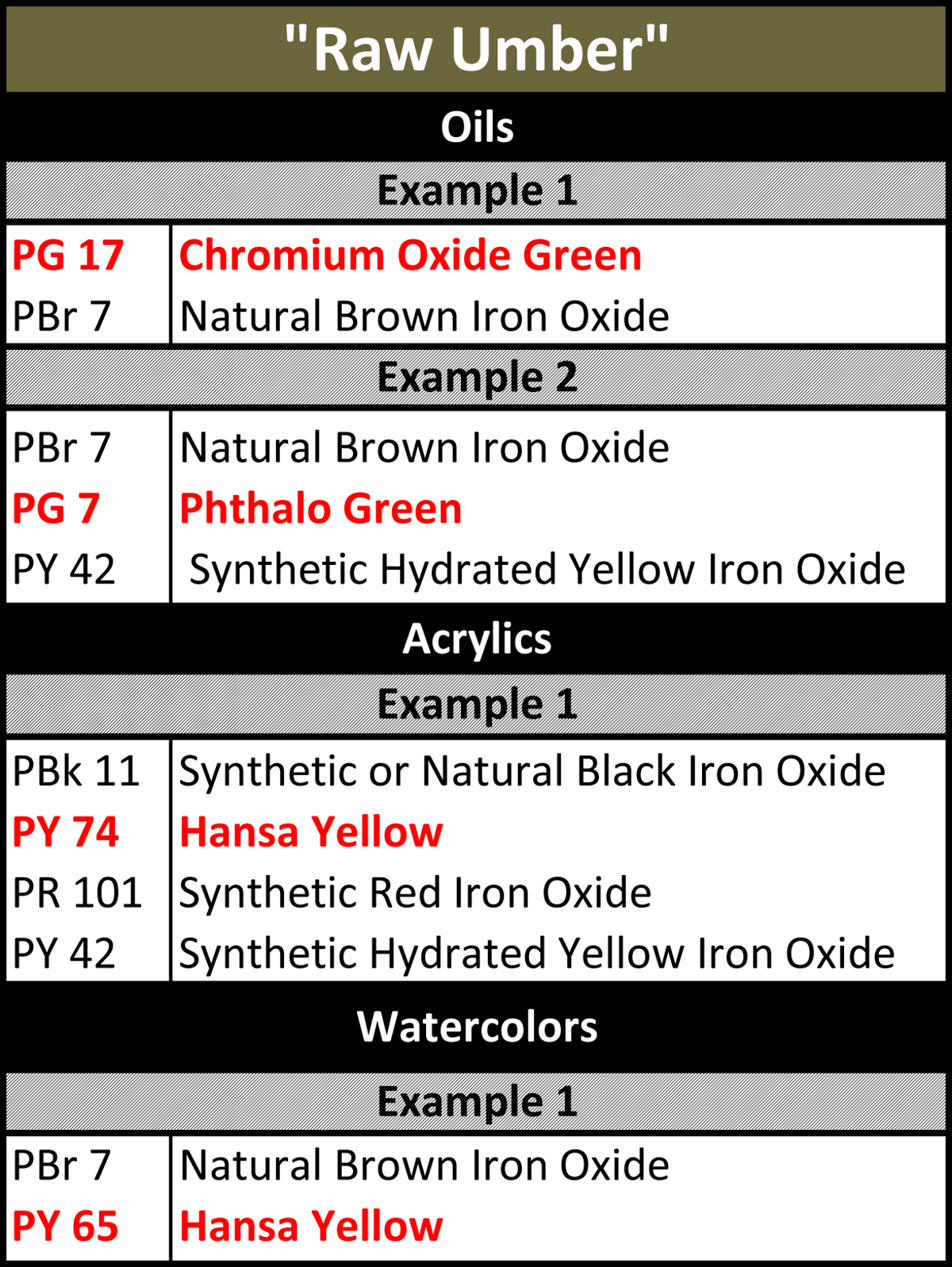
Raw Umber
Genuine raw umbers should be listed as a single pigment with a Color Index Name of PBr 7. It should also have an accompanying chemical description, either on the tube or the company’s technical information, as a natural iron oxide containing manganese. This later part is important because the manganese component is an essential feature of true raw umber. Because PBr 7 can refer to a range of brown oxides, we have used its broader and more generic description of “natural brown iron oxide” whenever we could not locate a mention of manganese in the listing or company literature.
While a couple of the entries do include a natural brown iron oxide in the formula, the addition of Phthalo Green, Hansa Yellow, or Chromium Green Oxide remains problematic for a color with a long history of being solely a natural iron oxide.
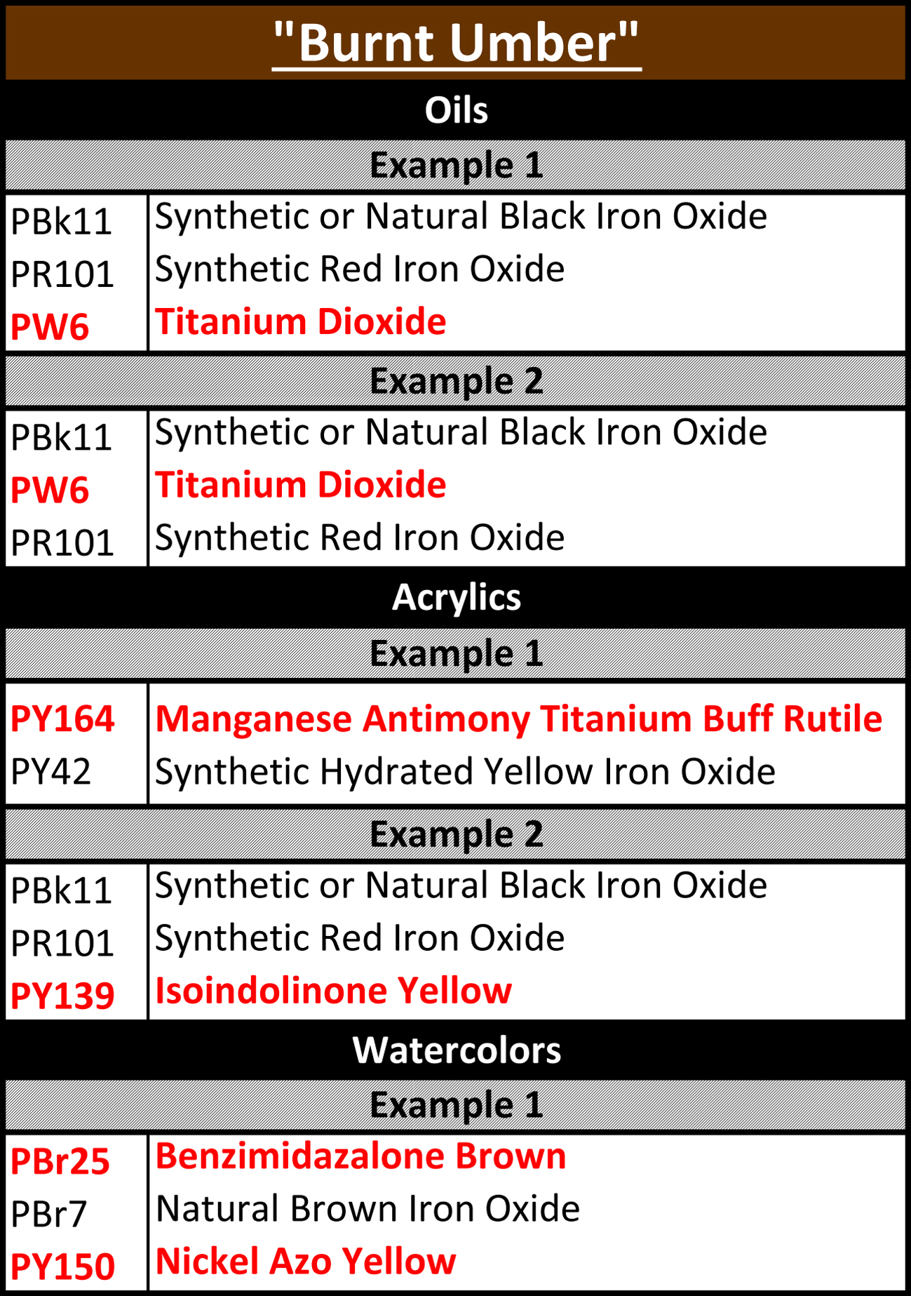
Burnt Umber
True burnt umbers are calcined versions of their raw umber cousins. They should be listed as a single pigment with a Color Index of PBr 7 and description as a calcined natural iron oxide containing manganese. Again, look for the presence of “manganese” to differentiate it from other types of brown oxides.
As you will see, none of these listings come even close to that ideal. Two of the entries list Titanium White, while you can find both synthetic organics (PY139, PY150) and complex inorganics (PY164, Pbr 25) in the other ones.

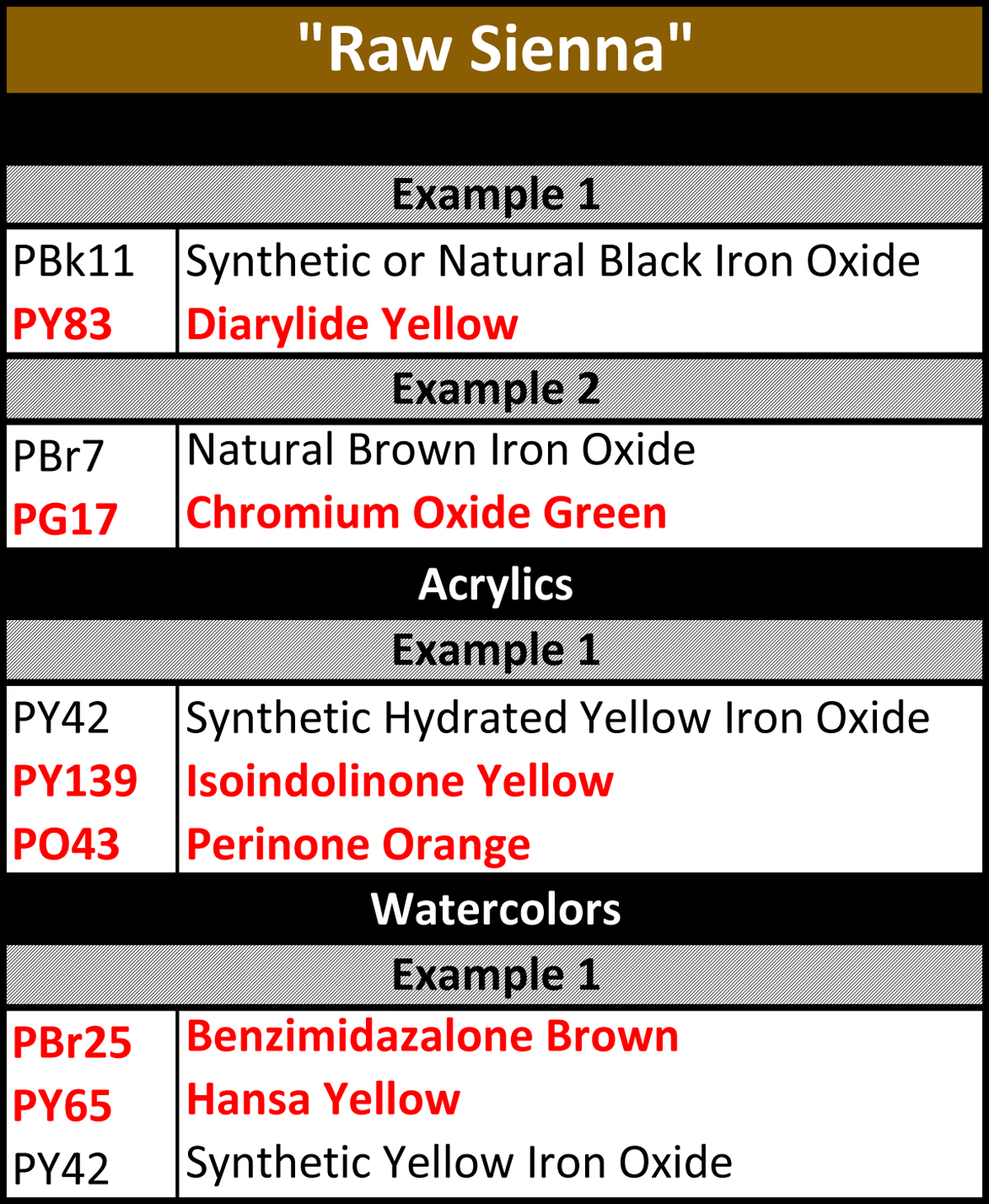
Raw Sienna
Natural raw siennas can vary in how they are listed depending on their shade and source, with some pigment suppliers listing them as PY 43, natural hydrated iron oxide, and others as PBr 7, natural iron oxide. In either case, it would be shown as a single pigment rather than a blend. Under no circumstance would a natural raw sienna contain the synthetic pigments listed in red below.
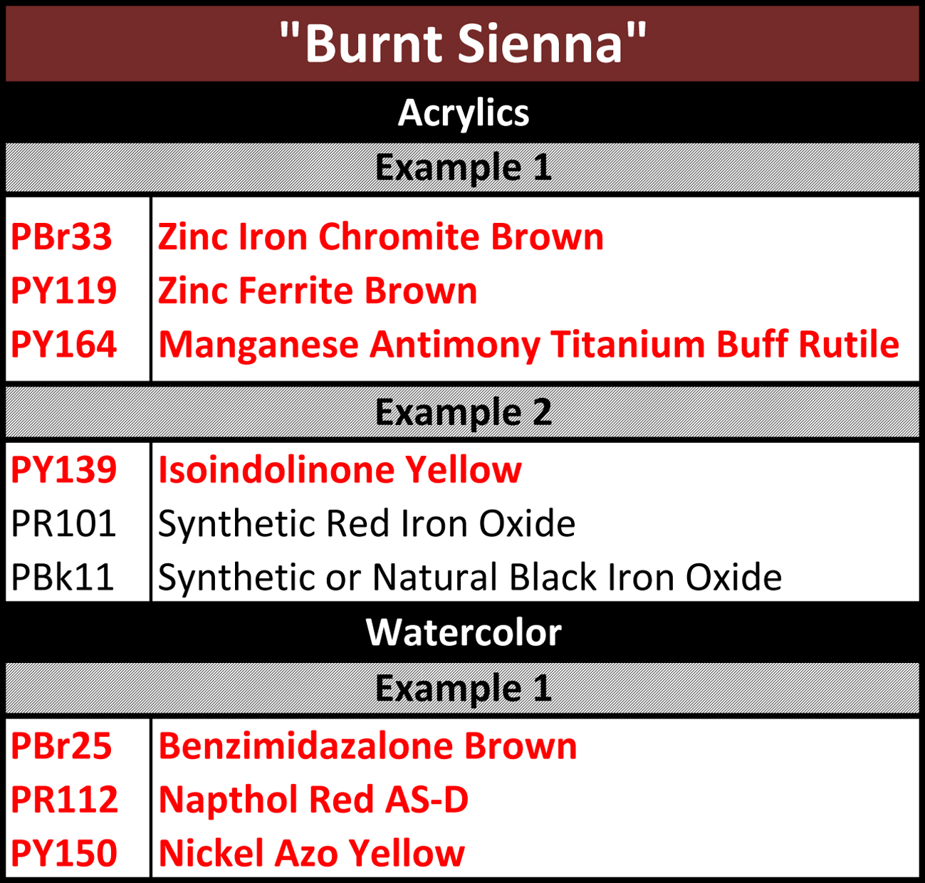
Burnt Sienna
Like raw sienna, genuine burnt sienna can also be found listed in two separate ways – either as PBr 7 or PR 102. Again the difference is generally the shade of color or the way a particular supplier classifies it. In either case it would still be described as a calcined natural iron oxide. However, none of the highlighted pigments below would ever be expected in a burnt sienna.
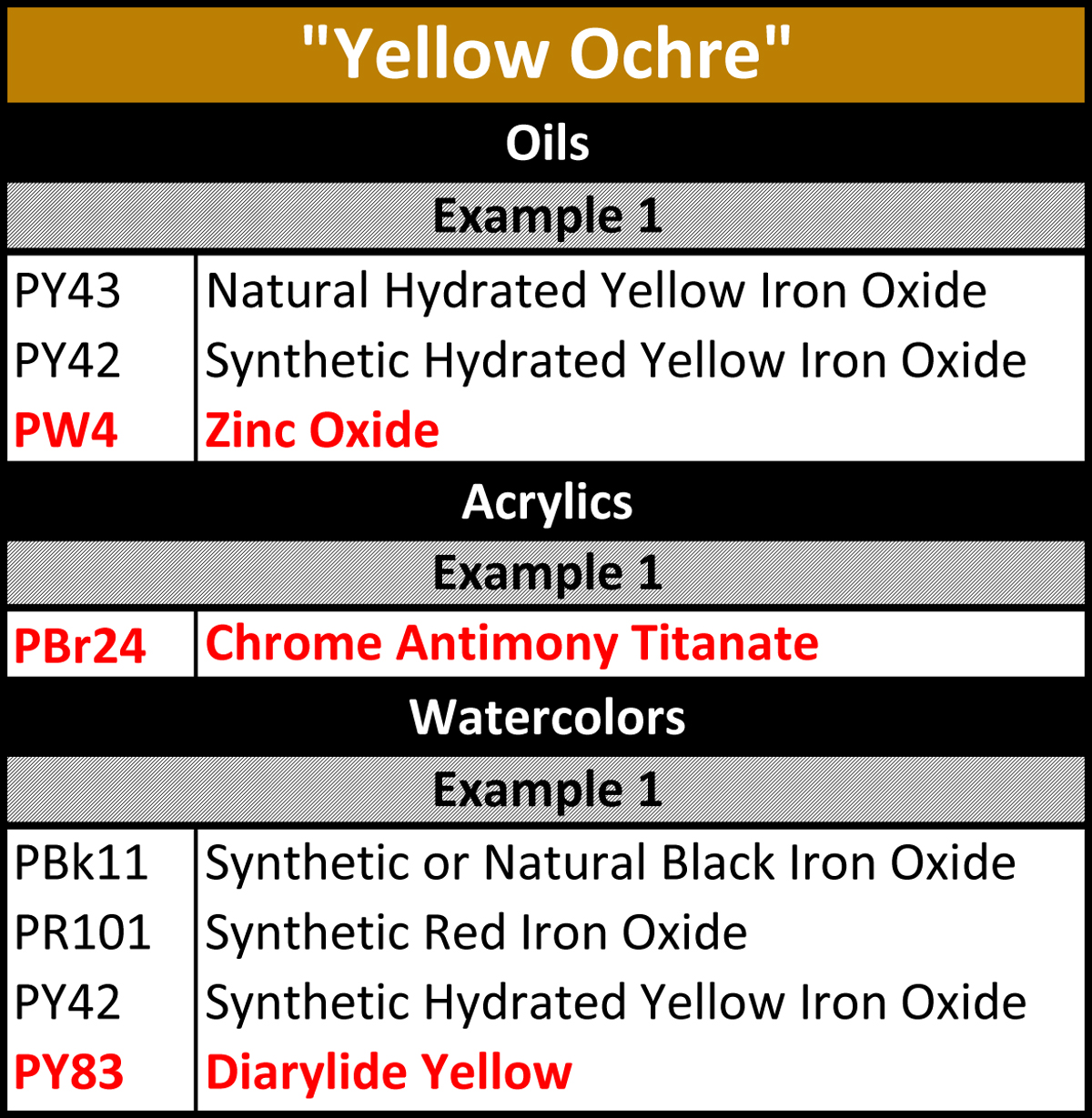
Yellow Ochre
This natural earth color should be listed as a single pigment, PY 43, natural hydrated iron oxide, which was mentioned earlier under Raw Sienna. Unfortunately PY 42, a synthetic hydrated yellow oxide that is much more dense and opaque, is frequently being substituted for the more subtle and transparent natural one. In addition, the pigments in red clearly do not belong in a true earth color under any circumstances.
Why You Should Care and What To Do About It
The current state of affairs among earth colors can be confusing and frustrating and it appears to just be getting worse. Long established standards for historically important earth colors are being upended and the colors replaced by a host of synthetic pigments that invariably have different properties. Labeling conventions are likewise being ignored as names once reserved for certain natural earths become, instead, mere references to a generalized type of brownish color space.
So why does this matter? Connections to historical painting techniques, color mixing recipes, materials lists handed out in classes and found in art books, all become a nightmare to navigate. A teacher recommends ‘Raw Umber’ or ‘Burnt Sienna’ and what was once an easy purchase becomes a mess of competing choices, many of which bear no resemblance to the actual colors these names are supposed to refer to. And slowly, bit by bit, the trust in labeling and paint names built up over the last many decades can start to fall apart and we find ourselves back to a time when almost anything goes as far as labeling is concerned.
And that is truly the larger and longer-term danger in all this. We might find that we get too comfortable with this type of slippery-slope loss of standards, thinking, “oh well, its just a few colors, and brown ones at that”. But if we allow these names to become untethered to their historical identities, there is really nothing to stop this eventually happening to other colors such as cadmium red, viridian green, or ultramarine blue.
As for what to do, in truth you are the best and most forceful agents of change in this. ASTM Standards can be passed and promoted, voices can be raised by some manufacturers, but it falls on artists to let those they buy from know what is important to them. If you value clear labeling, and feel that having access to genuine earth colors is important, then write, call, email, message, post or blog, but somehow let manufacturers and retailers know. And before you purchase your next earth color, turn the tube over. Check what pigments are being used. Ask questions. Let them know you want the genuine stuff.

Subscribe
Subscribe to the newsletter today!
No related Post
Thank you for your meticulous attention to this issue…I’m an old dog just new to painting (acrylics), but in classes I’ve taken I’ve actually been rebuffed for persistence in championing single pigment colors instead of the ones preferred by the instructor…one of my joys is mixing shades of secondaries, etc. from my quite limited basic palette! I rarely have good results when using colors that are already mixtures! I don’t mind being called a control freak because, hey, I don’t have all that much time and money left to mess around and end up wasting paint from failed combinations that have turned muddy!
Again, thanks for confirming my novice suspicions!
Hi Roberta –
Thank you so much for the positive feedback and glad that the article was able to confirm your suspicions. And if there is ever anything else we can do to make your exploration of painting easier, just let us know!
What a fantastic post. Here I am trying to find the chemicals to use to refinish some old wood (mahogany), thinking I could take some raw umber, sienna, etc, mush them together…
but, eh… I’m an artist, so I’ll always test my colors, I think, because I think all raw umbers are the same.
I’ve just learned differently. Thank you for this post. It reminds me to always “test” my colors.
Thank you very much for your work on this issue. As an artist with a serious concern about the longevity and predictability of art materials, I have always read the labels for the pigment content and am distressed that the ASTM standards are not being respected. Is there no oversight mechanism that can fine those who flout the rules? Concerned…
Hi Michèle –
Thank you for your reply and it is great to know that you are so passionate about this issue. That alone goes a long way to helping in the fight against the erosion of these naming conventions. Unfortunately ASTM Standards are completely voluntary, with no compliance enforcement mechanism, so as long as one is not claiming to conform to a specific ASTM Labeling Standard, they really are free to name it whatever they want. Which is all the more reason why we think the best and only hope to get companies to recommit to following a set of naming conventions is for customers to voice their concerns. But also rest assured, this is being discussed by members of ASTM and we will continue to see what we can do to educate the field. And stay tuned for our eventual Part II, where we will take more time to unpack the system and standards that dictate how pigments are classified and named.
Dear Sarah,
What an outstanding article! Thanks so much for raising the RED FLAG ! It is very much appreciated! I had no idea this was happening and will check my watercolor and acrylic tubes and pay attention before I buy. And if I find any offending manufacturers I will send them an email and inform the art supply store!
Thanks Linda! We truly appreciate the feedback! And its great to let companies and art stores know what you value. We truly think customers have the best chance of changing the labeling practices. As we pointed out, at least everyone discloses the pigments they use, so its less about calling them out for doing something wrong and more about sharing what you would like to see. Let us know how things go and if we can help in any way.
In this town there are plenty of artists, but only one other pigment geek like me. We speak of colors by their color index numbers as often or more as when we speak of them using the sometimes fanciful manufacturers’ names.
We like single pigment colors as well as blends, but we are very aware of what is in those blends. When we purchase paints, or when we are asked which paints to purchase, we go for and suggest colors based on their actual contents. In this way, I think we at least try to promote awareness of paint quality, thereby assuring we get the best product from the manufacturer that our sometimes limited budgets can afford.
Many of our listeners or students just cover their ears and go “la la la”, but they are missing out on high quality materials. Others pay attention, and with our and their purchasing power we can weed out flawed product and force manufacturers to straighten up their act.
Hi Marcao – Thanks for the comment. You are probably not alone in finding yourself as a stranded pigment geek, but how encouraging that so many painters are at least aware of the pigment numbers and use that as a guide. Just starting from there is already being far, far ahead of the game. As for the others….well, shall we say they simply live in ‘la la land’.
🙂
Thank you for this information. I’ll be looking at labels more closely now. Since each paintmaker can create their own standard, Unless there is a list somewhere of best ingredients, I guess I’m going to have to learn more about chemistry.
Hi Jennie – Its all a matter of baby steps, and just being more aware of labeling and the variations that you see can be helpful. Unfortunately it is true that many paint manufacturers will make there own set of rules, but ASTM does have labeling guidelines which is what we follow. We will continue to write articles on this topic, so stay tuned as there is a lot to learn and just Paint is a great place to find resources for exploring. Or feel free to throw questions our way about anything made by anybody! Truly! Just email [email protected] and usually an answer will appear on your end by the next day (or two at most).
Hi Sarah,
As always you are great and very helpful. I quit paying attention to “names” and paint with pigments, mainly choosing single pigment creations. The light frequencies absorbed, and those reflected, in a single pigment create a signature. When multiple pigments are combined it seems to muddy the signature.
My favorite site is the one Bruce MacEvoy created at http://www.handprint.com/HP/WCL/water.html. I wish there was more detailed information like that in a current site. He wasn’t part of a company so was free to share his opinions.
Thanks!
Hi Ernest – Thanks for the warm feedback – that always means a lot to me. And we totally agree about the value of Bruce MacEvoy’s site. What a gift to all of as and a true labor of love. Another site i stand in amazement of is Artist Creation and their pigment database tracked across manufacturers;
http://www.artiscreation.com/
As much as we can tell, just a person’s passion given freely to all. There are times that examples like these gives one hope and shows the power of the internet as a storehouse of knowledge.
Thank you for the enlightening and thorough information. I have recently been confused re the labeling of ultramarine blue and French ultramarine blue. I have always believed that French ultramarine was more red. Each tube is labeled PB 29. The two tubes are from two different manufacturers.
I’ve been surprised the sap green I buy seems to change rather often. Your article answers many questions. Thanks again.
Hi Linda – Thanks for the comment and glad you found the article valuable. French Ultramarine is indeed traditionally more red. However all shades of ultramarine blue, from ones that lean green to ones that are quite warm, have PB 29 as the pigment designation. Unfortunately Color Index Names, which is what those are, are good for tracking the major aspects of a pigment but not always its specific color. Cadmiums are similar – all cadmium reds are PR 108’s but obviously they cover a range from light warm reds to dark cool ones. Anyway, long story short the world of pigments can be confusing but we are always here to help, so don’e hesitate to send us any questions to [email protected]. We are almost always able to get a reply sent back within 8 business hours. At least that is what we aim for. In the meantime, you might find this article that we wrote on the topic of how pigments and color are described and designated by different systems helpful:
https://justpaint.org/the-nomenclature-of-color/
I wish Golden would make water mixable oils – a medium that I recently switched to from acrylics. I love the medium, but the problem you’ve written about occurs in all the brands I’ve looked into to a fairly large degree. These crazy “not what they are called” pigment combinations can sure make for some unpleasant surprises when mixing colors! I miss the wonderful single-pigment, correctly named Golden acrylic colors in my new medium!
Hi Sharon – We will certainly add your vote for water-miscible oils to our list of product ideas. And we hear you – it can get frustrating. The blends you are finding might be more prevalent in water-miscible oils because they tend to appeal to a wider range of artists beyond the more traditional oil painters – but not really sure. If nothing else, let them know. And just to be sure, have you ever given OPEN Acrylics a try? If not they could be an interesting as they provide a wonderfully long working time. But, just to be honest, still not as long as oils, and with less opacity. So always some trade-offs. Anyway, if not, we would be happy to send along some samples. And if we can help with anything else, just let us know.
What an appalling trend, and so unnecesssary. I’ve known for a long time that commercial paint names mean very little and that one must read labels scrupulously, especially in regard to so called cadmiums, cobalts etc which are so often nothing of the kind…. but this trend for falsifying (that’s the only word that fits, IMO) earth colours is a new low. Thanks for publicing this, Sarah!
Hi Jenny – Thanks for the comment. it is a bit shocking, which is why it caught our eye. Especially some of the blends which seem so unnecessarily complex. But at least you are scrupulous about reading labels. That alone puts you well ahead of the curve. And keep an eye out for our follow-up to this piece which will be a deeper dive into some similar issues.
I’m aware that some manufacturers use such wierd mixtures instead of real earth pigment. However, I wonder why they actually do this.
I understand, that one might decide to use a substitute for genuine cinnabar/vermilion (PR106, mercuric sulfide), as the real thing is somewhat toxic (although I suppose no one eats his paint), has questionable lightfastness according to some sources and of course is very expensive.
But why earths? I made few oil paints based on genuine earths myself and majority of pigments I used was really cheap, like 3,70 Euro per 100 grams.
Hi Ivan –
We totally agree and besides perhaps some advantage in controlling color variations, it does feel like taking something that is simple and inexpensive and making it into something more costly and complex. it will remain one of those enduring mysteries for now, but hopefully just making people aware that this is happening will help.
Hi Sarah –
Thanks for such an amazing article and thanks for caring so much about this subject. I started with the cheap paints and quickly realized that the savings weren’t at all worth the sacrifice in quality… and have been with Golden ever since. This article is so helpful for those of who aren’t chemists but want good paint.
Hi Anne! Thanks so much, both for the warm feedback but also for your support of our products and belief in what we do. That means the world to us and we never ever take it for granted. And if there is ever anything else we can do, just ask!
A couple of questions Sarah..
Bruce MacEvoy has said on his website regarding natural earths:
“NOTE: The manufacture of most iron oxide artists’ paints, including those with traditional names such as “earth”, “sienna”, “umber” or “ochre”, has changed from the use of natural iron oxide clays — designated by the generic color index names PBr7 or PY43 — to the use of synthetic iron oxide powders. Small supplies of artists’ grade natural iron oxides continue to flow from mines in Europe and the Middle East, but by 2002 there were no longer any suppliers of natural iron oxide pigments registered with the Society of Dyer’s and Colourists’ (UK) Colour Index.
Many watercolors now labeled PBr7 or PY43 are actually made of mixed synthetic iron oxide pigments, not natural ores. In fact, iron oxides used in watercolor paints today include pigments formulated for use in wood or leather stains, or as plastic, ceramic or masonry colors, and are available in a very broad range of colors and grades. See for example the page “earth tones dry pigments” at the web site of Kama Art Materials (Montréal, Québec), the mineral and iron oxide pigments available at Sinopia Pigments (San Francisco, CA) or Kremer Pigments (New York, NY), and the pigment information pages at Société des ocres de France or their USA distributor, The Earth Pigments Company (Tucson, AZ).
The use of natural oxides has dwindled so much that in 2001 the SDC considered eliminating the color index names PBr7, PR102 and PY43 from the Colour Index, and reassigning these pigments to the color index names for synthetic brown (PBr6), red (PR101) or yellow (PY42) iron oxides. However, manufacturers lobbied to retain these color index names as convenient “color” designations and desirable marketing labels. In 2007, the SDC reaffirmed to me that they were still deliberating on the issue.”
Second question: I have also heard (though I also don’t know if this is true) that some pigment supplies of PR102 or PY43 have some level of synthetic versions mixed in to ensure less colour variety between batches (as the impurities are what causes more colour differences in the natural versions).
Can you comment at all on these questions?
Hi Richard – We plan to address a lot of these questions in our follow-up to this article. We purposely separated out these issues because they quickly get complicated and involve a lot of untangling of the various roles of the Color Index, pigment manufacturers, ASTM, and artist paint manufacturers when it comes to how these pigments get categorized and labeled. Certainly there appears to be some credence to the issues Bruce McEvoy raises, but in our experience it is not nearly that universal, especially among the larger natural iron oxide suppliers. The fact that none of these are registered with the Color Index means little – simply that they do not see registering with them of any business value. The Color Index, after all, does not hold the same prominence as a trade association as it did in the past. We also have not found that larger suppliers have needed to blend synthetic iron oxides with natural ones for color consistency. Rather this can be managed simply by the controlled blending of multiple lots of naturally mined earths. That said, there is definitely a market that is pursued where this is the case – such as the need for a broad palette for coloring cement or grouts, for example – but these are largely separate offerings and clearly marked. Anyway, the main thing is that yes, Bruce raises good points and it is an area that manufacturers and artists who care about this are going to need to keep tabs on, and advocate for, but at least from our perspective true natural iron oxides continue to be readily available.
Hope that helps, but also look for our follow-up Part II to this article for a fuller picture.
Thank you Sarah 🙂
Hi Richard –
I want to amend my earlier response as I unfortunately misrepresented some information. Indeed, it does appear that larger suppliers use synthetic iron oxides in small percentages to adjust color while still labeling their pigments with the Color Index Numbers for natural earths: PBr7, PY43, and PR102. These additions, from our understanding, can comprise up to 10% of the blend and do not significantly alter the qualities of the pigment since they are chemically identical to the main components. This practice has been true for quite some time and is not a recent development.
There is more to unpack here, which we plan to do in the next installment to the article. It is also one of the reasons we wanted to set aside and discuss the issue of natural and synthetic iron oxides separately. In the meantime I just wanted to correct the record.
Hi Sarah! This is Carol McIntyre, we met recently at the conference in Boston. Thank you for your clarity and info. BTW, I speak a little to this subject in my forthcoming book “I Just Want to Paint: Mixing the Colors You Want!” Great to see it reinforced here by you, the expert.
Hi Carol! Great to touch base again since the conference in Boston. It was such a wonderful opportunity to meet people concerned with these types of questions. And there can never be too many voices raising these concerns! Maybe collectively we can all move the needle ever so slightly. or if nothing else, at least raise the level of awareness.
As some who prefers “earth colors” over the more vivid Cadmium and Quinacridones for landscapes and marine-scapes, the lack of clarity in pigmentation is fustrating in evaluation paints without purchasing them first. The [PBr7] paint-class is all over the map…so to speak. As you point out, most “earths” today are hues, not straight pigments. Plus the refinement of many pigments can skew their final hue-value-chroma, as well as their behavior when mixed with othe colors on the palette as the constiuent pigments interact. Even if their masstones are similar, their undertones can vary wildly. At least many manufacturers provide some info on their “transparency”.
Fortunately Golden, Gamblin and a few others make the Munsell notation accessible for their paints. I just wish more manufacturers did-so.
Hi Ted – We completely understand your frustration. And having the names of natural earths starting to be used for all sorts of blends is only adding to the problems that you mention, some of which are inherent to the system we have for indexing pigments and specifying colors. As you point out, even among PBr7 pigments, assuming no adulteration, you will still get a wide variation in color depending on source, processing, particle size, etc. Some of that has always been true, and the index name – Pbr7 – only speaks to the chemical composition and general color space but does not really specify a specific range of hues, much less undertones, that a PBr7 color needs to meet. Those types of specifications are done more at the level of specific industries or companies. The best advice, for now, is to try and stick to the brand or brands you rely on the most as they hopefully will be fairly consistent from batch to batch. And in the meantime, thanks for your support and appreciation. If we can do anything else to help, just ask!
Isn’t the root cause of this change due to factors like the rariety, expense, foreign sourcing or environmental costs of mining earth pigments?
Maybe we shouldn’t use the cliche “Cheap As Dirt” anymore!
Certainly there are costs to mining natural earths, including environmental ones that are likely hard to quantify and compare to the industrial costs of producing synthetic materials. However, in terms of basic price, the synthetic iron oxides are still more expensive pound for pound; although you often need less if you chief measure is tint strength. But your points are well taken that scarcity, shipping, and environmental costs should be factored in.
Wow very interesting! I personally like some of the synthetic iron oxides and would buy them just for their own sake. But I see the need to label them differently so that we know what we’re getting.
Hi Leslie – Thanks for the positive feedback and that you found the article interesting. We definitely agree that correct labeling is critical as it forms the foundation of trust between art material manufacturers and customers.
Thanks Sarah, for your dedication to color and quality in pigments! I noticed a couple of years ago that I was seeing puzzling issues in my paints.
For instance, my local scanner-company could not get certain blues (notably indanthrone) to reproduce correctly in giclee prints. The blue areas turned gray when compared to the rich deep chroma of the original artwork.
Also, a harsh yellow undertone kept emergining in landscape paintings, making pale wheat-colored grasses look like mustard. I discovered that my so-called “Yellow Ochre” (PY42) was actually a synthetic blend. Now I check to be sure the paint tube reads (PY43) “Natural Yellow Ochre,” the colors seen in actual landscapes.
But the worst offender is when either thalo blue or green is introduced to a color that should not contain it. Cobalt blue HUE, for instance, adds a synthetic toothpaste-aqua quality to skies, water and clouds. It just hurts to see paintings with this color so predominant.
These artificial mixtures really play havoc when an artist is trying to mix neutrals. Instead of a nice warm gray, one gets an orange or aqua that simply will not be modulated. It always remains harsh and chemical-looking, no matter how much of the complimentary color is added.
I spend hours researching the paints I buy, trying to balance lightfastness, quality of paint and the ability of pigments to mix well together. I fear that if we artists don’t support manufacturers who provide quality materials (even if we are willing to pay more for them), they will become unavailable.
Most likely, the popular craft market is driving this trend to substitute cheaper ingredients. I’ve seen art supply stores all over the country go out of business in the past 15 years, to be replaced by “big box” hobby stores. These usually stock only the cheaper brands, because, let’s face it: they are very profitable.
People who don’t know the difference will say, why spend $13 on a tube of viridian when you can get the same sized thalo green for $5? They see it as a good deal, money saved. But when an artist comes in later to buy viridian, the seller has discontinued it. As much as I want to support my local dealers, I’ve had to start buying online because the local companies won’t carry the items I want to purchase. Even when I beg them to.
I would also love to see Williamsburg develop a water mixable set. Williamsburg’s rich, handmade colors are delicious, but alas, I’ve become allergic to all solvents, including odorless mineral spirits and turpentine. Water mixable oils have been regarded as a “student-grade” category until recently. I think plein air workshops are fueling the demand for them. Artists can’t carry solvents on airplanes, so they take their water mixable kit. This is a huge market!
Regarding OPEN: I created a series of over 50 paintings using Golden OPEN acrylics, so I’m quite familiar with the brand. They have their virtues, but simply do not perform like oil paints.
Keep up your great work! I read your writings eagerly and appreciate your efforts on behalf of the world’s artists.
Hi Shere – What can I say but thanks – for the positive feedback and support for the things we do, and for such a thorough sharing of your thoughts in this critical area. We agree that there is a sea change happening in the art industry, and those who deeply care about these things are increasingly frustrated. But it is also true that artists like yourself remain central to what we do and we are committed to remaining a champion of quality and research.
You are not the first person who has encouraged us to look at water-miscible oils as an area for expansion, so certainly know it is on the list that we consider when looking at projects to take up. That said, I know that we currently have nothing on the horizon in this area. But perhaps one day. And we agree that OPEN is not a substitute for oils in the strict sense – especially in feel and density. Our aim was first and foremost to push the boundaries of what acrylics could do and to provide to the acrylic painter some of the working time that oil painters enjoy. But certainly we have been pleased by the number of oil painters that have taken them up – not necessarily as a substitute for oils so much as helping ease the entrance into this other medium and allowing for some of the blending and glazing they are used to. Recently, for example, we were pleased to see that David Hockney had taken to them with obvious enthusiasm: https://www.youtube.com/watch?v=QCB-inw3kMk
Anyway, let us know if we can ever help with anything, and in the meantime keep painting away!
This is why it is important to find reputable companies such as Golden to do business with, there are only a handfull of other companies I can say this about. It pays to read the labels and know what you want before you hit the store thank you for sharing this valuable information J.B.
Hi Jennifer. Thanks so much for the warm feedback and support for the work we do. Knowing that our efforts are making a difference makes it all worthwhile.
Hi Sarah, Glad you publish this, i totally agree:
there should be a regulation about these labels & what pigments they refer to.
In the case of W&N, the Galeria acrylics degraded from mono-pigmentary to multi-pigmentary at the exact time they moved the production to China.
Yet I thought Natural Iron Oxides were cheapest to produce, so i don’t understand the reason for the substitution. Maybe they work with mixing machines, you give them a sample color & they produce the paint, regardless of the pigments it comprises…
SURE there should be regulations, but i guess most names have been used historically in a very unscientific way. Under the term PB29 on the site http://www.artiscreation.com, there is a list of about 100 different names, such as “lapis lazuli”, “french ultramarine”, “navy blue” etc…So i guess Brands use this “historical impermeability” to put whatever pigments under a certain label.
As for Golden Paints…
Yes i like a lot Golden & am very satisfied by the quality.
But in my recent purchases of Fluid Acrylics i also had a surprise: i bought “Van Dyke Brown Hue”, yet once at home i noticed it was a mixture of “PR101+PBK7” (iron oxide & Carbon black).
I don’t get that, i used that pigment at the academy, it was an earth pigment, why they replace it?
& why do they sell it? I can add some red & black too, i don’t need Golden to do that for me!
Morale: even with Golden Paints you have to be careful.
Hello Nicolas,
Thank you for your comment. Sarah is on sabbatical for the next year, so I’m happy to reply in her absence.
Yes, some of the blends we’ve seen as replacements for natural earths are quite elaborate and seemingly would be more expensive and time consuming for the manufacturer. We know from our experience that the more complicated the blend, the more difficult it is to consistently match the color, working properties and dry time. That all adds up to more costs and headaches, so not sure why manufacturers would want to do that. When it comes to “Hues” though, it should be expected that the pigments used in those colors are not the same as the color they are named after. In most cases, hues are manufactured because the original pigments used to make that color are either no longer available, have a toxicity risk associated with them, are prohibitively expensive, or in the case of Van Dyke Brown, which is traditionally made with NBr8 Bituminous Earth, cannot be stabilized in an aqueous system – water-based acrylics. Please know that all of our GOLDEN acrylic colors that have the word “Hue” in the name are made from a blend of pigments, none of which are the pigments the color is named after or the pigments traditionally associated with that name. Unlike the LONG list of names associated with PB29, we try not to indulge our creative fancy when naming our GOLDEN Acrylic colors, but stick with the chemical name or the traditional name associated with that pigment or color space.
We hope this helps. Best wishes in the studio!
Greg Watson
Was part 2 ever written up? I’ve been quite fascinated by this article and its comments but have been unable to find the promised part 2.
Hi –
Unfortunately no – best-laid plans and all that, we just never got around to it before I took a year sabbatical in 2019/2020. It might be something I will get back to, but in truth, we led with what we thought were the most critical and important issues to highlight, which was the use of synthetic organics and various strange, complex blends, in “earth” colors where they clearly did not belong. Part II was going to look at the far more subtle issues when talking about naming and color-space within the world of iron oxides – for example, why is Burnt Sienna sometimes listed as PR102 and other times PBr7, or Raw Sienna as PY43 or PBr7, and does it matter. Or the use of synthetic iron oxides in place of or as a way to adjust natural earths. And finally, the relationship between the Color Index, pigment manufacturers, ASTM, and paint companies and how colors acquire their designations. But there was nothing else as egregious as what we laid out in this part. So…perhaps one of these days….maybe. But in meantime, as we said in this article, the good news is that companies do list what pigments are used, so you can easily see what you are getting. And if you have specific questions, just ask!
hello Sandra,
I am totally confused with all this. I was worried if the windsor and newton professional burnt umber and phthalo blue red shade contains magnamese in the b.u. as it is listed as PBr7, and copper in the phthalo, so far w and n have taken two months in response still hearing nothing from them, various art shops say there is no magnamese or copper in those paints, so does anyone actually know once and for all if the are these toxics in the paints mentioned? It is getting very frustrating!
Hi Jon –
Thank you for your question and we are sorry this is causing frustration. In terms of simply whether these colors chemically contain manganese and copper respectively, they do and we list that on our MSDS Sheet for Golden Acrylics
https://goldenhub.goldenpaints.com/storage/uploads/golden-master-sds-011816.pdf
In terms of whether they present a health or safety concern, let me forward your question to Ben Gavett, our Director of Health and Safety who is in a better position to answer all your questions. You should hear back from him in the following week. His email, should you wish to reach out directly, is [email protected]
Best regards,
Sarah
Many if not most earth pigments vary widely in composition, as iron readily combines with many different elements in nature. Mines/sources get exhausted and the next source is different or even different within a single site. Adding a process like burning (dehydration of raw sienna) also changes the hue to different degrees. Single pigment Burnt Siennas vary in hue a great deal from brand to brand. Ultramarine Blue is originally an earth pigment/natural which I would never want to use over the synthetic. Should we not judge these colours on permanence, hue, and mixing results rather than single or ‘natural’ pigment? Also, are these multiple pigment paints not labelled with the word hue in brackets – Cadmuim (Hue)?
Hi Peter –
We certainly agree that natural pigments can vary in hue and have no problem when, to maintain color consistency, a pigment company adjusts the color with small additions of other iron oxides, even if that entails using a synthetic one such as a mars color, as has been common in the industry going back to the 19th century. But those additions are truly quite small and not meant to change the core properties of the natural iron oxide that the tube is labeled as. What we are concerned with is when organic pigments are added to the mix, or purely synthetic earths are sold using the name of a natural pigment – for example, a purely transparent synthetic red iron oxide being sold as the normally more opaque and less chromatic Burnt Sienna. That feels closer to misleading someone to believe they are getting something they are not. Not unlike using a phthalo in something sold as Ultramarine Blue. You are correct that if the companies labeled their tubes with ‘Hue’ as part of the name, then we would be fine and they would be absolutely conforming to the labeling system that was developed to help artists know what they were purchasing. Unfortunately, however, none of the examples we gave used Hue in the name – thus our concern. Hope that helps!
another intresting article
it’s something beyond the “Hue” and the limitation of “Color Index”
(PB29/PR108/PBr7 won’t tell me the exact color / it varies a lot
I don’t know that genuine “Yellow Ochre” should be PY43
since most company sell it with PY42
(should have “Hue” but didn’t
In other words, i didn’t get a good educate on that
even if i do search “https://www.artiscreation.com” for help
(is there any good book on that?
though this difference doesn’t bother me since i’ve spent lots of time on the K-M/Munsell
(using some modern but also retro method when mixing / such as using different “neutral gray” by Frank Reilly / recipe doesn’t matter anymore
(i have to say Golden Mixer is really a great tool, paint-based but also easy enough to use / at least to get the right relative relationship
the danger/puzzle is on commucation
a hobby painter say the word magenta
i don’t know he mean PR122 or PR122+PW6 / glazing or tint
or “Rose Red”
i don’t know he mean certain PV19 or just some random mixture of PR, maybe even without enough blueish when glazing
and the same thing would happen when reading relic stuff or other people’s note if this situation goes on