Introduction
In the last issue of Just Paint we discussed why some QoR Watercolors had a Lightfastness rating of NA, or Not Applicable, while most carried the familiar ASTM Lightfastness ratings of I and II. Essentially this came about because some of the pigments being used at that point were not currently rated by the American Society for Testing and Materials (ASTM) although all of them were in the process of finishing up several rounds of tests that would allow them to be submitted for approval. We are happy to finally be able to report those initial results with you.
In sharing this update, there are really two stories to convey. The bigger, and in some ways more important one, is the hope to expand the list of pigments rated by the ASTM Standard for Watercolors for the first time in nearly 20 years. That process will begin in January 2016, when we submit the final test results for 16 new pigments. Alongside that group we will also show results for two colors, Quinacridone Magenta and Dioxazine Purple, which were initially rated as marginal back in the early to mid-90’s. However, both of them have proved to be much more durable in all the current testing, at least within our own line of QoR Watercolors. Hopefully these two examples will provide an opportunity for the subcommittee to create a system to resolve these types of contradictory ratings when they arise.

The Tests
Another part of the broad overview we want to share is simply the sheer scale of the testing involved. Each color must be diluted with enough water to create a very precisely measured pale wash representing a 40% reflectance at the wavelength of maximum absorption. Nine samples of each color were then created: three to be placed outdoors in Arizona, three for accelerated Xenon, and three kept as controls. It should be noted that the Standard currently only requires two samples be exposed in each manner, but we increased it to three to make the results as accurate as possible. Each sample was read by a spectrophotometer in five places before and after exposure, or in the case of the three controls, prior to being kept in storage. Taken together, the 17 single pigment colors plus 4 blends generated a total of 1,575 spectrophotometer readings.
Results
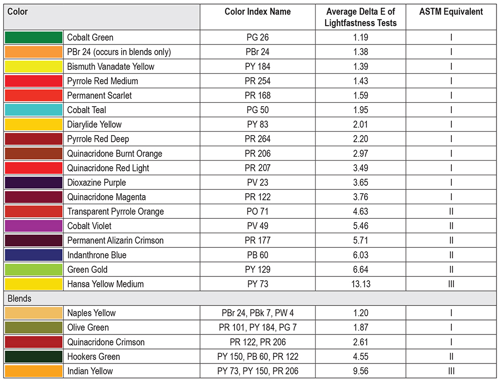
As the first sets of data have come in we have been incredibly pleased by the performance of colors that feel central to the palette of many artists, and which have performed solidly for us in decades of testing in acrylics and more recently, oils. As can be seen in Table I, the majority (10) of the 17 single pigment colors showed excellent durability, achieving the equivalent of an ASTM I rating, while another 5 achieved the equivalent of ASTM II. Two colors of special note include Quinacridone Magenta (PR 122) and Dioxazine Purple (PV 23), which ASTM had listed in an appendix to D5067, Standard Specification for Artists’ Watercolor Paints, as being Lightfastness III or III/IV respectively. However, all six samples of our Dioxazine came in as the equivalent of ASTM I, while averaged results for Quinacridone Magenta were still within current ASTM I standards. Because our ASTM D4303 tests differ so sharply with those previously reported ratings, we’ve chosen to continue to list these two pigments as NA while the matter is reviewed by the ASTM Subcommittee.

Dioxazine Purple
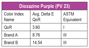
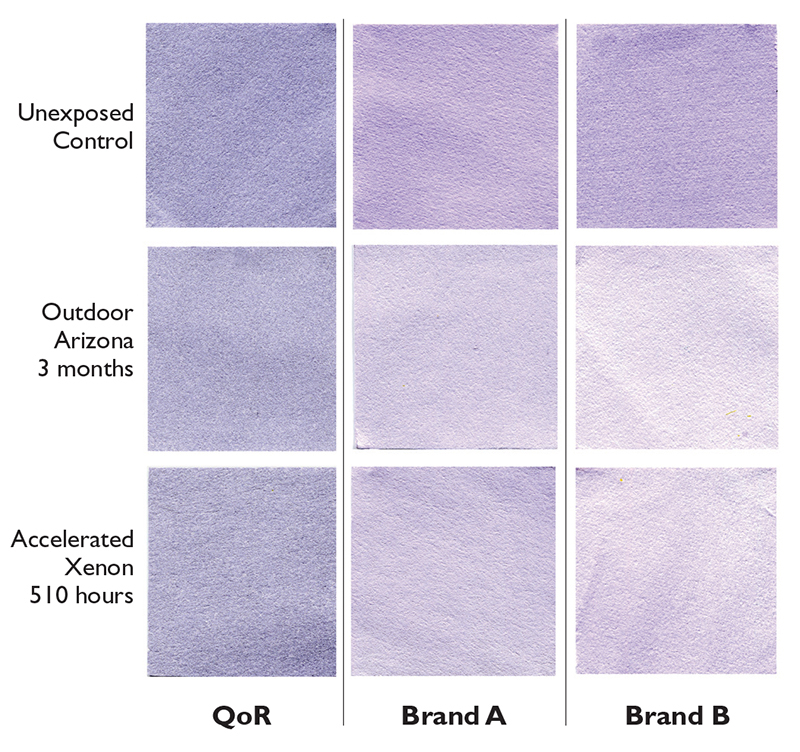
When testing Dioxazine Purple we included the same number of swatches from two major brands of watercolors, prepared in the same way and undergoing the same procedures. As you can see in Table II, both of those brands tested as the equivalent to ASTM III. This sets up something of a quandary, which the ASTM Subcommittee will need to wrestle with. Currently, as the system stands, we can submit our results and ask for the pigment to be reclassified as having an ASTM I rating. However, this would then allow any manufacturer to simply claim that higher rating without having to ever test their specific formulation. Instead, they would only be required to look up the pigment on the ASTM pigment table and report that. However, the types of variations that show up in actual tests, such as the ones with Dioxazine Purple, has led many artists to distrust the current system. Because of that, we believe the subcommittee should consider moving to a formula-based system where each manufacturer would have to have their specific formulations tested. This would allow artists to know that an ASTM Lightfastness rating on a particular color speaks to that formulation by that manufacturer, and not simply the pigment in the abstract or based on testing of one set of swatches from one brand at one point in time. This is an uphill road that will take time to achieve, but we believe it will ultimately serve artists better and provide much more confidence in the value and validity of ASTM Lightfastness Tests throughout our industry.

Test swatches for different brands of Dioxazine Violet, PV 23.
Current ASTM Standard for Watercolor lists Red Shades of PV 23 as Lightfastness III, Fair, and Blue Shades as IV, Poor. However QoR’s version, which is a bluer shade, tested as the equivalence of a very strong ASTM I, Excellent.
Hansa Yellow Medium
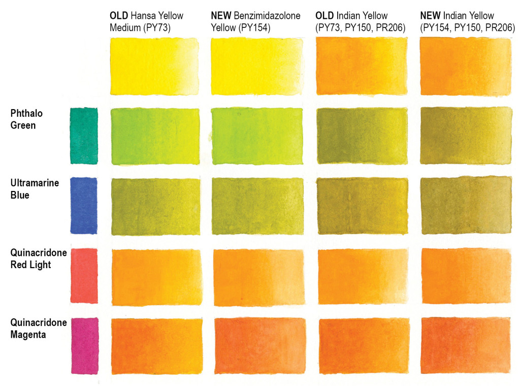
The one color that was not in line with our expectations, especially given its extremely long history as a reliable color in both oils and acrylics, was Hansa Yellow Medium (PY 73). In this case, both the accelerated Xenon and outdoor tests in Arizona clearly showed it was an ASTM III. Because of these unexpected results, we have decided to discontinue this color and replace it with Benzimidazolone Yellow, PY 154, which has an excellent reputation for lightfastness and carries an ASTM I rating in watercolors. While providing a more durable choice in a similar color space, it is definitely cooler and not as transparent as the Hansa Yellow Medium it replaces, so it will also create clearly different mixtures when blending. The same is also true for Indian Yellow (although to a lesser extent), which has been reformulated with the new Benzimidazolone Yellow in place of the older Hansa Yellow Medium (Image I).If you have purchased either of these earlier colors and have questions or concerns, please contact one of our Materials and Applications Specialists by either phone 607-847-6154 or email [email protected].
Looking Ahead
We are delighted to finally be able to share these results with you, despite the disappointment around one of the pigments, and excited as well for the chance to ultimately share our results with the ASTM Subcommittee on Artists’ Paints and Other Materials. Working with members of that subcommittee and other partners in our industry, we hope to strengthen the standards for all watercolors going forward. However, because the process of getting these pigments officially approved can still take a year or more even after being submitted, we felt it was important to have our labelling reflect as much information as possible during this period. Therefore, starting in January, we will implement the same guidelines that will be used by our Williamsburg Handmade Oil Colors, which we share elsewhere in this current issue: namely, colors that are currently listed as NA but which tested as the equivalent of ASTM Lightfastness I will be given an interim rating of Excellent, while those testing as ASTM II will be assigned a lightfastness rating of Good. Once the ASTM approval process is complete, we will then do a final update to reflect the official ASTM Lightfastness ratings. And finally, while we will be making these changes in January, keep in mind that it can take several months for new labels to make their way onto store shelves, as well as be reflected in our printed color charts and other marketing materials. If you have any questions during this period please go to our website, QoRcolors.com for the most up to date information, or simply contact us directly and we will be happy to help.
About Sarah Sands
View all posts by Sarah Sands -->Subscribe
Subscribe to the newsletter today!
No related Post


It’s interesting that your blue shade of PV23 performs better in your watercolors than the ASTM rating of the blue shade in PV23 in oil paint (which is ASTM II, as far as I can see). How can that be? The pigment content in the paint must be at a lower concentration than in the oil paint tested, no?
(As far as I know the concentration of pigment in the paint in practice generally makes a big difference on the lightfastness of the paint).
I would like to be able to test the paint I make in the studio sometimes, and this makes me want to do that even more. I tried finding som lightfastness strips around here in Denmark, but haven’t been able to so far, unfortunately.
Hi Sebastian – We agree there is more to be explored here. Part of the problem is that most of the ASTM ratings trace their origins back to testing done in 1977 and often using pigments from a single supplier. Since then, unfortunately, little in the way of retesting has happened. We are coming across these issue with QoR Watercolors and Williamsburg Oils because their introduction to the market, as well as using quite a few colors currently listed as unrated, prompted us to undertake the type of broad testing you see being reported on. And which happens to also be the first of its kind in literally decades. That said, results such as these is definitely making us take a fresh look at many issues, with Dioxazine Purple being one of them. As new rounds of testing get underway, we will be sure to publish results in a future Just Paint. But realize these things can take time to be completed, giving the complexities involved, so it might be a couple of years before those results are finalized.
As for the question about how one could have different results in Watercolors vs Oils or Acrylics, the issue of pigment loading is somewhat neutralized since all the tests require diluting the pigment to a similar degree – what is known as a 40% reflectance. However one generally would expect watercolors to be more vulnerable simply because the pigments are far more exposed to the elements and especially UV without the benefit of a binder encasing it. So, that does add to the conundrum that needs to be looked into. For now, at least, the testing of the Dioxazine Purple in QoR looks quite solid.
Hi, just following this up 5 years later to see if there is any update that I missed. Your work with testing back in 2015 was fantastic. Unfortunately before we know it another decade will have passed!
Hi Ryan –
Unfortunately, no new updates to report. The pandemic essentially wiped out a couple of years of ASTM in-person meetings, slowing everything up. But other than submitting our test results for use in the ASTM Watercolor Lightest Pigment tables, all that work was completed and we believe the assigned ratings to be reliable and accurate. So hopefully we can pick this back up in the coming ASTM sessions and try to get the pigment tables updated.
Best –
Sarah Sands
Hi Sarah, Thanks to Mark Golden, to you, and the staff at Golden Paints for your extensive materials, and methods research and education program. It’s extremely helpful, and very much appreciated! I’m wondering if you have continued testing the lightfastness of pigments since the article above?, and if you have, where I might be able to see those results? As you know, I have a current particular interest in PR 264, and I’m also wondering about any further results for PV 23. I have a PV 23 Dioxazine oil paint from another paint maker that insists all their pigments rate at least 7 out of 8 on the wool scale. I’m also wondering if your test results have resulted in ASTM pigment lightfastness rating changes since the publication of your article about 2 years ago? Finally, it does make sense that a pigment in watercolor would generally be less protected than the same pigment in oil, and so testing pigments in watercolors would be the tougher/harsher test. That being said, is Golden/Williamsburg doing any lightfastness testing of pigments in oil paints?
Hi Jack –
We definitely do a lot of lightfastness testing for our oil colors and in fact, I believe, just got back a huge trove of samples from Arizona that should help us with getting some of the ASTM ratings updated or having the pigment added to the table. In terms of the specific colors you are interested in, PR 264 has tested consistently in oils as equivalent to ASTM LF I. In fact, its numbers in the 3-month outdoor tests in Arizona would make it a strong LFI, at a Delta E ~2.4, with LF I being between 1-4. In Xenon tests, it had a Delta E of 3.08, which is still a solid I. I would not have any hesitancy in recommending it as a permanent pigment. As for Diox Purple, our Williamsburg Oil Color has tested in both outdoor and accelerated indoor tests as a solid LF I as well, and ASTM provides two different lightfastness ratings for Diox Purple in oils, depending on the shade. We are in the process of updating our labeling and other information to reflect the change from LF II to I on our Egyptian Violet, Payne’s Grey Violet, and Provence Violet Bluish, which all utilize PV23. Expect that to start appearing within the next several weeks, although of course, it takes time to show up on the labels in the stores as they rotate stock through. But rest assured all the PV23 we have used is the same. In terms of getting the ASTM COmmittee to update the tables and add new pigments, it has been a challenge. While we have brought those materials to the meetings, we have unfortunately lacked a quorum, making doing these updates more difficult. But we will keep trying, and in the meantime rest assured that we are in the process of testing or have tested every color we make in all the lines. So never hesitate to inquire about a particular pigment as we are always happy to share what our testing shows.
Hi Sarah!
I see in a reply that we are open to asking for specific pigments! I am very curious about your results for QOR indigo. It is such a beautiful color! It is rated II but if I look at the pigments, they are usually very lightfast on their own.
Will you also share the rest of the watercolor results at some point?
Thank you for being so thorough and open about this process!
Hi Ellen –
Thanks for asking about the lightfastness of Indigo. Which we agree is beautiful and one of those anchors on a lot of people’s palettes. This is one of those oddities caused by ASTM’s current ratings for pigments used in watercolors, where Phthalo Blue (one of the colors in Indigo) is surprisingly rated as a Lightfastness II. We agree that this does not make intuitive sense, and certainly other respected authorities – such as Bruce McEvoy’s website Handprint ( https://www.handprint.com/HP/WCL/waterb.html ) – has found Phthalo Blues to perform quite well. As the article pointed out, we had a similar case with Quinacridone Magenta and Dioxazine Violet, where our own ASTM compliant testing showed them both as solidly lightfast, where ASTM had given them ratings of III, based on tests from the 1990s. In any case, we will need to include this in a round of testing to see if we can also seek to have the ASTM rating revised. Unfortunately, it is not a color we have tested in the last few years, although we did test Phthalo Green which performed as a solid I.
As for what to do in the meantime, we are currently stuck with the ASTM rating until we can have our own results in place. But based on the Handprint results, which were across the board for all brands he tested, we think you should feel confident in using colors having Phthalo Blue as being quite durable. Also, keep in mind that even ASTM LF II is considered acceptable for artists work, and watercolors should, of course, be mounted behind a UV filtering glass which will certainly give all the colors a much longer life.
Hope that helps – and if you have further questions just let us know.
Thank you so much for the lightfast testing that you do on your paints. I’m very disappointed to find out that a few watercolor paints I had bought, not from Qor, but from another company we’re rated excellent only to find out that they fade quickly in a sunny window. I don’t understand why each watercolor company is not required to do their own lightfast testing on their own formulations. Art materials are expensive and to find out that you are buying something that you thought was lightfast only to find out it is fugitive is very frustrating. Is there anything consumers can do, such as sign a petition to make sure that there are correct lightfast ratings on watercolor tubes?
Hi Ceclia –
We completely agree about the need for manufacturers to test their own formulations!! It is a drum we have been beating for many years now at the ASTM Committee for Artist Materials, which is the body that sets standards for lightfastness and labeling. However, it is also true that while the committee can make standards, it has no way to enforce them – the standards are completely voluntary. So it is complicated. In terms of what you can do as an artist, we would recommend a couple of things:
Hope that helps. Getting involved with ASDTM comes the closest to the idea of signing a petition, so hope you will pursue that. And in the meantime, whatever we can do to help you in choosing lightfast materials, simply let us know.
Sarah Sands
Senior Technical Specialist
Hi Cecilia, can you please list which products specifically you used and from whom? As an artist I would like to avoid buying them, instead of running into the same mistake you made. Thanks, Ryan
Good Day/Evening Sarah.
I am wondering if the pigments you use in the QoR range are the same as those in the Williamsburg and Golden ranges? If so, why are not all the pigments present in the Williamsburg range also available in the QoR and Golden ranges (such as the cyan version of PB28, PB35, PY65, PO36)? Do their permanence ratings in oil paint version also apply in acrylic and watercolor forms? If they do, is there a possibility they may also become available in Golden and QoR versions sometime in the foreseeable future? Thank you very much and stay safe.
Hello Clarence,
Sarah is away this week and asked me to respond to your questions. First, we are always considering new pigments and take artists’ suggestions seriously. If there is a pigment/color you really wish we included in one of our paint lines, then please let us know.
Second, to your questions. When Williamsburg joined Golden, both brands had their own traditions of color and pigment use, and we continue to honor those traditions while considering both lightfastness and color space. Pigments do have different behaviors in the different paint mediums, and ASTM has a separate lightfastness rating chart for oils, for acrylics, and for watercolors. We also conduct our own lightfast testing. In addition to this, some pigments are not compatible with a particular medium – Prussian Blue (PB27) for example, cannot be used in an acrylic binder and so we have Prussian Blue Hue in Golden acrylics. When our watercolors were being developed, pigments were taken from both Golden and Williamsburg to create the range of colors we offer in QoR.
We have a limited number of color spaces to fill, and so we carefully select which colors to add when changes are made. This brings us back to the start of this response – please do let us know if you have suggestions as to pigments we should consider in general and for specific paint lines.
Happy painting,
Cathy
Hi Sarah, when mixing paints can we expect the lightfastness of the mixture to only be as good as the worst paint in the mix? Or is the relationship more complex than that? What about when mixing QoR watercolours with more traditional ones?
Hi Ryan –
Yes, the ratings are always assigned as the worse of the two individual pigments.
Best –
Sarah Sands