“Do you like oil paint?” It’s a seemingly, almost deceptively simple question, and one that I use at the start of almost every Williamsburg lecture and demo. It’s adapted from an anecdote in The Writing Life by Annie Dillard, where a young student, wanting to know if they could become a writer, is asked: “do you like sentences?” The overriding point is that there are many ways to tell stories ‐ from film to comics, from plays to dance ‐ but what ultimately makes a writer a writer is falling in love with the very stuff of their craft; the mechanics of word following word, sentence placed after sentence. Something very similar is true about painters. We become painters at some deep level not out of a love of images ‐ after all, there are many ways to create those. Instead, at some point, we fall in love with the very stuff of our chosen medium. And if that happens to be oils, then our love is with the silky, dense, slippery, and intractable mud we spend our lives trying to master. We fall in love with those materials that speak to our sensibilities and souls; to being lost within the muddle of the mess of it all.
At the heart of Williamsburg is a dialog between a painter and their materials which began some thirty years ago with Carl Plansky’s first batches of paint from Milton Resnick’s three-roll mill that we still use to this day. It was a conversation baked into the daily feedback loop of piles of freshly made paint being pushed across wide expanses of canvas. In that exploration was a love not just of color but of the very physicality of the paint itself; of color embodied, made thick or stringy, glossy or matte, smooth or coarse. It opened up into a palette of textures as much as a palette of colors. Painting was and will always be as much a tactile experience as a visual one, and that connection is important to hold onto because ultimately it is one of the essential things that makes Williamsburg special.
What follows is a brief overview of how pigments impact paint, and in particular, how they define a range of textures within the Williamsburg line. Along the way we will also need to touch on history, define terms and take a brief glance at some issues.
Pigment Grinds and History
It all started with the chimps. At least that is where The History of Grinding (Lynch, 2005) places the origin story by which we owe not just our flour, chocolate, coal, and metal ores, but of course the very pigments we so lovingly attend to in our studios as paint. From those first primates who could hold a rock and deliver a crushing blow to crack open nuts, to the industrial crushers that break apart mined minerals, the production of fine powders and pastes has always required tremendous amounts of effort and energy. By the time we get to the Renaissance, a general process for making paint is largely in place with small amounts of pigments being hand mulled on an as-needed basis with a variety of binders, in a process that could stretch out over many hours if not days. With an obvious touch of hyperbole, Cennino Cennini even comments in The Craftsman’s Handbook, about the preparation of vermilion: “If you grind it every day for twenty years, the color would still become finer and more handsome.”
During this period artists also developed a very intimate and direct relationship to the making of their products; if not personally, or via an assistant or apprentice, then through a close relationship to the abundance of small color merchants that sprung up prior to the latter 19th century. We know from records, as well as conservation studies, that paint throughout this time was much more individualized and had a much wider range of textures and feels, running from extremely smooth to very coarse.
Probably the watershed moment when paint manufacturing takes a big turn is in the mid to late 19th century when the rise of larger commercial paint companies and mechanical milling machines moved the production of paint further away from the experience of the studio. If initial complaints were that these newer, machine milled paints were too coarse and crude, in just a handful of years they would soon be seen as over milled and far too homogenous. As one went from color to color the very material basis of the paint seemed to recede as the unique characteristics of particular pigments were lost altogether.
Williamsburg
Part of Williamsburg’s legacy is a reaching back to just that moment when 19th century artisanal paintmaking gave way to a more industrialized process and to reimagine it from a much more intimate, studiobased perspective. In the right hands of a painter-turned-paintmaker, such as Carl Plansky, the three-roll mill became tied not to efficiencies in process or standardization across a line, but guided by an open exploration into how the various settings and mill passes could help push and keep the range of possible textures and feels at their maximum. The fact of differing sheens and the physical sense of the underlying pigment that sometimes came to the fore were embraced not as distractions from the color, but extension and supplements to it. Color and the physical nature of the underlying pigment were synonymous.
With that legacy firmly in place, the task we face is not simply maintaining those intuitions and dialogs that formed the line in the first place but to constantly keep opening it up to new ranges, such as the Special Edition Transparent Iron Oxides featured elsewhere in this issue.
The Williamsburg Range
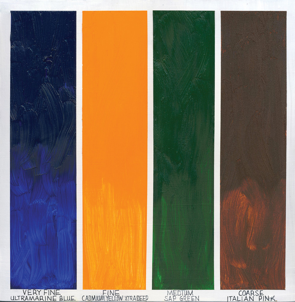
Williamsburg paints can be roughly divided into four groupings of different textures created by both the inherent grind of the pigments as well as how the paints are milled.
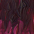 VERY FINE: Silky smooth, glossy, with little to no hint of texture. Home to most of the colors based on organic pigments such as our Quinacridones, Phthalos, Diarylides, and Dioxazine, as well as various inorganic pigments that are manufactured to very small particle sizes such as Titanium White, Ultramarines, synthetic iron oxides, Prussian Blue, and Lamp Black. The rheology, or feel, can run the gamut from the very long and ropey feel of Mars Red, the soft but still firm body of Ultramarine or Cobalt Blue, all the way to the short, buttery, and dense feel of things like Permanent Crimson or Titanium White.
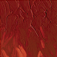 FINE: While still experienced as smooth, with just a touch less gloss, some sense of pigment starts to be felt even if individual grains cannot be seen. Home to all of the Cadmiums and most of our regular earth colors, like Yellow Ochre, Burnt Sienna, as well as the Umbers, the organic pigments have dropped out for the most part, with Fanchon Red and Indian Yellow being rare exceptions. Other core colors in this group include such well known anchors to the traditional palette as Viridian Green and Cerulean Blue (Genuine).
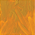 MEDIUM: A clear and definite feel of the underlying pigment, in the form of texture, starts to be both felt and seen. While we feel ‘gritty’ is too strong of a description for these, a sense of grain is definitely part of the experience. Most of the colors have a satin or matte appearance. This is where all the imported French and Italian Earths will be found, as well as our particular take on Alizarin Crimson. Other colors like Sap Green or Quinacridone Gold Brown are here mostly as they include these coarser pigments in their mix, giving them a particularly wonderful play between grainy and smooth, dark and bright, that can only come from blending the smooth organic colors in the first groupings with these larger iron oxides.
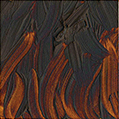 COARSE: An unusual and small group of colors that define the coarsest and grainiest of our paints. You will not find anything approaching this coarseness elsewhere and they provide an expression of texture that has been a unique aspect of Williamsburg from its earliest days. A mix of small and large particle sizes give these paints an intriguing interplay of light, with very bright shimmering undertones contrasting simultaneously with very dark, gritty, light absorbing masstones. If you are drawn to the smooth undertones in these colors, but need something more suitable for smooth glazes and blends, our newest Special Edition Transparent Iron Oxides, which are based on the same pigments, would be a perfect match.
Coming to Terms
Move even slightly into the world of pigments and powders and you quickly bump up against a handful of basic terms and concepts, which we want to briefly touch on in the sections ahead.
Grind vs Mill
It is habitual to talk about paintmakers ‘grinding’ pigments, and to think that the goal of the muller or the mill is to literally crush pigment particles into ever finer sizes. But this is not actually the case, and even a powerful mill cannot bring enough force to bear to accomplish that. Rather the sheering action of the pigment paste being sent through the rolls of the mill, or being compressed between the flat surfaces of the muller and glass, is simply to break apart loose clumps of pigments, called agglomerates, that are formed during storage and processing. Referred to as ‘milling’, this process is quite distinct from grinding, which really only happens at the level of the pigment manufacturer when reducing the raw pigment to a specific size range.
Primary Particles, Aggregates and Agglomerates
As pigments are processed or manufactured they take on different groupings:
- Primary particles are singular grains of crystalline matter but are almost never encountered or seen, not even when squinting closely at the thinnest layer of powder spread out on glass. For the vast majority of pigments they occur below the threshold of human sight, at the extreme sub-micron level, and represent the core building blocks of the pigment’s mass.
- Aggregates are a group or cluster of primary particles bound together by powerful chemical and electromagnetic forces and forming a common crystalline structure. For most of us, when we think we are thinking about pigment particles, we are actually thinking of aggregates. These tightly joined particles are incapable of being broken apart during the process of milling paint. To give a dramatic sense of the force that would be required, particles on the scale of .1 microns, such as synthetic iron oxides, Prussian Blue and Quinacridones, would require 105 times the accelerative force of gravity (32 ft/s2) to pull them apart. That would equal an astounding 3,215,223 ft/s2, well more than four times the accelerative force of a bullet fired from a typical rifle! Not exactly a doable proposition on a three-roll mill, or any other equipment a paint manufacturer might have laying around. For all intents and purposes, the particles at this scale are irreversibly fused together.
- Agglomerates, on the other hand, are loosely associated groups of primary particles and/or aggregates joined at their corners and edges, making them relatively easy to break apart and disperse. In fact, when talking about dispersing a pigment, and reducing particle sizes in the process, what one is really talking about is the breaking up of agglomerates, which allows for a fuller and more efficient wetting of the pigments. And unlike aggregates, agglomerates represent an area where paintmakers can exert much more control over the final feel of the paint, with mill settings and the number of passes deciding just how much they are broken down.
The Impact of Particle Size
Particle size is one of the single most important physical properties of any pigment, impacting almost every aspect of how paint feels and performs. A large part of what drives that is the simple fact that the smaller a pigment becomes, the more its surface area grows exponentially. As a thought experiment, imagine having a one inch cube of some mineral and brushing a thin layer of oil over the entire surface. If we then cut the cube in half, additional oil would be needed to coat the newly exposed sides. Now imagine cutting these halves in half, and half again, repeating this process until we have a very fine powder. At each step, you would be forced to continuously coat the freshly exposed surfaces with additional oil. But the total volume of the pigment – namely the initial one square inch – has not changed, simply the surface area that is exposed and the increasing amount of oil needed to fully wet it out. The implications of this are huge, however, since each division means there is much more opportunity for the particles to interact with the binder, with each other, and even respond to light in a very different way. What follows is a brief look at some areas where particle size matters.
Oil Absorption
As the immediate thought experiments proved, as pigments get smaller the amount of oil needed to make a workable paint grows dramatically. This means that all the possible chemical interactions between the oil and pigments increase as well, and that impacts drying time, yellowing, and fat over lean issues, to name just a few. It is also why the oil absorption rate for a specific pigment is typically reported as a range and can vary widely.
Tint Strength
The smaller the particle, the greater the tint strength. This is again linked to the surface area. The one inch cube in our thought experiment would not be particularly effective at tinting a volume of liquid because the majority of its mass is below the surface and does not interact with light. As you reduce the cube into a powder, one is exposing more of its surface to light and so its tint strength, or how much a specific amount of pigment can color a material, will naturally increase.
Opacity/Transparency
Opacity arises mostly from a pigment’s ability to absorb or scatter light (the K/S variables of Kubelka- Munk Theory) and confusion arises because we commonly think of those properties as intrinsic to a pigment and operating independently from its particle size. However, as particles move up and down in scale, the way they interact with light, and even which light waves they can interact with, changes. As a simple illustration, consider that a large half inch crystal of titanium dioxide would actually appear completely transparent, but ground to a powder of a certain size it becomes the opaque white pigment we know so well. To add to the mystery, grind it further still, down to a nanoscale range, and the pigment will become increasingly transparent again.
A detailed explanation of what is happening is beyond the scope of this article, but in general, pigment particles scatter light most effectively when their size equals half the size of the dominant wavelength they reflect. Go much below this size, and the pigment will scatter less and less, until finally – if dipping below .2 microns (half the wavelength of the shortest violet light) – it will slowly cease to scatter light altogether and will simply absorb or transmit the light it encounters. This is the “secret” behind transparent synthetic iron oxides, which have extremely small particle sizes, and how they differ from their very opaque cousins, the Mars colors, which have the exact same chemical makeup but possess a larger particle size that is optimized for scattering. It is also why the rougher ground Italian and French Earths will display more transparency as well, since they also move out of this optimized scattering range, and absorbency can again take on increasing importance. Colors like our Stil de Grain and Brown Pink are examples where we use this to our advantage. In these cases, we adjust the mill setting and number of passes to prevent breaking down the clumps of pigments too much, keeping the range of particle size much broader than normal. While this results in a much coarser feel, it introduces a wonderful interplay between the bright transparency of the smaller aggregates and the darker masstone of the larger ones. Bear down with a palette knife while working the paint on a hard surface and one can see the undertone develop and deepen even further as additional agglomerates are broken apart, giving the painter the ability to manipulate this to their advantage.
Viscosity and Rheology
In general as particles get smaller, the thickness or viscosity of paint will increase, which only makes sense. Increased surface area means increased friction, not simply with the surrounding medium but because smaller particles will collide and rub against each other more often. There is also an increase in how tightly the particles can be packed together. However, one must be careful about applying this too rigidly past a simple, idealized model, as there are a host of ways to manipulate and control viscosity in an actual paint formulation. In addition, the chemistry itself of each pigment also contributes to the building of both viscosity and rheology of the resulting paint.
The final measure of these choices of grind, viscosity, color development is successful only to the extent by which they meet each artist’s sensibility. The Williamsburg range of colors extends the options for exploration and in the simplest of terms, offers the artist an even wider array of choices. For us as paint manufacturers, this was why we have been so excited by Carl’s paint, as artists have shared their enthusiasm with these choices. It has been our delight, not only to make these colors with this diverse palette, but to amplify the range and continue to offer artists even more options.
Bibliography
Art in the Making: Impressionism, Bomford, David, London: National Gallery, 1990
Color Science in the Examination of Museum Objects: Nondestructive Procedures, Johnston-Feller, Ruth, Los Angeles: Getty Conservation Institute, 2001
Colorants: Organic and Inorganic Pigments, A. Lewis, in Color for Science, Art and Technology, ed. K. Nassau Editor, Elsevier Science, 1998
Effect of Pigment Particle Size on Application Properties, P. Gunther, Hauser, P., Radtke, V., Review of Progress in Coloration and Related Topics, Vol. 19, pp. 41-47, 1989
European Coatings Handbook, Brock, Thomas, Michael Groteklaes, and Peter Mischke, Hannover: Vincentz, 2000
Influence of Pigments on the Properties of Coatings, in Coatings Formulation, Bodo Muller, Ulrich Poth, Vincentz Network, 2006
Iron Oxide Pigments (In Two Parts), 1. Fine-Particle Iron Oxides for Pigment, Electronic, and Chemical Use, Thomas S. Jones, U.S. Department of the Interior, Bureau of Mines, 1978
Light: Its Interactions with Art and Antiquities, Thomas B. Brill, Springer, 1980
Paint Flow and Pigment Dispersion: A Rheological Approach to Coating and Ink Technology, Temple C. Patton, New York: Wiley, 1979
Painting Materials, a Short Encyclopedia, Gettens, Rutherford John., and George Leslie Stout, New York: D. Van Nostrand, 1947
Pigments For Paints, A G Abel, in Paint and Surface Coatings, Woodhead, 1999
The History of Grinding, Alban J. Lynch, Rowland, Chester, Littleton, CO: Society for Mining, Metallurgy, and Exploration, 2005
The Art of Impressionism: Painting Technique & the Making of Modernity, Anthea Callen, New Haven: Yale UP, 2000. Print.
The Importance of Particle Sizing to the Coatings industry, Part 1: Particle Size measurement, Alan Rawle, Advances in Colour Science and Technology, pp. 1-12, Vol. 5, No.1, Jan, 2002
The Science of Paintings, W. Stanley Taft, James W. Mayer, Springer, 2000
About Sarah Sands
View all posts by Sarah Sands -->Subscribe
Subscribe to the newsletter today!
No related Post

![article2_3[1]](https://justpaint.org/wp-content/uploads/2015/02/article2_31.jpg)
Thank you for this useful information. I wish the drying time was listed with the color information. Actually I wish all of the relevant information was all on one chart as in the art store I’m always searching through different sources for all of the information I consider and it takes too long
Why do the coarse grinds cost so much more than finer grinds of equivalent pigments? I wish it cost less to grind something less
Is van dyke a reliable paint, with bituminous earth in it?
Thanks
Hello Ted,
You are welcome. We have not made a single comprehensive chart with all the different pigment qualities including dry times, but we will take that into consideration. In the meantime, here is a link to the dry time chart for Williamsburg colors: https://www.williamsburgoils.com/pdf_viewer?file=https://www.williamsburgoils.com/admin/image/get_assets/williamsburg-drytime-chart-091818.pdf
As for cost of coarse pigments vs very fine, the synthetic iron oxides that compose most of our coarse colors are the same pigments as the Transparent Red and Transparent Yellow Iron Oxides which are very fine. These pigments are all series 4 colors. The less expensive colors are the natural iron oxides (umbers, ochres and siennas), which are series 1 and the opaque synthetic iron oxides (mars colors), which are series 2. Opaque and transparent iron oxides are called by the same color index name. For example PR101 is both Mars Red and Transparent Red Iron Oxide, but they have very different color qualities.
In our testing, the bituminous earth in the Van dyke Brown performed with a lightfastness rating of Good. Good is our in-house rating based on standard ASTM test protocols. Good is the equivalent of ASTM Lightfastness II.
Hope this helps.
Take care,
Greg watson