Changes are difficult. As much as you want decisions to be based on facts and facts alone, there is still a wrestling that can happen. Paints, and especially color, escape being easily tied down to just quantifiable clean choices. Rather, one can be caught having to choose between love and lightfastness, between beauty and the best. Which do you side with and when? We want our paintings to last, but also to dazzle and seduce. And after all, the choices are often not about whether changes in color will occur, but at what rate: a long almost imperceptible shift that slowly takes place over centuries, or a brighter blaze that entrances but fades a bit faster or a bit more? And the choices are even harder when that seductive color is unique; when it comes down to either this or nothing else like it.
So that is where we have found ourselves. Stewards of Williamsburg’s legacy and responsible for walking that line, we know that coming at these choices with just spectrophotometer readings and lightfastness test results is not the sole answer. Before swapping in new alternatives you have to ask if the trade-offs are worth the trade. And so with all of that in mind, we want to walk you through changes that will be taking place that we hope will make the line more solid, while leaving in place certain colors that we deemed irreplaceable with any other combination of more permanent pigments.
Origin of the NA’s
Embedded for seemingly forever within the Williamsburg line has been a list of some 23 colors that have a lightfastness rating of “NA”, or Not Applicable, because one or more pigments in their formulation has never gone through official lightfastness testing based on ASTM D4303, which still remains the only recognized standard for assessing lightfastness for art materials. And that is something we have wanted to remedy as obviously NA provides you with very little guidance in terms of permanency. So, almost two years ago, we started preparing samples to be put through all the required procedures. As initial results have filtered in, however, it became clear that we needed to begin making some immediate choices and changes while we still waited for the last rounds of testing to start this Fall. Once everything is finished, the final results will be assembled and formally submitted to ASTM sometime early next year.
A New Lightfastness Rating to Replace Most NA Ratings
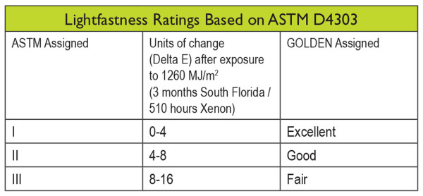
While we believe every pigment used in artists’ paints, with a few exceptions, should carry an official ASTM Lightfastness rating based on D4303, the testing and approval process for newer or unlisted pigments can easily take a couple of years or more. However, during this period we have often completed our own testing ahead of time, following the same protocols for exposing prepared tints to 3 months outdoors in South Florida, as well as 410 hours of accelerated Xenon, with total irradiance in both cases equalling the prescribed level of 1260 MJ/m2. Because of this, we felt it was possible and important to create an interim rating system that was still based on well understood and available standards. So we are pleased to introduce the scale seen in Table 1, which you will find replacing nearly all the current NA ratings.
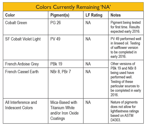
The only exceptions include four colors that are still in the process of completing even these initial tests, as well as all the Iridescent and Interference colors, (Table 2) where the nature of the pigment does not allow us to take spectrophotometer readings, nor to cast them as tints with Titanium White without masking them.
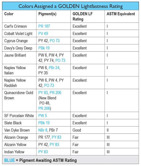
Colors Assigned a GOLDEN Lightfastness Rating
Representing by far the largest group, each of these colors uses one of nine pigments that are currently unrated by ASTM: Naphthol AS (PR 187), Cobalt Ammonium Phosphate (PV 49), Diketopyrrole-Pyrrole (PO 73), Powdered Slate (PBk 19), Chrome Antimony Titanate (PBr 24), Diarylide Yellow (PY 83), Quinacridone (PR 206), Bituminous Earth (Natural Brown 8 [NBr 8]) and PW 5, a complex co-precipitate of barium sulfate and zinc sulfide. Ten of the colors, from Carl’s Crimson to Slate Black (Table 3), performed exceptionally well in ASTM D4303 testing, earning a GOLDEN Lightfastness (LF) rating of Excellent. Please note that a new blend is also being introduced for Quinacridone Gold Brown using PO 48, an ASTM rated Quinacridone Gold, in place of the previous PY 83. While both mixtures earned a GOLDEN LF of Excellent, removing PY 83 should further increase its durability and allow it to eventually conform to an official ASTM I rating.
Coming after this first block of colors, our genuine Van Dyke Brown (NBr 8) also did well, achieving a GOLDEN LF rating of Good, thus equal to an ASTM II. This is better than often assumed for this color, where historical research points to its performance as dependent on sourcing and composition. Luckily our supply for this pigment has been very stable and we would certainly retest should that change. In fact, the French Cassel Earth listed in Table 2, ‘Colors Currently Remaining NA’, is an example of this. Although also designated as NBr 8, and so chemically similar, we felt it was critical to test it separately because it originates from a different supplier, even though ASTM allows you to submit a pigment from one source and have that rating used for the pigment in general; an inherent weakness in the current ASTM system that we eventually hope to address.
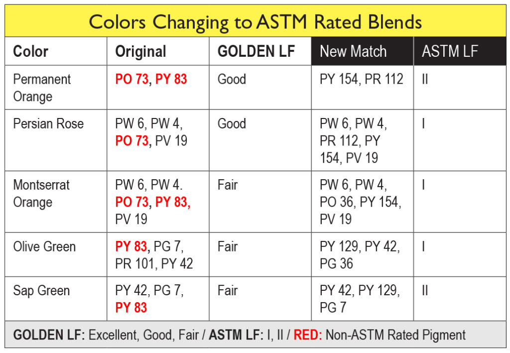
All of which brings us to the last three colors: Alizarin Orange, Alizarin Yellow and Indian Yellow. Unfortunately the pigment at the center of these, a type of Diarylide Yellow, comes in various forms that all share the same Color Index Name of PY 83. As you can imagine, this can lead to some confusion when assigning a rating. The opaque version, which carries the additional designation ‘HR-70’ in its chemical description, has excellent lightfastness and is on the ASTM list of rated pigments. However, our testing showed that the transparent version Williamsburg had chosen could only be rated as Fair, or the equivalent to ASTM III. And here lies the crux of our quandary. These three colors have had exceptionally long and beloved histories within the Williamsburg brand, going back to its earliest days. Many painters who have used Williamsburg throughout these decades are passionately connected to their uniqueness, so a sudden change would be felt as particularly disruptive. And as if to confirm that, when searching for an alternative pigment we could use, we simply could not find anything with the same brilliance, transparency, and glow. So a choice needed to be made: dramatically change the look of these colors, discontinue them, or keep them as part of our offerings but clearly label their lighfastness as Fair, a rating similar to Alizarin Crimson.
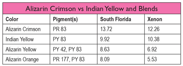
Looking at Image 1 you can see that even the pigments that came closest to matching PY 83 still lacked its distinct qualities and presence, and so after a long debate we have decided to make an exception in this instance and to side with beauty over the best. It’s not ideal, but neither was the loss of what is admittedly a unique color space. And a look at the underlying data, comparing these to Alizarin Crimson, can perhaps put some of the risks in context (Table 4). Keeping in mind that the colors are being tested as tints mixed with Titanium White to 40% reflectance, and so ostensibly at their most vulnerable, one can see that Indian Yellow performed measurably better than Alizarin Crimson, especially in the outdoor tests, while the two colors that contain PY 83 performed just over the ASTM II limit of 8 Delta Units of change in outdoor testing, and actually below that cut-off in the accelerated Xenon. While certainly still a point of concern, hopefully this comparison can place the risks in a little more context and guide people in how and when they are used. And of course, encourage those who do use these pigments to keep their paintings away from direct, bright light and to use a UV protective varnish to further mitigate and slow down any changes.
Colors Changing to ASTM Rated Blends
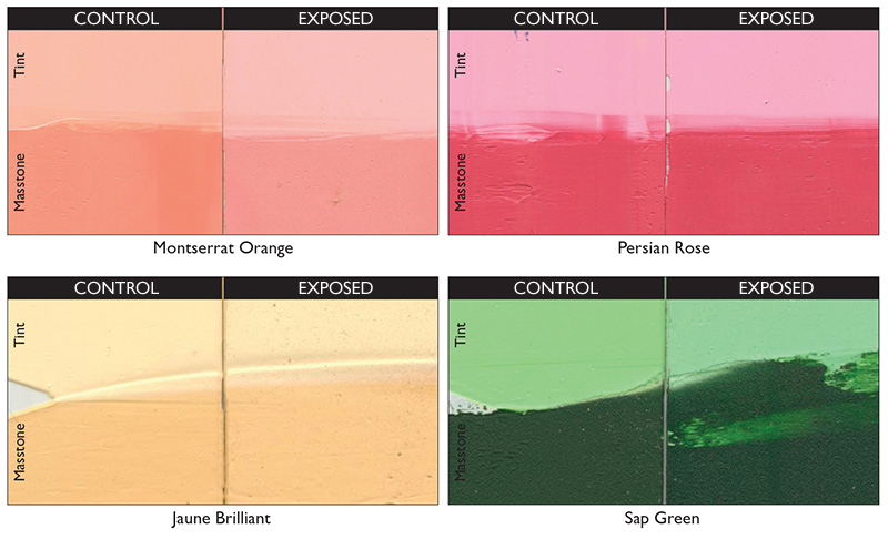
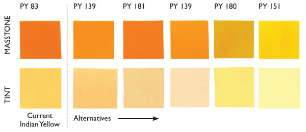
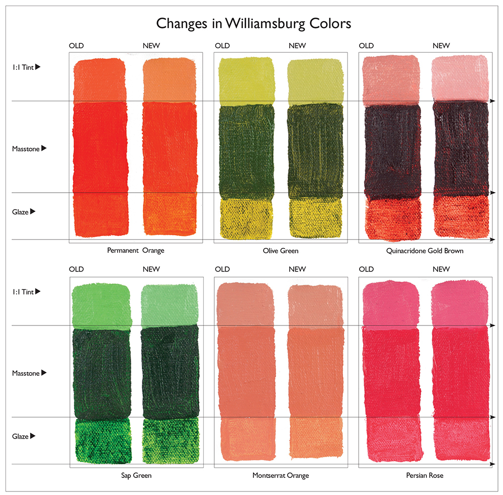
This last category involves blends where we were able to create a new match using only ASTM rated pigments and in the process, improve the overall lightfastness. We undertook this with the full knowledge of the long histories for some of these blends, but also knowing that at several times in some of their histories, similar and often larger changes happened. Persian Rose and Montserrat Orange, for example, used to be based off of Cadmium Orange at one time, while Permanent Orange, Olive Green and Sap Green, have had to dodge the ever changing world of organic pigments that frequently get discontinued or undergo a shift in hue. We have done our best to craft substitutions that should feel very close to what you currently use while providing much greater lightfastness in the process. What small trade off there might be, we felt, was worth it. At the same time, having test results that show three of the blends (Montserrat Orange, Olive Green, and Sap Green) as originally having a GOLDEN assigned Lightfastness rating of Fair can be a cause of concern for painters who have used these colors both recently as well as extending much further back in the past. There is no way to completely dismiss those concerns. Certainly the use of a UV protective varnish will help mitigate or slow down any color shifts, and we hope to look into that further in the coming months. In the meantime, if you have any questions or concerns around these issues, please contact a Materials Specialist at 607-847-6154 or via email at [email protected].
From Sea Shifts to Firmer Footing
The changes we have discussed are sweeping and broad in many respects, and none of it taken lightly. Many of them will raise questions about how close particular matches will be, and some will cause deep concerns around lightfastness as we have mentioned above. In the very long run, however, the bigger story is the work of moving cherished colors, and the line as a whole, onto much firmer ground and making the information shared on our labels and in our literature more accurate and in line with our most current testing. And the truth is that this work is not done. The whole landscape of lightfastness testing and ASTM Standards needs revisiting, and a new framework needs to be built from the ground up that can offer the type of information artists so deeply want, based in a system they can rely on and trust. This is but a start in that direction.
About Sarah Sands
View all posts by Sarah Sands -->Subscribe
Subscribe to the newsletter today!
No related Post

One, small, comment: I notice while looking at the alternatives for PY83 a color I’ve used is not shown. Did you check PY150? I know it’s floating around out there somewhere I din’t remember off the top of my head who uses it but in watercolors it’s beautiful.
only my .02 worth.
Hi Steve – PY 150, Nickle Azo Yellow, is definitely gorgeous and might one day make it into the line simply on its own strengths as a beautiful color. However, for this specific project, it just didn’t have the strong warm tilt of the Indian Yellow that we were trying to match, at least taken as a single pigment. That said, it might very well play a role if we ever decided to make a more lightfast version as a blend. You can see an example of just that in our Golden line of acrylics: http://www.goldenpaints.com/products/colors/heavy-body/indian-yellow-hue In any case, thanks so much for taking the time to share you thoughts. We definitely love Nickle Azo Yellow and will continue to consider it as we look for new colors to introduce.
Williamsburg paints have changed my painting life. The elegance of pushing their rich pigments has me painting everyday. The Prussian Blue is absolutely divine, and incomparable. I am so happy to have been introduced to these incredible paints, and hope to own a whole
Hi Regan – Thanks SO much for sharing your enthusiasm for our paints and how they have impacted you as a painter. Comments like yours mean the world to us. And if we can ever do anything to help further just ask!
what happened to ultramarine pink?
Hi Larry,
Unfortunately Ultramarine Pink has been discontinued by the manufacturer. We should have supply to continue production through 2024. Ultramarine Violet is still available.
Thanks,
Greg