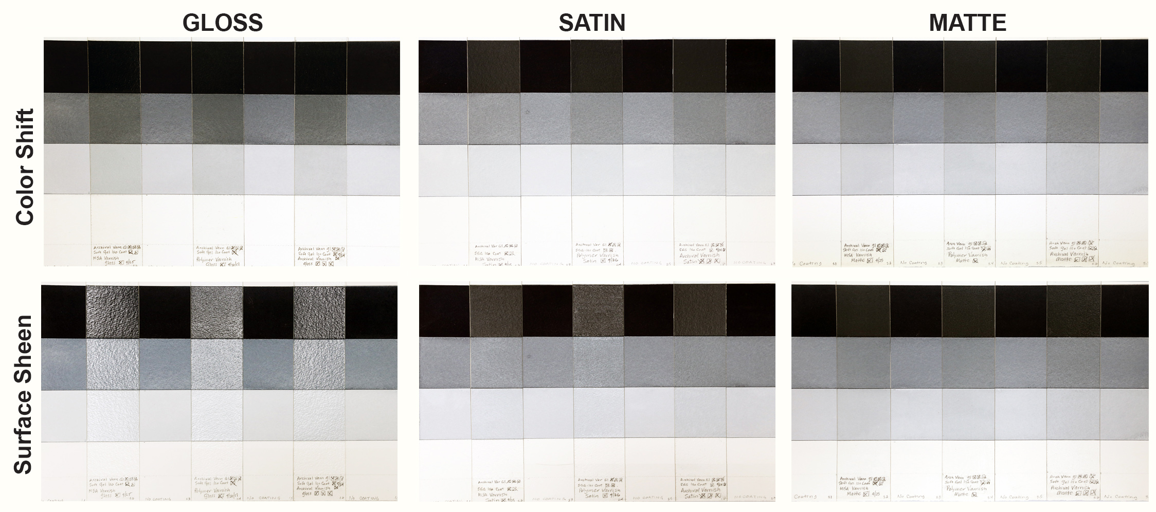
This article briefly explores the permanent changes created by varnishing transparent watercolor on paper, in particular the aesthetic changes to color, value, texture, and sheen. Keep in mind that varnishing also changes the nature of the painting through the permanent addition of acrylic. While there are several approaches to varnishing watercolor, we only focused on what happens when creating a removable varnish layer. This involves a three-step process: ‘fixing’ the transparent watercolor, applying an isolation coat, and varnishing. By creating a barrier between the painting and the varnish, the isolation coat allows for removal and replacement of the varnish should the surface become damaged in the future. For more information, please see our Varnishing Watercolors with GOLDEN Products tech sheet and Varnishing Resources page.
Sample Preparation:
We applied QoR Payne’s Gray in three dilutions to Fabriano Artistico 300 lb. / 640 g.s.m. cold press watercolor paper. This resulted in a strip of bare paper, then bands of light, medium, and dark washes. Over this, spray coats of aerosol Archival Varnish Gloss locked down the water-soluble paint surface. An isolation coat of Soft Gel Gloss diluted 2:1 with water was brush applied, allowed to dry, and followed with a second isolation layer to create a glossy surface. Finally, following directions for dilution where appropriate, we applied Gloss, Satin, and Matte versions of MSA Varnish, Polymer Varnish, or Archival Varnish.
Test Results:
Overall, varnish changed the transparent watercolor paint’s color and value while overpowering or muting the distinctive interplay of light and shadow inherent to the texture of cold press watercolor paper. Lighting angles and viewing positions can have a dramatic impact on how a varnished surface reads, and the same area may be easy to see or completely obscured depending on context and position.
Color
Changes occurred to the watercolor paint’s value and color with every varnish. Payne’s Gray darkened slightly in nearly all the examples. This change is demonstrated clearly in the tests of Gloss varnish over a dark wash. The only exceptions to this darkening of color are the Matte varnishes, which lightened the dark wash. Varnished Payne’s Gray also developed a tinge of tan throughout the tests, shifting color away from a blue-black and toward a warmer or more neutral black or gray. Overall, all of the varnishes seem to have the smallest impact on the appearance of bare watercolor paper, with the Matte varnishes creating the least change.
Surface Sheen and Cold Pressed Texture
All three Gloss varnishes dried to glossy surfaces, although the Polymer Varnish Gloss is slightly less shiny. Light reflecting off the Gloss sheen creates a white glare in certain lighting and viewing situations. The higher areas of the paper texture reflect light more brightly, and can create a broken reflective quality that obscures the painting. The intensity of the reflection and the impact of paper texture are both less with Satin varnish than with Gloss. However, Polymer Varnish Satin was glossier than its Satin companions, and created a surface that can sparkle with tiny dots of reflected light that make it hard to see the painting. MSA and Archival Varnish Satin both created a low sheen with softer reflections that provide less distraction. There are no disrupting light reflections with the Matte varnishes, and the painting is visible through the layers. The muted sheen created by the Matte surface quiets the visual texture of the cold press paper by reducing contrast. This subordinates the importance of the paper’s unique texture, which consequently plays a lesser role in the overall composition of the painting.
Conclusion
Varnishing transparent watercolor on paper permanently changes the nature and aesthetics of the painting, creating a mixed media work with altered colors, values, surface texture, and sheen. We recommend testing on the paper and with the paints being used before a decision is made as to varnish and sheen. If these changes are embraced, varnishing of watercolor may be both acceptable and liberating. If a painting contains many intense dark colors, Gloss or Satin varnishes might be good choices. If the painting focuses upon light and middle values, the changes created by a Matte varnish might be most satisfactory. We will continue our own testing of GOLDEN Varnishes over more QoR watercolors in the future.

