Color can be a complex and overwhelming subject, so in this article we hope to shed some light on the subject of neutralizing color, or toning it down without changing the color itself or its “color identity”. We will touch upon methods using White, Gray and Black, Complements, and how the Virtual Paint MXR can function as a helpful tool. You can skip ahead to any section that is of particular interest or follow along with a little science on color mixing!
Subtractive Color Mixing
We all have experiences where in an effort to tone down a color we ended up completely changing that color or producing varying shades of brown. Before we get into some advice on how to approach this, it might be helpful to talk about the paint as a physical material first and what happens when we mix color.
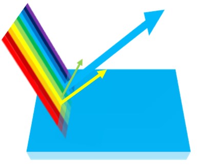
As a physical, pigmented material, paint will reflect wavelengths of light that correspond to the visual expression of its color and absorb to a greater or lesser degree the remaining wavelengths. The more colors we mix together, the more light is absorbed, producing darker, duller mixtures. This is why mixing paint is commonly referred to as “subtractive color mixing” as in we are subtracting wavelengths of light. Even white, that might seem like an exception, is darkened by anything it is mixed with.
Below is an example of subtractive color mixing where two complementary colors become darker and duller the more they are mixed together. It is also worth noting here that small additions of a complementary color can serve to tone down a color without dramatically changing its identity. We will go into this in more depth below.
Masstone and Undertone
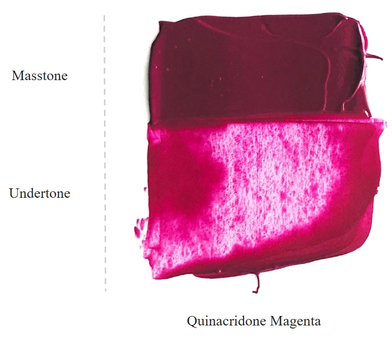
Another thing to be aware of when mixing color, especially when trying to neutralize color, is identifying a color’s Masstone and Undertone. The Masstone is visible when paint is applied more thickly or when looking inside of a jar for example. The Undertone is most visible when a color is spread thinly over a surface or mixed with a lot of medium. In this example of Quinacridone Magenta, the Masstone looks much different from the luminous Undertone. The Undertone gives us a sense of what the bias of this color is. Is it warm or cool, more yellow or blue? With Quinacridone Magenta, knowing it has a cool bias leaning more towards blue will be important when finding its complement or a color opposite it on the color wheel.
For more information on color bias and its effect on color mixing, please refer to our Just Paint Article: Defining Warm and Cool Colors: It’s All Relative
Methods of Neutralizing Color
Keeping all of this in mind, there are a few ways color can be toned down while mixing without dramatically changing a color’s identity. The simplest of these being additions of white, gray and black. Other methods such as mixing together complements are a little more complex, but equally effective as we will illustrate below.

White
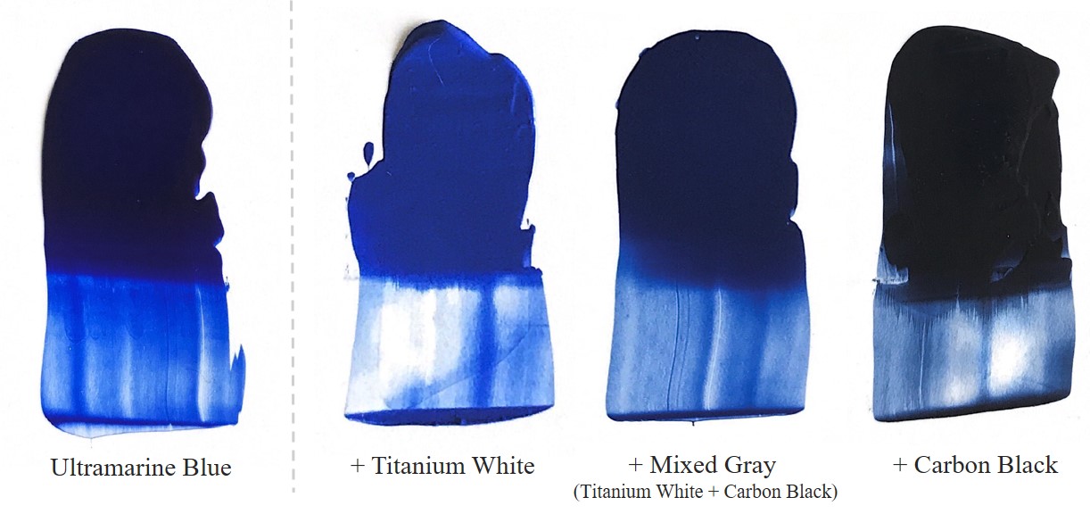
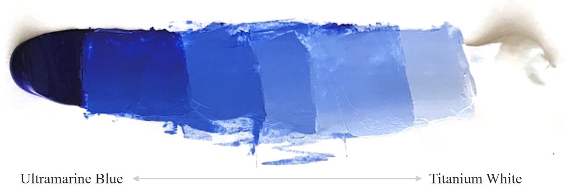
Mixing Titanium White into a color is an effective method of reducing its saturation, but this will also have an effect on the value (lightness or darkness of a color) and its opacity (how opaque or transparent it is). With colors that have a darker masstone like Ultramarine Blue, the addition of white can actually tease out the color more, making its Masstone look brighter. As more white is added, it becomes more pastel and less saturated. Zinc White with its weaker tinting strength can also be a great white for subtly toning down a color.
Gray
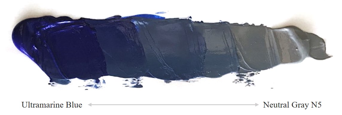
You can also neutralize a color by adding gray. The easiest way would be to use one of our Neutral Gray colors that are available within our Heavy Body, OPEN or High Flow Acrylic product lines, but you can easily mix a gray using white and black if you already have these in your studio. Mixing together two complements to get a gray is possible as well. We will go over this in more detail below. If the gray is the same value as the color, it can be a very effective way of toning down a color with even less change. For more information on our Neutral Grays, please refer to these links below:
Munsell Notations for GOLDEN and Williamsburg Paints
Black
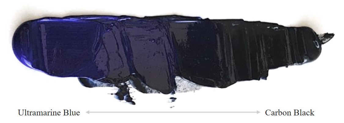
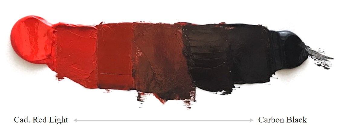
Similar to white, larger additions of black can have an affect on a color’s opacity and greatly darken its value, but it too can tone down a color. Keep in mind that “black” is a relative term in color mixing, different blacks will be made from different pigments, each with slightly different qualities and biases. For example, Carbon Black, is a cool black with a very strong tinting strength, so often a dab will do! Since Ultramarine Blue is an inherently dark color to begin with, we have included another example using Cadmium Red Light.
Complements
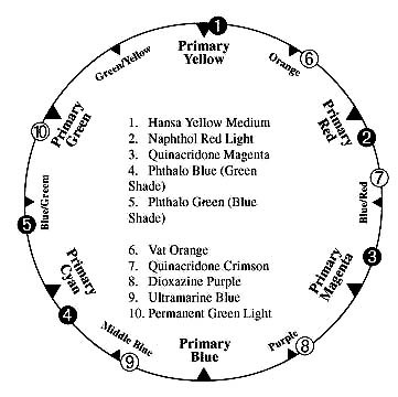
A complementary relationship between colors means that they are on opposite sides of the color wheel. When true complements are mixed together, they can neutralize or cancel each other out, producing a gray or black. This becomes a bit more complicated though, because we are dealing with colors made from pigments that each have unique characteristics and color biases. They do not always fall neatly into place on a color wheel as we can see on the illustration to the left. Because of this, finding exact complements can be somewhat challenging. While a good color wheel is a great place to start for finding complements, our online Virtual Paint MXR can be a lifesaver in finding these pairings and working out the mixing ratios to get you the colors you are after. More information on this below.
That being said, when possible, direct complements are an incredibly effective way to tone down color without changing the color’s identity. For this example we chose Fluid Permanent Green Light and Quinacridone Red. When mixed together in equal parts they produce an achromatic gray, or a colorless gray approaching black. This means their color biases cancel each other out, which is an indication that they are good complements. When we take just a little of the Quinacridone Red and add it to the Permanent Green, with a little Titanium White to lighten the color back up (remember, colors will darken with subtractive color mixing), you can see that we effectively toned down the Permanent Green with minimal change to its color identity.
Depending on the tinting strengths between a set of complementary colors, the amount of paint needed to tone down a color will vary and may require some experimentation on the palette. Here are a couple more complementary and near complement scales for some ideas!
Virtual Paint MXR
While digital color mixing works through an “Additive” process, relying on colored lights rather than material color like paint, our MXR software is designed to simulate “Subtractive” color mixing. Because of this, it may not be possible to reach the saturation of some colors chosen from a digital source using paint, a physical material, but the MXR software does a nice job of getting you as close as possible to these colors using GOLDEN Acrylics. The important thing to note with this software is that each color is populated with unique data from our lab and colors mixed using the MXR should perform similarly to GOLDEN Acrylics when mixed on a palette.
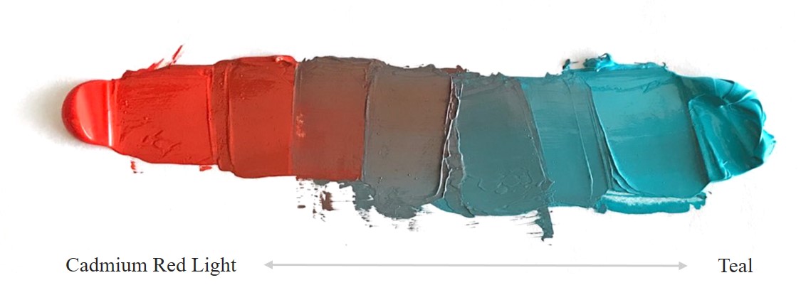
By choosing a color from one of the available palettes, (Heavy Body, Fluid, OPEN) we can seek out its complement from colors we may have available in our studios or more broadly to what is available from a GOLDEN paint line. For example, we had a tube of Teal laying around and without physically mixing it with each color we had, we did a quick glance at a color wheel and sought out colors that were between orange and yellow on the MXR. After a few experiments, we found that Cadmium Red Light made an excellent achromatic gray. We then tested this further by doing just a small addition of Cadmium Red Light and we were able to nicely tone down the teal without changing its color. We have re-included our first painted example again to show just how well this software works!
If you haven’t used the MXR software before, here is a link to this software again and a short video walk-through of its features:
We hope this information was helpful. Color mixing can seem vast, but working on a few key things at a time gives you a lot of control when you go to painting! If you have any questions or comments about this article or any other paint related topic, please feel free to contact our Materials Application Department at [email protected] or by calling 800-959-6543.
About Scott Fischer
View all posts by Scott Fischer -->Subscribe
Subscribe to the newsletter today!



Goodmornng Scott,
My name is Jan and I live in Western Australia.
Could you please send an email with the information to download the MXR please.
I am a new painter and would like some instruction on : How to download and use please.
Thank you I will await your reply.
Best wishes,
Jan
0407 382 777
Hello Jan,
Its great to hear from Australia, thanks for reaching out to us! The Virtual Paint MXR is a free web app on our website, no downloading is needed and we are happy to hear you are interested! Here is the link:https://www.goldenpaints.com/mixer We also have a link within the article to a tutorial as well if you would like a walk through of its features.
If you have any questions please do not hesitate to send us an email at [email protected].
Best,
Scott
I am using mostly the golden fluids and really appreciate your article, I love the virtual paint mixer too! Thanks for that
You are welcome Heidi, thanks for the kind words and we are glad the MXR is helpful!
Best,
Scott
Hey Scott, very informative article! One question about transitions:
How was this color mixing achieved? It looks so clean, and smooth!
I’m guessing you start with both colors on each end then use a knife.
Is there a video or explanation on how to do it? I want to practice that.
If you could explain or show us visually, it’d be appreciated! Thank you!
Hello Bill, Thank you for your question! For this mixing, I did it on a sheet of palette paper using a palette knife. I pulled the color in from each side like you said and started by mixing a neutral gray in the middle. I made enough of the gray to then find the in-between gradations by mixing the clean color with the gray. If you get the middle handled first it is much easier to get the steps between than going from one side to another for example. Glad you liked the visuals and we will see if we can get some mixing videos in the future!
Best,
Scott
Thanks for the reply, Scott. Some mixing videos would be really useful!
Even if it’s short because it’d help us a lot, also using the MXR web app.
The video tutorials on Golden’s channel taught me a lot about products.
I’m looking forward to learn more from you in the future! All the best, Bill.
Thanks Bill, we will pass along the interest! I made a short video on using the mixer, you can access the video here. Let us know if you have any questions about it! Paint MXR Tutorial
Warm Regards,
Scott
The virtual paint MXR is an awesome tool and a paint saver. Thank you for providing it.
Thanks Les, glad you are finding it useful! It is a great thing to have on the site, we are proud of it!
Best,
Scott
Hi there,
Thanks for the article. I also think the virtual paint mxr is supercool and use it a lot.
If you ever think of enhancing it, I would love to be able to say what colours I already have and force the app to stick to those. I know that probably goes against your need to sell paint, but it would be a real world feature.
Keep safe!
Andrew
Thank you Andrew, we agree this would be a great addition to the MXR and for folks to be able to see what their colors can do. We are always looking to improve! We will save your suggestion and pass it along to the right people!
Best,
Scott
Is the Golden MXR software for sale? I did not understand by looking at your tutorial how I could manipulate this on your site myself, i.e., mix my own colors.
Hello Tanya,
The software is embedded in our website and it is free to use. We will include a link for you. You can select colors from the selection of Golden Acrylics, add these colors to tubes by clicking on them and play around with proportions of one color to another to see how they mix and what results from these combinations. You can always reach out to us at [email protected] if you have additional questions. Here is that link: https://goldenpaints.com/mixer
Scott