Small Differences That Make All the Difference
Every painter knows the dance, taking a few steps back from the painting, their head tilted slightly askew, the eyes pulled tight into a squint, or the hand held in front to block off an area from view. The to and fro of action and adjustment, of sense and sensibility. And if color happens to be foremost in that dance, the search is often for still unseen subtleties to be coaxed from the colors at hand. Even if the effect is one of clash, there remains the desire for it to be ‘just so’; a clash tuned to the highest pitch or given a particular piquant flavor. In the end, artists thrive on subtleties, on the small differences that make all the difference, and their search for colors that can respond to those needs is endless.
All these immeasurable things, no matter how rarefied they might seem, ultimately have a material basis rooted in the nature of pigments and paint, the common tools of the trade. In the pages ahead we will start by reviewing some of these underlying factors and then examine why some of the most subtlest of variations can make all the difference in choosing the right color matching your intent.
Beyond All Measure: the Limitation of Colorimetry
When trying to describe what makes any particular color unique it is tempting to point to a color’s location within a well defined system such as CIE L*a*b* or Munsell. Doing so allows us to feel that we can place the color’s uniqueness within a mapped and measured space, and even calculate the degree of difference it has from all those other colors that jostle for a treasured spot of their own. But we would quickly learn that it is precisely those subtleties that are lost in the process. For all the accuracy of our spectrophotometer in reading the exact makeup of the light being reflected back from a sample, nothing in that information really tells the artist what they need to know about actually using that paint: how it mixes with other colors, its degree of opacity, tinting strength, or any number of physical attributes. Paint is ultimately color on the move, dynamic and energetic, and no single snapshot can capture that more vibrant life lived on the palette of the studio.
While clearly no system of measurement is perfect, spectral reflectance curves perhaps come closest to capturing the nuance of a color, especially if the spectrum is available for both masstone and a tint of a known percentage. With these two points as reference one can roughly gauge how a particular paint might perform in mixtures. However, care must be taken as even here there are difficulties. Cadmium and Hansa Yellow Medium, for example, might share nearly identical spectra at full strength but no one would mistake them for the same in practice. Additionally, one must factor in the responsiveness of the eye to various wavelengths, as this can greatly shape how the eye perceives the color — which can be very different from the data itself.
Underlying Causes of Subtle Differences
Nearly all of the subtleties of a particular color can be traced back to the physical attributes of the pigments and the way light interacts with those particles within a paint film through absorption, reflectance, scattering, and transmission. Pigments, in turn, are largely characterized by their underlying chemical composition, along with such factors as particle size, refractive index, and scattering coefficient, while paint films impact color through their pigment load, thickness, and sheen. Ahead we will touch on all of these briefly, as a way to introduce some of the complexity behind many of the subtle differences we see.
Physical Properties of Pigments
Crystalline Structure of Pigments
All pigments, with rare exception, have crystalline structures that dictate their color, and even small changes at this level can alter which wavelengths are absorbed or reflected. Phthalocyanine Blue, for example, has two types of crystal formations (α and β ) that are responsible for their slight leanings toward the Red or Green Shade, while changes to the crystal lattice of Quinacridone is responsible for its broad range that runs the gamut of bright Quinacridone Reds to the ever deeper Magentas and Violet. A third example includes the entire array of Cadmium colors, where cadmium sulfide, which is yellow in its pure state, is made progressively redder and deeper by replacing the sulfur in the crystal lattice with increasing amounts of selenium. This substitution broadens the amount of the spectrum that can be absorbed, and if enough selenium is added, Cadmium can actually appear black.
Transparency/Opacity and Tint Strength
A particle’s opacity is greatly dependent on its ability to scatter light, which relies primarily on a particle’s refractive index and size. The larger the difference in the refractive index between a particle and its surrounding medium, the more light is scattered and the underlying layer obscured; a phenomenon similar to the way fog scatters a car’s headlights. Conversely, the closer these numbers are, the more transparent a particle will appear. The high refractive index of Cadmium Yellow and Titanium White, for instance, is almost solely responsible for their tremendous hiding power and sense of opacity, while Zinc White and Hansa Yellow appear more transparent because their refractive indexes are considerably closer to that of an acrylic polymer. Because dark pigments with low refractive indexes, such as the Phthalocyanines, do not scatter much light, their hiding power resides almost completely in their ability to absorb light, the pigment loading, and the thickness of the film.
The other aspect of particle size has equally dramatic consequences on both scattering and tinting strength. As a particle becomes smaller it scatters light more effectively until a certain optimal size is reached, after which this aspect begins to drop off sharply. As one continues further below this threshold, the pigment particle grows increasingly transparent while simultaneously reaching a maximum of tinting strength. Here is where the magic of the Transparent Iron Oxides reside, as the normally opaque iron oxide pigments are manufactured to such small particle sizes that they become wonderfully translucent and far more effective in glazing and the production of cleaner, higher chroma tints. Titanium White, on the other hand, is carefully manufactured to optimize its particle size for maximum light scattering, and hence opacity. In fact, a one centimeter wide crystal of Titanium Dioxide is completely transparent, and it is only as the crystals get smaller that scattering becomes dominant and we sense the pigment as inherently ‘white’; an effect similar to the whiteness of finely ground glass. Should the Titanium Dioxide be ground even further down to a nano-particle scale, it would actually become completely transparent, a feat that seems almost magical given how strongly we associate opacity with Titanium White.
Purity and Uniformity
Differences in the chemical purity of a particular pigment, as well as the uniformity of its shape and size distributions, are responsible for still other quirks of coloration. For example, natural earths owe their particular flavors and nuances to varying amounts of trace elements, such as manganese oxide, silica, alumina and clays, as well as their wide assortment of particle sizes. While this accounts for many of their prized undertones, and explains why particular regions in the world become coveted for their mined ochres, siennas, and umbers, it is also the reason why these colors are generally weak tinters and lower in chroma than the parallel range of synthetic oxides. Also, because they are mined, these pigments have a wide lot to lot color variation depending on the level of impurities in the next shovel full. Ultramarine Blue presents another example; one of the earliest synthetic pigments, it is richer and more saturated than the genuine Lapis Lazuli it replaced, which as a mined rock always came with impurities of calcite, sodalite, and pyrite, that muted its tone.
The Physical Properties of Paint
Film Thickness
As most artists know, colors do not necessarily stay the same through thick and thin. In thick films of densely packed pigment, the masstone is dominant and the color will appear more saturated and deeper. As the film becomes thinner, the undertone becomes more pronounced and the overall color can appear more transparent, lighter in value, and sometimes higher in chroma as well, assuming the underlying substrate is very light in tone. These effects are ultimately caused by having an increased amount of light reflected from both the pigments and the underlying substrate in the form of backscattering.
Pigment Load
Beyond film thickness, simply altering the pigment load or density in a paint film can markedly change the perception of a color. For example, in a film of densely packed translucent pigments, much of the interior scattering and transmittance of light can be lost through subsequent and repeated absorption, and one primarily sees just the reflected light coming from the surface. This reduction in light reads as a deepening in hue and a reinforcement of the dominant absorption band. As pigment load is decreased, and light begins to penetrate through the film, the interplay of scattering and absorption has a larger impact on the overall color. One can imagine a similar effect if placing identical sheets of stained glass on top of each other, one after another. As the pile grows thicker, the color will get increasingly deeper and more saturated.
At its most extreme, the spectral reflectance curve can change considerably as more and more light is able to penetrate deeply into the material. This phenomenon can be seen in such transparent colors as Green Gold and Nickel Azo Yellow, where a dramatic difference emerges between the mass and undertone, as well as a subtler shift in spectra for Phthalocyanine Blue G/S.
Sheen and Surface
Whether a surface is glossy or matte, smooth or textured, will ultimately impact a color’s expression as well. As a paint film becomes glossier and smoother, there is less scattering of light at the surface and more penetration and absorption of the light by the pigments themselves. This causes darker colors to typically appear deeper and more saturated when they have a gloss sheen, and conversely, appear to lighten if matte; not unlike the phenomenon of removing a darker colored stone from the bottom of a riverbed and watching the seemingly rich color dissolve before ones eyes with the evaporation of the water.
Case Studies
The spectral data used in the following case studies was obtained using a Minolta® Spectrophotometer. Samples were as 10 mil drawdowns on lacquered cards, with each color represented both at full strength and mixed with varying percentages of GOLDEN Regular Gel (Gloss) or Titanium White. Many of the graphs used in this article are spectral curves, which might be unfamiliar to many artists as they are not that common outside of laboratory settings. The easiest way to understand them is simply as showing the amount of light that is reflected from the surface for each wavelength in the visible spectrum. The more that is reflected, the higher the curve will be at that point. To make the readability a little easier, along the top of each graph we include markings showing the approximate range for each band of color, running from Violet through Blue, Green, Yellow, Orange, and Red. The x-axis, running along the bottom, is marked with the actual wavelengths themselves.
When Colors Coincide
Phthalo Blue (GS) Mixed 1:3 with Hansa Yellow Medium and Cadmium Yellow Medium
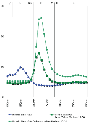
The Hansa Yellows sit across from the Cadmiums like a row of twins arriving late and uninvited to a family dinner. Contrary to many notions these are not the poor substitutes for the ‘real’ thing, but truly flushed with their own sense of flash and purpose within the painter’s toolbox. The Hansas might not have the opacity of the Cadmiums, but their transparency allows them to be an essential ingredient for transparent glazes, deep greens, and composite blacks. For all the brash and brawn of the Cadmiums, the Hansas speak in their own bright voice.
A good way to experience these subtleties is to watch how the two colors impact various mixtures. With a Phthalocyanine Blue or Quinacridone Magenta, for example, Cadmium Yellow
Medium creates dense lighter-valued tints with a sense that white has somehow strayed into the mix. In the accompanying graph (Graph 1), notice how it produces a sharp spike in value after 500nm, and an elevated refl ectance throughout the oranges and reds. With Hansa Yellow Medium, on the other hand, the saturation of Phthalo Blue (GS) is largely preserved and the hue is simply shifted towards green with a minimum increase in value. What is not as well shown here is the fact that the translucency is held onto as well, the mixture remaining ideal for glazing and developing other rich, dark greens.
Seeing Through Opaque Pigments
This section begins with pairs of synthetic and natural iron oxides whose differences revolve almost entirely around particle size, with the synthetic oxides being exceptionally small when
compared to the usually chunky, larger-scaled pigments of natural earth colors. As mentioned earlier, when particles grow smaller not only does the total surface area increase rapidly, but
their ability to scatter light diminishes as well. With scattering held to a minimum, the pigments’ interaction with light is solely through absorption and reflection, which both maximizes their tinting strength and increases their translucency. As a result, the synthetic oxides will often be the preferred choice when needing brighter mixtures and cleaner glazes, while the more standard earths can provide a wonderful opacity and density when relying on their masstone.
Yellow Oxide (PY42) / Transparent Yellow Iron Oxide (PY42) Yellow Oxide and Transparent
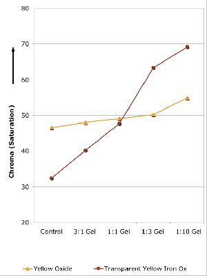
Yellow Iron Oxide have differences that are a little obscured, perhaps, by their identical Color Index designation as PY42. In fact, many artists assume far too often, that pigments with matching Color Index names are unvaryingly the same. But nothing could be further from
the truth, especially if reaching for a yellow earth for glazing or to use in tints or mixtures. And some differences can be seen fresh out of the tube, where the Yellow Oxide starts out brighter and very opaque, while the Transparent Yellow Iron Oxide has a much deeper, almost Raw Sienna masstone and is one of our most transparent colors. From there the differences
grow, all tied to the singular issue of particle size more than anything in their chemistry. The accompanying graph (Graph 2) traces changes in Chroma when varying amounts of gel are added. As one can see, Yellow Oxide remains relatively flat throughout, increasing only slightly as more and more gel is added. No matter how transparent you make it, Yellow Oxide remains a muted color with moderate saturation. On the other hand, while Transparent Yellow Iron Oxide starts appreciably lower in overall Chroma, it actually increases dramatically in saturation
as gel is added, eventually surpassing Yellow Oxide at the 1:1 mark and continuing to rise even further. Paradoxically, perhaps, the color grows in brilliance as it is extended with gel, providing proof – should one ever be needed – that it is the better choice for creating luminous glazes.
Burnt Sienna (PBr7) / Transparent Red Iron Oxide (PR 101)
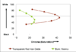
Mixed 10:1, 3:1, 1:1, 1:3, 1:10 with Titanium White
In this grouping, well-known Burnt Sienna is contrasted with the similarly hued Transparent Red Iron Oxide. Both start off as mid-toned earths, the Burnt Sienna a touch brighter and with a slightly higher reflectance in the warmer orange to yellow range, while the Transparent Red Iron Oxide reads as a ruddy and rich mahogany brown, with its peak reflectance deep within the cooler range of reds. None of that, however, quite prepares one for the transformations that happen when the samples are tinted with white or mixed with gel to form a glaze. As the graph shows (Graph 3), for example, Transparent Red Iron Oxide jumps dramatically in Chroma, or Saturation, even when mixed as high as 1:1 with Titanium White. By contrast, Burnt Sienna remains very low in Chroma, never raising much beyond its starting point, as it forms the tell-tale cold and pasty pastels of nearly every brown when mixed with white alone. Similarly, when making glazes, the Transparent Red Iron Oxide blooms into rich browns with bright, fiery undertones of orange while the Burnt Sienna will always carry a slight sense of murkiness.
Family Resemblances
Quinacridone Violet and Quinacridone Magenta Masstones
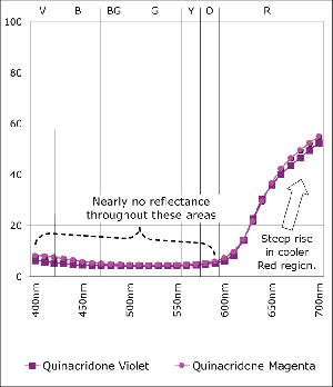
Magenta Masstones
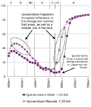
Magenta Mixed 1:50 with Regular Gel (Gloss)
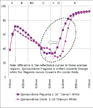
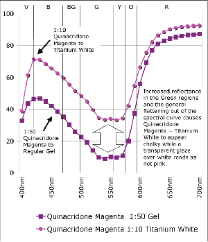
Quinacridone Magenta and Violet are one of those common cases of colors that seem so close together surely it couldn’t matter all that much which an artist reaches for. Of course the answer depends somewhat on your needs. Quinacridone Violet is more opaque and bluer in the undertone than its more transparent, redder cousin. While these features go easily unnoticed when used full strength, the subtleties become much more pronounced when tinted or used in transparent glazes, as can be seen in the spectral graphs. Notice how the spectral curves of the masstones of Quinacridone Violet and Magenta (Graph 1) have virtually identical shapes, with almost negligible levels of reflectance from Violet all the way through Yellow (400-600nm) until finally rising sharply within the cooler, outlying regions of Red. If one looked at these two colors, it would be difficult to tell them apart. However, mixing these colors 1:10 with Titanium White or 1:50 with Regular Gel not only dramatically changes the shapes of their respective spectra but clearly highlight their differences as well. In both the transparent let downs (Graph 2) and the tints (Graph 3) of these colors one can ‘see’ the warmer aspect inherent in the Quinacridone Magenta, where its spectra now rises much earlier, indicating a new more orange component, while the Quinacridone Violet continues to exhibit strong absorption even past 600nm.
Another aspect to notice is the difference between the mixtures of Quinacridone Magenta with gel versus Titanium White (Graph 4). While the one with gel reaches a level of reflectance for cooler reds that is nearly equal to the same mixtures with white, there is a continued, extremely shallow level of absorbance in the 525-575nm range, which would be descriptive of a complementary shade of Green. Because this complement is suppressed, this transparent mixture is able to possess a very high and brilliant chroma, creating a scintillating pink that is impossible to achieve when adding white. It’s a good lesson to remember for those constantly frustrated with an inability to hit that jarringly high note. And the reason is easy to see. With the addition of white the spectral profile starts to flatten out, with more and more light in the Green range being reflected, which ultimately results in a loss of chroma and a ‘chalkiness’ as the cooler tones begin to essentially cancel or grey-out their warmer compliments.
Phthalo Blue (GS) (PB 15:3) / Phthalo Blue (RS) (PB 15:1)
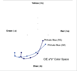
Mixed 10:1, 3:1, 1:1, 1:3, and 1:10 with Titanium White
These twins present an interesting conundrum where they start off ever-so-slightly reversed in terms of which masstonehas a more measured red or green cast, with Phthalo Blue (GS) initially having a small edge in the red zone and an even a greater lean towards the warmer, violet end of the Blue range. As the colors are let down or tinted those positions reverse themselves and the warmer undertone of Phthalo Blue (RS)
finally comes to the fore. One can see this in the above graph (Graph 8), where the Phthalo Blue (GS) starts, oddly enough, with actually more red then its supposedly warmer sibling Phthalo Blue (RS). However, once mixed with white, the Green Shade finally assumes its rightful place, passing across the trajectory traced by the Phthalo Blue (RS) and comfortably out-distancing it along the green axis. This peculiar flip-flop holds true even when extending these with gel and can be clearly felt when mixing with yellow to create various greens.
Conclusion
When I was given the task to write about the nuances of color I was excited. Extremely excited. And who wouldn’t be. After all, color is at the core of what moves my heart and shakes my soul. A few days later, however, Mark Golden stood in my office, looking very grave and solemn. It seemed a small detail had been overlooked, a minor oversight which now loomed large. Apparently, when assigning this article, Mark forgot it would be appearing in the one and only issue every year done solely in black and white. My face went pale. “Black and white?!” I blurted, my voice rising until fi nally trailing off like a distant muffler backfiring: “But….but….” It was no use. The dream of showing fabulous drawdowns of rarely seen subtleties was suddenly shattered; and while the topic of color may be many things to many people, the one thing it clearly is not, is black and white. So I pleaded and implored, and was eventually reassured that, at the very least, we would still have the web. And so dear reader, that is where I beckon you now to turn your sights; to see a dazzling display of drawdowns showing the real (or at least virtual) subtleties of color that lurk behind these many graphs of gray: http://www.goldenpaints.com In addition to a wide assortment of drawdowns for each of the examples in the article, the following additional case studies will be shared: Pyrrole Red (PR 254) / Cadmium Red Medium (PR 108), Carbon Black (PBk 7) / Mars Black (PBk 11), and Nickel Azo Yellow (PY 150) / Green Gold (PY 150, PG 36, PY 3). We also hope to be able to post the complete collection of more than 300 drawdowns of all the colors we examined, mixed with varying percentages of gel and white, providing one of the most thorough detailing of color available anywhere.
Links to additional supporting visuals
Quinacridone Magenta (PR 122) / Quinacridone Violet (PV 19)
Transparent Red Iron Oxide (PR 101) / Burnt Sienna (PBr 7)
Yellow Oxide (PY42) / Transparent Yellow Iron Oxide (PY42)
Pyrrole Red (PR 254) / Cadmium Red Medium (PR 108)
Phthalo Blue Red Shade (PB 15:1) / Phthalo Blue Green Shade (PB 15:3)
Carbon Black (PBk 7) / Mars Black (PBk 11)
Cadmium Yellow Medium (PY 35) / Hansa Yellow Medium (PY 73)
About Sarah Sands
View all posts by Sarah Sands -->Subscribe
Subscribe to the newsletter today!
No related Post
