Have you ever stood in the aisle of your favorite art supply retailer, or stared online at a color chart with awe (and maybe a little bit of intimidation) of the vast selection before you?
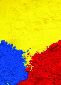
The workhorse behind this range of colors is pigment – finely powdered insoluble particles available in a staggering array of colors. Throughout much of art history, these colorants primarily came from naturally occurring sources like minerals and charcoal. Very few pigments were synthesized before the 1800’s, but advancements in organic chemistry soon led to incredible growth in availability of manufactured pigments.

These colorants are used in a wide variety of applications including coloring plastics, and for automotive, architectural and art paints. Overall, the paints and coatings industry is one of the largest consumers of pigments. Within that, though, artist’s paints are a relatively small player. Industrial, architectural and automotive paints are far larger users of pigment and therefore drive pigment manufacturers’ decisions on what to make.
Of all the pigments available for us to use in artist quality paints, we are concerned with more than just the color the pigment offers. We also need the pigments to be stable in the binder we are using, and need them to be lightfast so they won’t fade or discolor over time. When we find a pigment we like – one that offers a unique color space and also passes our intensive stability and lightfast testing, we tend to keep it around for as long as possible. We become pretty attached, so it’s a sad day when a pigment is no longer available. This can happen for a variety of reasons. Many historical pigments are no longer used because they were impractical, dangerous, or unsustainable to use or to continue making. The list includes such pigments as genuine Indian Yellow (produced from the urine of cattle fed only mango leaves) and the original Ultramarine (a prohibitively expensive pigment made from grinding semi-precious lapis lazuli into powder).
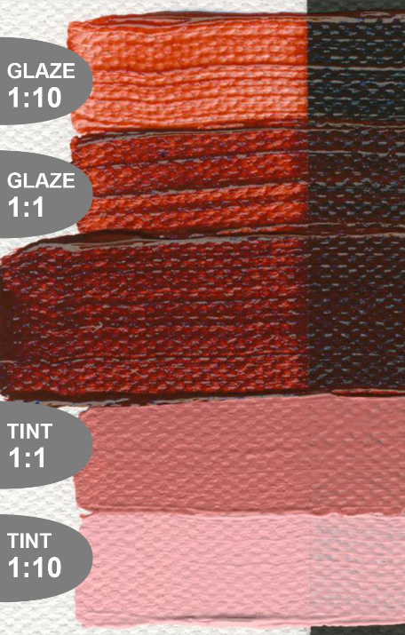
In modern times, the reason for discontinuation is more often that the big pigment users (industrial colorants, automotive and architectural coatings) are no longer using the pigment, and it’s not feasible for the pigment manufacturers to continue production to support the small amount used in art materials. This is likely the case with recently discontinued PR206 Quinacridone Burnt Orange – a similar color space can be achieved with less costly Red Iron Oxide pigments, so it makes sense that automotive and industrial coatings would make that switch. But, we will miss the interplay between dark red-brown masstone and bright reddish-orange undertone that distinguish Quinacridone Burnt Orange from Red Iron Oxide.

Even when a pigment remains available, changes driven by the needs of other industries can make them less desirable for use in fine art. In 2018, we shared the news that we were moving away from Hansa Yellow Light and Hansa Yellow Medium pigments in favor of Benzimidazolone pigments. The Hansa colors had been decreasing in lightfastness performance – something we believe may be attributed to them being milled finer and finer over time to provide stronger tint strength.
It’s not all bad news though. Those same industries that might stop using a pigment, leading to its demise, are also driving innovation that brings us new options for art materials. Recently, we’ve been checking out new metallic and other iridescent pigments. So, as sad as we are to see a pigment go away, we’re excited to see what comes next.
About Bryce Lampe
View all posts by Bryce Lampe -->Subscribe
Subscribe to the newsletter today!
No related Post

I am heartbroken about QBO! A favorite color! You can’t get its beautiful transparency with combinations of red oxide, even using Satin Glazing Liquid. Believe me, I know.
😩
Great article!
Looks like there are some Golden and QoR paints I need to stock up on before PR206 disappears! It has those peachy undertones that just aren’t in any otherwise similar pigment. There seems to be a lot less discussion about the upcoming loss of PR206 online than there was for the loss of PY49, which was a big deal for watercolorists. I would bet, though, that acrylic painters will really miss PR206. Will you be formulating a new Quin Burnt Orange?
Hi Bryce, great article,
I was shocked to hear that Golden was discontinuing the Hansa Yellow line due in part to it’s poor performance. then i checked the date and discovered it was three years old.
Hansa Yellow Medium is one of my favorite colors and seems to be working just fine. Did you find a way to improve the yellow or am i allowing the beautiful color to dissuade a proper look at its overall performance?
thanks for all the great colors, keith
Keith,
Lightfastness testing is carried out on tints of each color and with exposures designed to approximate many many years of indoor/gallery lit conditions (you can find out a bit more about the process at justpaint.org/lightfastness-testing-at-golden-artist-colors). Used full strength or in stronger tints, with less intense UV exposure, or any combination of the two and the degree of color change could be greatly reduced. There’s a great chart in the linked article on Hansa’s, about halfway down, showing that tints of PY73 Hansa Yellow Medium using 50% or more Titanium White showed much greater color shift than PY73 full strength or mixed with just 10% Titanium White.
-Bryce
I would be very interested you did a review on your line of interference colors and applications.
Hi, thank you for your interest in our interference colors. Here is a list of information material that we already have on the interference colors:
– Tech Sheet: https://goldenpaints.com/technicalinfo/technicalinfo_iridint
– Layering and Mixing with Iridescent and Interference Acrylic Paints: https://justpaint.org/layering-and-mixing-with-iridescent-and-interference-acrylic-paints/
– Video: Pouring with Interference & Iridescent Colors https://www.youtube.com/watch?v=afUG9IB9DhQ&t=364s
– Video: Beguiling Iridescent Colors from Golden https://www.youtube.com/watch?v=X9jgriHkDbA
Thank you for the interesting article! I personally discovered this beautiful color (or more like – saw it in new light) thanks to this! I was not into pigments as much as I am now when QG got discontinued but I heard a lot about it when I dived into watercolor few years ago and although this pigment doesn’t seem to get as much attention it’s exciting to be a part of the journey.
I found it interesting that it’s not mentioned elsewhere, are other manufacturers not affected? is the pigment discontinued in general or only in golden’s products?
Also I was wondering if you would consider making a page of discontinued colors / pigments, historical pigments etc. for reference! As someone who recently ordered QBO tube and waiting for it to arrive, I looked to send a friend a photo of this color I ordered and was surprised to see it’s gone from the color swatches page (as in, it’s really happening!) and I’d like to have a picture of the swatches saved for reference. So if there is a page or link for the photos I’d love that.
Thank you!
Was quinacridone crimson discontinued as well?
Hello, Mano.
Yes. We lost a key pigment to that color. We may create a crimson color in the future, but it won’t be made entirely from the quinacridone pigments.
– Mike