Neither Warm Nor Cool
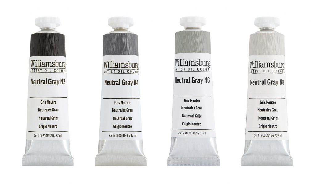
Positioned between red, yellow and blue, is gray. And sometimes gray is the exact color needed to compliment higher chroma pigments on the palette. Grays can be used to desaturate colors while maintaining or shifting their value, the relative degree of lightness or darkness. They can also be used to create a grisaille as an underpainting or final artwork. GOLDEN Artist Acrylics and Williamsburg Artist Oil Colors have created a whole range of Neutral Grays that can be used for this purpose – without color bias, neither warm nor cool. Our Neutral Grays are made from a blend of Titanium White, Lamp Black (Williamsburg), Bone Black (GOLDEN) and natural iron oxides to create spectrally neutral colors that create an evenly spaced, achromatic selection between white and black.
Munsell® and Neutral Grays
For those who use the Munsell® color system as part of their painting practice, neutral gray will be a familiar concept. In the Munsell system, the color space containing all the hue families is built off a central axis of absolutely neutral grays that range from black at the bottom of the axis to white at the top. All colors radiate from the central axis with desaturated hues closest to the axis and full-strength color further away. Light value colors emanate from the top of the axis and darker value colors from the bottom. Williamsburg Neutral Grays were perfectly matched to an official, new set of Munsell Gray cards from Pantone®.
Mixing Neutrals with complementary Colors
Many painters will mix high chroma, complementary colors together to make grays that can be used on their own or to neutralize other colors (Neutralizing Color). While this type of mixing can produce some beautiful, subtle blends, it can be time consuming or expensive depending on the base colors. An alternative would be to use the premixed Neutral Grays by GOLDEN or Williamsburg to get a similar benefit without the time or the cost. All of our Neutral Grays are series 1 and ready to use.
Practical Uses for Neutral Grays:
1. Grisaille
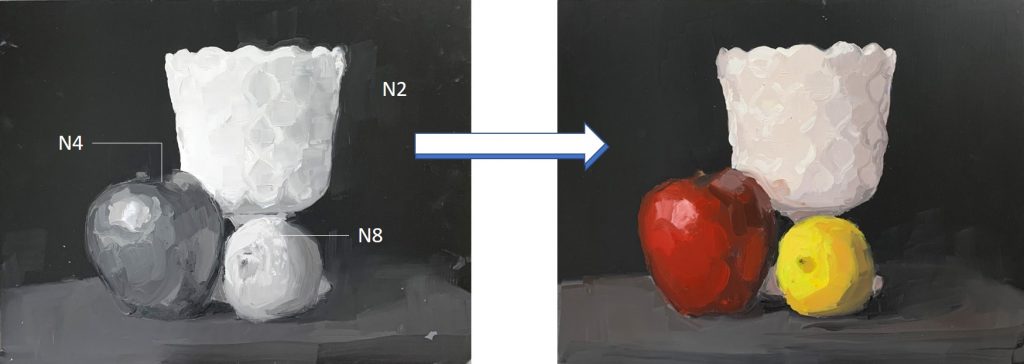
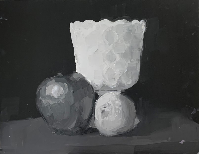
“Grisaille” is a French term that literally means grayness, and is used to describe paintings executed entirely in achromatic colors, without bias toward any particular hue. Grisaille paintings can be beautiful on their own or used as an underpainting for full-color applications over top. Whether working in acrylic or oil, the Neutral Grays can be used directly from the tube with the addition of Titanium White and the black of your choice to create a full-value grisaille painting. Unfortunately, we do not have a perfectly neutral white or black, so the lightest and darkest parts of the grisaille may not be as neutral as the grays in between. Keep in mind, that if transparent glazes will be used over the grisaille, every glaze layer will darken the value of that passage. Leaving the underpainting a little lighter can provide luminosity in the final color and accommodate the reduction in value that comes with many layers of transparent glazes.
2. Matching Color to the Grisaille
All Williamsburg and GOLDEN colors have an assigned value. When painting over a grisaille, it is possible to match the values of fully saturated colors to each specific Neutral Gray. So if one knows the value of the grays used in an underpainting, then colors of that same value can be used directly over top without changing the value structure of the composition. The Williamsburg Munsell Notations and GOLDEN Munsell Notations have a column indicating the numbered value for every color, which coincides with the number on the Neutral Grays.

3. Reducing Intensity of Pure Color
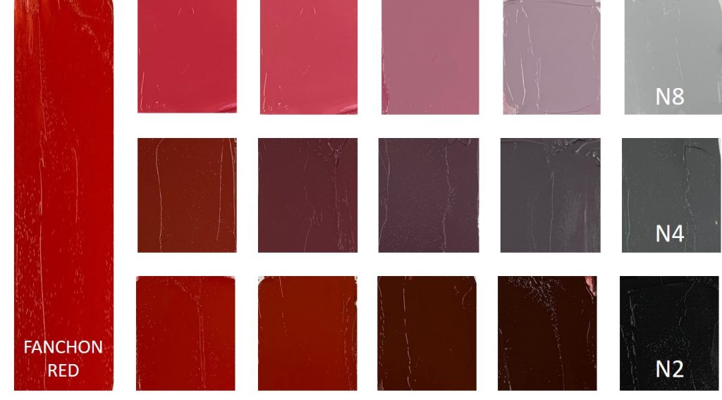
Neutral Grays can be used to desaturate pure color. If a color is too intense, but has the right value, then the corresponding Neutral Gray can be used to desaturate that color without changing its value. For example, Williamsburg Fanchon Red has a value rating of 4 which can be desaturated with the N4 without adjusting its relative lightness or darkness. If that same color needed to become neutral, but lighter or darker, then mixing with the Neutral Gray one or two steps in either direction can reduce saturation AND change the value as needed. Having one or several Neutral Grays on the palette can be a convenient way to modify the intensity of higher chroma colors without relying on black, white or the complexities of complementary mixing.
Available in this Category
Golden Artist Acrylics has a full range of values from N2-N8 in our Heavy Body line, with N5 being available in OPEN and High Flow. N2 is the darkest and N8 is the lightest neutrals we make. For a near white neutral, go HERE to learn more about how to mix your own custom N9. Williamsburg has produced N2, N4, N6 and N8 in 150 ml tubes for almost 10 years as Special Edition Colors. We are pleased to announce a new Williamsburg Neutral Grays Set containing all four Williamsburg Neutral Grays in the 37 ml size. These will be presented as a set initially, but will become standard product as individual tubes moving forward.
Not only are these colors valuable for the reasons mentioned in this article, but they are beautiful in their own right for creating hazy distant clouds, muted backdrops or perfect highlights without color bias. We hope you enjoy adding Neutral Gray to your palette and look forward to your feedback!
On July 12 from 2:00 pm – 2:30 pm EDT, we will be holding a Facebook Live event. Please join our Materials & Applications Specialists to learn tips on how to use Neutral Grays in your painting process, and about the Neutral Grays available from Golden Artist Acrylics and Williamsburg Artist Oil Colors. This live event will be recorded and available to watch at your convenience.
Please let us know if you have any questions or comments by emailing [email protected] or by calling 800-959-6543.
Additional Links
WB Neutral gray video: https://www.williamsburgoils.com/videos/Painting-with-Williamsburg-Neutral-Grays
Williamsburg Special Edition Neutral Grays: https://justpaint.org/williamsburgs-special-edition-neutral-grays/
GOLDEN Neutral Grays: https://www.goldenpaints.com/technicalinfo/technicalinfo_neutgray
Neutralizing color article: https://justpaint.org/neutralizing-color/
Williamsburg Munsell Ratings chart: https://goldenhub.goldenpaints.com/storage/uploads/munsell-and-cie-lab-data-for-williamsburg-oils.pdf
Golden Munsell Ratings chart: https://www.goldenpaints.com/technicalinfo/technicalinfo_munsell
Nomenclature of Color: https://justpaint.org/the-nomenclature-of-color/
Munsell info: https://munsell.com/color-blog/munsell-color-and-science/
About Greg Watson
View all posts by Greg Watson -->Subscribe
Subscribe to the newsletter today!
No related Post


I always look forward to reading a new article in Just Paint, and I’m sure that I’ll appreciate this one too. Eventually. If I can get past “complimentary,” which is where all the vestiges of my editorial past shut down the reading process. The correct word, in this context, is “complementary.” Using appropriate complementary values and hues in a painting may well result in a finished piece that gathers complimentary comments. But the “compliments” can’t be baked into the painting.
Hi Appel,
Thank you so much for the correction. We appreciate you keeping us on track! Changes have been made.
Best,
Greg
Thank you for the concise information. This is very helpful to art instruction. Videos are helpful!!
You are welcome Laurel! We hope you enjoy.
Greg
Very much tempted, I only wish there was some lead white in the mixtures.
Hi Marc,
That would be a great product. Perhaps we can come to that at some point in the future! It would be nice to have neutrals with a little less tinting strength and the added benefit of lead in the paint layers.
take care,
Greg