
We are surrounded by units of measure we rarely give a second thought to; common scales and rulers that parcel out the world in units of ounces and inches, meters and miles. But alongside these are others we rarely use, or could easily explain in any precise way, such as centipoise and mols, decibels and pascals. Even the overly-familiar calorie, long before appearing on food labels or menus, is technically defined as the energy needed to raise a gram of water one degree Celsius at a pressure of one atmosphere. Who knew? And into that murky zone we can also plop ‘Delta E’, a term people will constantly encounter in lightfast testing but which is rarely defined.
Put simply, Delta E is a single number that represents the amount of difference between two colors, or if testing a single swatch, the amount of change that particular color has undergone. Sometimes abbreviated as dE or ∆E, it is a combination of the Greek letter delta, used to signify change in mathematics, and E, which comes from the German Empfindung, or “sensation”. So literally, it measures the amount of change in a sensation.
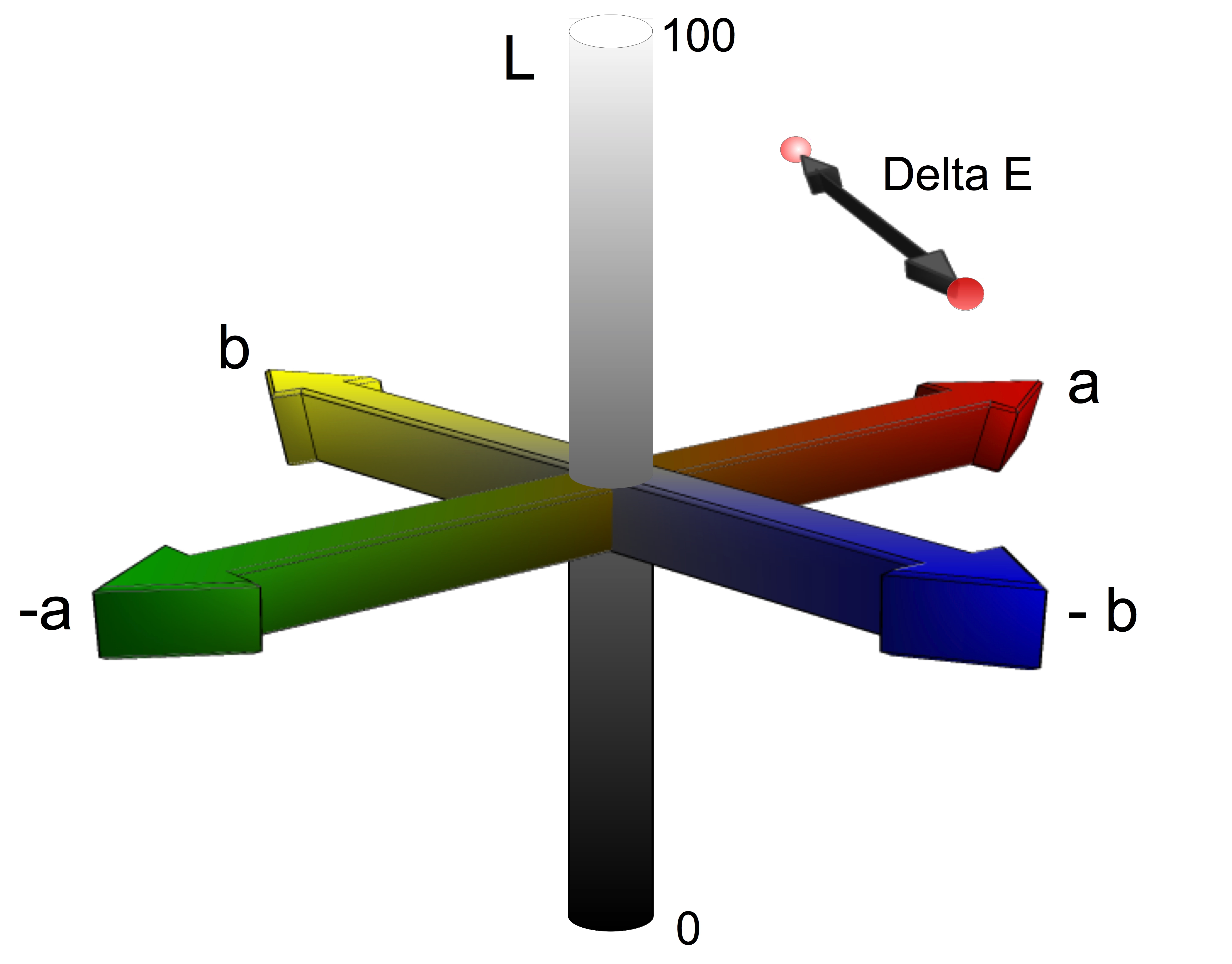
One calculates Delta E using a spectrophotometer which can ultimately translate a color into three variables plotted along the three axis of a standardized color space known as CIE Lab, or more precisely, CIE L*a*b*. Those axis represent Lightness (L), Red-Green (a/-a), and Yellow-Blue (b/-b). Once you have two sets of these coordinates, taken for example from a swatch before and after being exposed to accelerated UV, you can easily calculate the distance between them in three dimensional space. It is this distance that we know as Delta E. (Image 1)
Over the years there have been various attempts to improve the way one calculates Delta E, trying to get the formula to ever more closely model the way a theoretical person (known as the ‘standard observer’) would see a similar difference. This is particularly true when trying to optimize the calculations for specific fields, like textiles or graphic arts. For our purposes, however, ASTM still relies on the original system, known a CIE 1976, or dE76, when determining the lightfastness of artists’ materials. It should also be noted that all of the various systems define a single unit of Delta E as the minimum amount of color difference a standard observer could recognize.
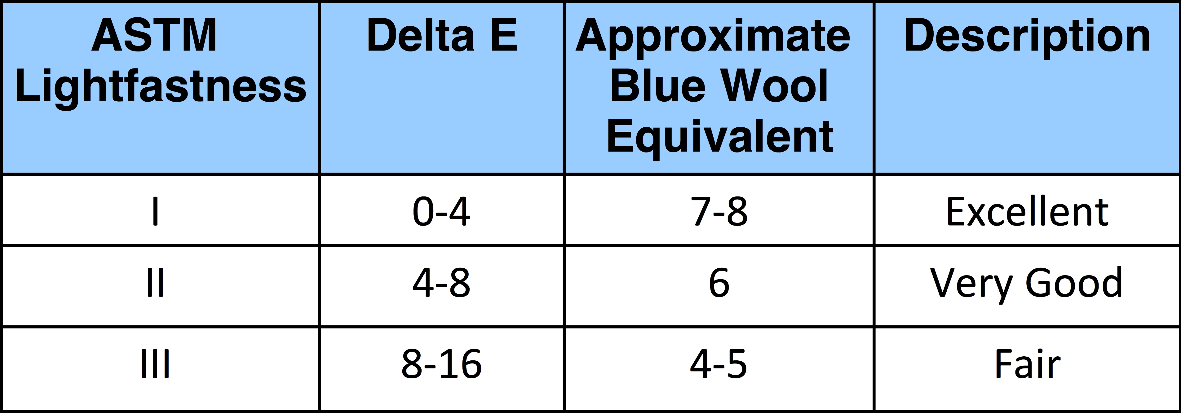
While CIE 1976 gave the ASTM Subcommittee a way to measure how much a color changed when doing broad testing that led to the original 1977 draft of ASTM D4303, “Standard Test Methods for Lightfastness of Colorants Used in Artists’ Coloring Materials”, the problem of translating those numbers into Lightfastness categories still remained. In other words, how much can a color change or fade, how many Delta E’s can it have and still earn an ASTM Lightfast rating of I, II, III, and so on? Ultimately the ranges were informed by three things: the amount of change seen in specific, well-known pigments found on historical paintings, in particular rose madder and alizarin crimson, correlation with the much used but less rigorous Blue Wool Scale, and the amount of tolerance needed to account for all the uncontrolled variables, such as the small differences in sample prep and test placement, that can sometimes cause a difference of several Delta units between ostensibly identical swatches.
Taking all of those things into account, the ASTM Committee in 1977 examined results from 92 different pigments made in both oil and acrylic, then subjected to varying exposure times in both Xenon Arc and High Output Fluorescent accelerated test chambers, as well as two outdoor testing facilities in Kansas and South Florida. From those tests emerged the following ranges, as well as their rough Blue Wool equivalents, which are still used to this day:
The question still remains, though: just how much visual change does all of this represent? In Image 2 we illustrate what you would see as you pass through each of those categories. As expected, a single unit of change, where Delta E = 1, is a small and subtle difference; however, by the time one gets to Delta 4, the change has become distinct and noticeable. By Delta 8, the degree of difference is definitely substantial, while above that, one can understand why ASTM III colors such as Alizarin Crimson are considered Poor in Lightfastness and not recommended for permanent works of art.
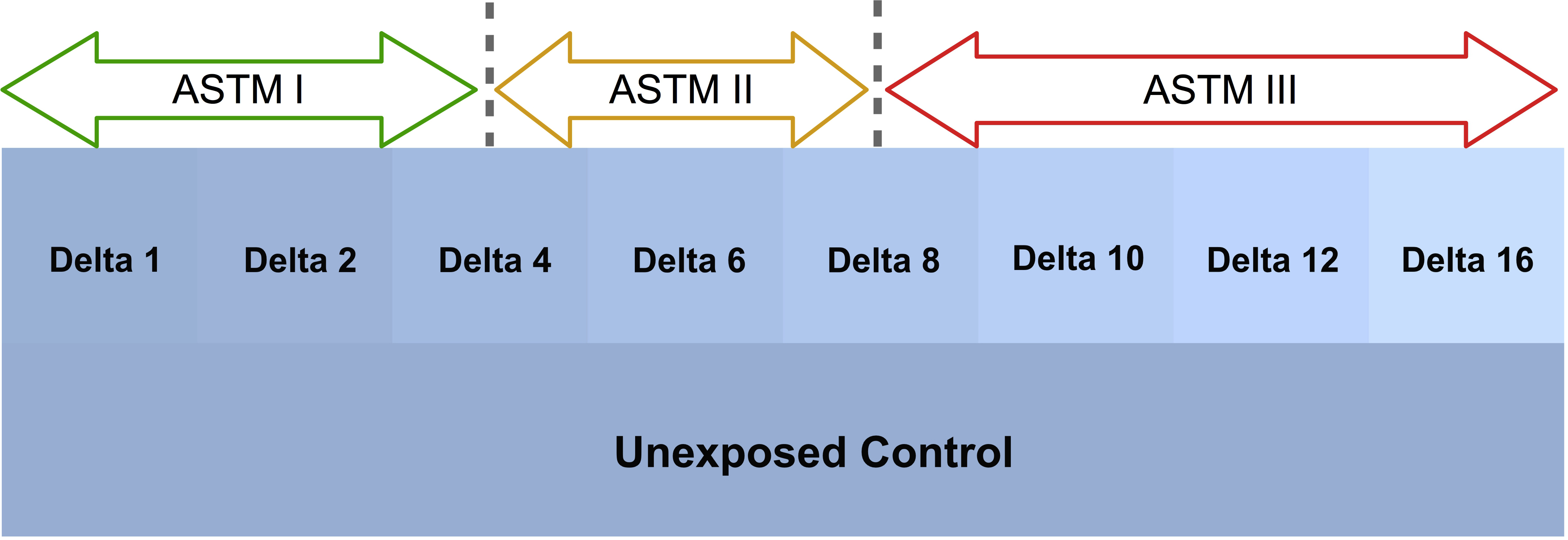
Seeing the amount of change allowed for each of the ASTM Lightfastness Categories might come as a surprise for many people who have come to expect that Lightfastness I means a color will not fade or change to any degree, or at most show a subtle and ‘just noticeable’ difference. It is important to remember, however, that ASTM Lightfastness testing is not meant to be predictive in the narrow sense that a result of Delta 3.8, for example, will mean unequivocally that a similar swatch of color on a particular work of art will display that degree of change after x number of years. There are simply too many variables at play, and besides, only a handful of pigments have even been around long enough for that type of precise correlation to be remotely possible. Keep in mind that ASTM Lightfastness testing is extremely harsh, with colors being exposed to very high levels of UV and visible light in a very compact, short period of time. While the levels of exposure were originally set because the results corresponded to the amount of change seen in 100+ year old samples of rose madder and alizarin crimson, among other historical pigments, whether that relationship will be equally tight for many of the more modern pigments remains to be seen. And again, it is important to note that a pigment that might show a Delta E of 1 or 2 in one set of tests, or at one point in time, could show slightly different results of a Delta 2 or 3 in additional testing for a host of reasons. So it is critical to set ranges wide enough to account for that. In the end, it is helpful to realize that many pigments considered among the most durable, both historically and by experts in the field of materials and color science, have consistently fallen within the 0-4 Delta E range when undergoing this testing, so for now, at least, those remain the pigments that are your best bet when creating artwork that is as permanent and durable as possible.

Subscribe
Subscribe to the newsletter today!
thank you Sarah, are you related to Ginny Sands from Alfred.
enjoyed reading about this.
I’m not related to her but am glad you enjoyed the article!
I am absolute;y fascinated with information like this. I have been working with JND as a concept for a little while but you have added a completely new dimension. Thank you!
You are SO welcome! We love that you find this information fascinating and valuable as clearly it is part of our passions as well.
Are there any measures for color changes due to exposure to chemicals or moisture rather than light? Thank you for your article.
Great question. The measure would actually be the same since Delta E is neutral about how the change comes about and simply measures the difference in color between two readings. So, for example, when Cadmiums or Ultramarine Blue are exposed outdoors in an environment with moisture or humidity, chemical changes take place that are not really classic “lightfastness” issues, but which will cause an Ultramarine Blue to bleach out, or a Cadmium Red to get darker. Or we will see cases where a particular pigment will appear lighter after outdoor exposure, but due to chalking of the surface rather than fading, which is a form of erosion different from purely a fugitive color. Ultimately, however, while all of these changes can be described in terms of Delta E, that does not mean all of them are reflected in ASTM’s lightfastness rating even though they can impact how a pigment is used. So, for example, returning to our earlier example, while Ultramarine Blue and Cadmiums are all given a Lightfastness rating of I by ASTM, their use is restricted to indoor applications. As most paintings are exhibited and live their lives indoors few artists notice this, but for those who paint murals they will find them absent from our list of recommended colors for exterior applications. For more information on that aspect, the following are good links to look at:
Exterior Mural Tech Sheet – Recommended COlors
Selecting the Best Exterior Mural Pigments
Thanks! I didn’t realize that there was no warning for some environmentally caused changes in colors.
Thanks so much Sarah. Great article. ML
Thank you!
You are welcome!
Hi Breet –
I am not going to be able to help in terms of the preparation or formulation of your materials – that is just not something we work with here, being solely an artist paint company specializing in acrylics, watercolors, and oils. However, I do have some questions that might help me understand things better.
What settings are you using for your spectrophotometer, and what type do you have? Different settings as well as the different equations used to calculate Delta E will give different results. As mentioned in the article, we use CIE 1976, or dE76 for calculating the difference – but that is not the only option and is not the one used by most commercial paint companies, who often rely on CIE 98 or 2000. Our use of de76 has to do with the particular history of lightfastness calculations for artist materials. So you might see what your results are when using these other formulas. And on the reason why these can give different results, I thought this article was helpful:
https://www.datacolor.com/color-systems-cielab-cie2000/
and the difference in the equations is decently covered here
https://en.wikipedia.org/wiki/Color_difference
In terms of the light source, we use D50, and set the standard observer angle to 10 degrees. Lastly, make sure to choose Specular Component Included (SCI) for your readings to compare actual color divorced from the impact of specular gloss on shiny surfaces. For an explanation of that see the following:
https://sensing.konicaminolta.us/us/blog/specular-component-included-sci-vs-specular-component-excluded-sce/
We hope that helps some and if you can let us know what you are using and the settings – for both you and the other people who are getting different readings – that can help if further questions arise.
Can a color, say pms 144, be in the blue green quadrant? Wouldn’t that become a different color? Become dirty?
Should quadrants be considered for color consistency? Meaning I should be in that quadrant each time I want to repeat the color?
Or lastly, Isn’t a color either in its correct quadrant or not? It can’t be moved from the correct area into another area without “changing” the color? Please help. Drowning under the -b value!!!
Hi Tony –
Happy to help, but first am a little uncertain about the question as it relates to -b values. The Lab equivalent to pms 144 (assuming you mean Pantone Matching System’s 144) is reported as L = 66.88, a = 30.02, b = 72.67, so there is no -b value involved. Perhaps I am misunderstanding the issues with that specific color? In any case let me answer your questions in a more general way:
Can a color pms 144 be in the blue green quadrant?
Not if we are talking about that specific swatch, as described above. It will be defined as laying in the Red Yellow quadrant, positive a, positive b.
Wouldn’t that become a different color? Become dirty?
Yes, absolutely, as you would be introducing blue (or more technically a ‘blue bias’) into a color that started off as orangish.
Should quadrants be considered for color consistency? Meaning I should be in that quadrant each time I want to repeat the color?
Yes. A color’s Lab values are absolute, in the sense that a specific swatch will always read the same. That said, there are almost always some variations that might have slight differences that we perceive as the same. But the variation would be small.
Or lastly, isn’t a color either in its correct quadrant or not? It can’t be moved from the correct area into another area without “changing” the color?
Correct! Moving a color from where it is, meaning changing its Lab values, will always define a different color. And definitely changing quadrants would describe a very different indeed.
Please help. Drowning under the -b value!!!
Happy to throw you a colorful floating ring buoy to help prevent drowning! What is it about ‘-b’ that is causing distress? Is it that Yellow is described by -b and you are thinking of ‘b’ as meaning ‘blue’? Which is not really the case – it’s merely a coincidence of a how this geometric space was set up, labeling the axis’ as ‘ab’ rather than, say, ‘xy’.
Does that help? Keep treading water if not!
Sarah