
Introduction
Our Lab, in conjunction with the Materials and Applications Specialists Department, recently updated the lightfastness testing for the entire QoR Watercolor line. Our testing methods employed a significantly expanded range of dilutions with water as well as incorporating, for the first time, tints with titanium white to more accurately simulate how artists use watercolor. The results, shared below, provide us even greater confidence in the stability and archival qualities of these modern watercolors. After reviewing these results, artists should feel confident is using QoR for a wide range of watercolor painting applications.
Methodology
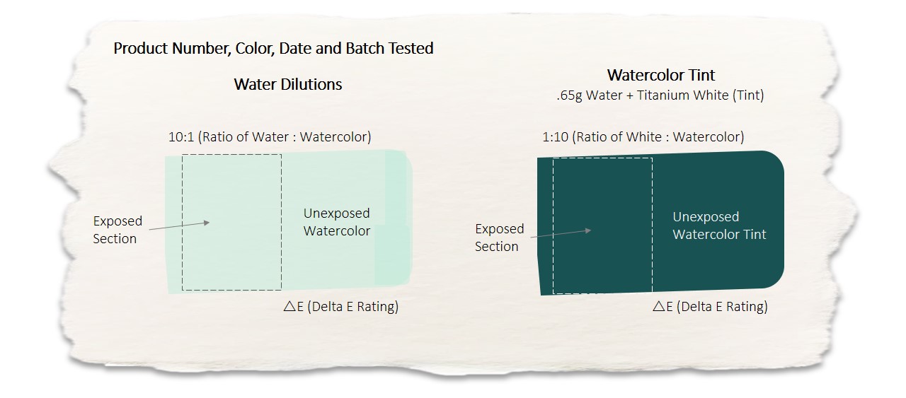
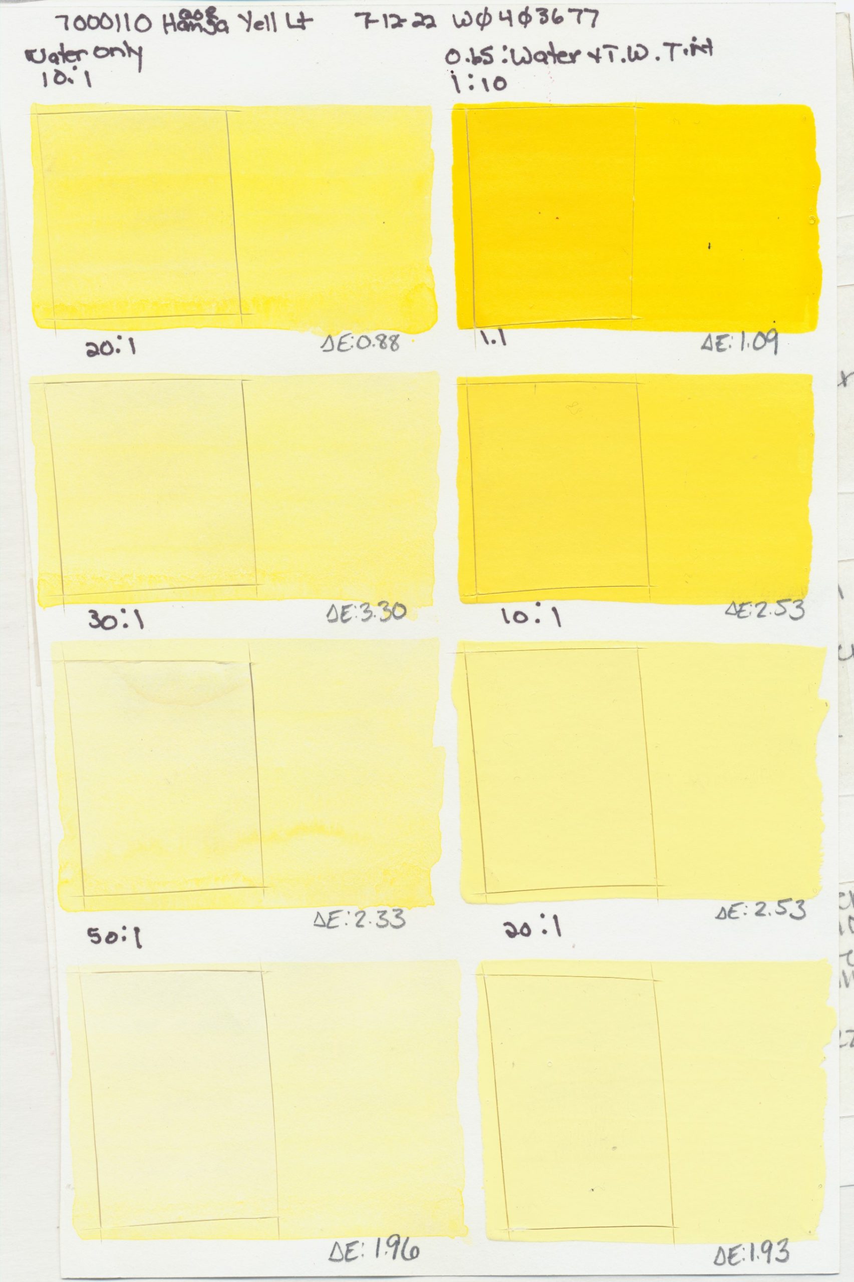
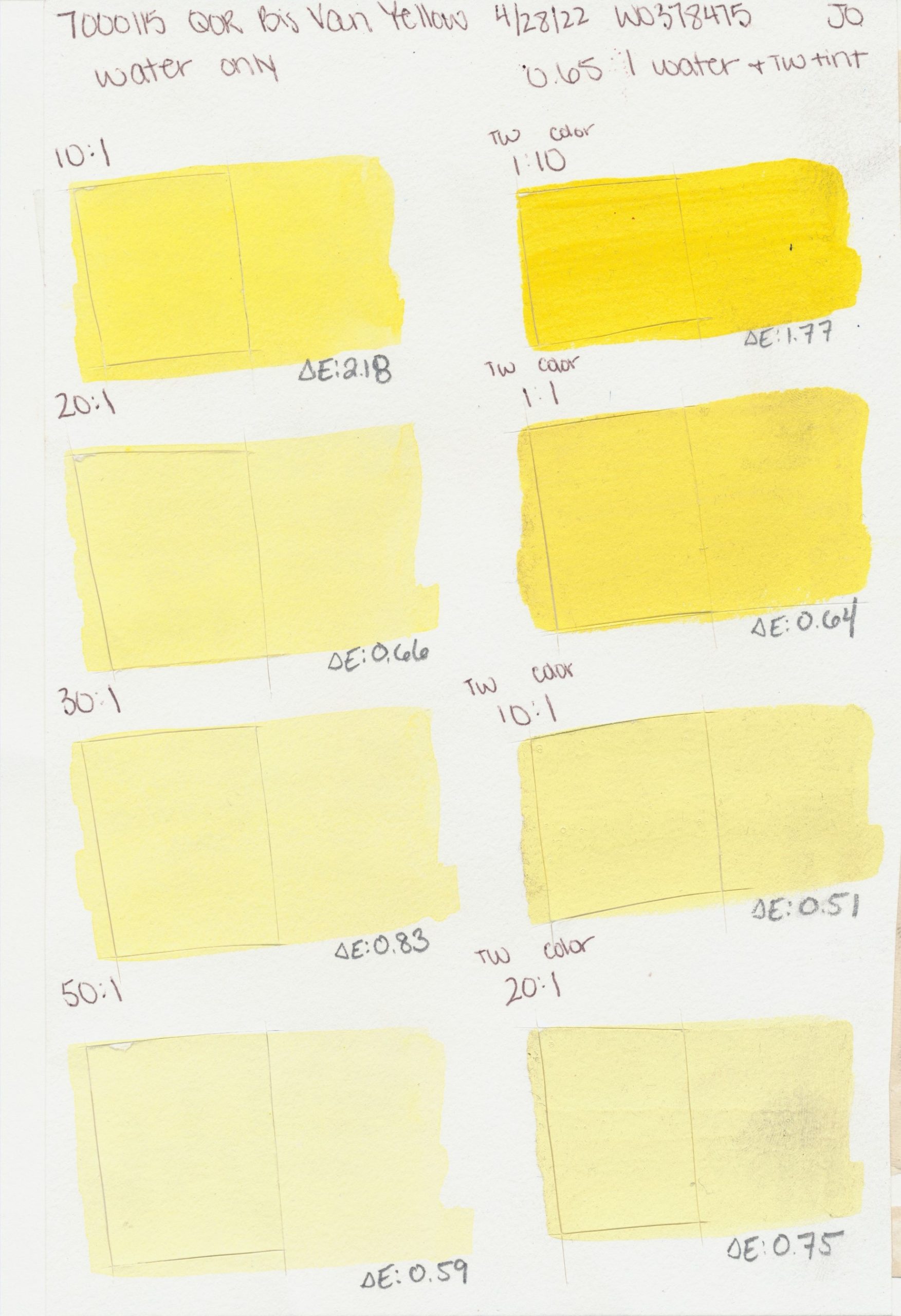
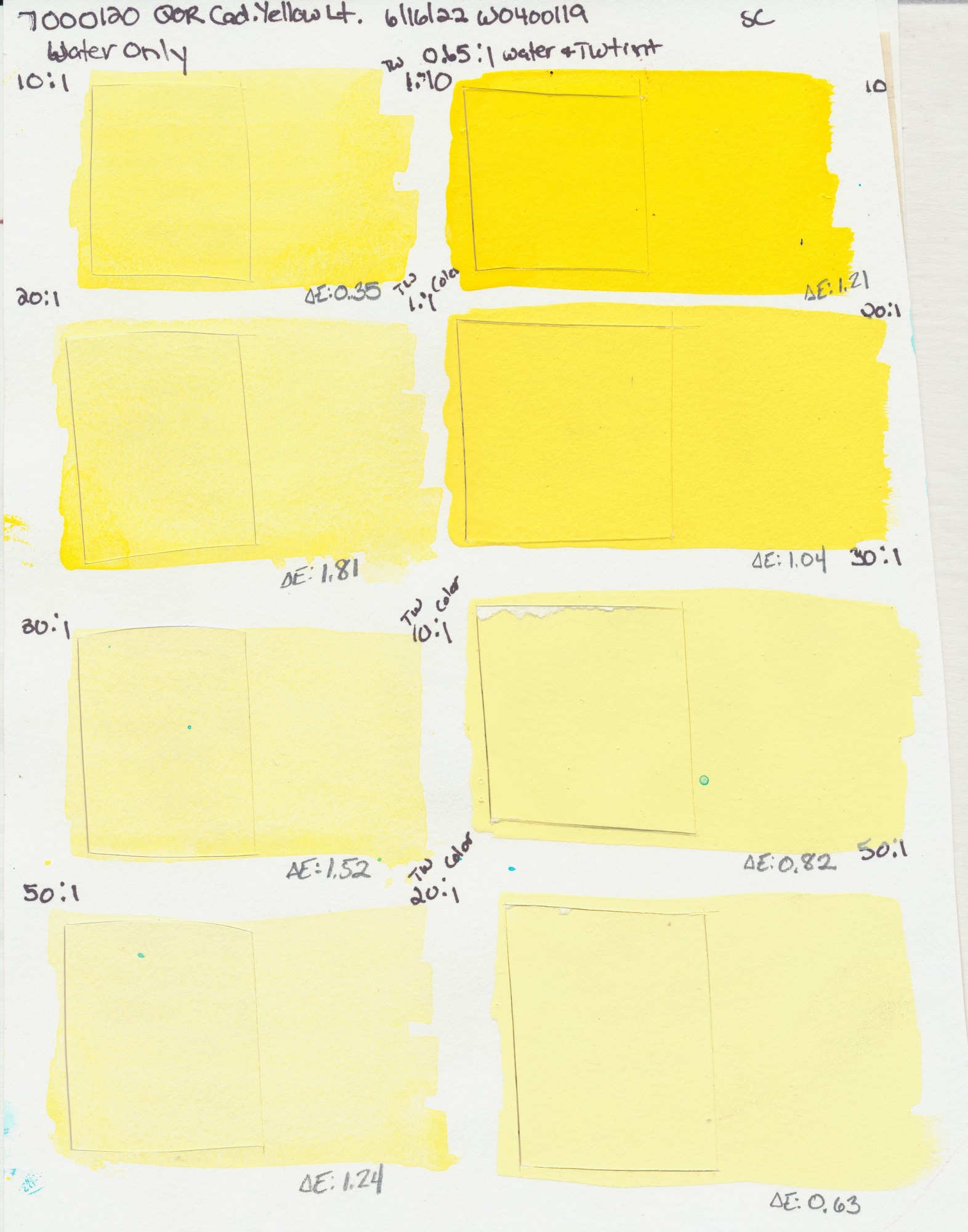
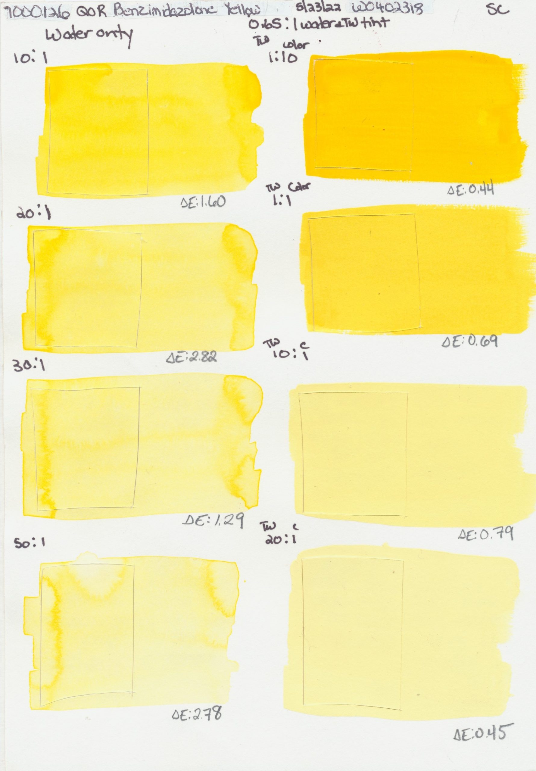
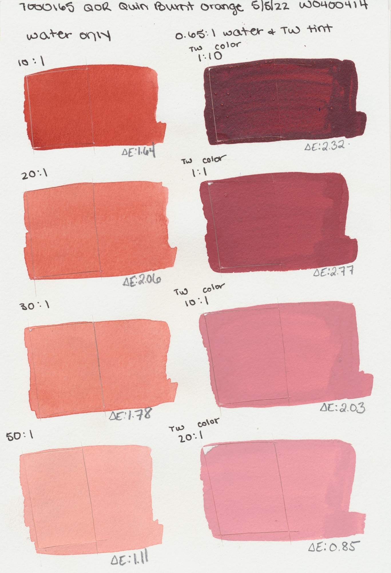
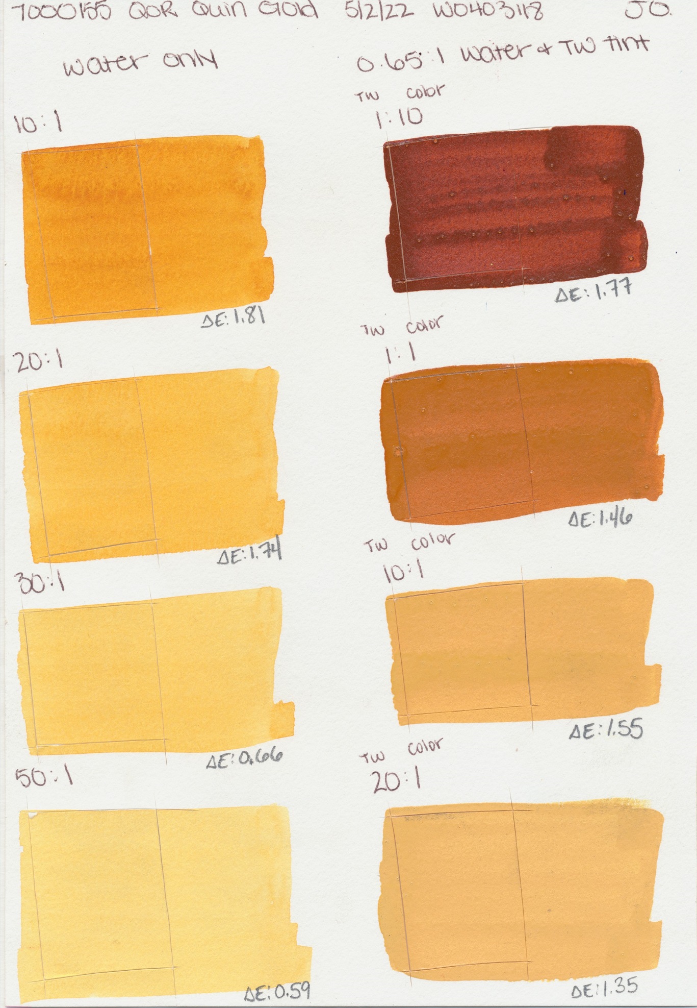
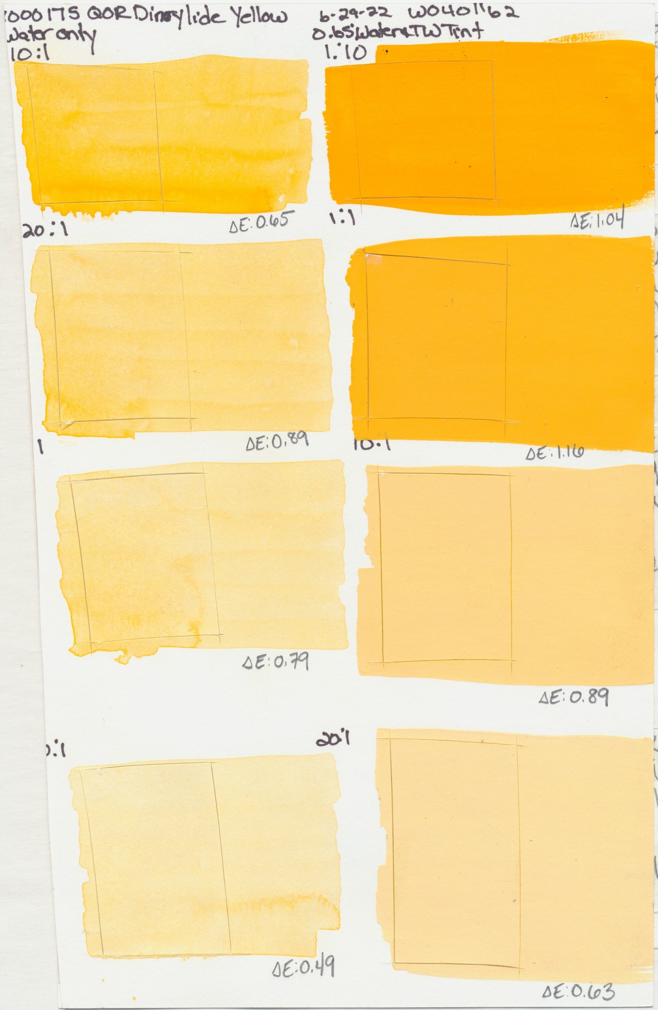
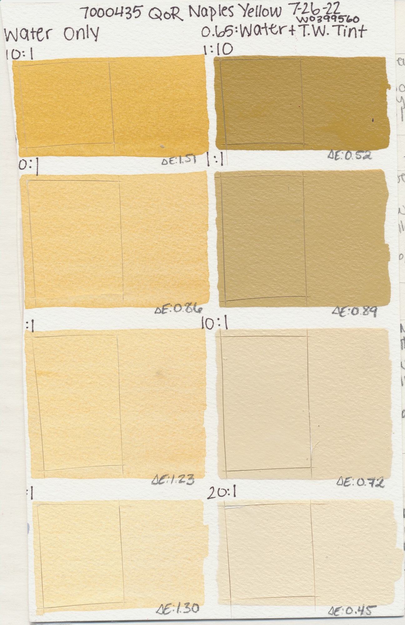
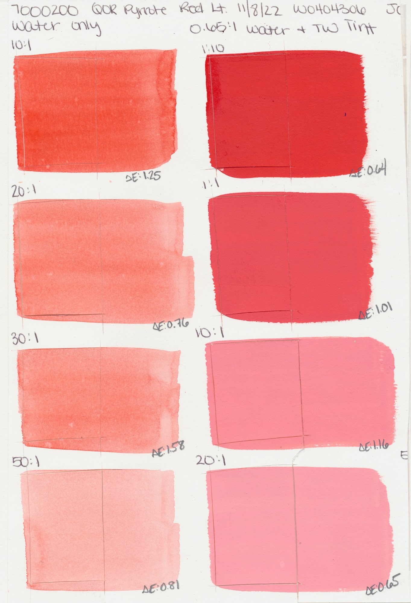
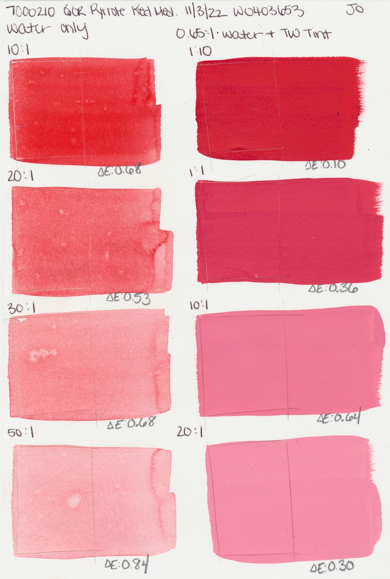
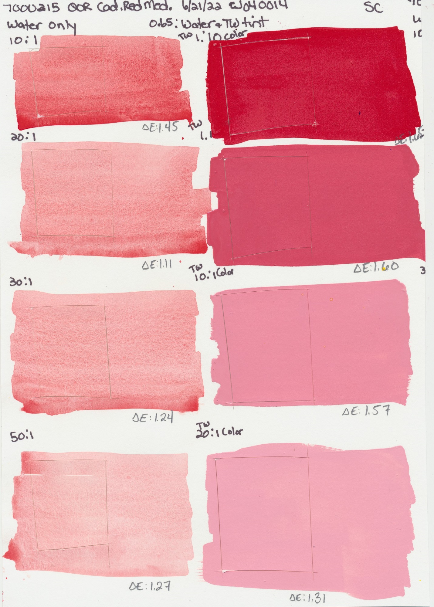
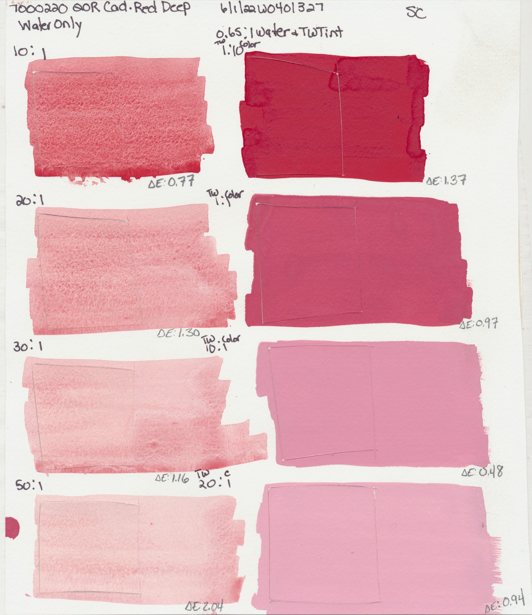
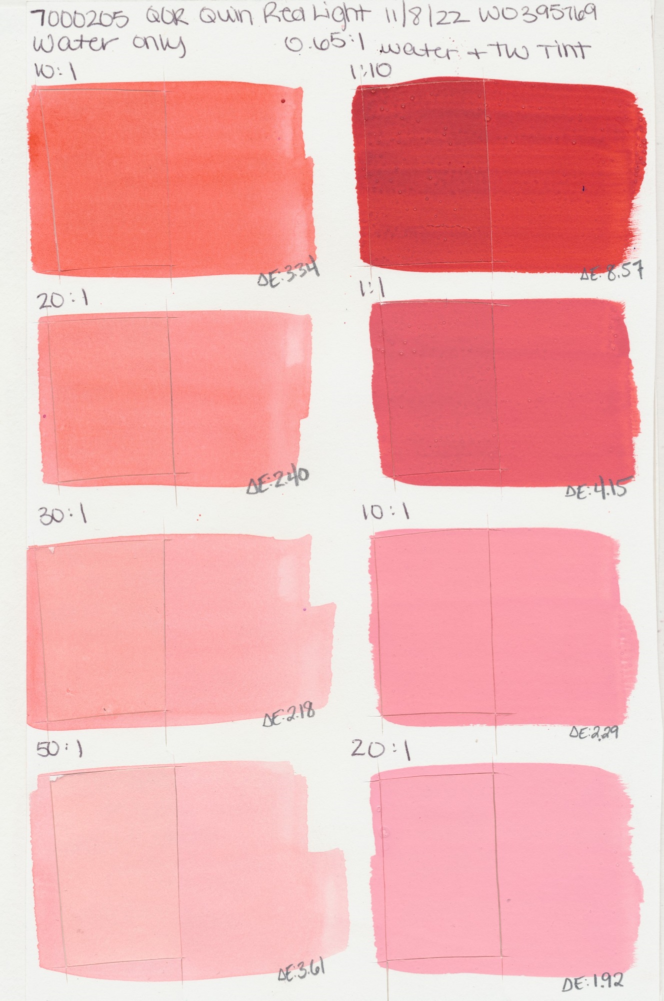
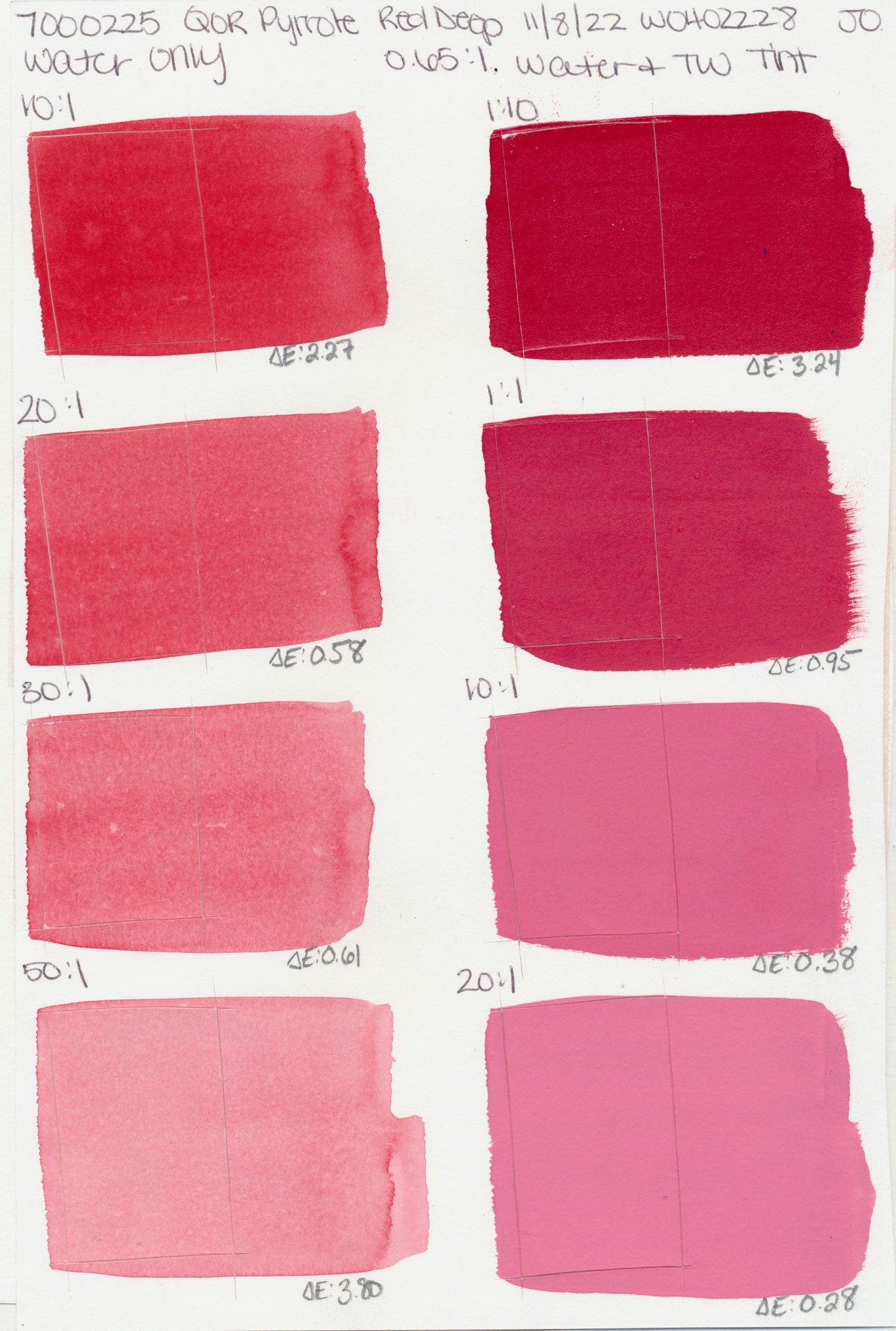
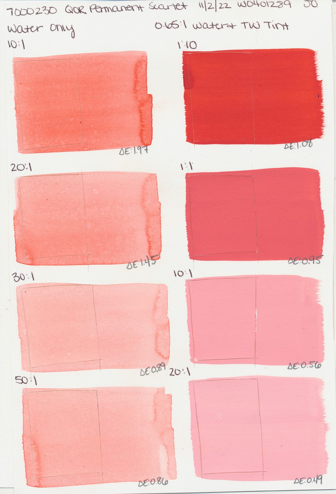
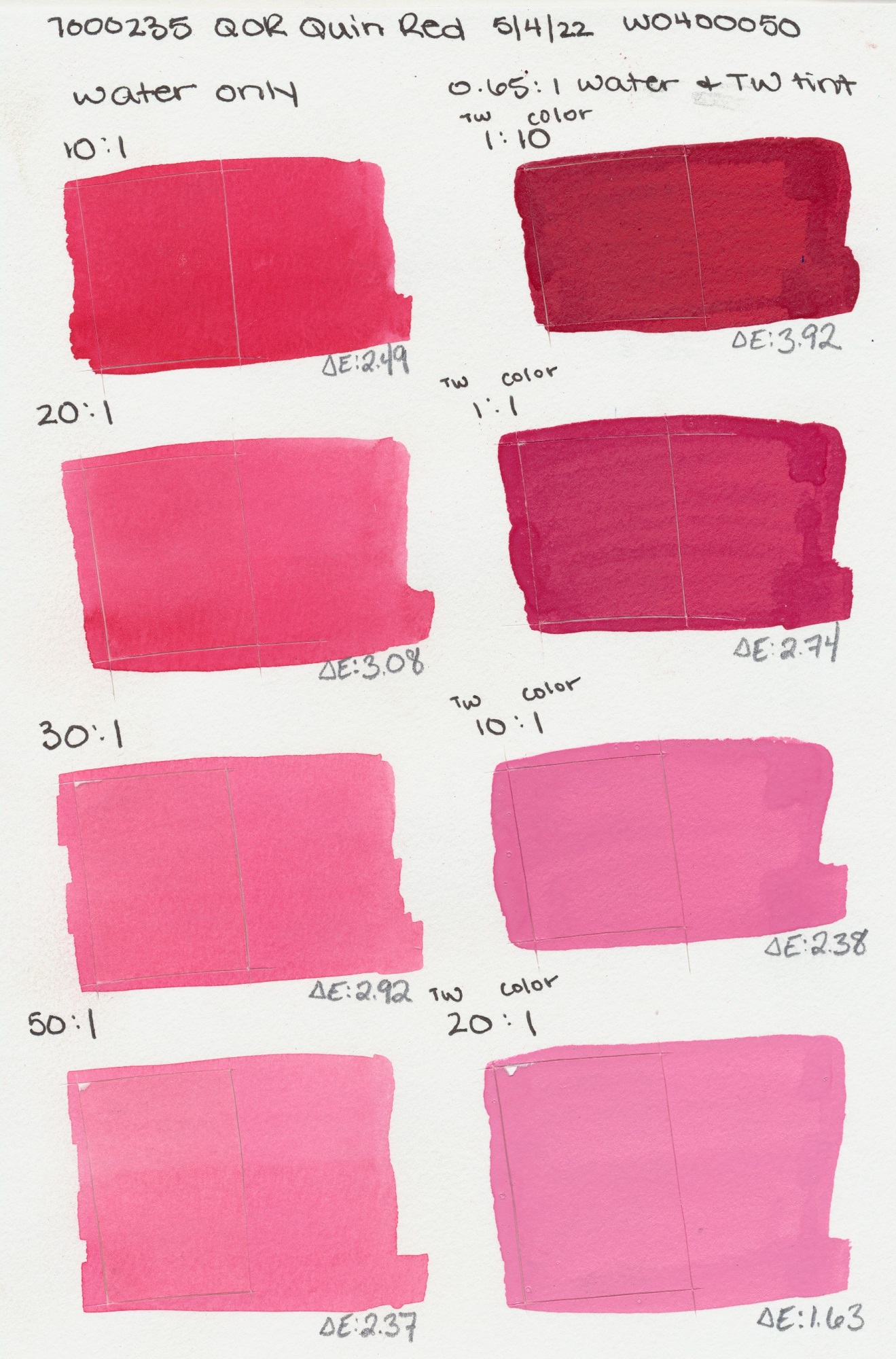
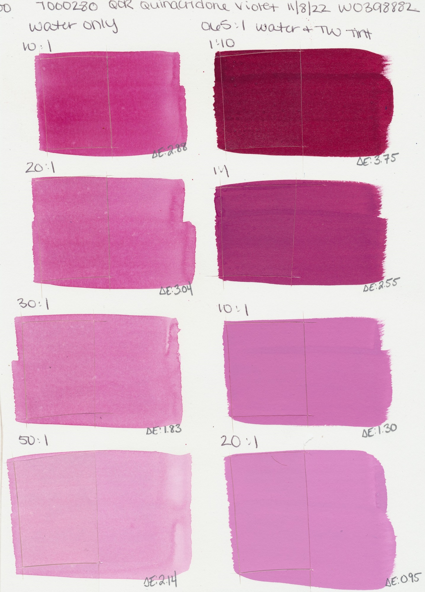
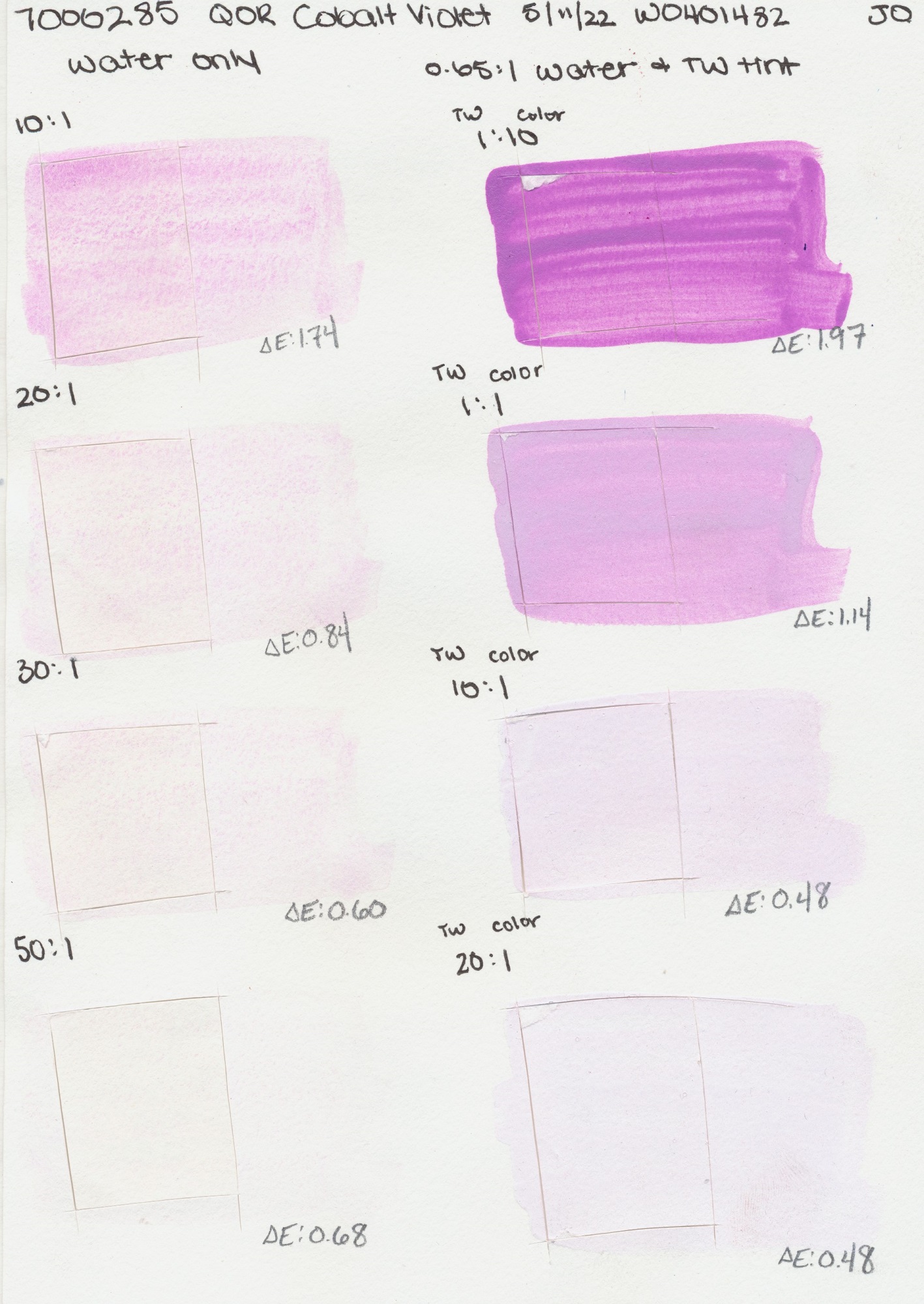
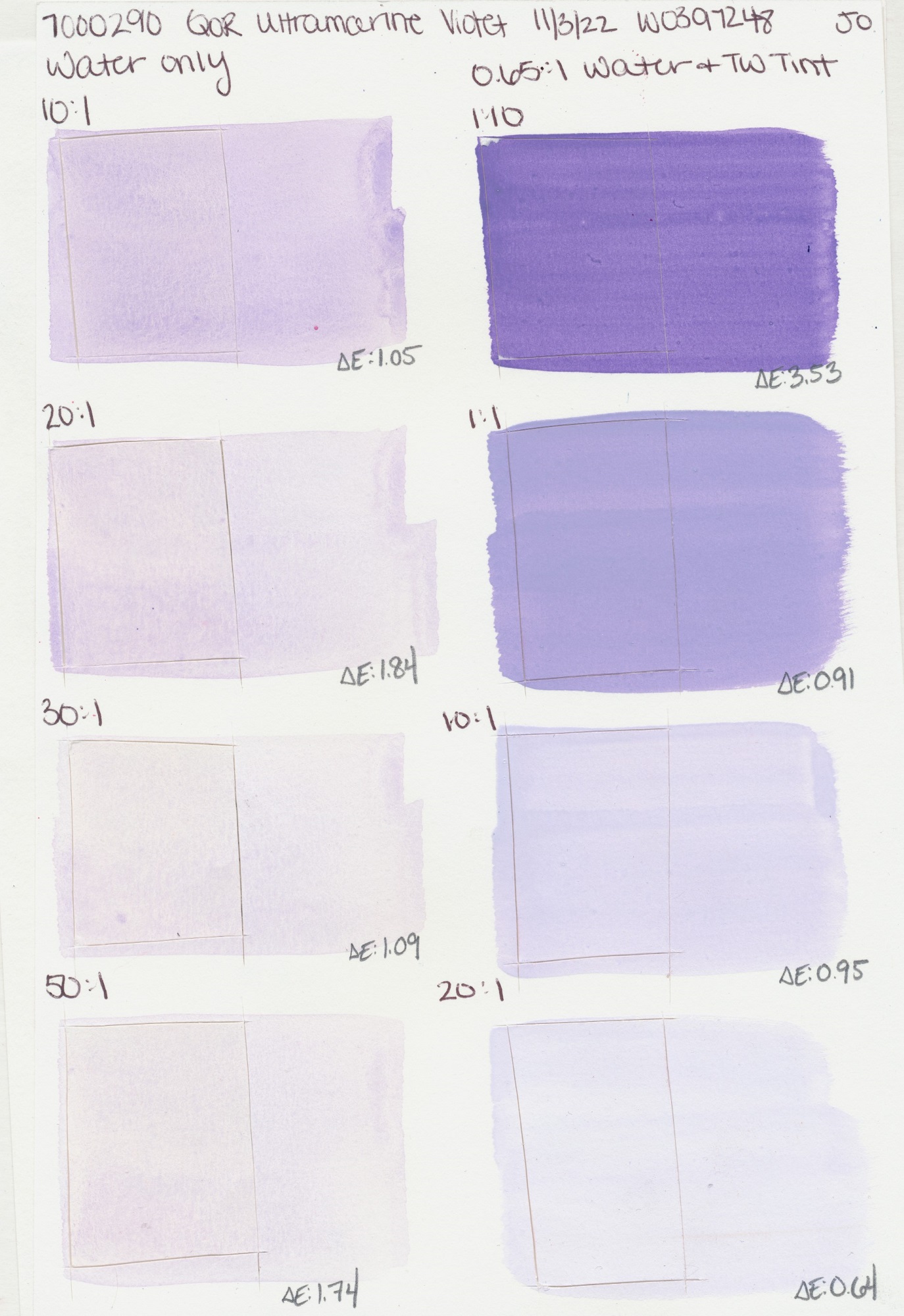
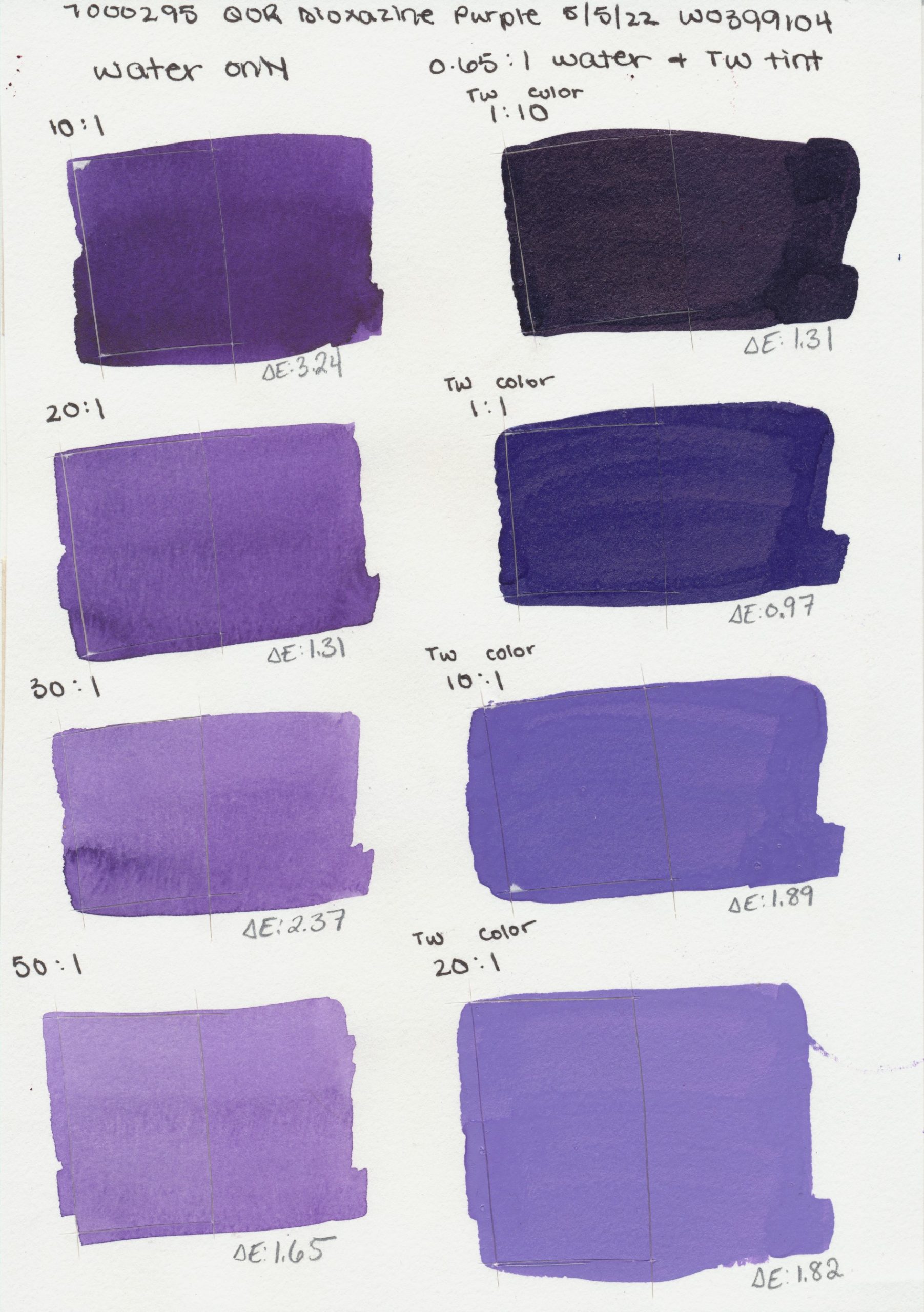
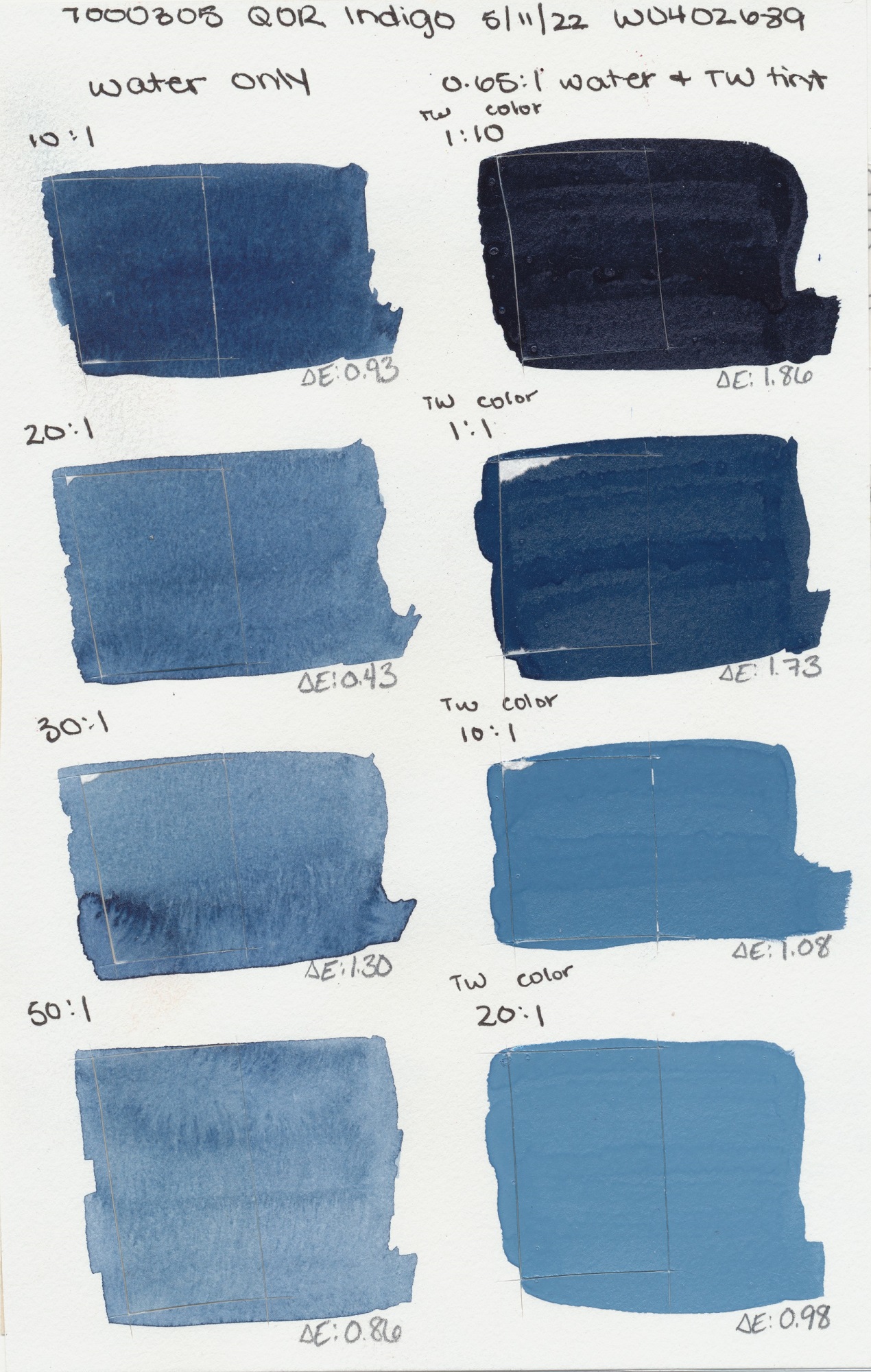
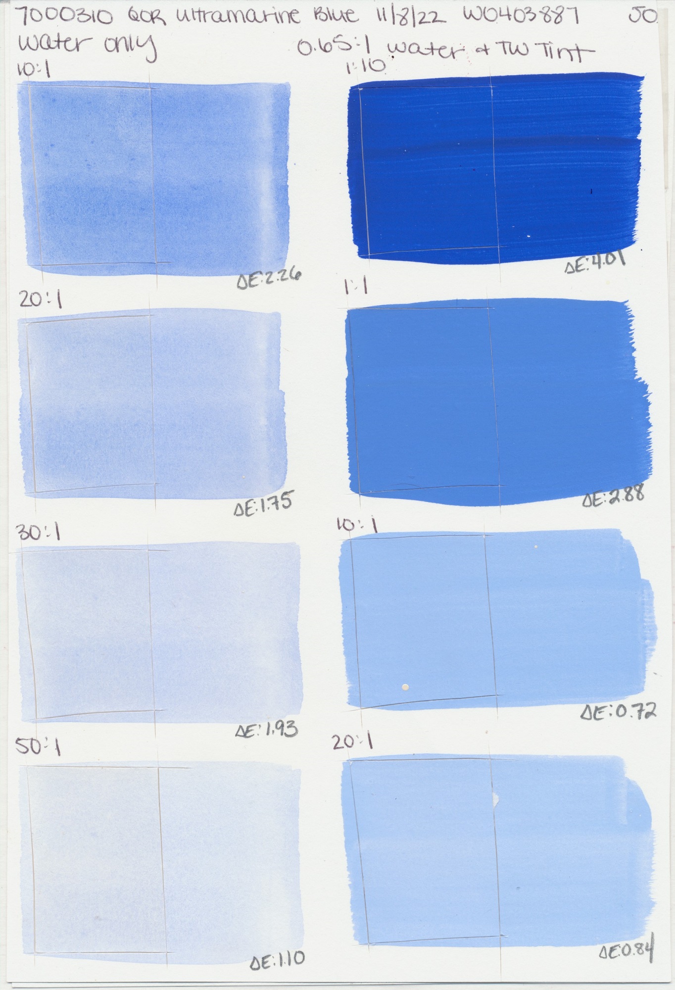
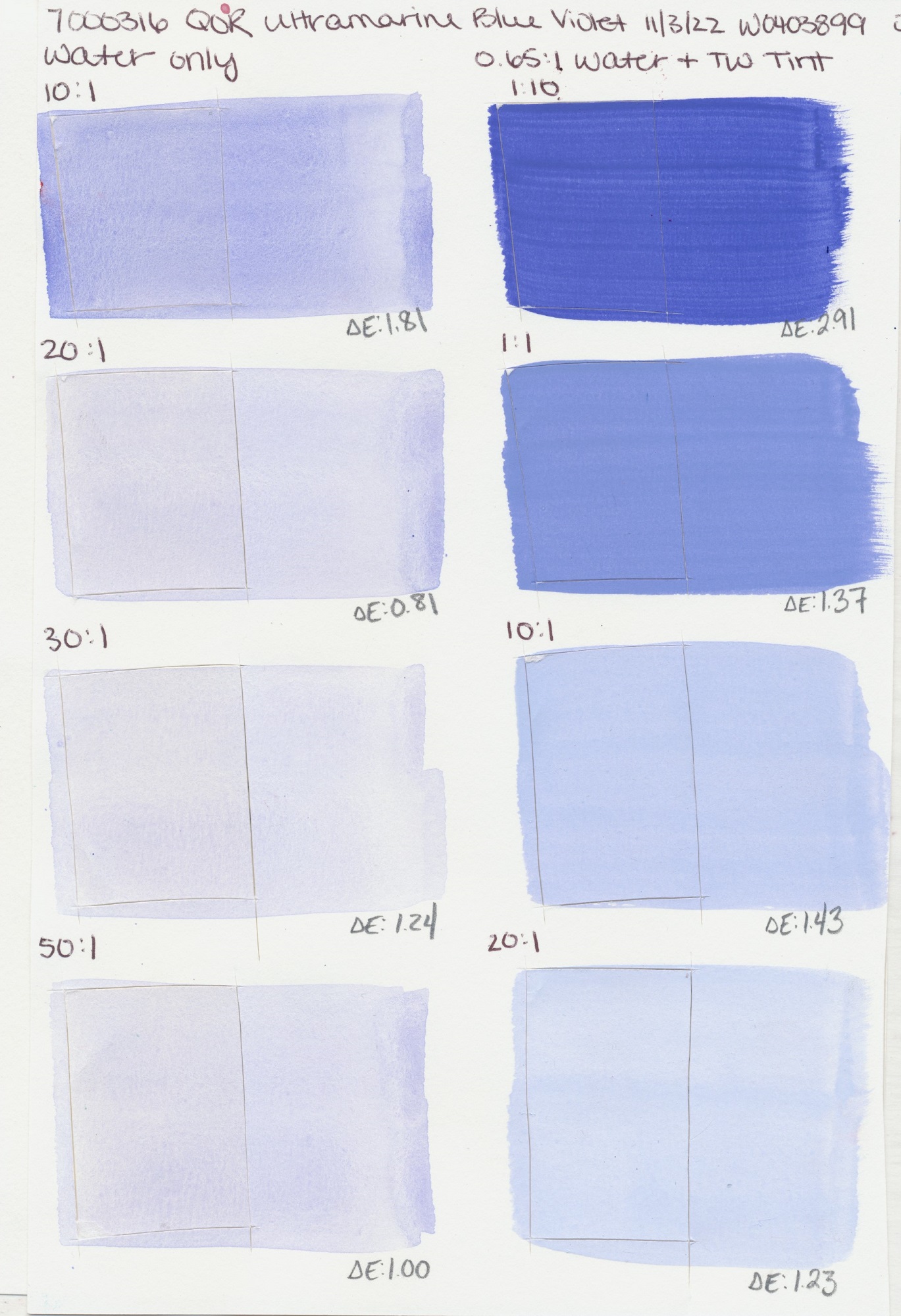
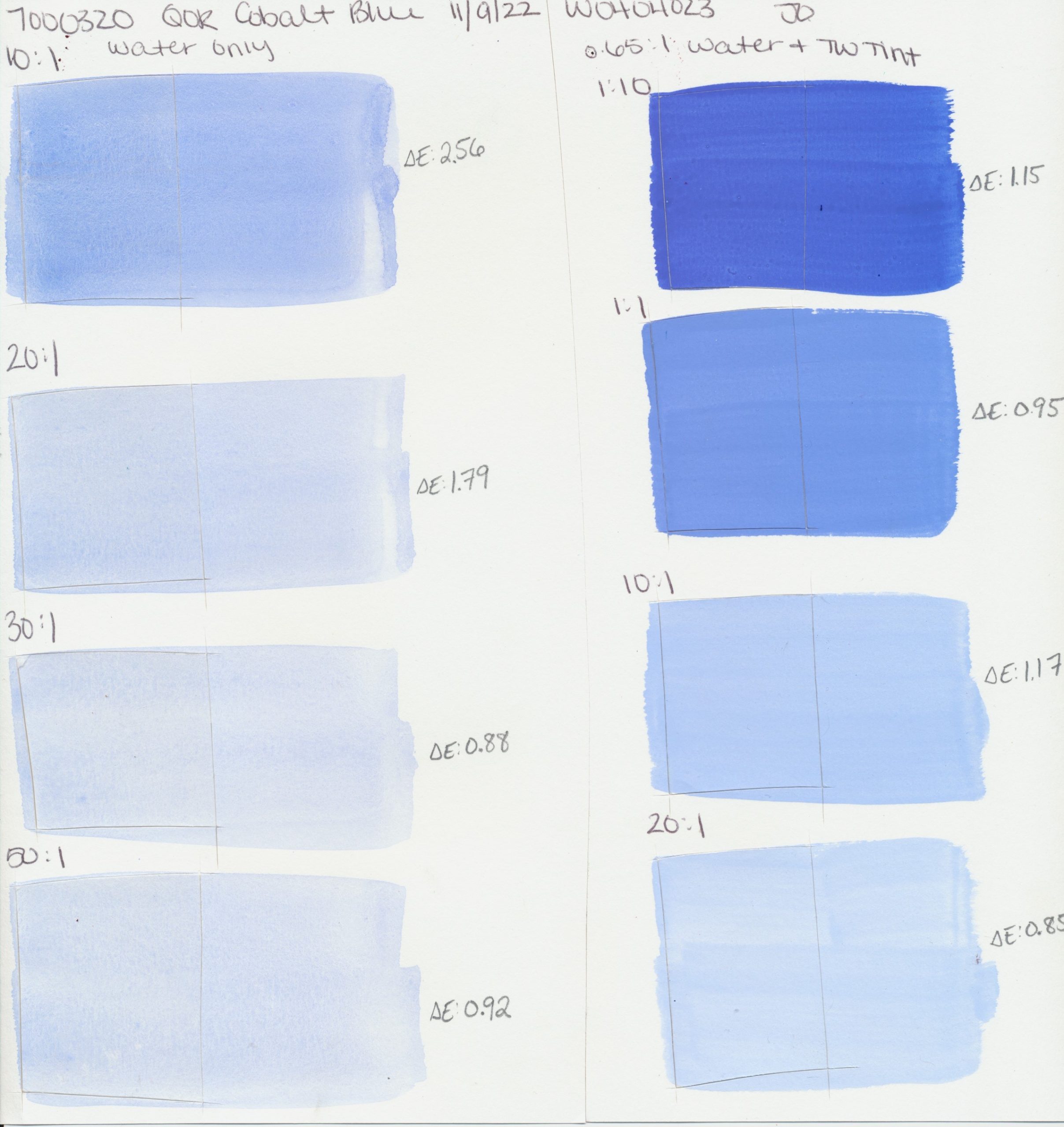
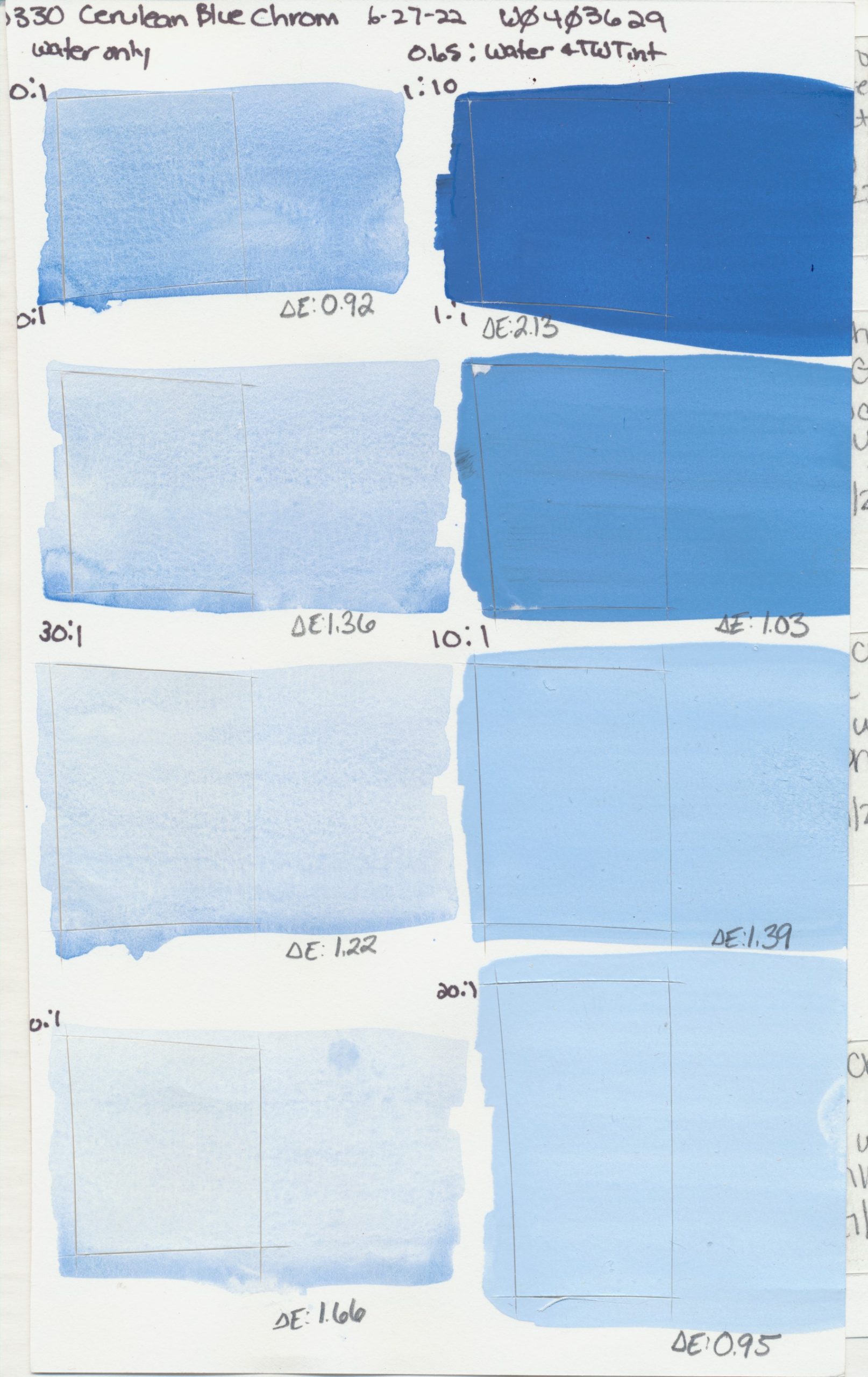
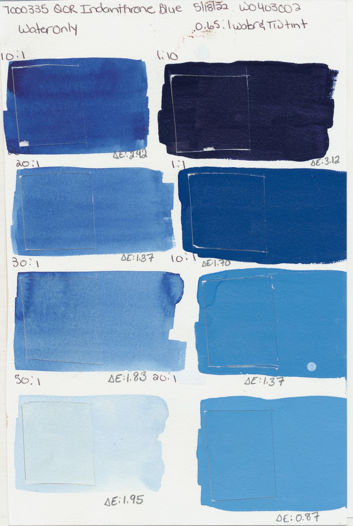
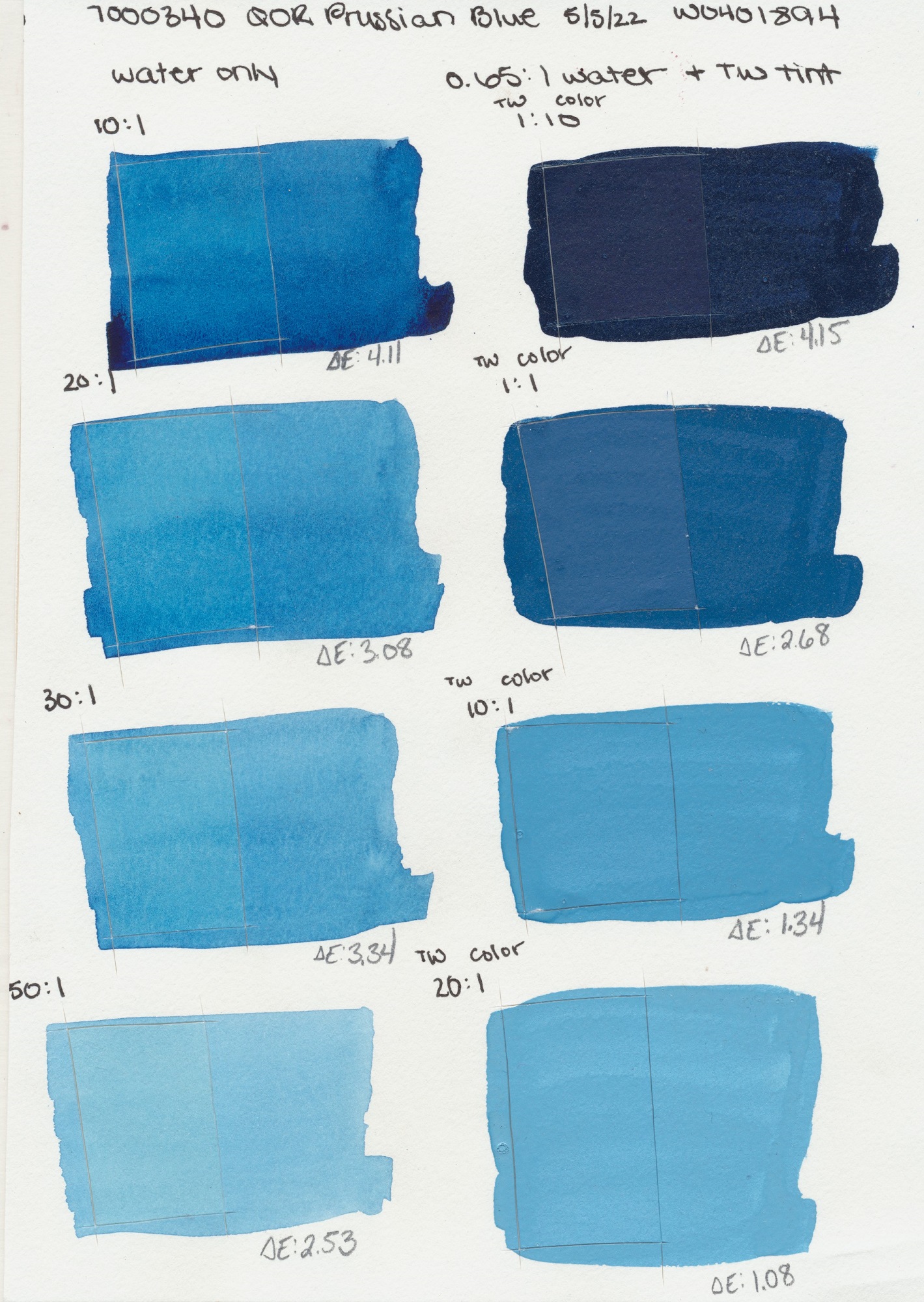
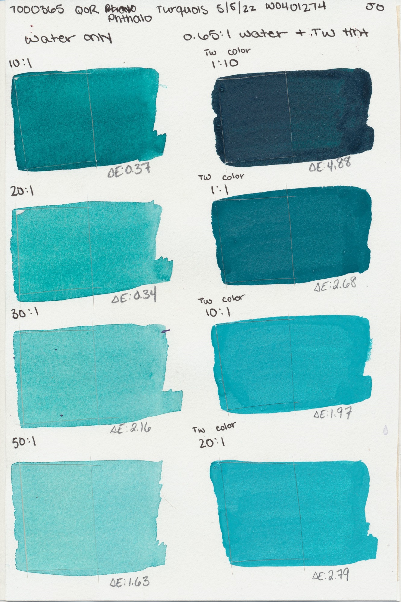
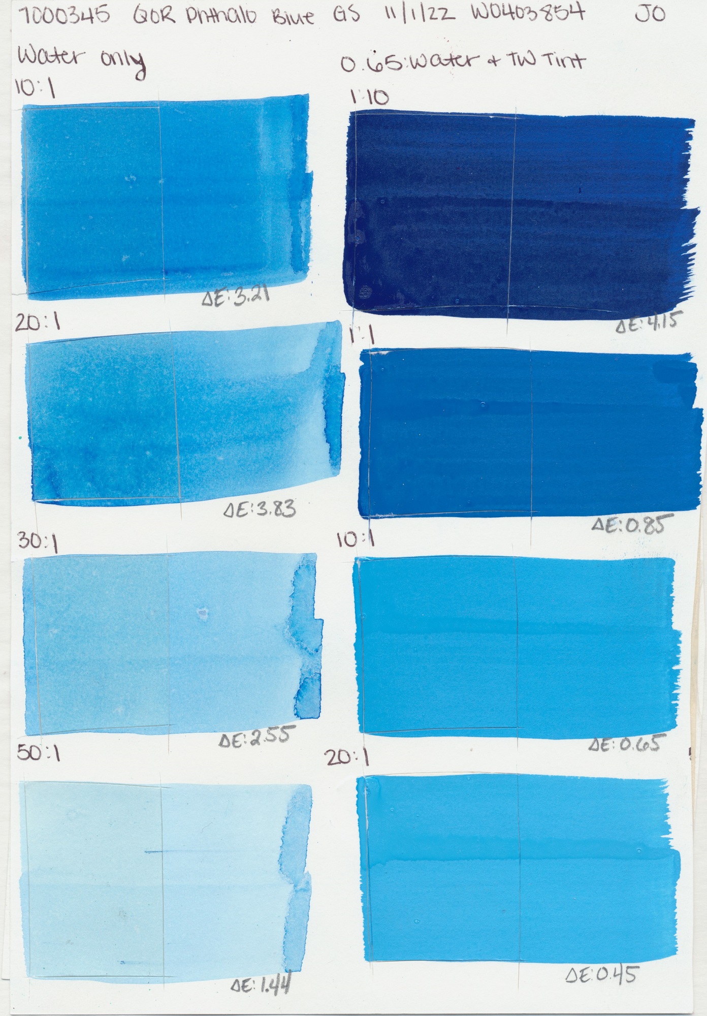
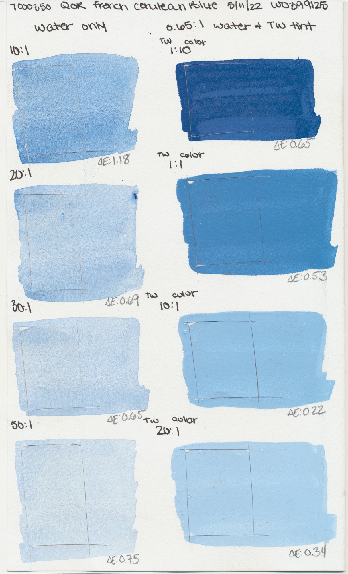
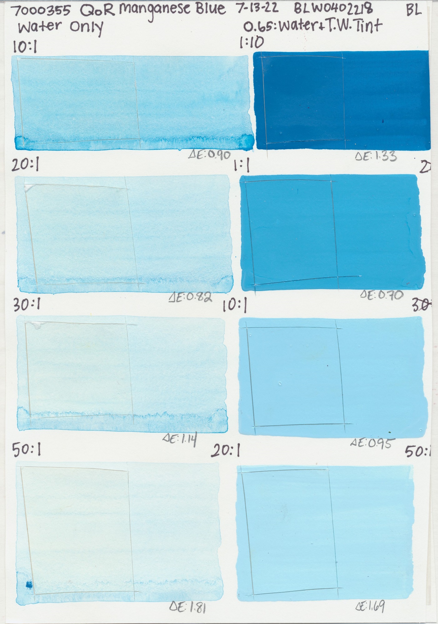
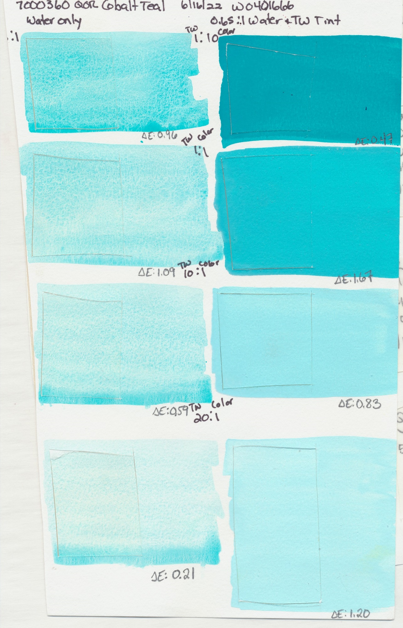
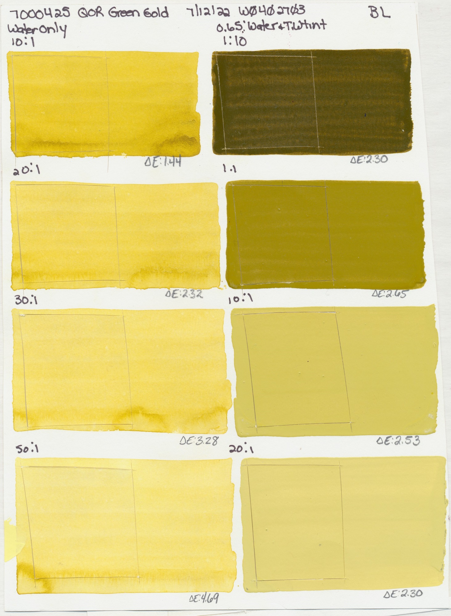
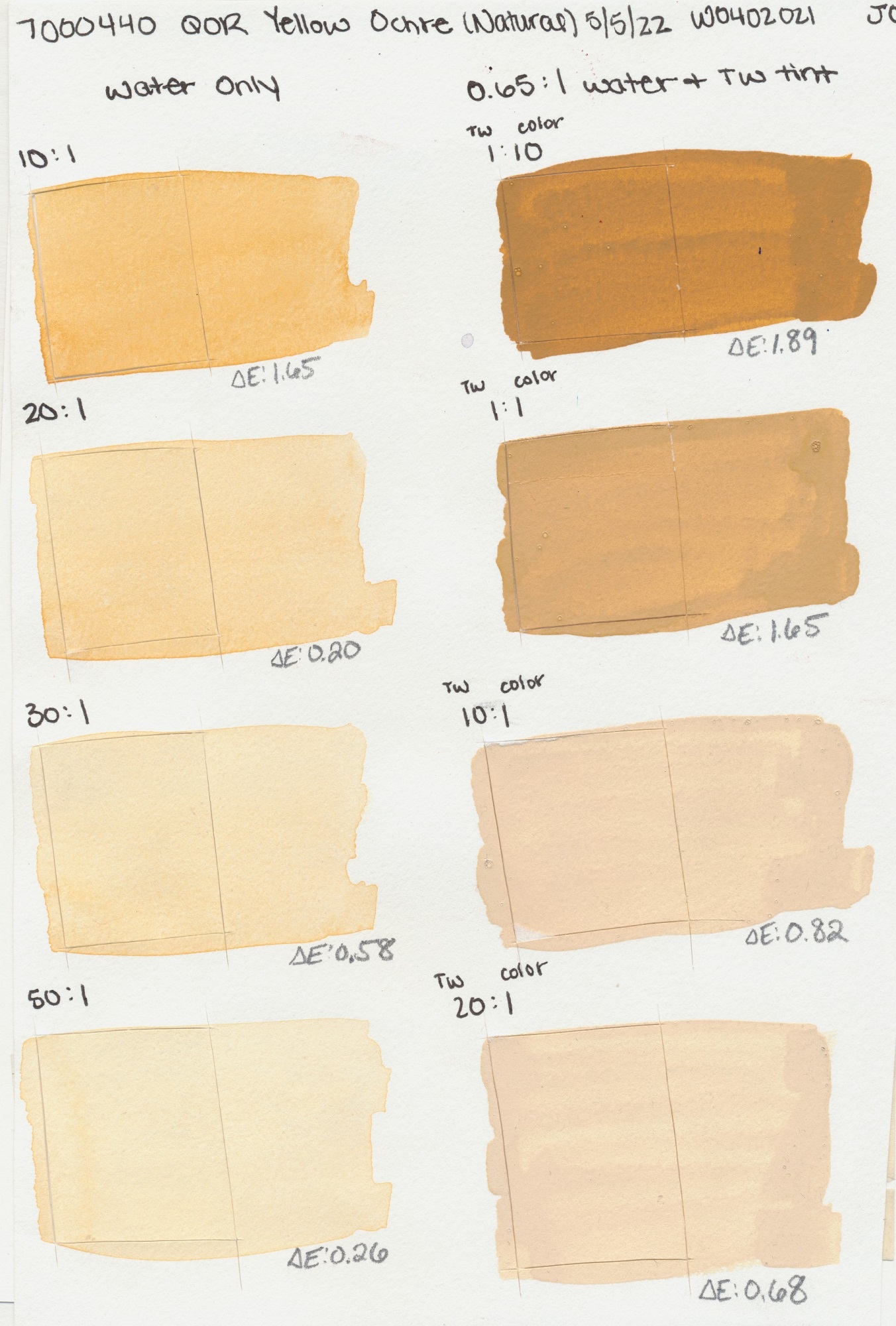
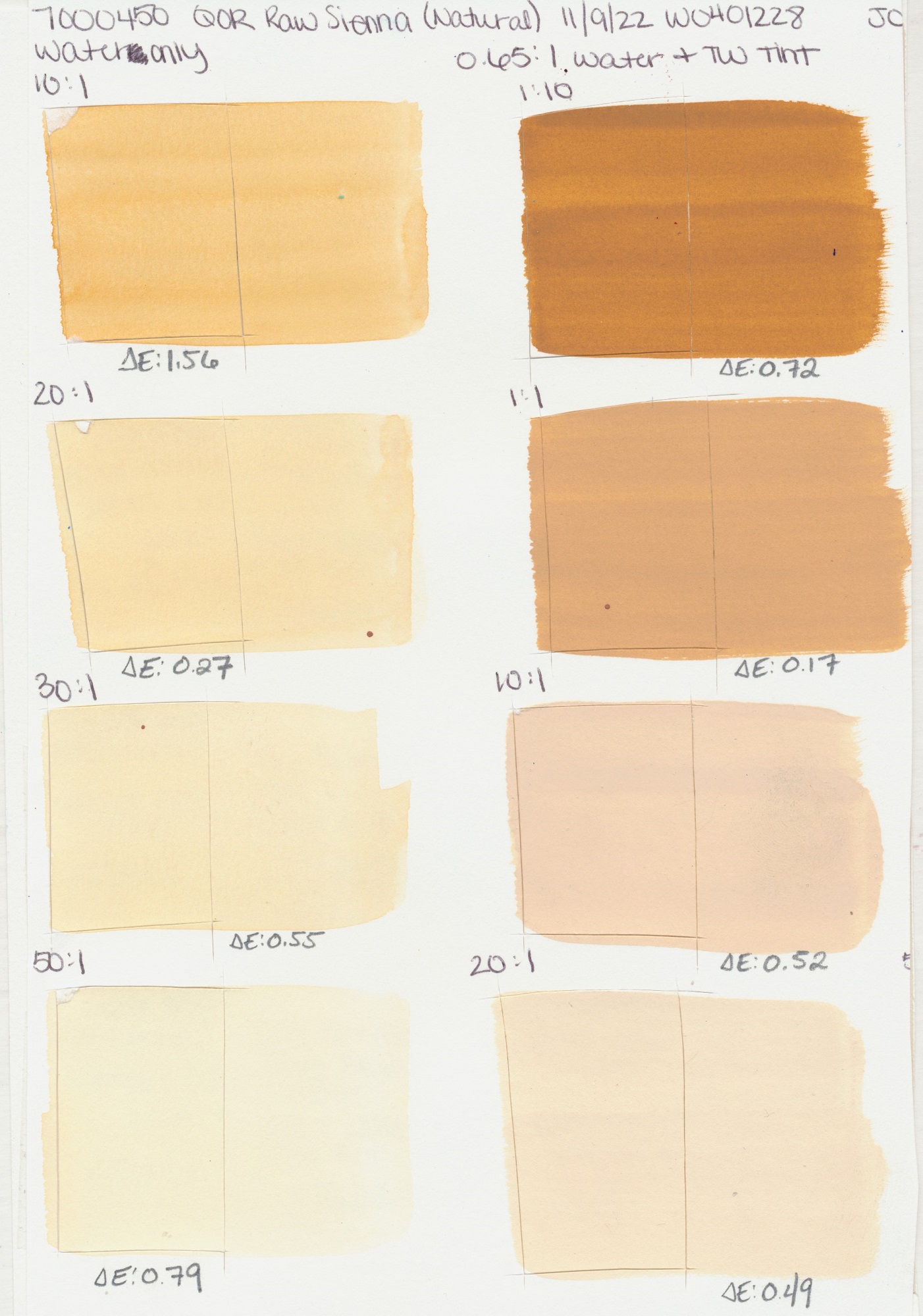
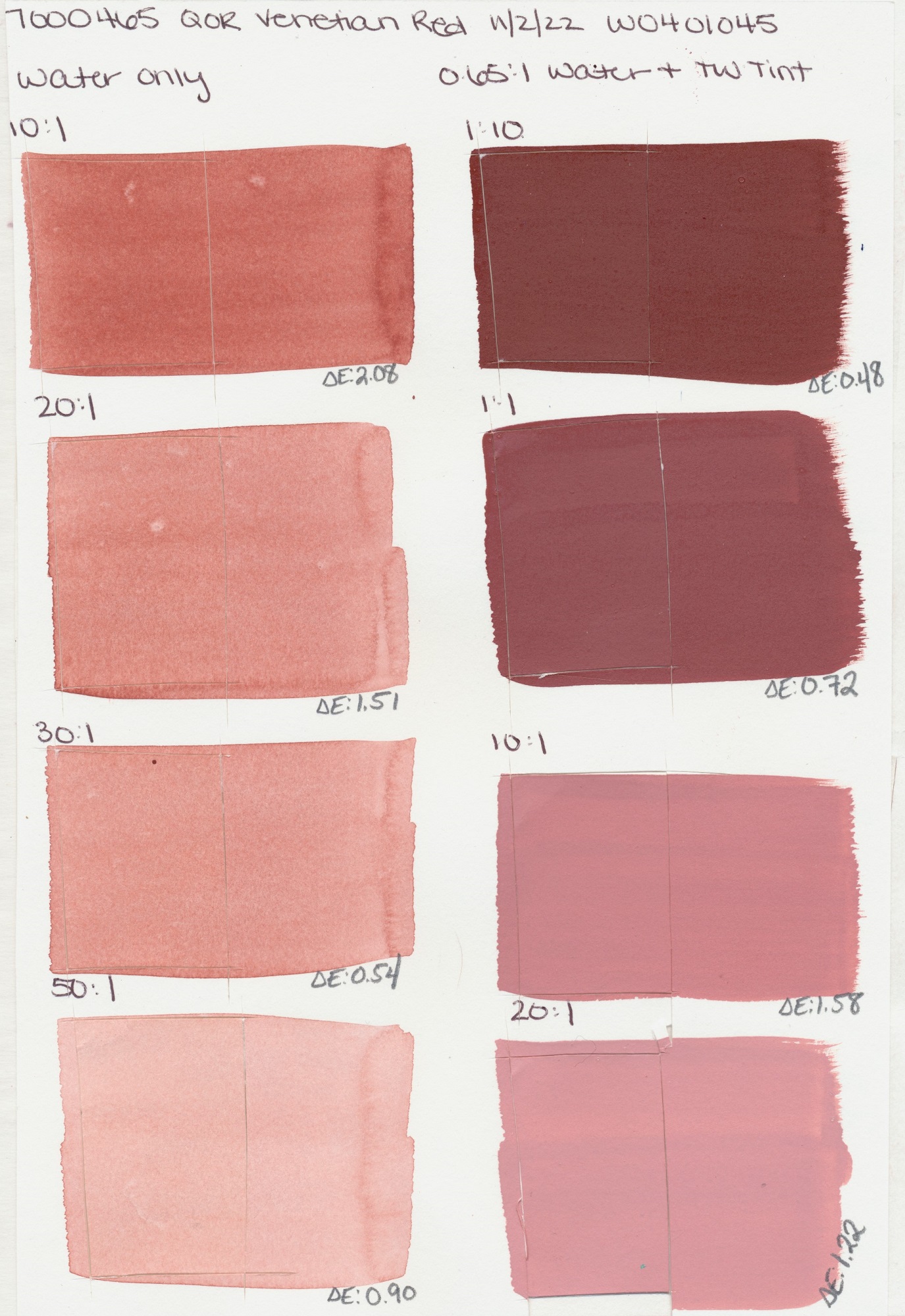
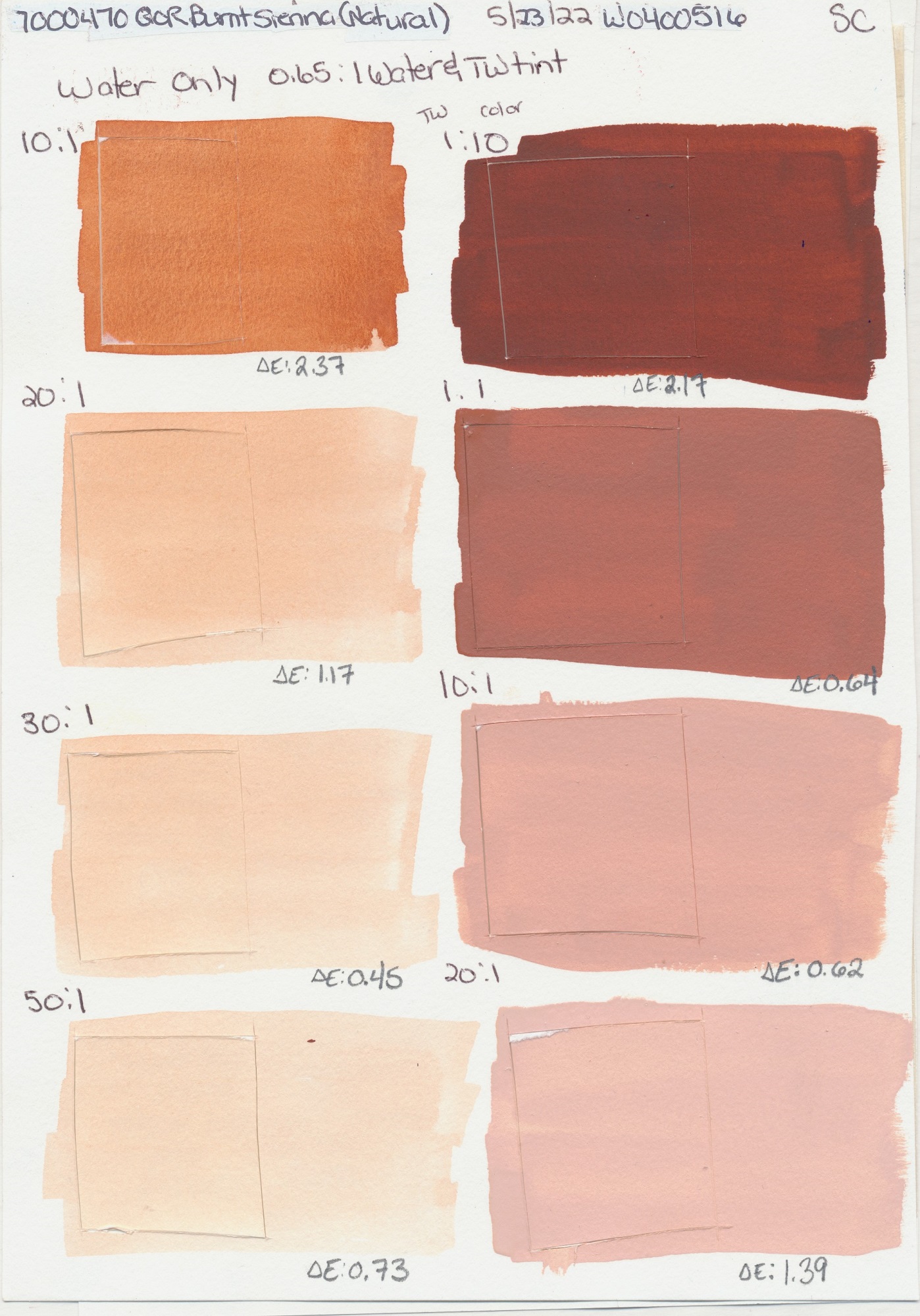
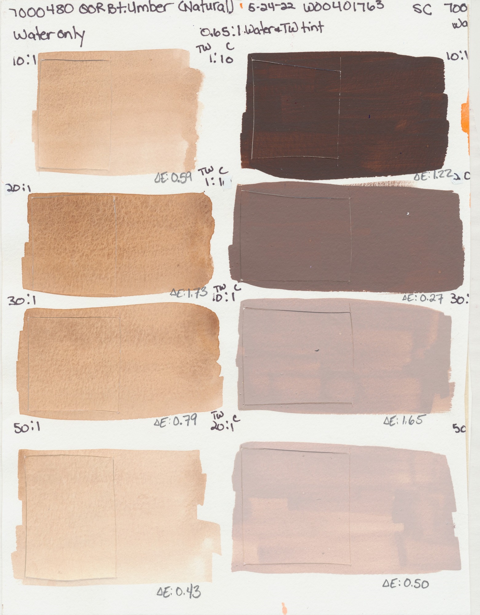
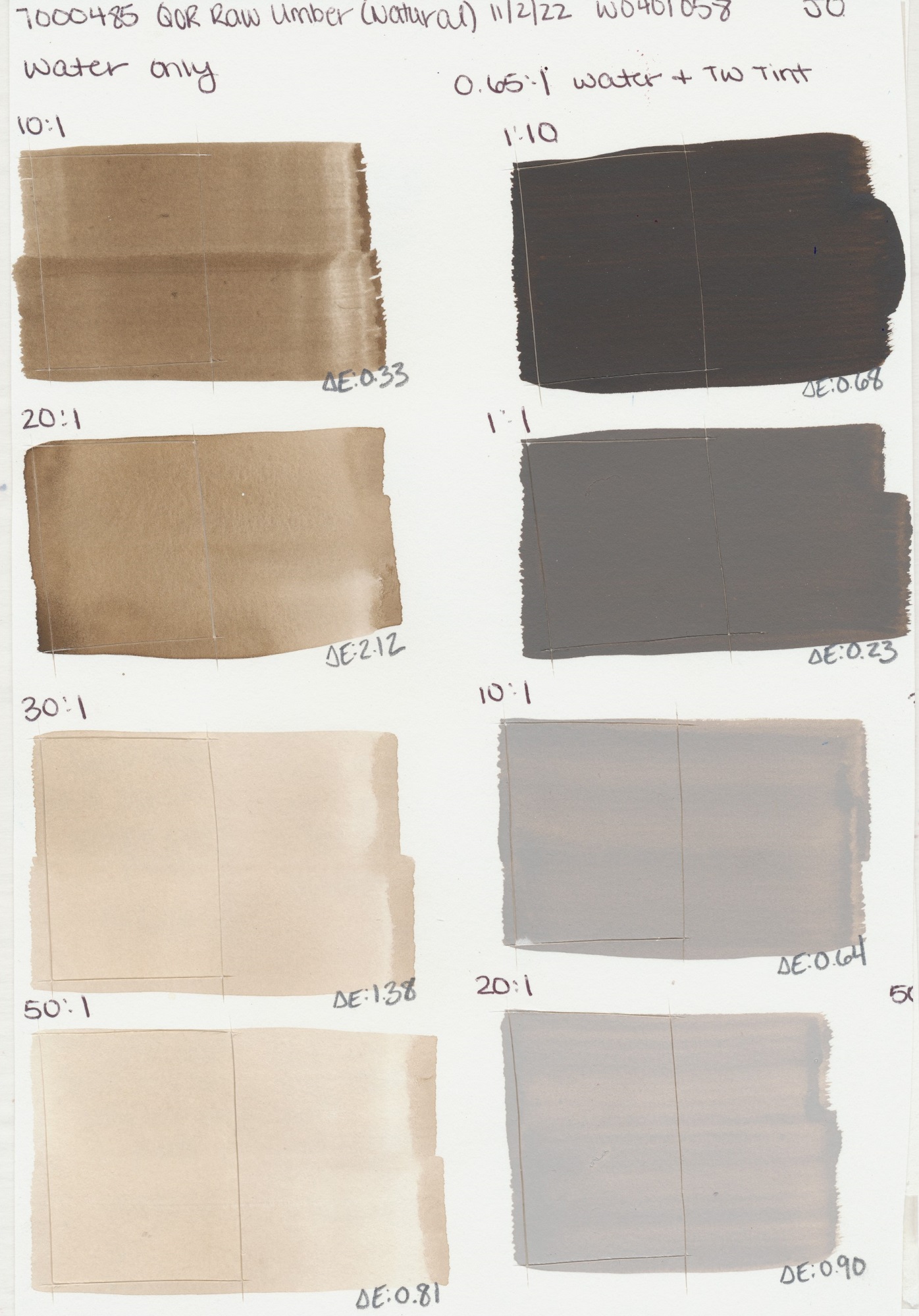
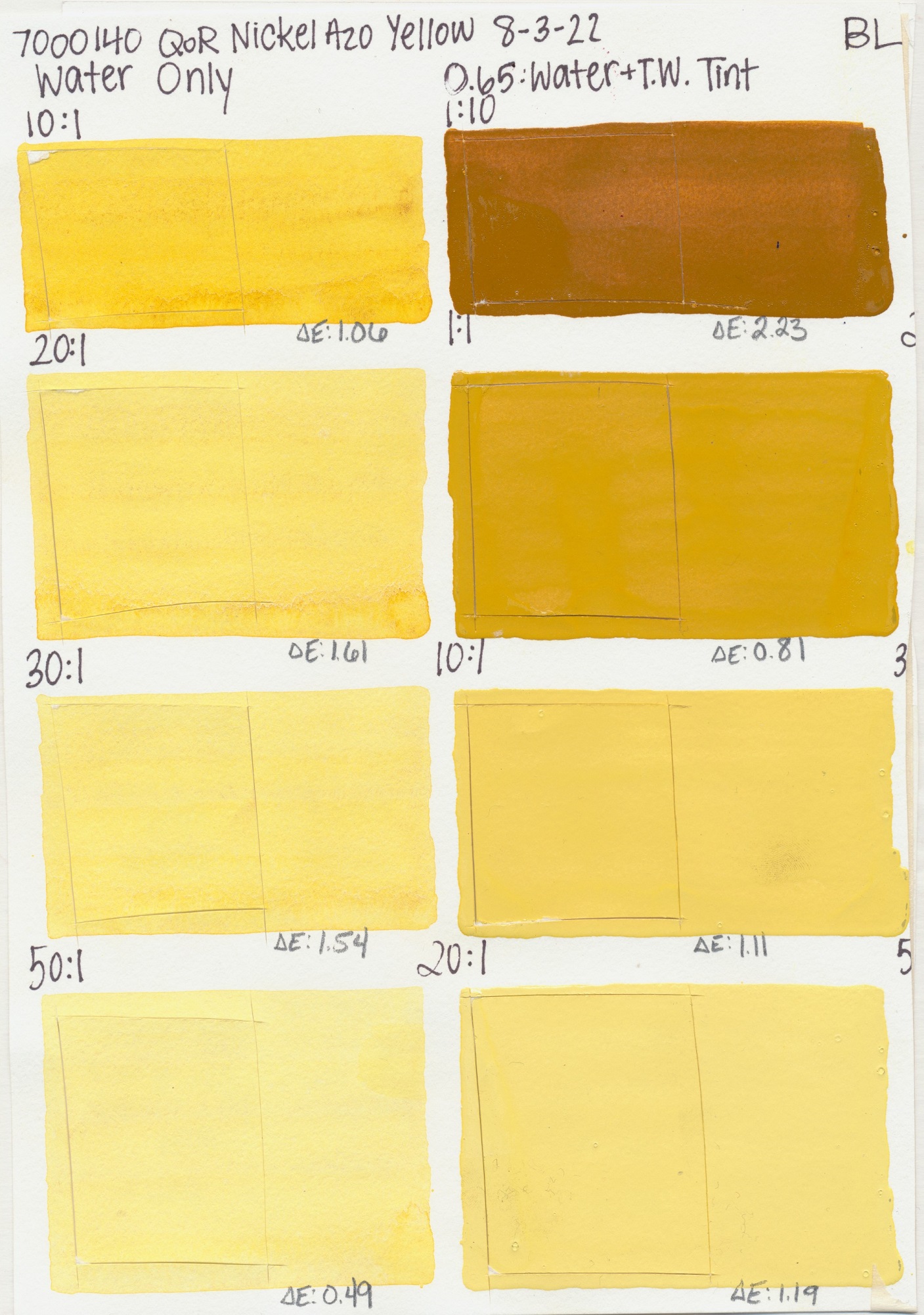
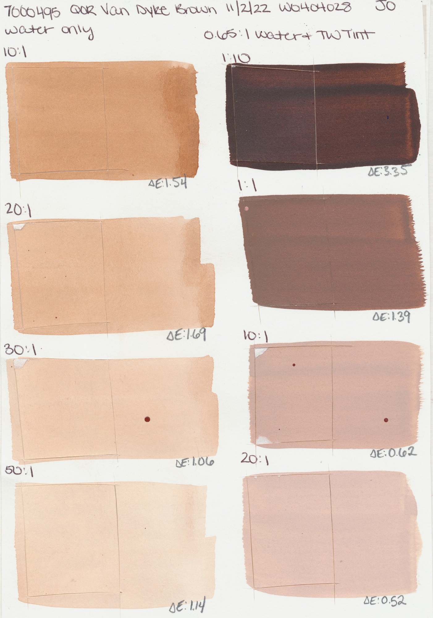
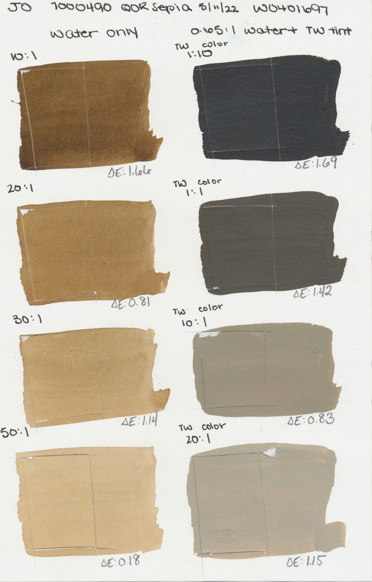
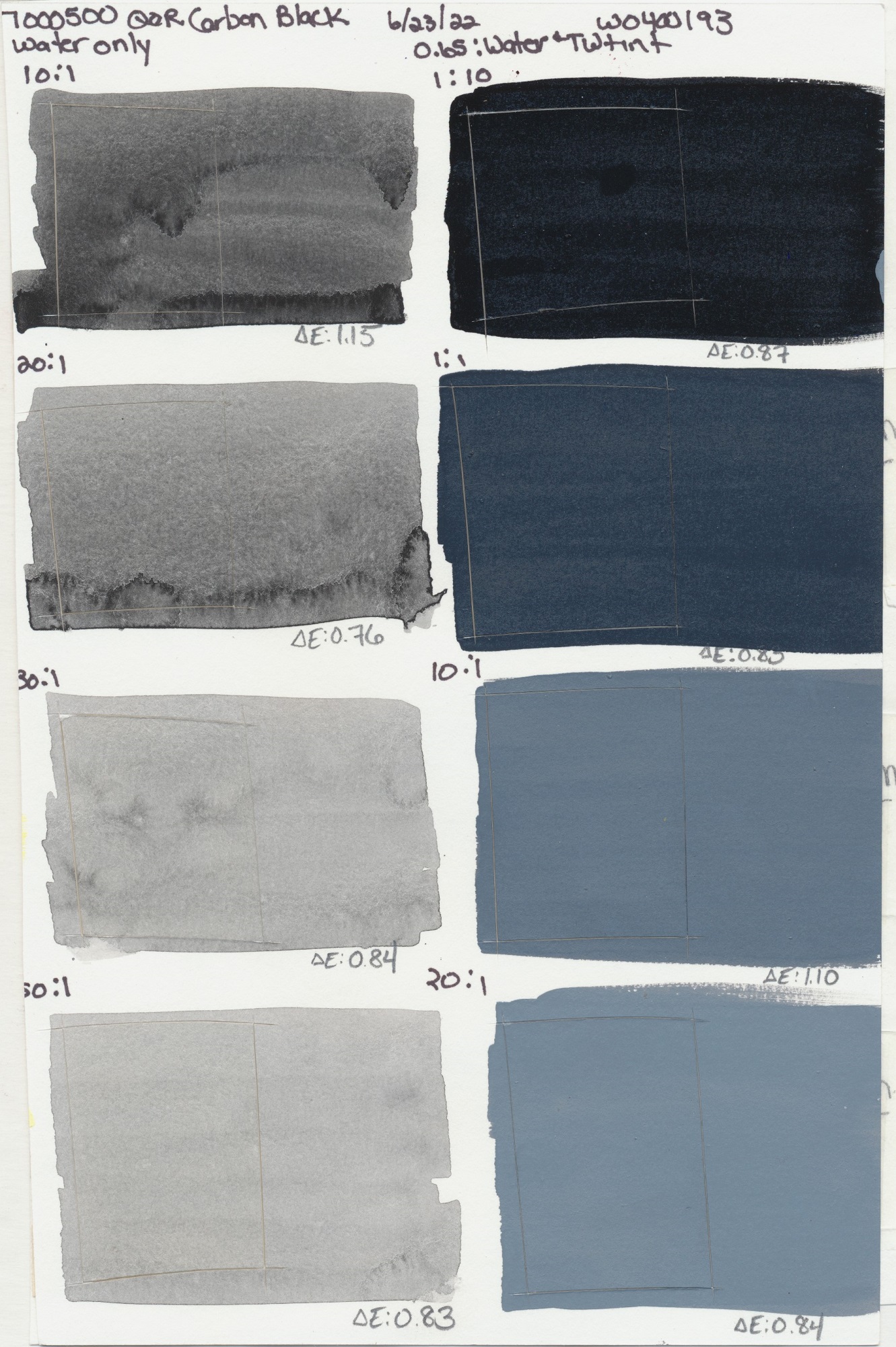
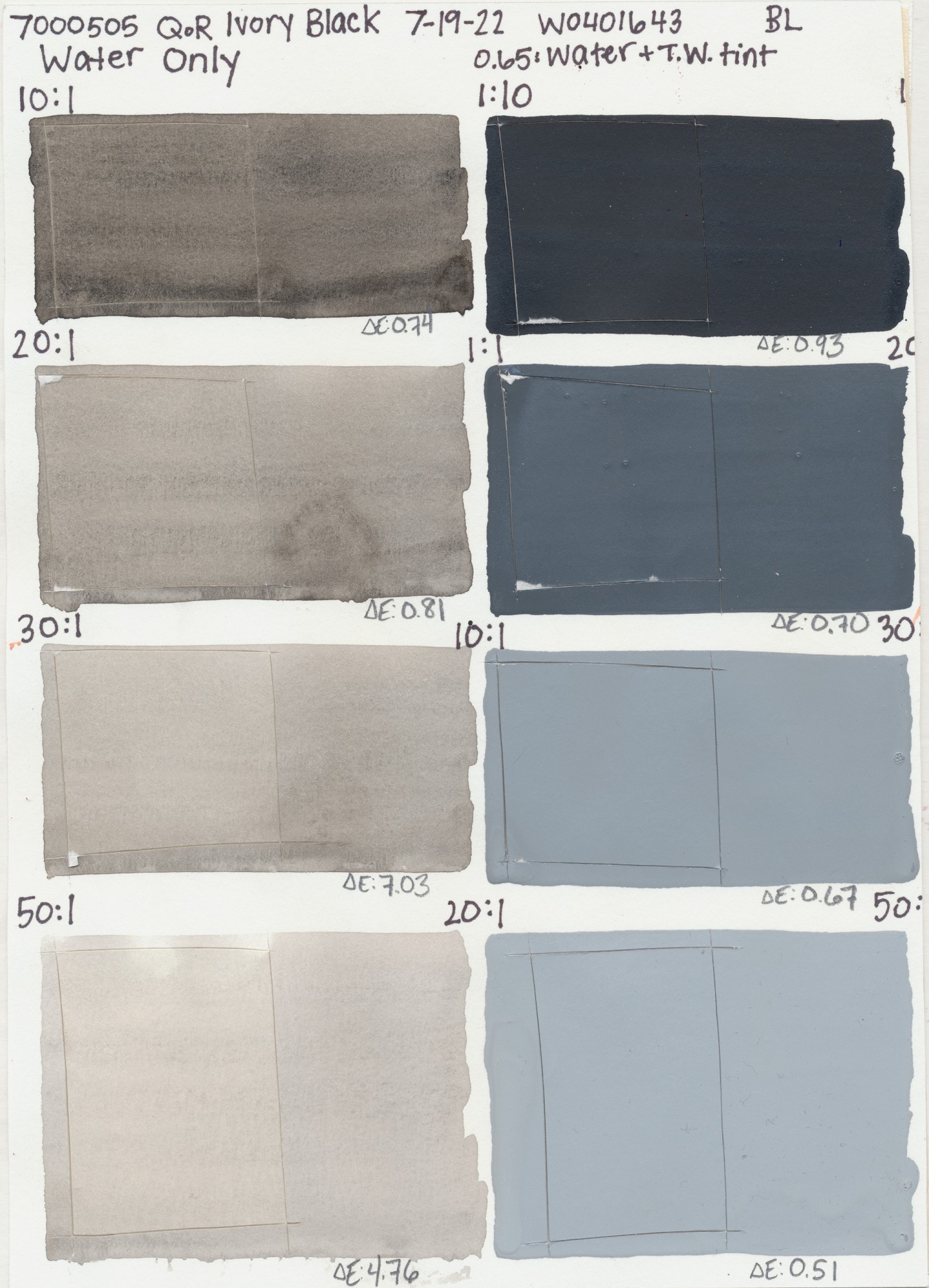
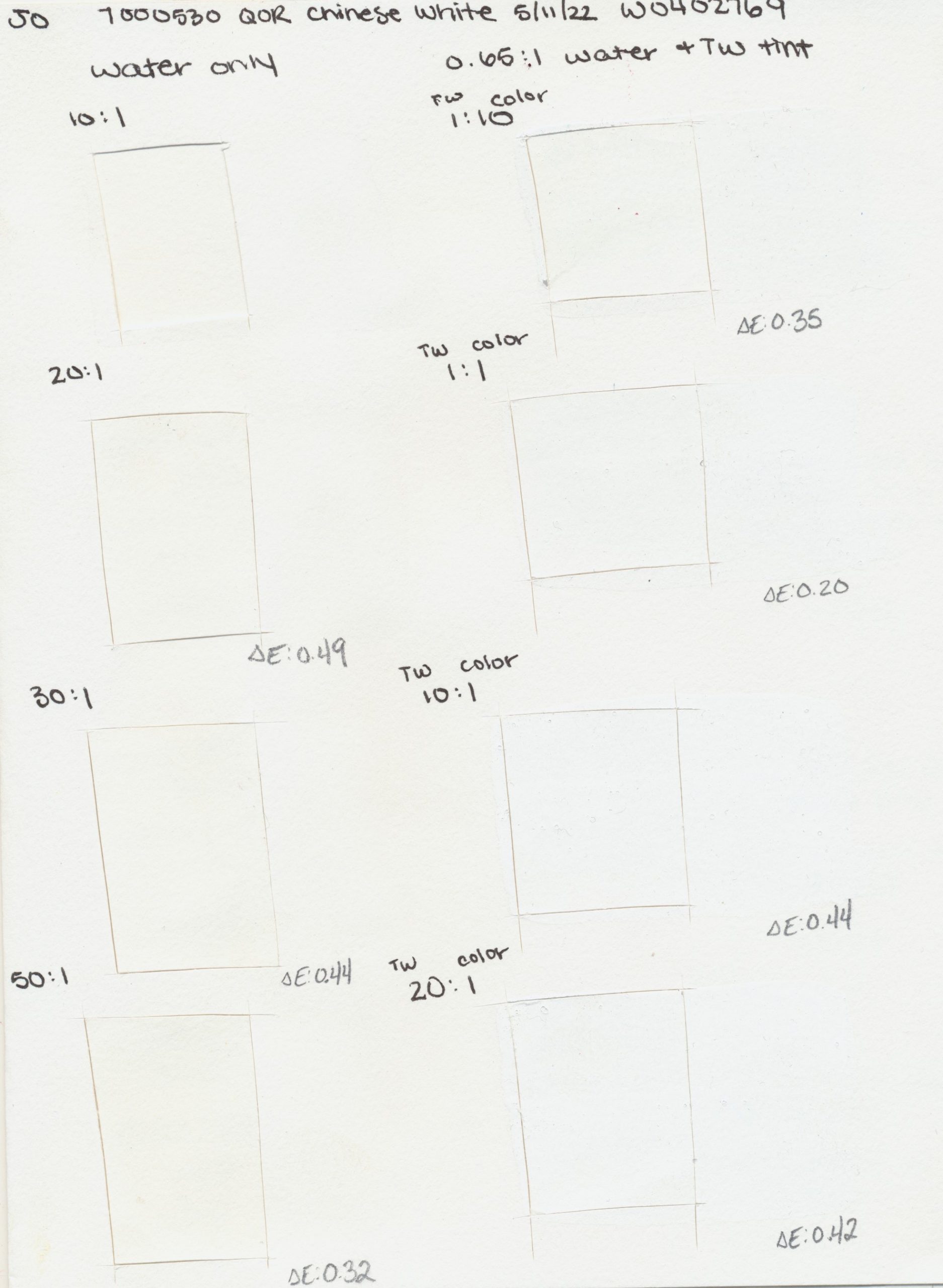
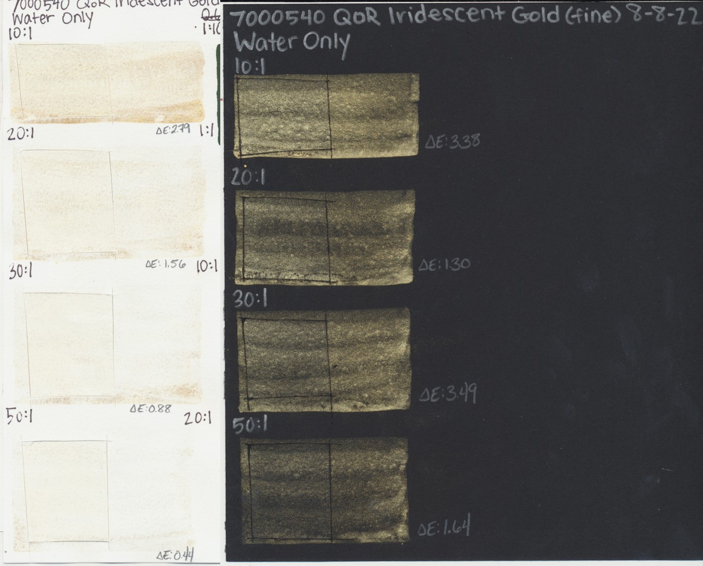
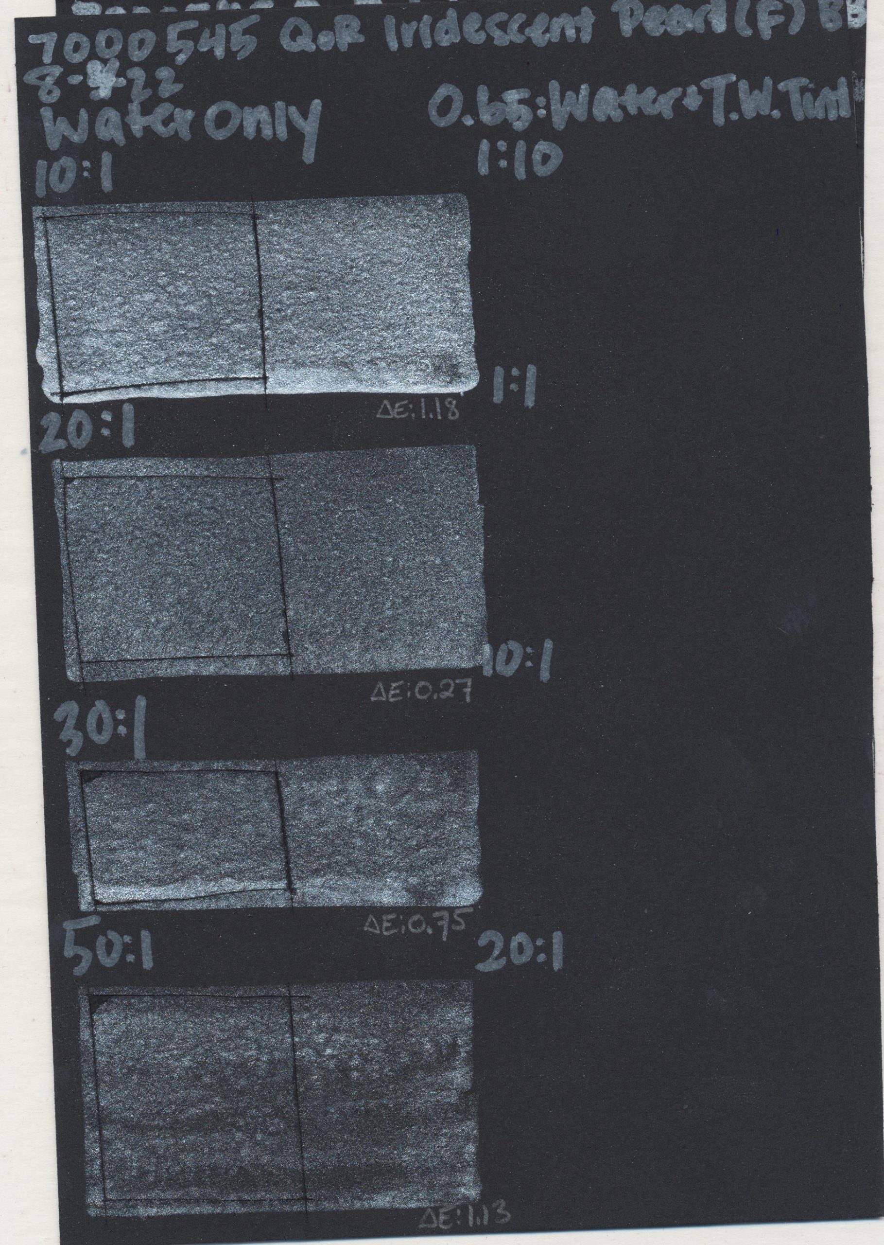
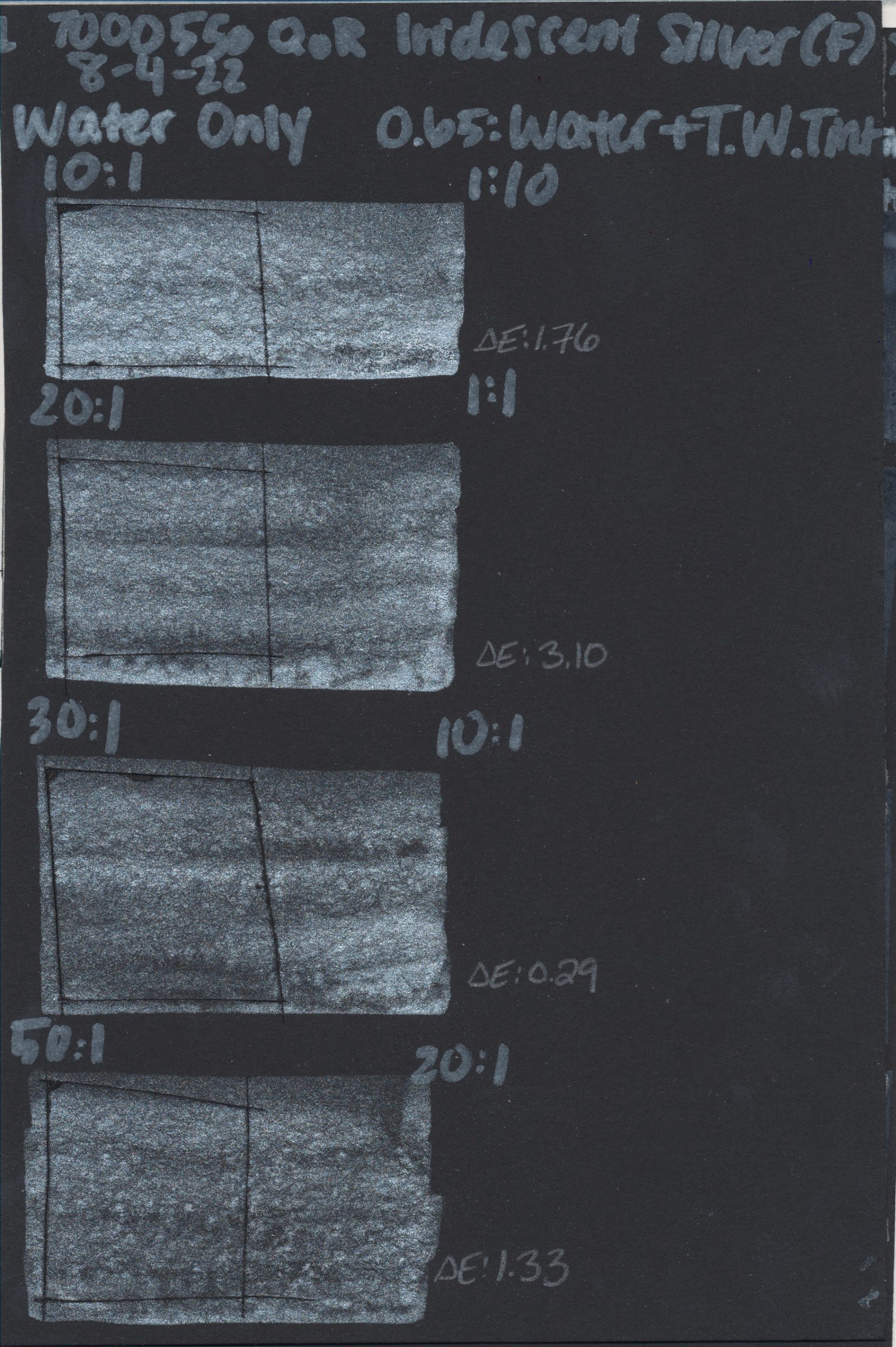
In order to account for a wider array of realistic artist applications, we expanded our testing methods by including a range of dilutions from 10:1 up to 50:1 (water to watercolor). We also included tints of every QoR watercolor in a range of ratios with QoR Titanium White, except our iridescent colors, as this produces a weak tint and diminishes their overall effect. Incorporating tints was important to us so as to address lightfastness concerns watercolorists have expressed since our article on Hansa Yellow. All watercolor tests were created on Canson Foundation paper, to use a utility grade paper over premium alternatives.
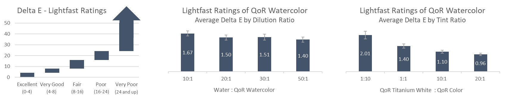
All samples had radiant exposure of 510 KJ(m2‧nm) at 340nm within our xenon arc chamber, which is equivalent to roughly 100 years of indoor gallery lighting conditions. After exposure, these samples were scanned against the control using our spectrophotometer to get Delta E ratings, which is the standard unit for quantifying a visible color change or color fading. In total, we tested 84 QoR watercolors and between all of the dilutions, tints and controls, we did 4,032 spectrophotometer readings. Each test sample and control was scanned three times, then averaged, for their Delta E number.
Test Results
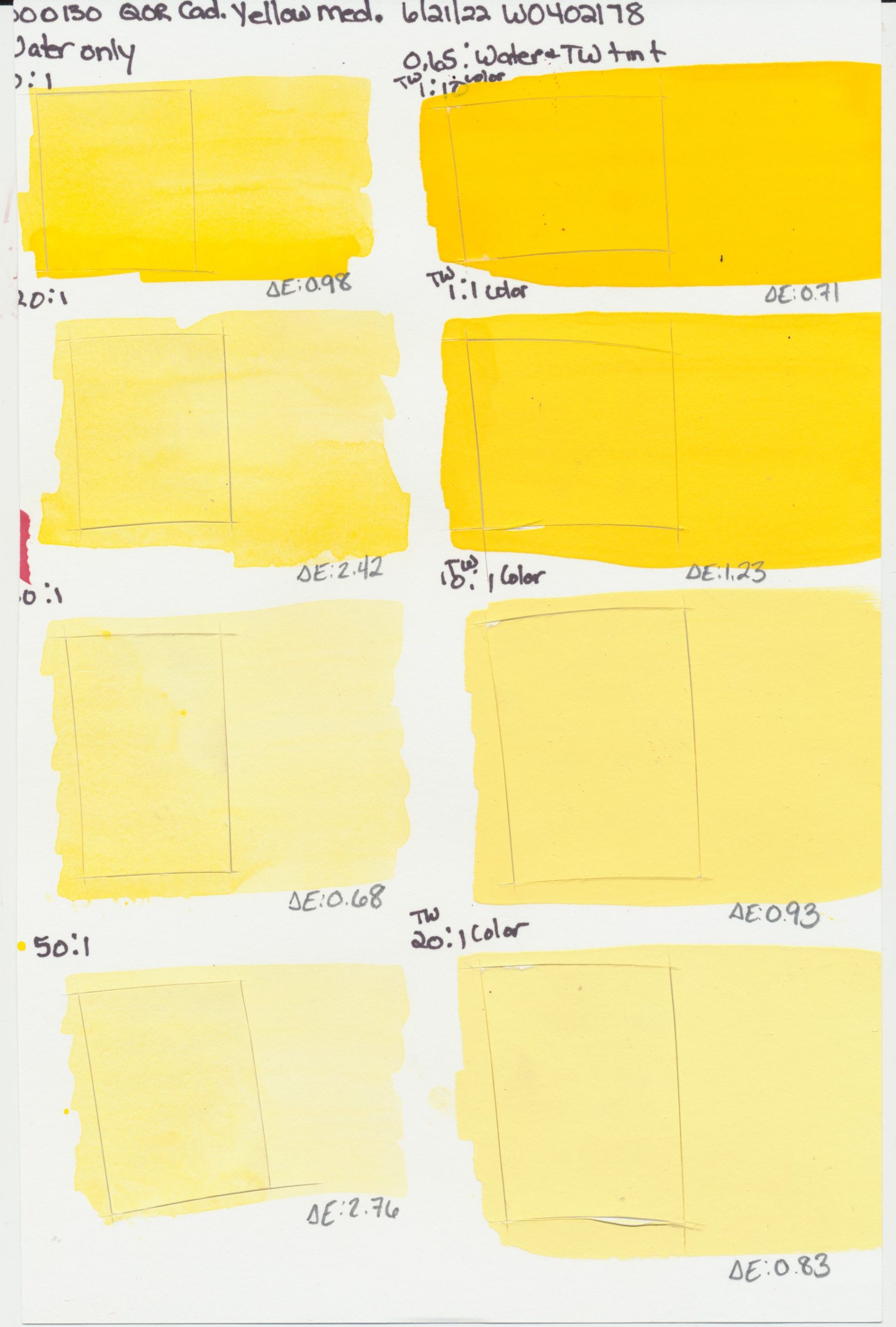
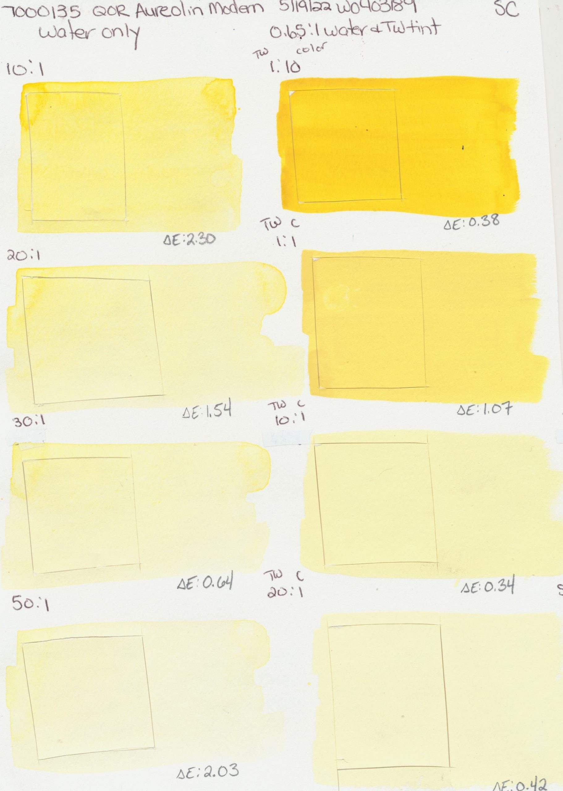
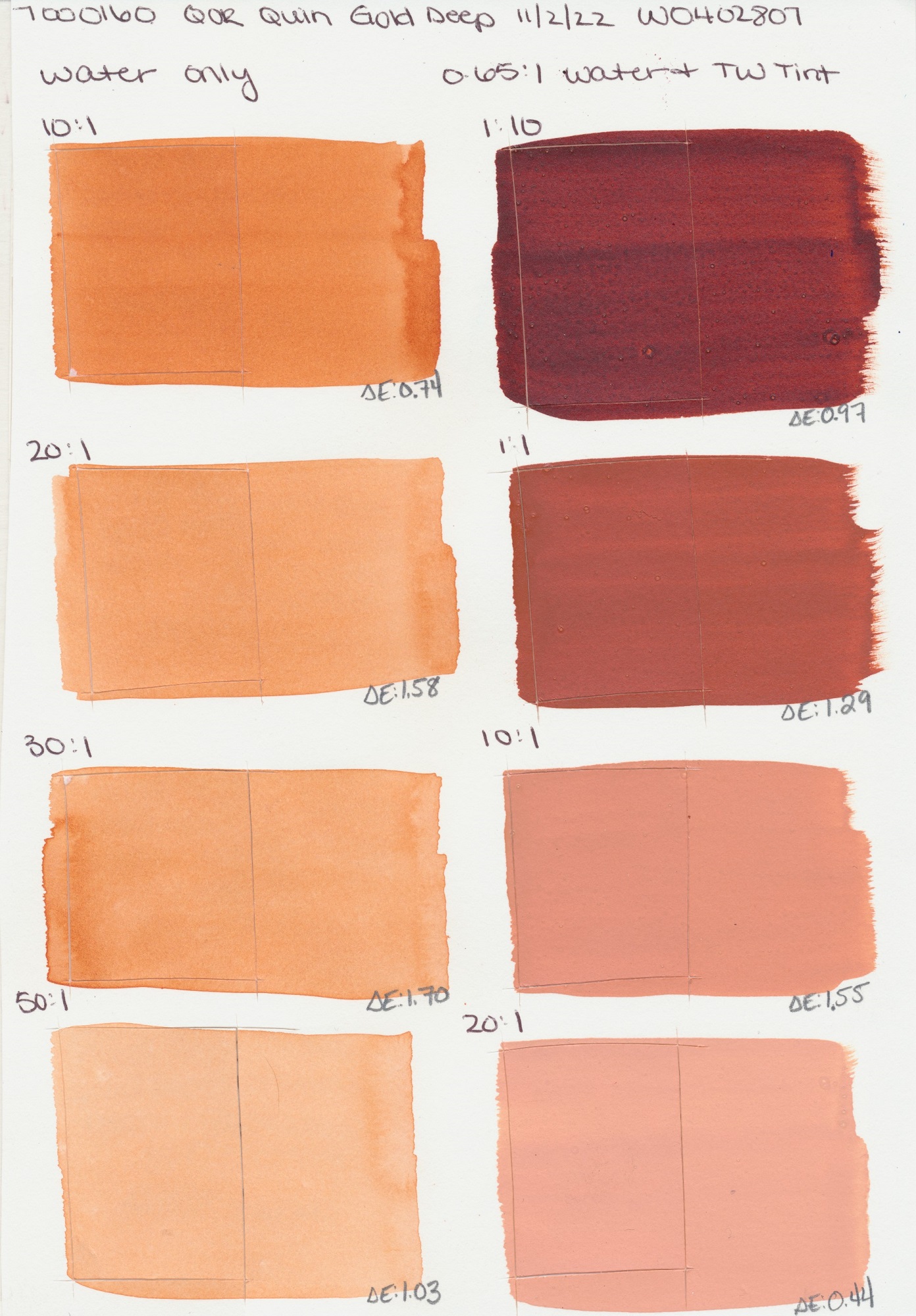
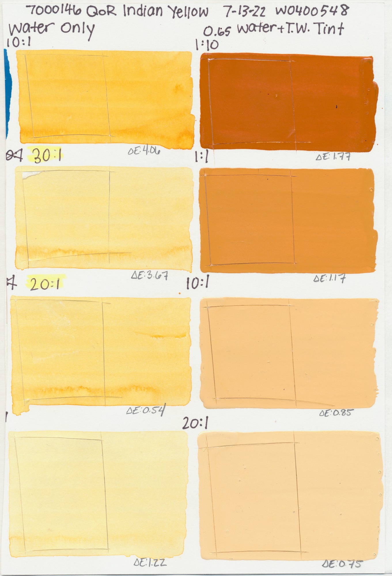
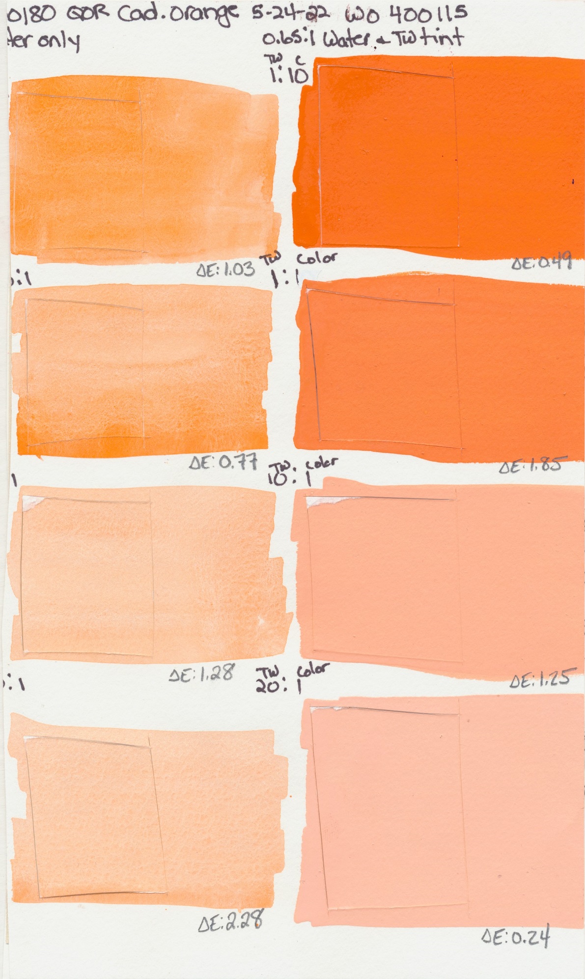
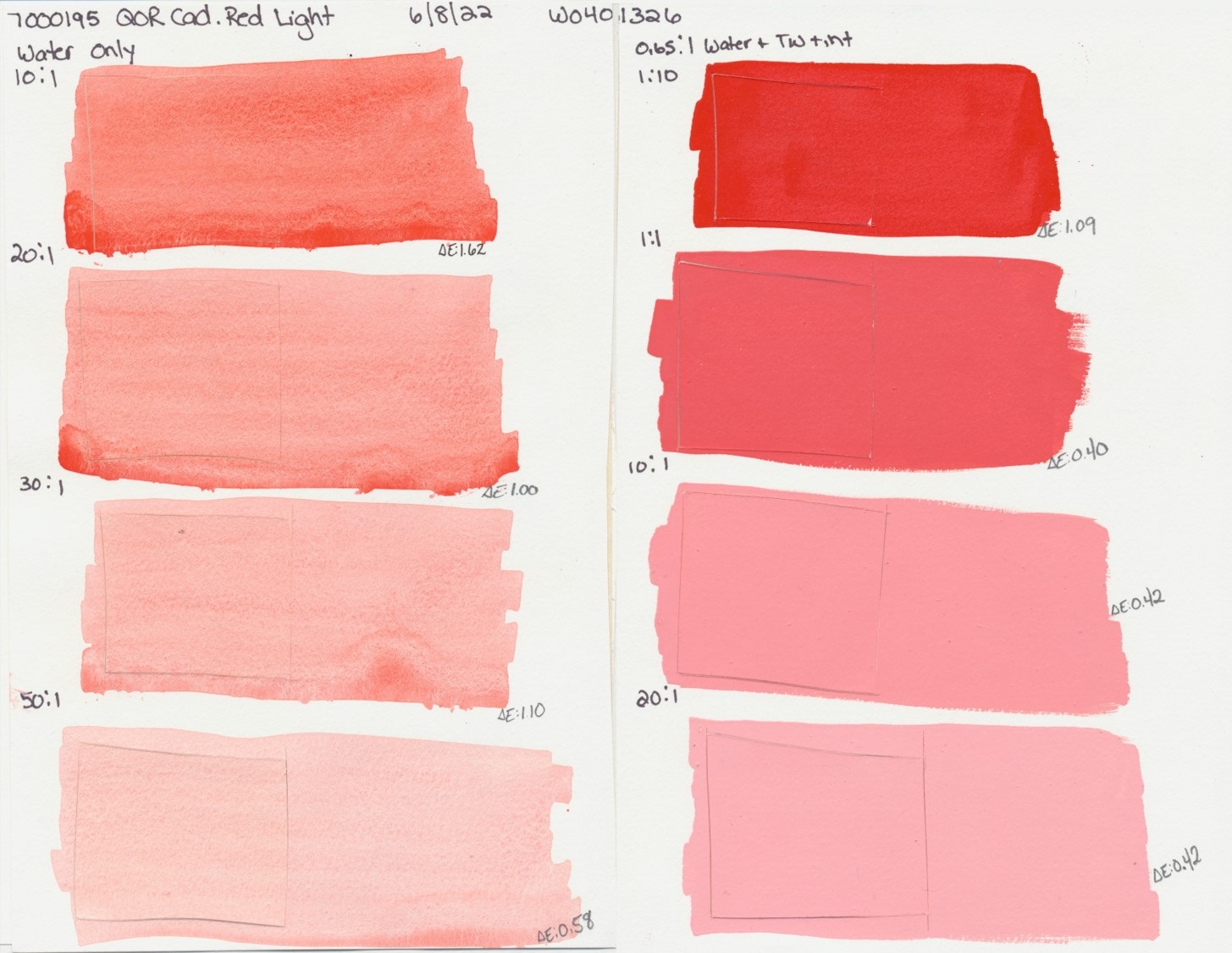
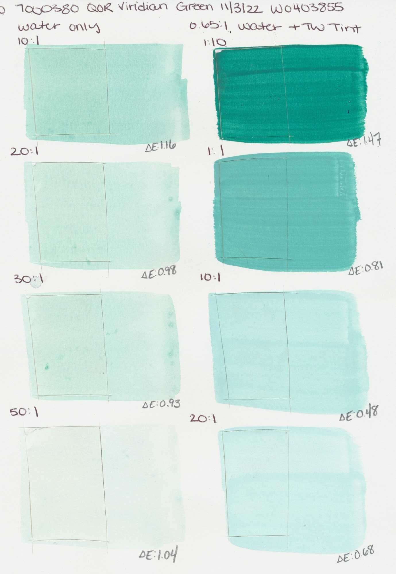
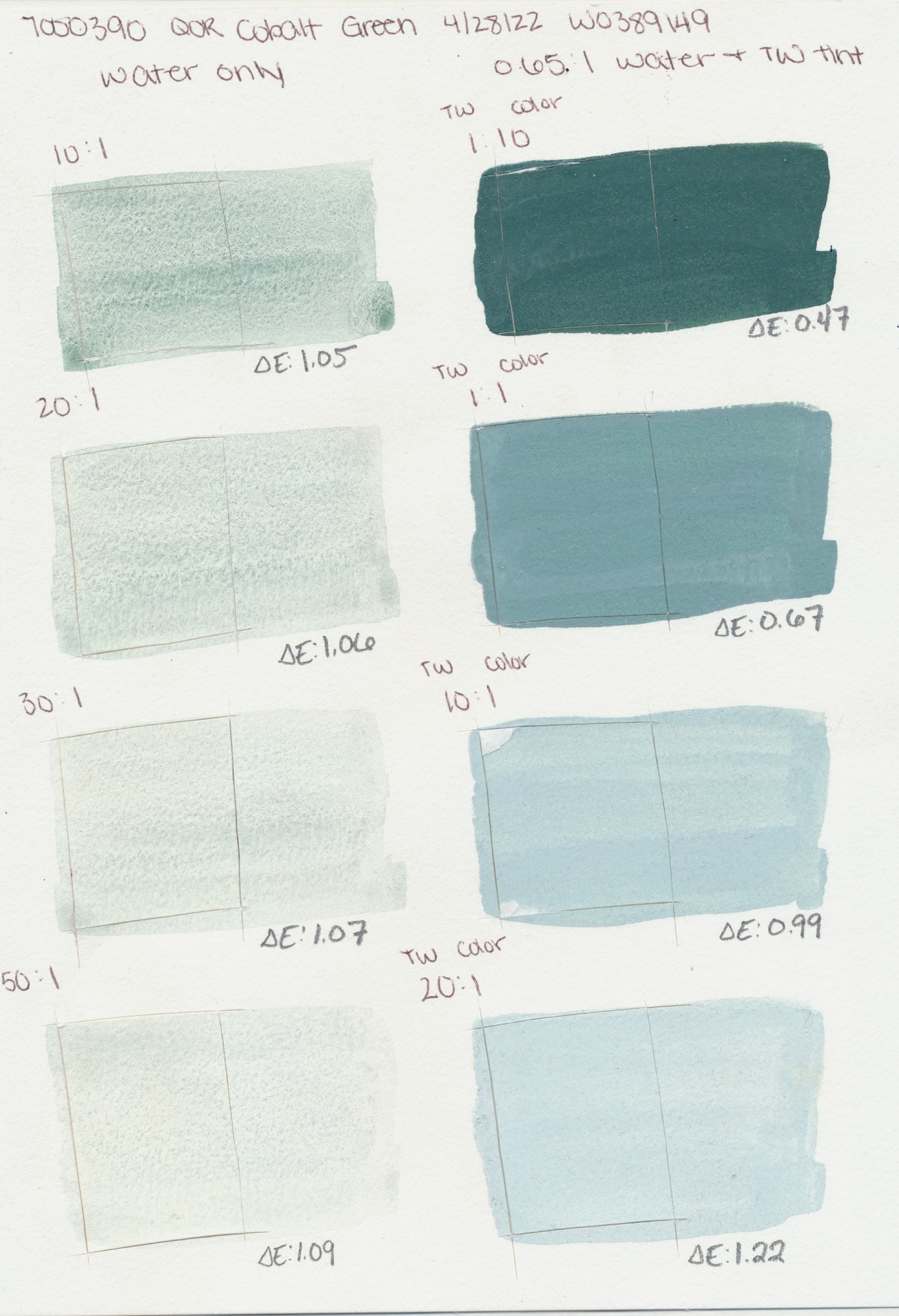
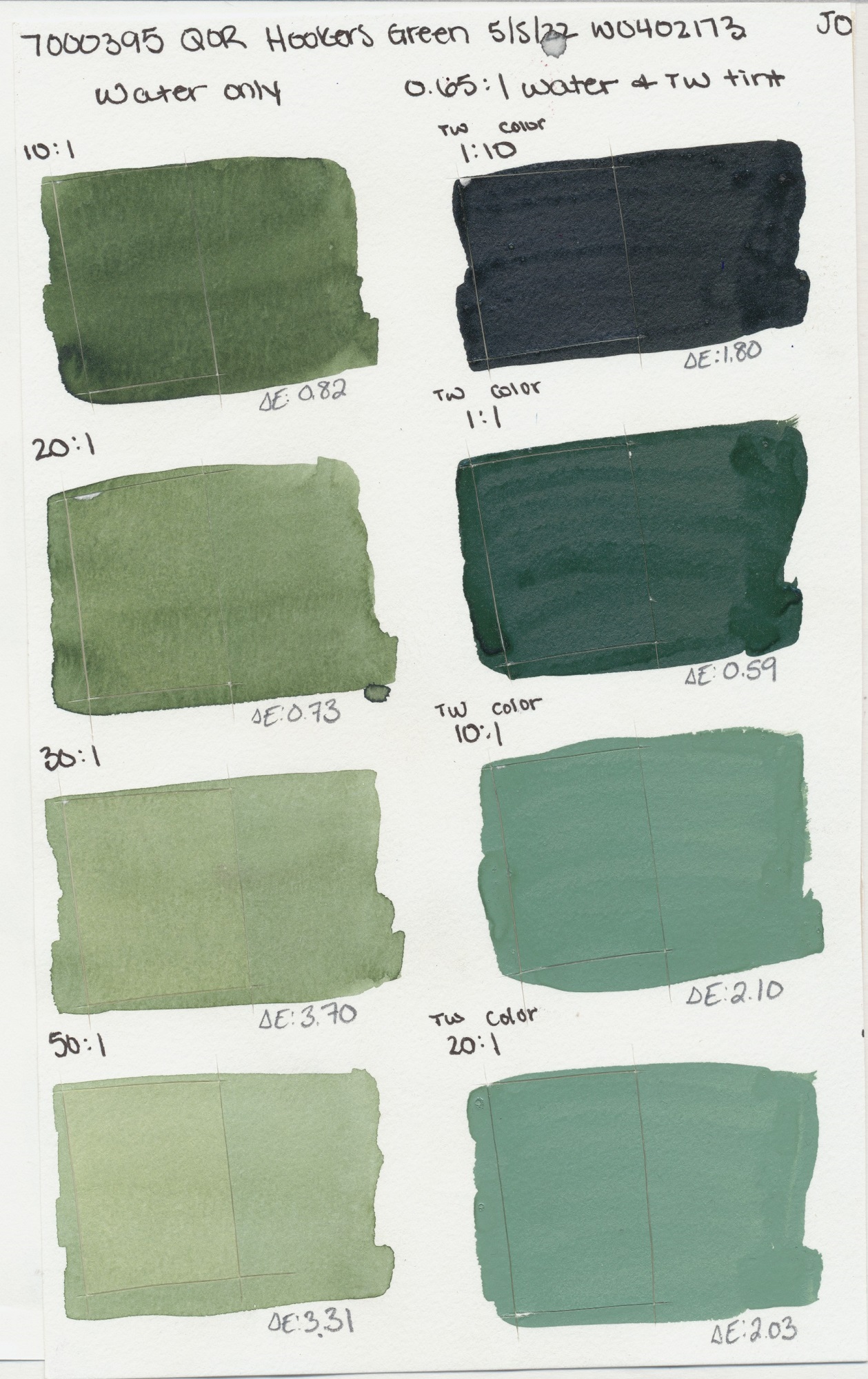
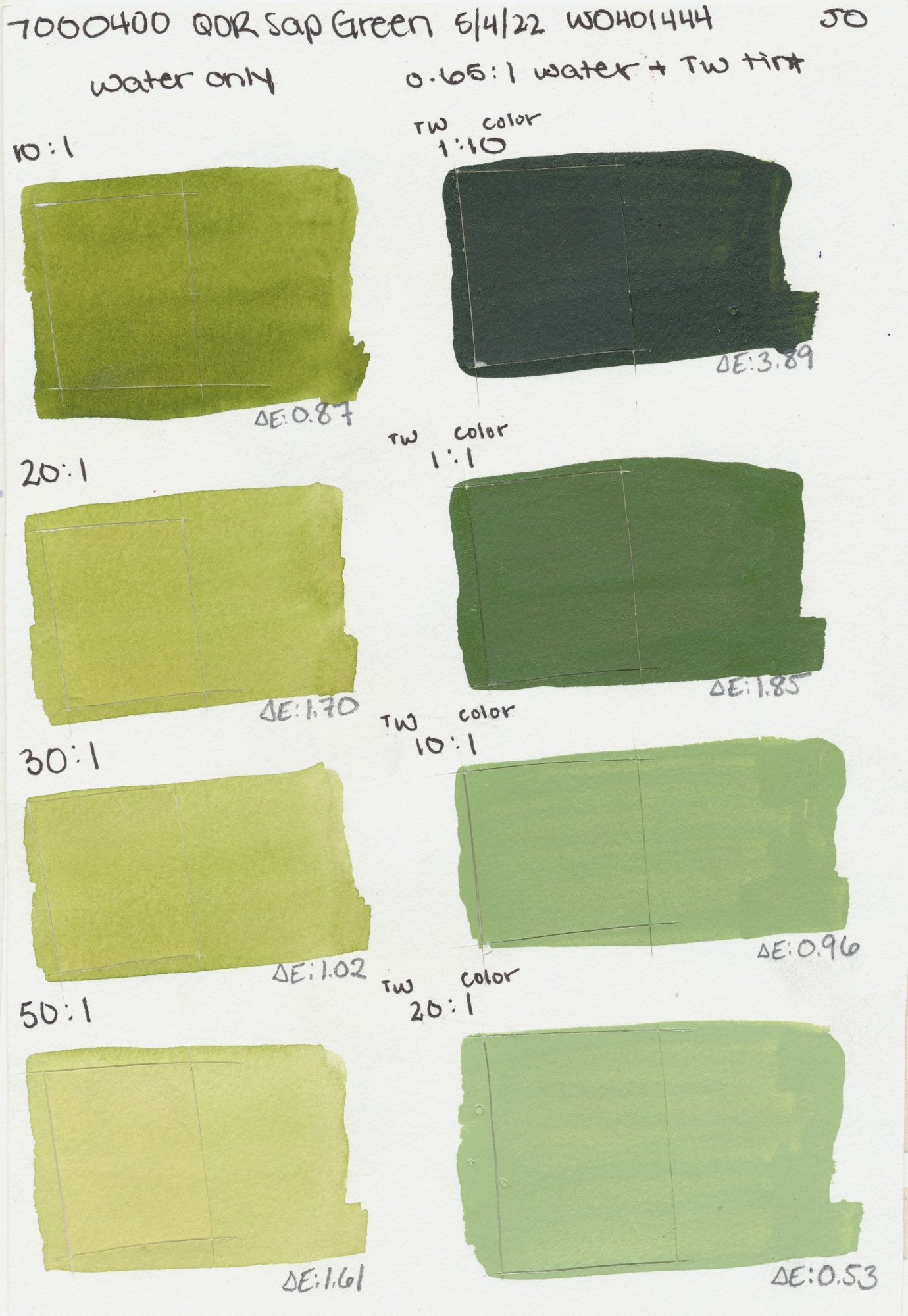
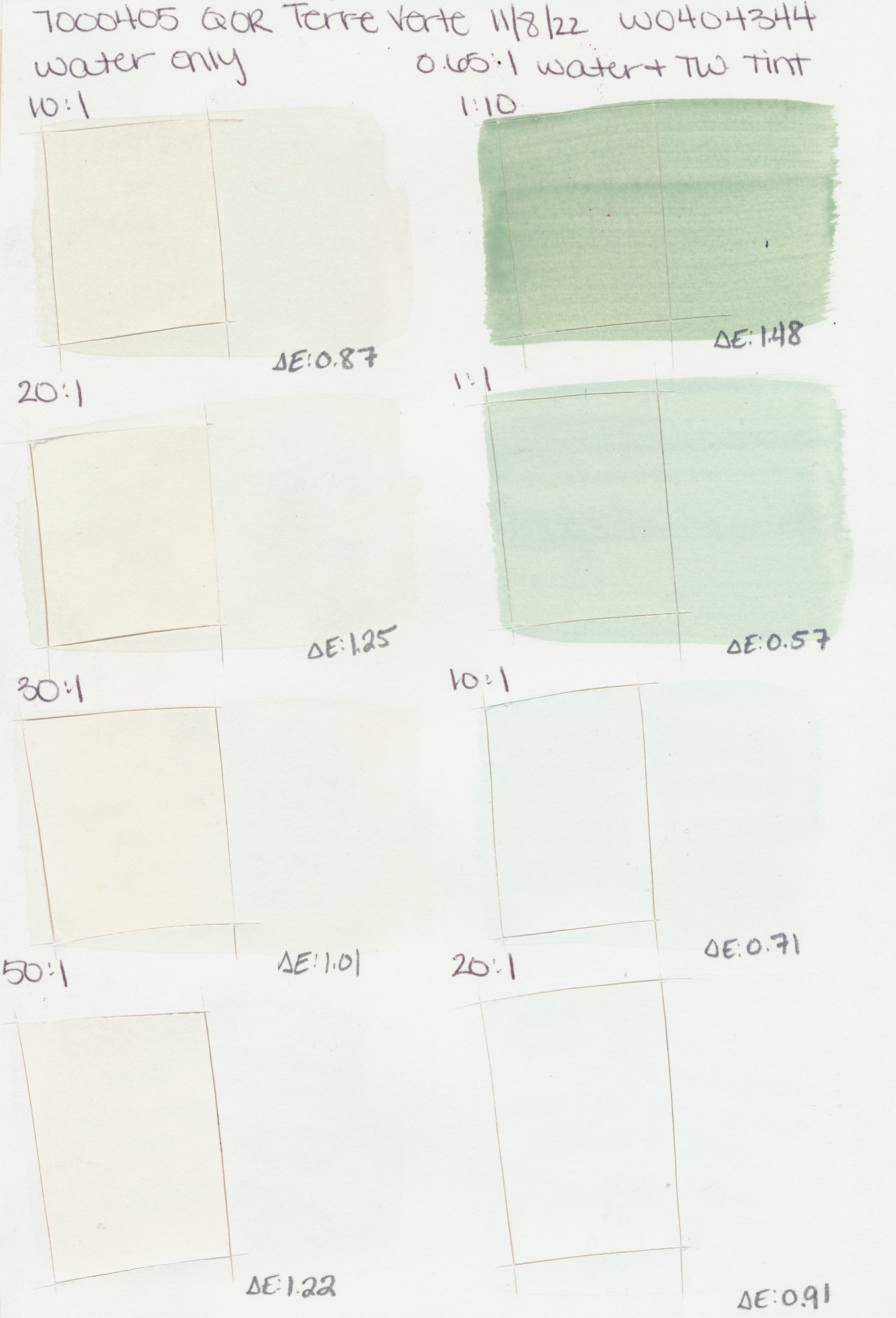
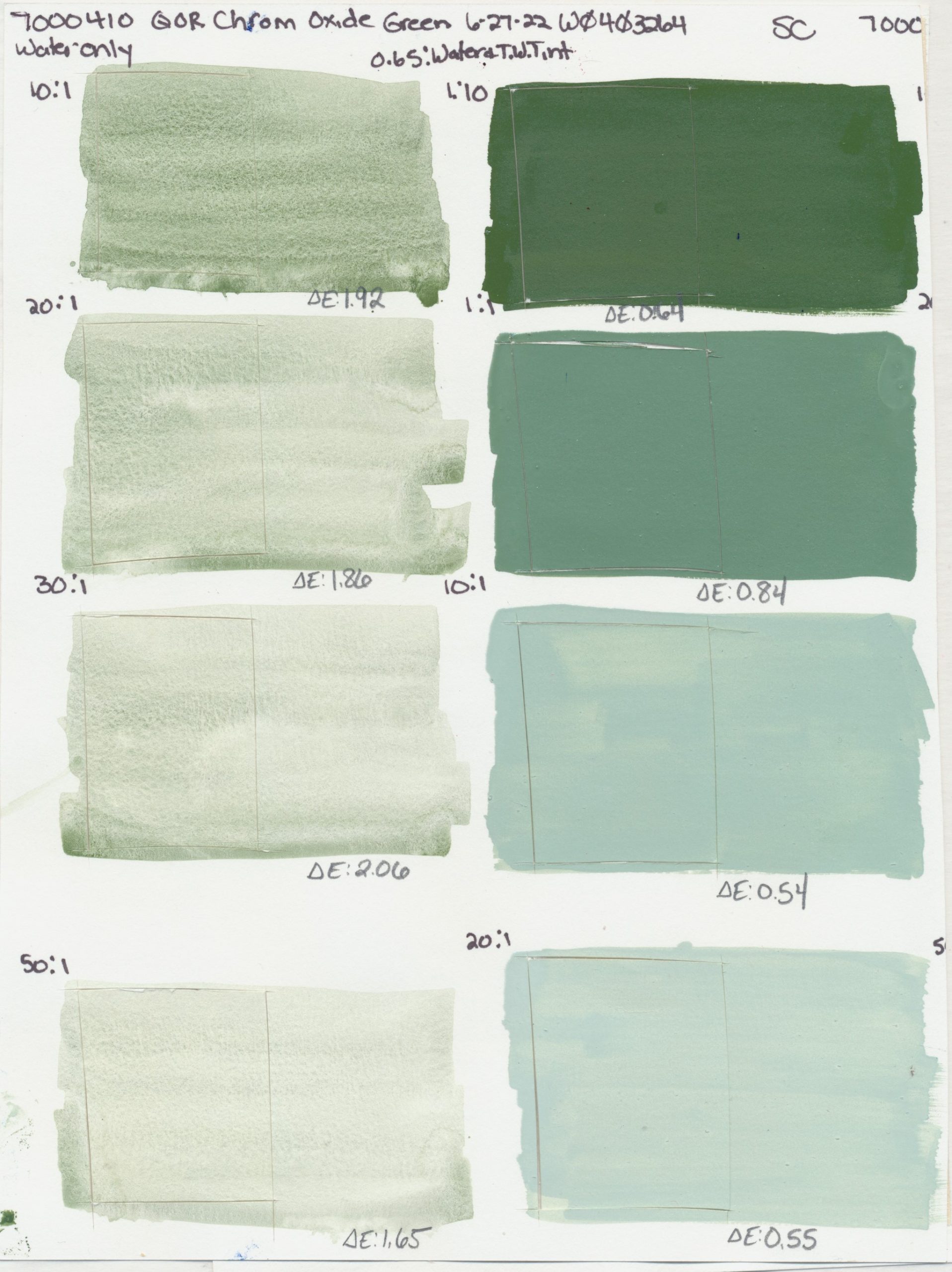
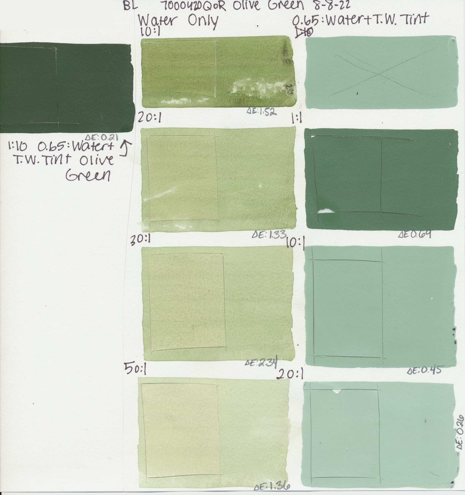
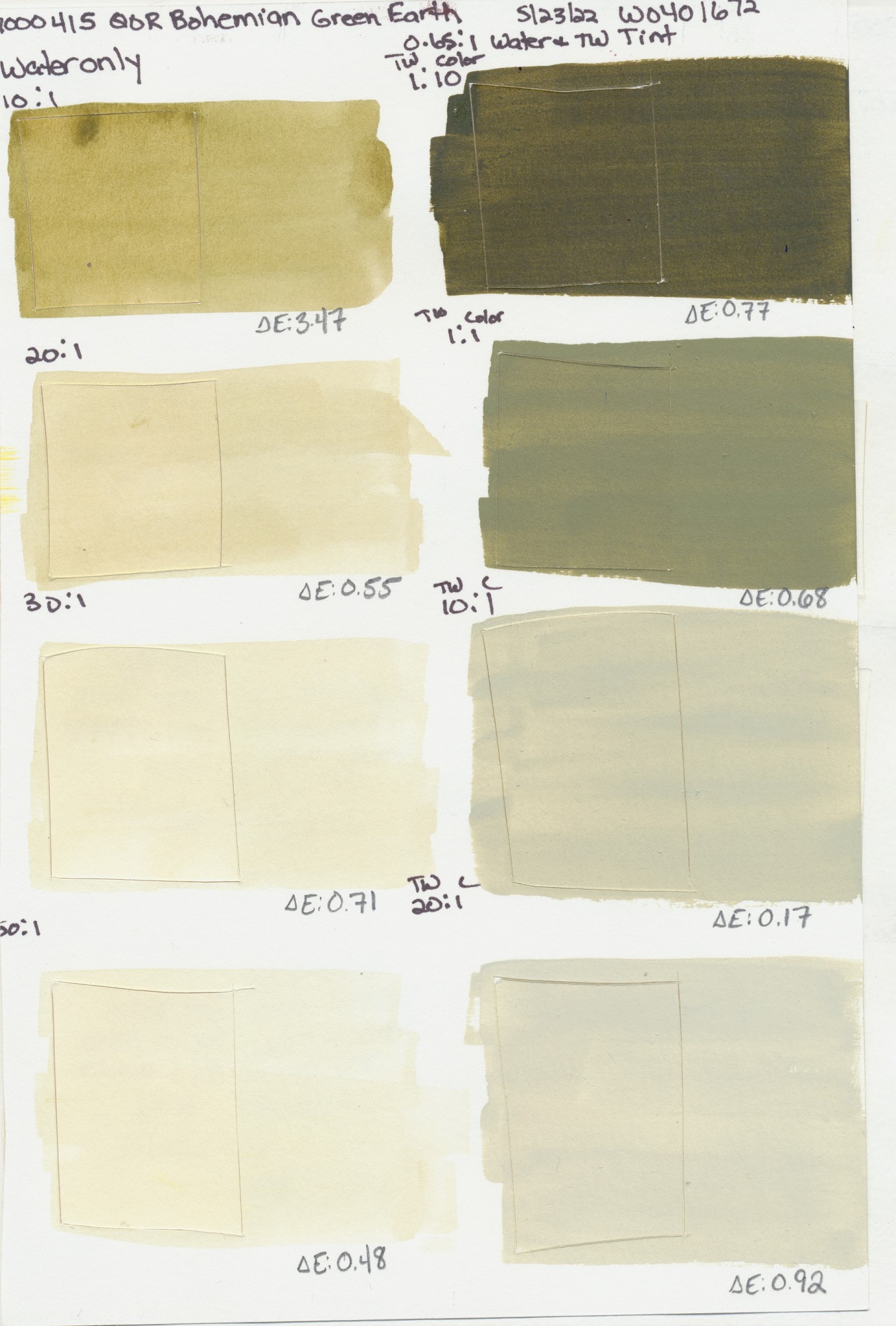
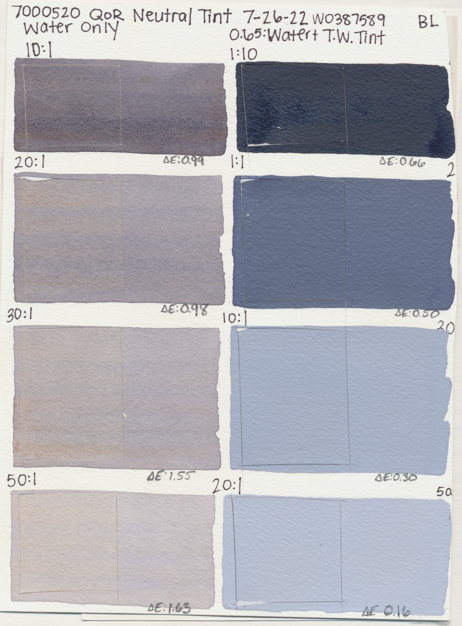
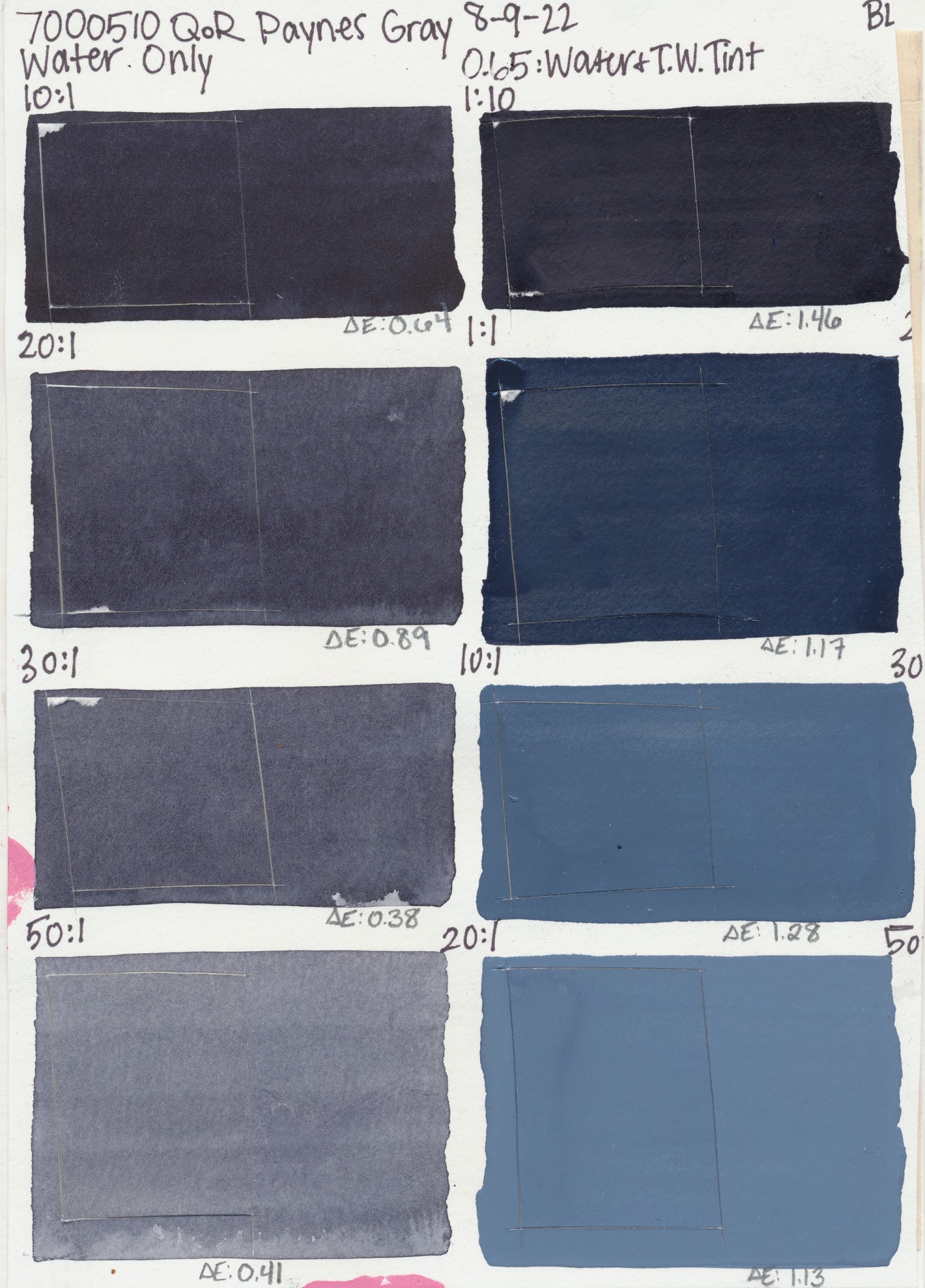
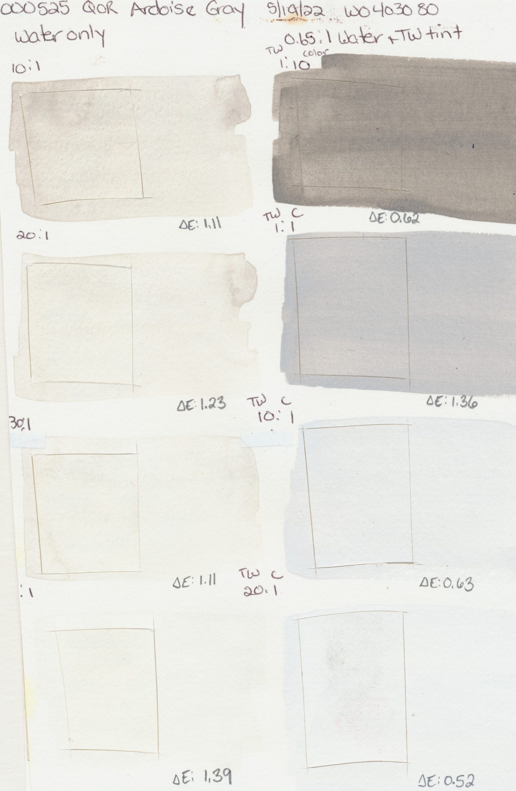
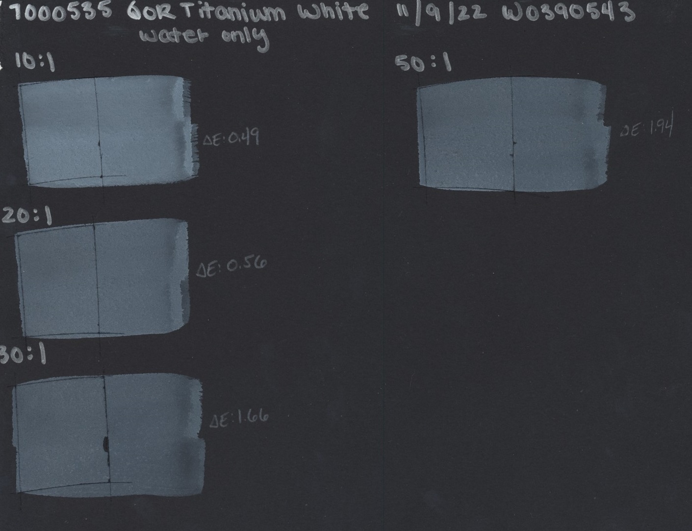
Overall, QoR Watercolor performed beautifully in both dilutions and tints with most colors remaining in the category of Lightfast I, meaning they have excellent resistance to UV under these testing constraints. Interestingly we observed, on average, there was minimal shift in lightfastness, even slight improvements with higher additions of water as well as Titanium White. That being said, it is important to note that Lightfastness I is a range from 0-4 Delta E and any observable trends are narrow at best, even if we love the direction they are going!
Outliers
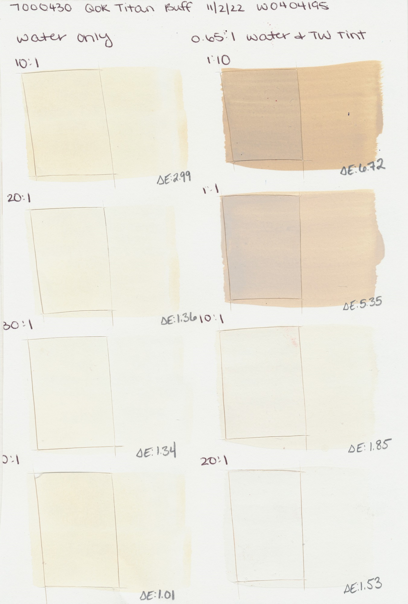
When reviewing the testing results, there are a few outliers worth mentioning and providing additional context for. The first being QoR Titan Buff, which in our testing showed the PW6:1 pigment’s tendency for darkening when exposed to xenon, especially when tinted. This is a case where in a 1:10 tint of Titanium White to Titan Buff, we see this color moving into Lightfastness II. A notable change for a white pigment.
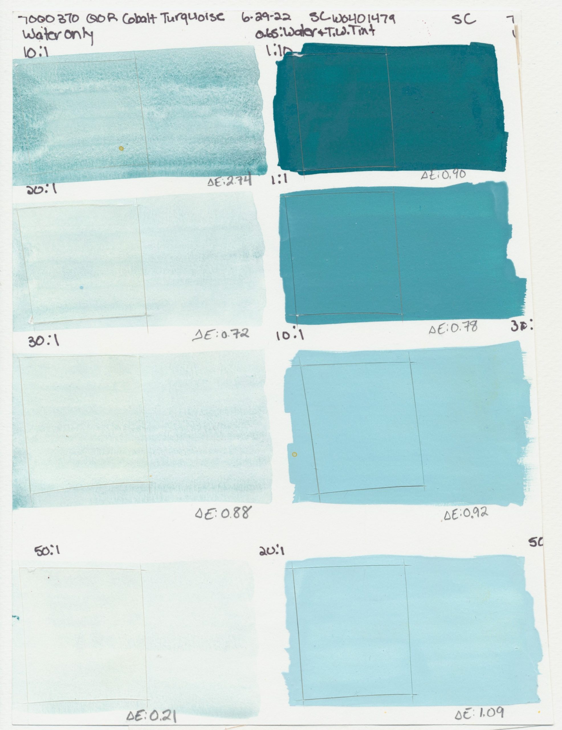
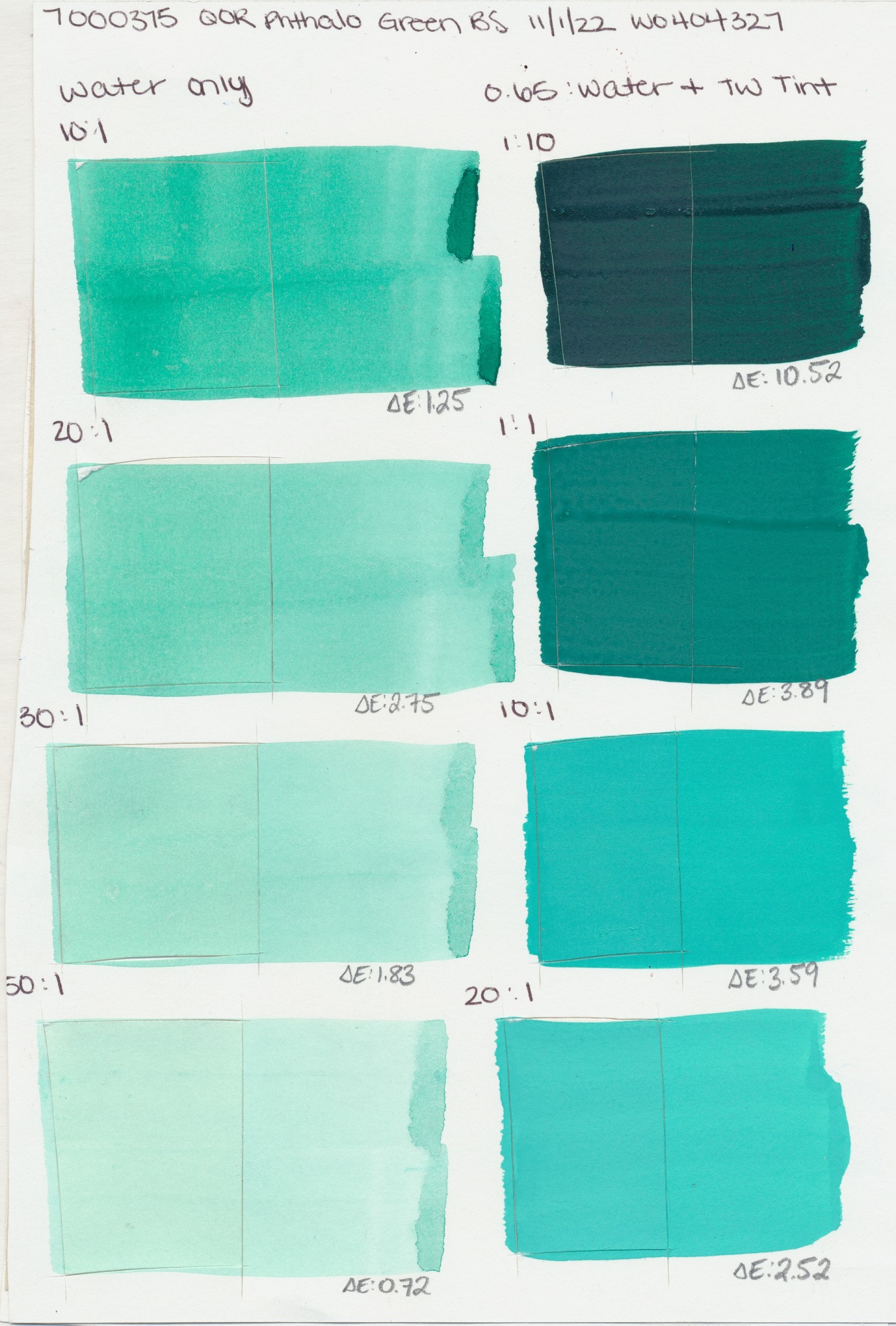
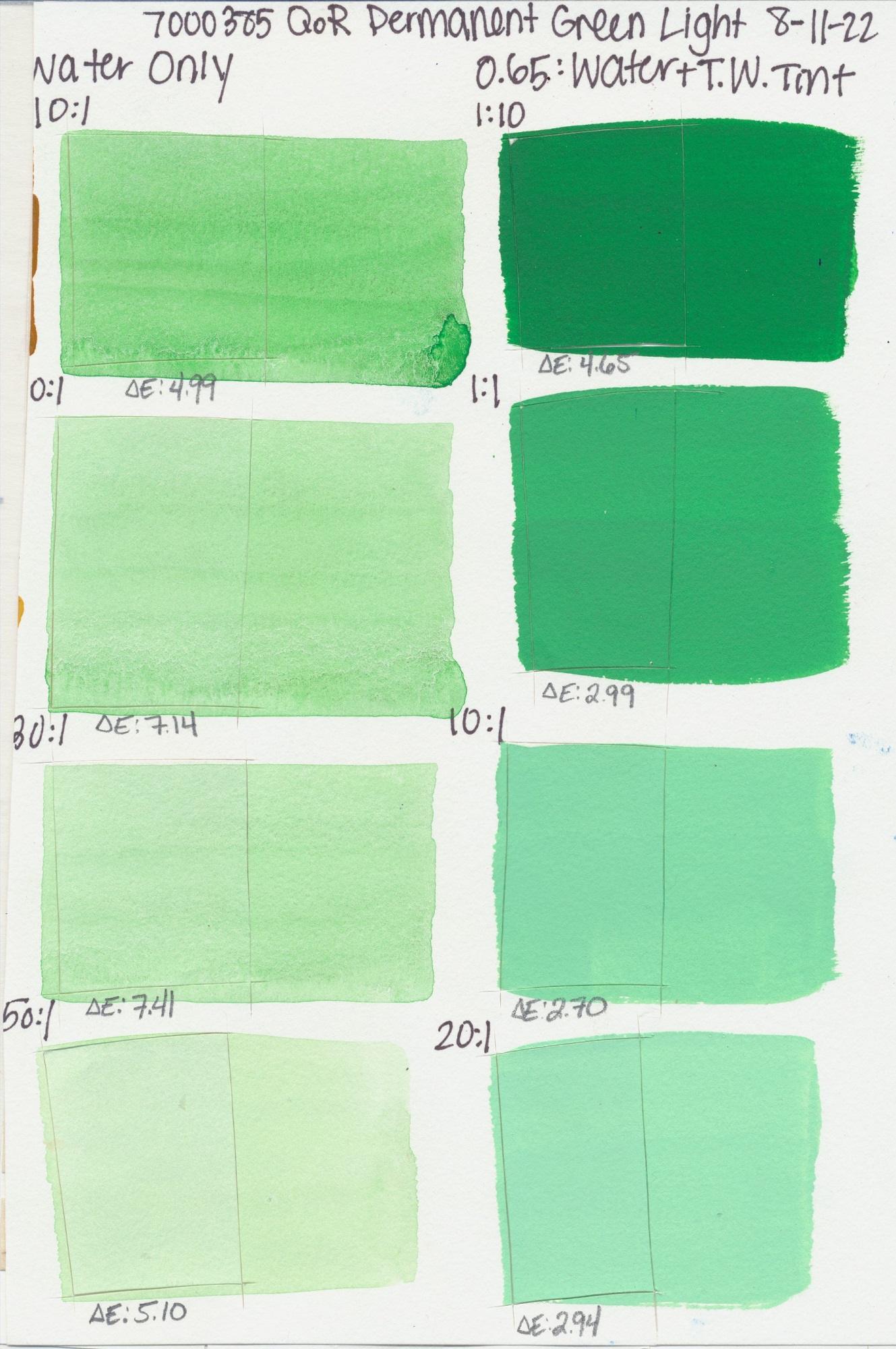
Two other outliers worth mentioning are QoR Phthalo Green (Blue Shade) and Permanent Green Light. In both colors we observed a decline in lightfastness, but in different scenarios. With Phthalo Green (Blue Shade) there was a meaningful change in the 1:10 tint (Titanium White to Phthalo Green) bringing this sample into Lightfast III. It remained in lightfastness I in all other test scenarios. Permanent Green Light showed, in higher dilutions with water, a slight reduction in lightfastness, but the color remained a Lightfastness II. In higher tint ratios with white, Permanent Green Light moved into lightfastness I. We included the test sheets for these colors below to provide visual context for what the data shows. We suspect some artists might be pleased with so little change after “100 years” and while the numbers may show a shift, visually it can be more nuanced.
Conclusion
First of all, we would like to thank our lab and all those involved in this project. It took many months to complete and we believe it offers useful information about QoR and its performance in applications that more closely resemble what an artist might do. That being said, overall, the test results look good. While we cannot fully explain some of the trends we observed, these results have been interesting, spurring more questions and ideas for future projects. In the future, we would like to test the Canson Foundation paper on its own to have a control to go along with this project. We would also like to expand our testing to include more paper options and perhaps a different white to see what effect that may have on lightfastness.
Data and Images
Below is a link to an excel spreadsheet containing all the lightfast results as well as the scans from this recent round of testing. Just click the icons to see the full test sheet.
Yellow
PY53
PY35
Light
PY3
Vanadate Yellow
PY184
Light
PY35
PY154
PY35
Modern
PW6, PY150
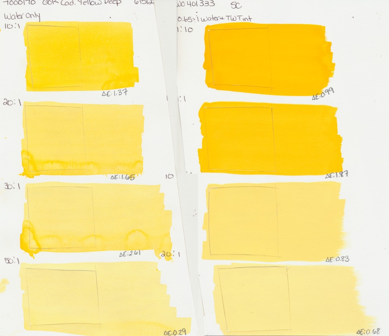
Deep
PY35
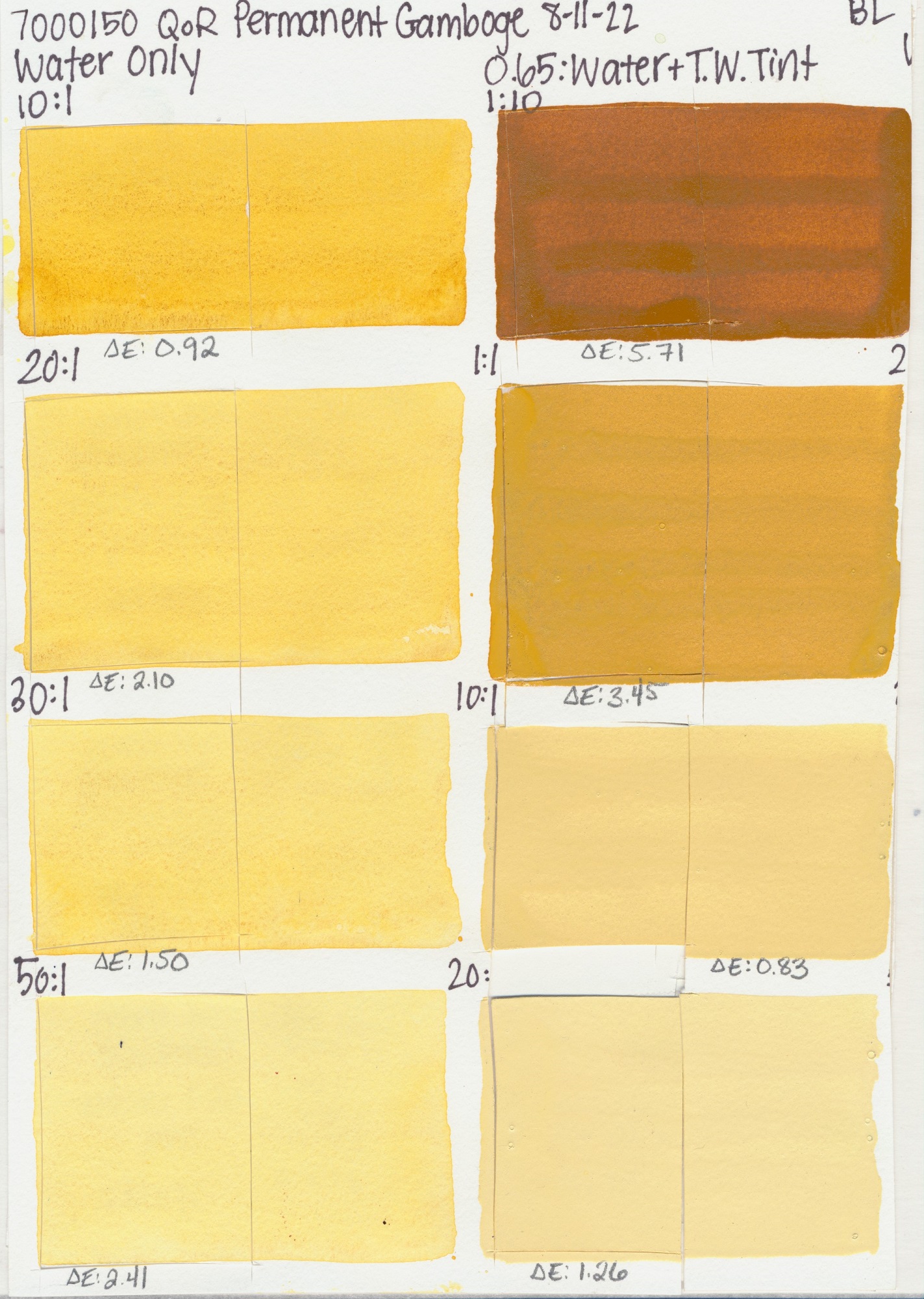
Gamboge
PY42, PV19, PY150
Orange
PR206
Gold
PO48, PY150
Yellow
PY83
Yellow
PBr24, PBk7, PW4
PO48
PY154, PY150, PR206
Orange
PO20
PO71
Light
PR108
Light
PR255
Medium
PR254
Medium
PR108
Deep
PR108
Red Light
PR207
Deep
PR264
Scarlet
PR168
Red
PV19
PR177
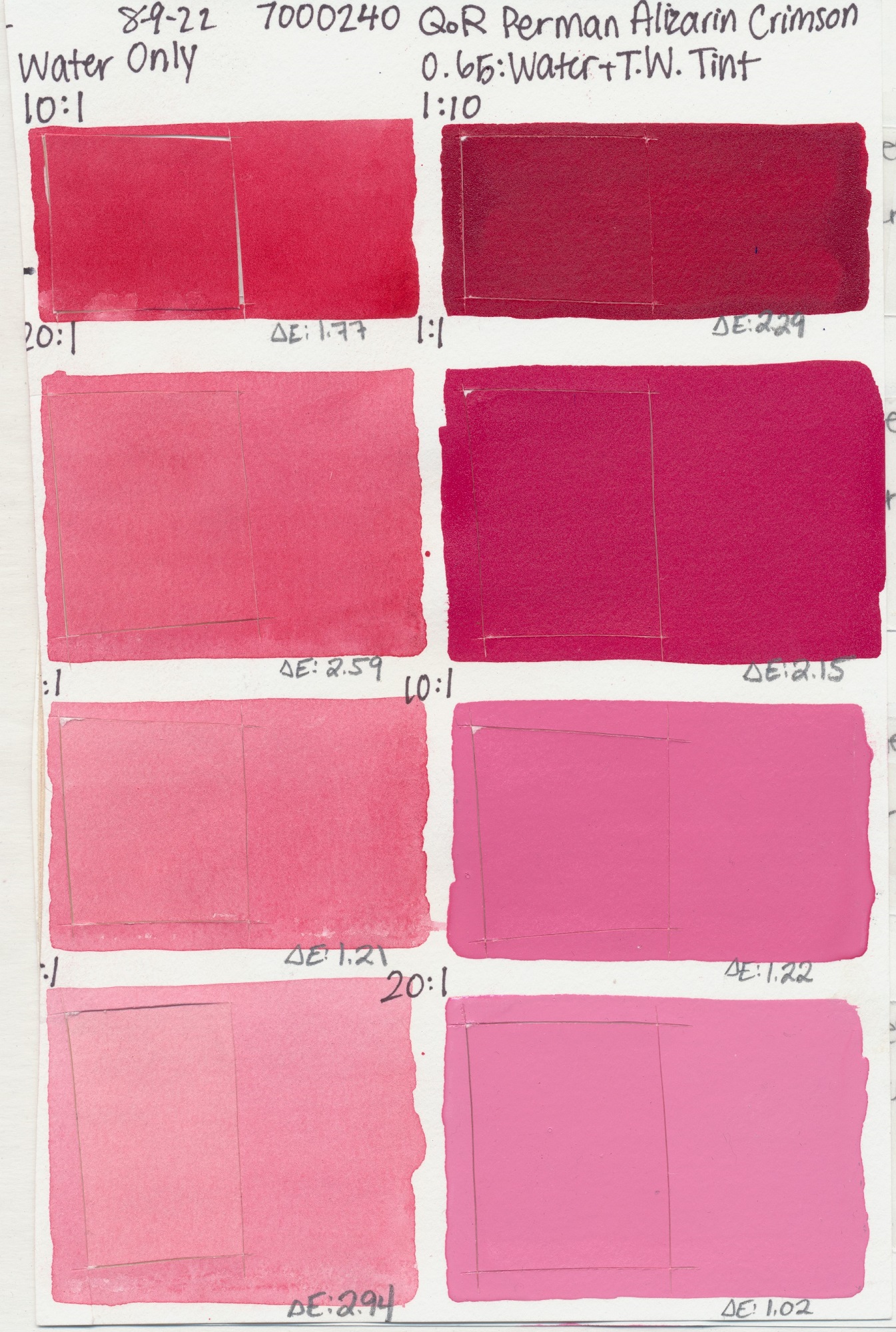
Crimson
PR122, PR206
Magenta
PR122
Pink
PV15
Violet
PV19
Pink
PV49
Violet
PV15
Purple
PV23
PB15:3, PBk7,
PV19
Blue
PB29
Violet
PV15, PB29
Blue
PB28
PB36:1
Blue
PB60
Blue
PB27
Turquoise
PG7, PB15:3
PB15:3
Blue
PB36
Blue
PG7, PB15:3

Turquoise
PB36
Teal
PG50
PG7
Green
PG18
Green Light
PG7, PY3
Green
PG26
PY150, PB60,
PR122
PG36, PR101,
PY150
Verte
PG23
Green
PG17
PR101, PY184,
PG7
PBk7, PG7,
PR101, PY42
Gold
PY129
Buff
PW6:1
(Natural)
PY43
PY42
(Natural)
PY43
Oxide
PR101
Red
PR101
(Natural)
PBr7
PR101
(Natural)
PBr7
(Natural)
PBr7
Yellow
PY150
Brown
PR101
PR101, PY150,
PBk7
Black
PBk7
Black
PBk9
PY42, PR122,
PB15:3
PB15:3, PBk7,
PV19
Gray
PBk19
White
PW6
White
PW4
Gold
Pearl
Silver
PBK7
As always, we hope this information is helpful! Don’t hesitate to reach out to us at [email protected] if you have questions or if you would like to leave a comment below.

Subscribe
Subscribe to the newsletter today!
I find it fantastic that you make such a big database accessible to your customers. It is great to be able to compare so many swatches. Only one thing I personally would have changed. I would have preferred to see the tests on high quality paper. When looking at the diluted Ultramarin Pink or Ultramarin Violet, it is clear that the paper yellowed more than the Pigment. But with the colors with higher tinting strength, this is not clearly distinguishable anymore and is not clear how much is paper change and how much is Pigment change. And it might seem that the color has changed, while in reality it is the paper. Kind regards,
Thanks for the feedback Mara. We intentionally used a student-grade quality paper to start this testing so as to have results that were more critical of the paints and less reliant on the paper for good results. You are correct that as you dilute the watercolor the paper will have more exposure. We are planning to test the paper independently to see what that looks like without the watercolor and in the future we hope to expand upon this testing by including additional papers to see how this might affect lightfastness. This is the first step and these points you bring up are great next steps for us to consider. Thanks for reaching out, we appreciate the feedback! Warm Regards.
Scott
Thank you so much for posting this, very useful and informative!
I saw the result for Titan Buff in your acrylics before, odd that it reacts with the Xenon acceleration as I don’t think iron oxides or titanium white on their own do?
The PG7 result is very odd though, never heard of this issue in any other lightfastness testing and results..?
Hello Richard, Thanks for the interest. We did not see this same darkening with Titanium White or with Iron Oxides in our testing. The Phthalo Green Blue Shade was an outlier as it showed this darkening only in the application that was minimally tinted with white. The Spectro read it as a shift towards red and a darkening in value, visually it is noticeable, but it is nice to see the visual next to the Delta E to compare. It tested well under the other test conditions, so it was an interesting result we will keep our eye on.
Thanks for sharing this information! The results about Titan Buff are a little disturbing… is this darkening also likely to manifest in acrylics?
Hello Asaf,
We have seen some similar darkening in the media we have tested, including oils and acrylics. Lightfastness is strongly pigment dependent, while there can be some role the binder plays, pigments will often test similarly in terms of lightfastness in different binder systems.
Scott
Thanks Scott. I think it’s worth noting that somewhere in the paint descriptions, particularly because there are alternative mixtures which are likely safer.
Hello Asaf, thank you for the suggestion, we will pass this up the chain. You could certainly make a mixture that resembles this color if there is concern. While we have tried this ourselves on many occasions with a variety of colors, matching a single pigment color is not an easy task. There is the color quality, but also the performance properties that are unique to a pigment. We will put this to the team again though and add it to our New Product Idea bank!
Thanks Scott. No further questions! I think my rational was not clear though. So for future readers who found themselves reading this far :):
Up until reading these findings, my understanding was that in terms of lightfastness, a single first-grade lightfast pigment is always preferable to a connivance mixture, especially if the later includes a white pigment. For illustrations, following this principle I considered the cool counterpart of titan buff (titan green pale) somewhat inferior (not suggesting the use case is similar of course).
Even more importantly for this case (and I guess this still holds true most of the time), my understanding was that mixtures become less lightfast the more white they contain.
Coming back to titan buff, I personally almost never use it as-is. Instead I have often used it for warm tinting or as a base warm light layer. For this reason matching the very exact hue is not a major concern for me, surely not as much as having a reliable warming tinter that doesn’t loose its warming or tinting qualities over time. If that’s not the case, a connivance mixture (bought or homemade) may turn out to be the superior.
Hello Asaf, this would have been a conclusion we might have come to as well, were it not for this new round of testing. It seems that the tints affect some edge case colors, but by an large they perform quite well. Perhaps a mixture that approximates the Titan Buff could be an option for opaque applications of watercolor if an artist needed it, but in dilutions it looks pretty good. Depending upon technique, adjusting temperature of a color for a dilute watercolor application using Titan Buff seems on the table. Hopefully the results offer enough context to make these types of decisions. Thanks for getting back to us!
Thank you for performing this testing and thank you even more for posting every color. Your transparency as a company, and commitment to improving your products, is unparalleled. I am particularly impressed there is no change to PR177 or PB27. I have seen many amateur tests on YouTube that easily document fading in these pigments in other brands.
I have heard people say your versions of many paints are more lightfast; but have never heard it explained how that is achieved. Do you use additives or some other method to achieve higher lightfastness?
Thanks again for your spectacular products, and the testing to back them up!
Hello Jenn,
We are happy this is of value. That is why we publish this stuff so folks can reference it as needed! We are selective of the pigments we use, so there can be a range in the market for performance and we choose ones that have the best lightfastness and color quality. This amounts to a lot of testing basically. We do not use additives for lightfastness as it it mainly a quality of the pigment itself. Varnishing could be done to add some UV filtering if needed at the end.
Cheers,
Scott
PB 27 here has obvious fading. PR 177, though, did do well.
Actually, now that I looked again, PR 177 also has noticeable fading in all of the water dilutions except for the 20:1. It did well when mixed with white. PV 23
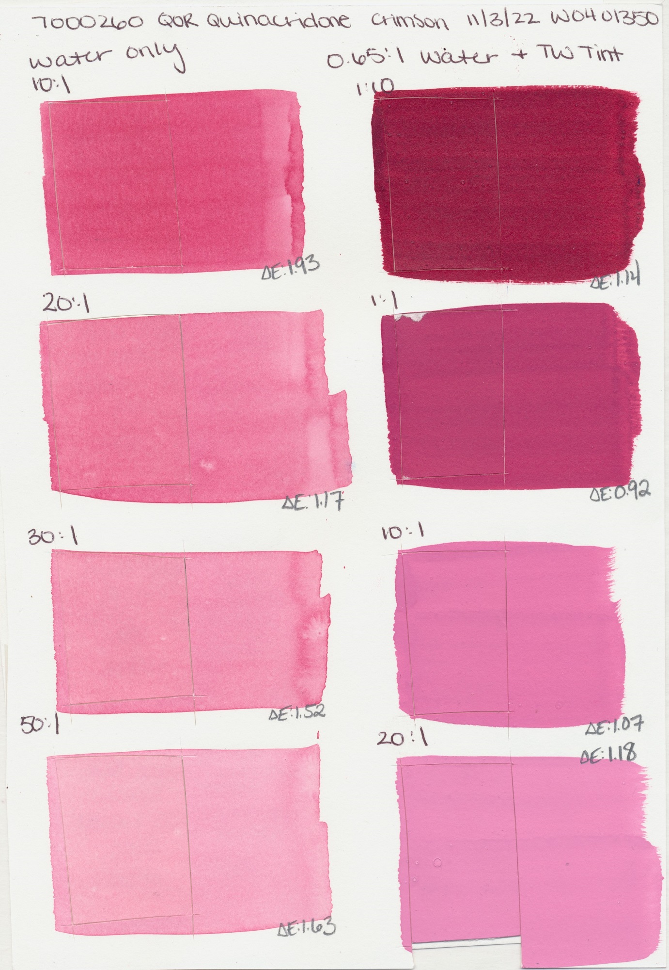
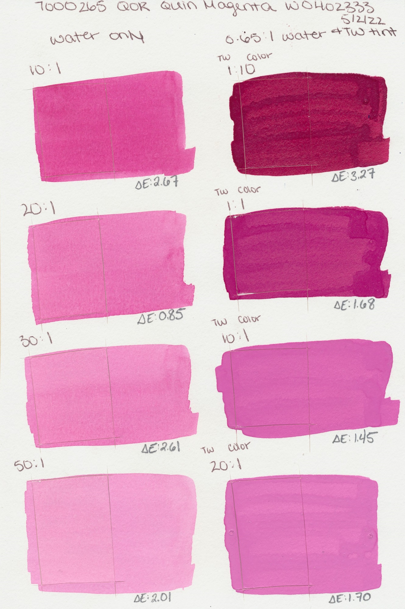
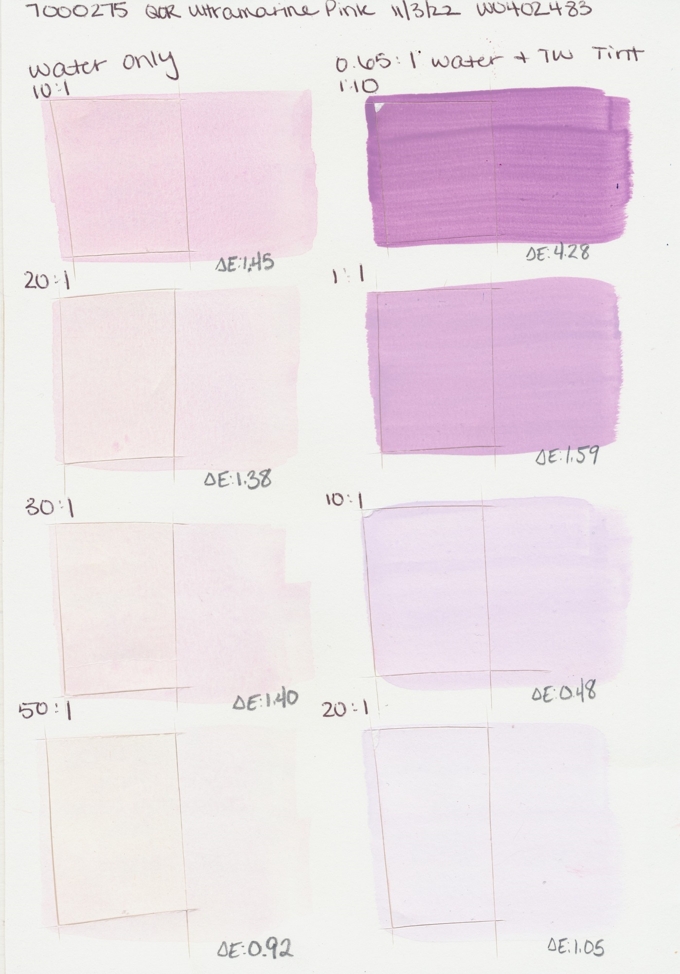
The little number in on the bottom left of each sample reflects the Delta E or the measurement of change. So all colors in this chart have changed, it is just that the degree of change falls within the Lightfastness 1 category, which shows excellent resistance to UV. Keep in mind the measurement was done on a spectrophotometer which is much more accurate, but there may be some variations in web color and our scans. In general, these are a good reference though in showing the type of change and degree. Hope this helps!
Scott