
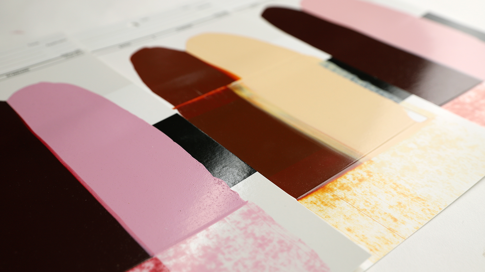
“Discontinued Color”: A phrase artists never want to hear!
A pigment is “discontinued” most likely, when a pigment manufacturer ceases production. In turn, this creates a ripple effect in the artist industry. Sometimes we can locate another manufacturer that offers the same pigment. Often, we cannot. Unable to find another source, we are forced to discontinue some beloved paint colors. This is the case with (PR206) that we call Quinacridone Burnt Orange. Not only is this fiery and versatile pigment used to make one color, but it was also a key component in making Quinacridone/Nickel Azo Gold and Quinacridone Crimson.
These three colors were produced in most of the GOLDEN Acrylic Paint lines, QoR Modern Watercolors, Williamsburg Handmade Oil Paints, and many other artist materials manufacturers.
The loss of these three “quins” creates a hole in our color offerings and as artists run low on these colors, they’ll need paints with similar properties. Our R&D Laboratory and Material & Application Specialists are actively working on replicating these colors as closely as possible, employing both pigments we already have in-house and others that we are bringing in to evaluate their potential. While we may be able to match some aspects, there is often a compromise of these properties with an emphasis on the most critical ones. These colors were known for their rich undertones resulting in vibrant glazes and washes, so this attribute takes center stage.
Mixing a Quinacridone Burnt Orange Hue
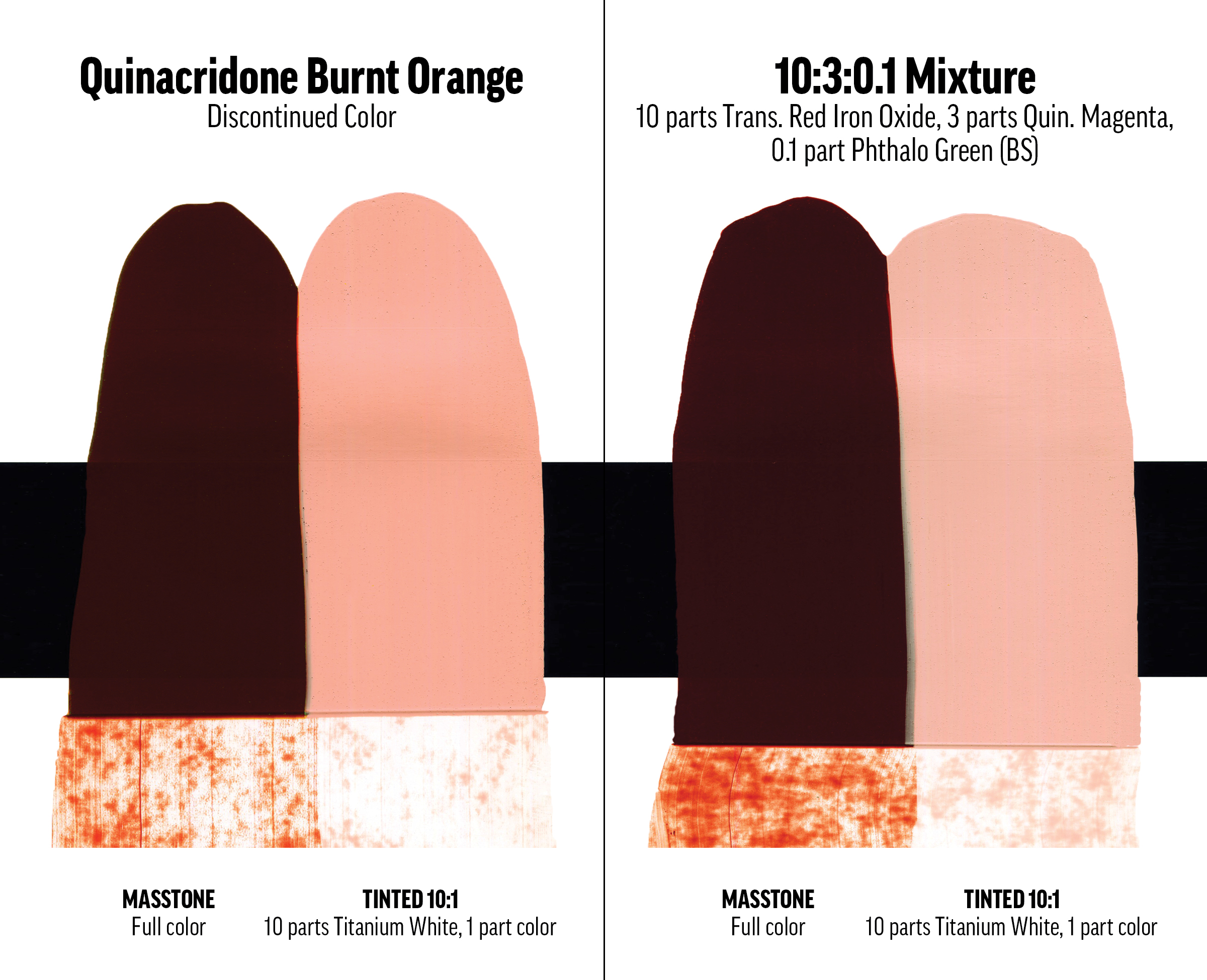
Quinacridone Burnt Orange (PR206) is where we will start because it can be used to recreate the other two paints. The most direct approach is to start with Transparent Red Iron Oxide (PR101) as a base and add Quinacridone Magenta (PR122) at a 10:3 “parts” ratio. This mixture is then deepened with a very small amount (0.1 parts) of Phthalo Green Blue Shade (PG7).
Mixing a Quinacridone/Nickel Azo Gold Hue
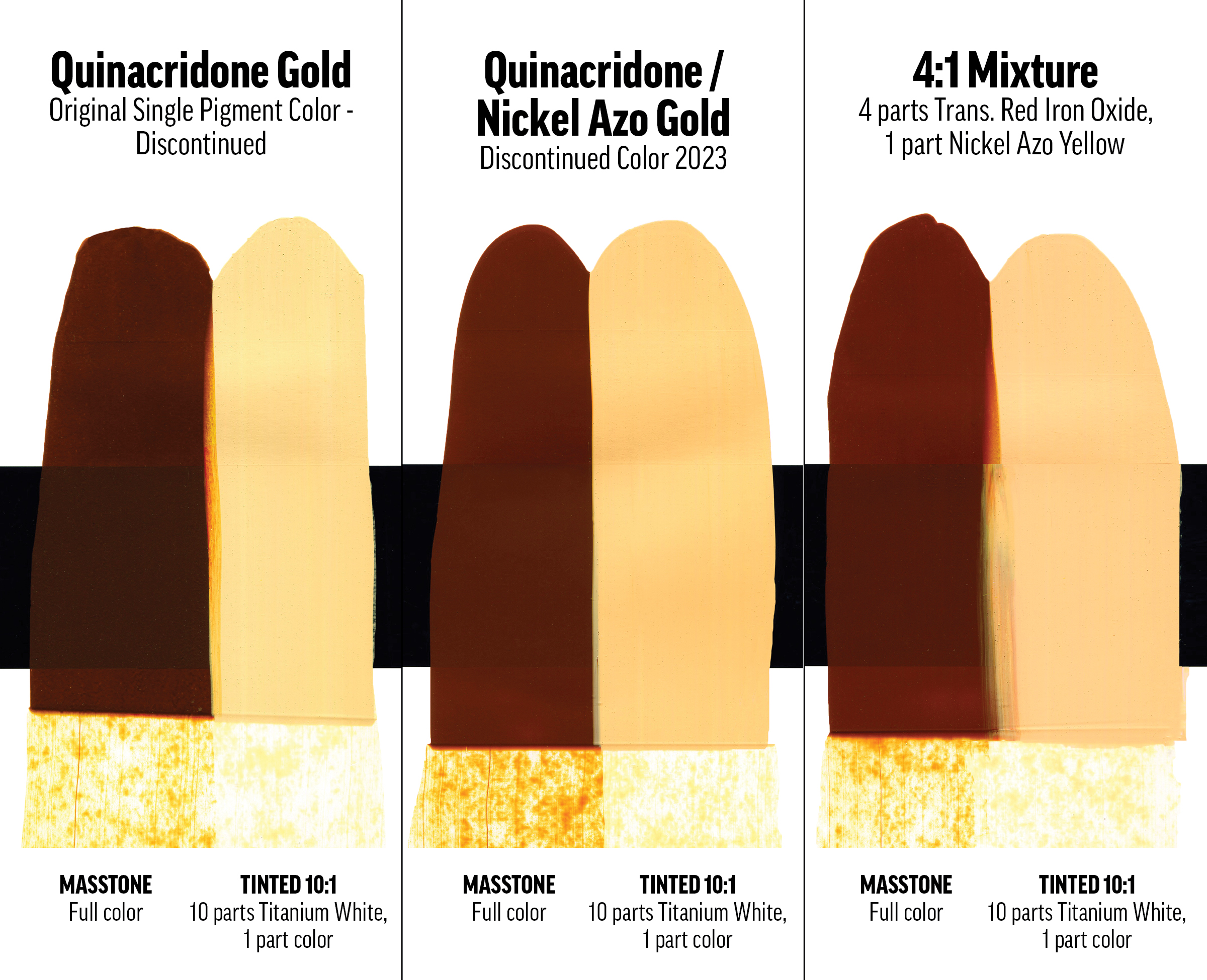
Quinacridone/Nickel Azo Gold. This color has had a history of change that began over 20 years ago. When Golden Artist Colors opened its barn doors in 1980, Quinacridone Gold (PO49) was a popular single-pigment paint. But in the 1990s, the pigment manufacturers ceased production of the specific variant we were using. Thankfully, there were other PO49s still being produced. We settled on one that was just a bit greener and combined it with PO48 used to create the new Quinacridone Gold in 1994. Since it was a blend of two quinacridones, we kept the original name.
As you may have guessed, we then lost the alternative PO49. Our R&D Lab came up with a new formula, but we had to rename this version to Quinacridone/Nickel Azo Gold. Nickel Azo Yellow (PY150) is also a vital pigment for other colors such as India Yellow, Hookers Green, Sap Green (Hue), and Green Gold.
This current mixture pairs Transparent Red Iron Oxide (PR101) with Nickel Azo Yellow at a 4:1 ratio. You can increase Nickel Azo Yellow if you want to bump up the undertone brightness.
Mixing a Quinacridone Crimson Hue
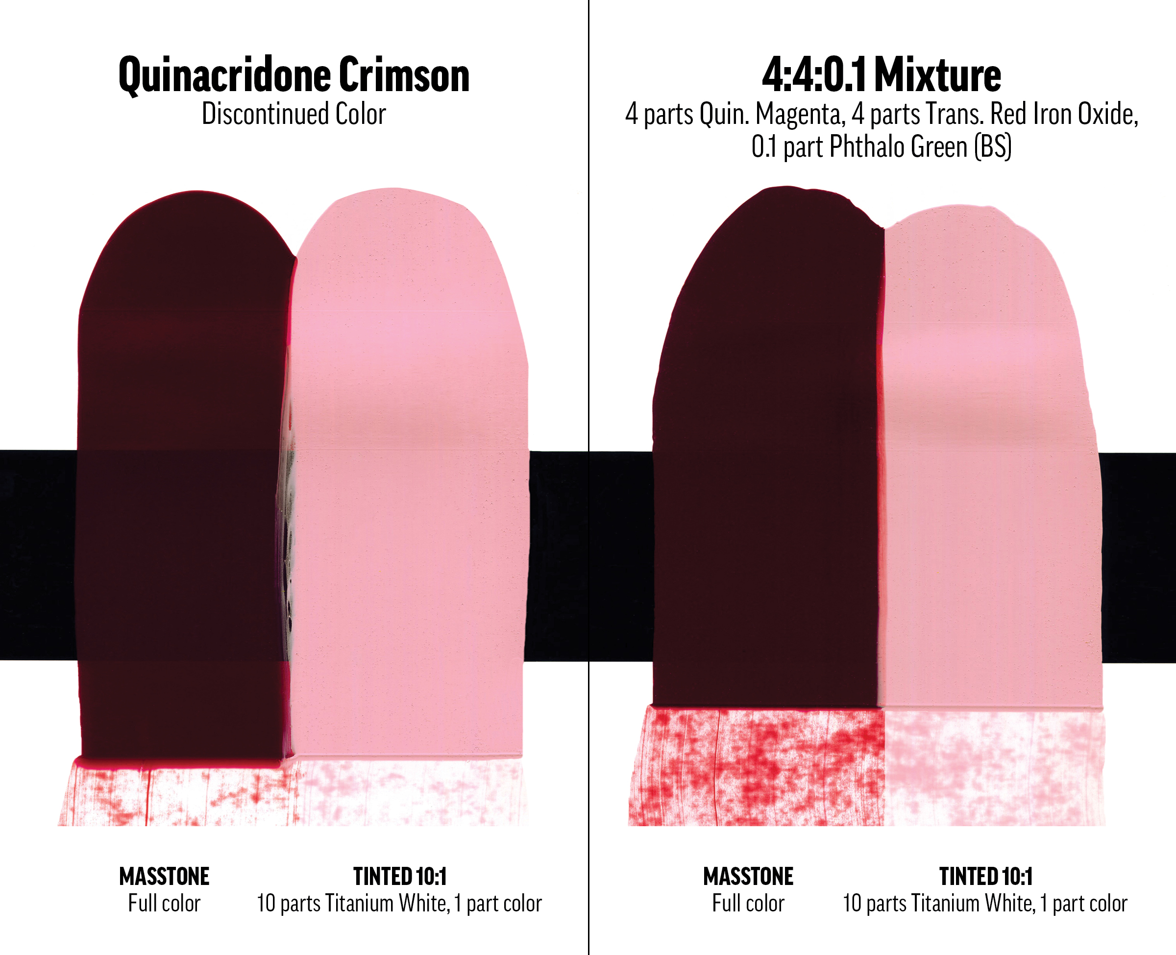
Quinacridone Burnt Orange was used in Quinacridone Crimson, originally a blend of (PO48) and a quinacridone pigment (PR202) similar to our Quinacridone Magenta (PR122).
Quinacridone Magenta mixed with Transparent Red Iron Oxide – and just a touch of Phthalo Green Blue Shade (by weight, 4:4:0.1) results in a satisfactory crimson. Adjust the Phthalo Green Blue Shade to deepen your mix as desired.
How will you replace these colors on your palette?
We will continue looking at our several options that will allow us to replace these lost colors and which pigments give us the best alternative mix. We may try to recreate all three quinacridones, as well as add some new pigment/paint options in our paints or both. So please be sure to let us know your thoughts and any questions you may have.
Comment below or contact the Material Application Specialists if have any questions or if you’d like to share a recipe that works for you.
Michael Townsend

Subscribe
Subscribe to the newsletter today!
Thank you for keeping us informed.
These are 3 of my favorites for glazing.
You are very welcome Kathy! Thanks for commenting. The undertone of these colors is quite different than the thicker mass-tone, and as you blend to re-create them, be sure to test them as glazes. In fact, I found that adding some medium into the recipes does help them appear more “quinesque” (brand new word! I should probably just stick with quintessential) :-).
– Mike Townsend
Thank you for this update on the discontinued colours. I use Quinacridone nickel azo gold, and also quinaridone magenta ( acrylic). I hope you will be able to come up with substitutes, and will look forward to that. Thanks.
Thanks for your comments, Marilyn.
So far, Quin Magenta isn’t going anywhere soon. It’s vital to us as a base color, as is the Quin Red, which is less violet-hued compared to the Quin Magenta.
– Mike Townsend
When I saw the headline, it was like a stab with a sharp knife. The “quins” are where i start and they are always where I start thinking when I’m working. You are right about the versatility from thick luminous impasto to the subtlest of glazes.
In the early 2000s I rethought my palettes and settled on the “quins” and thalos along with that amazing anthraquinone (?) blue and green gold.
I feel bereft right now but also am trusting, as I always have, in Golden’s ability to make the changes work.
Personally, I am so glad that the staff, and especially you, Mike, are artists who also walk on the chemistry side as well. This means the world to me and think about it every time I open a container of Golden Paint. It is a security I have come to rely on.ZG2
Thank you for your thoughts on this, Stephen! They are valued and speaks to the very reason we do what we can to provide the best products and artist resources within our grasp. I discovered some really interesting combinations when trying to recreate the “original Payne’s Grey” recipe, a recent journey into the life of the under-investigated William Payne. https://justpaint.org/nothing-is-black-and-white-with-paynes-gray/ .
– Mike Townsend
I use Quinacridone Nickel Azo Gold in every painting! Please come up with a replacement asap!
Thank you for you comment, Diane.
Yes! That is the plan. We are working to create the next chapter in the Quin/Nickel Azo Gold saga!
– Mike Townsend
After just reading your article on the discontinued Quinas I was wondering what
ever happened to my favourite yellow Hansa Yellow Light? I was sad to see that one go.
is it the same story??
thanks, Deborah
Hello, Deborah.
Thank you for your question about the Hansa Yellow Light. During our lightfastness testing – which involves accelerated light exposure and actual exterior exposure, we discovered that Hansa Yellow Light was not as lightfast as older ASTM Lightfastness Ratings had indicated. What we believed was that Hansa Yellow Light was a ASTM LFII pigment, turned out to be a color change into the range of ASTM LFIII, which is beyond what we prefer to offer for the professional artist. This prompted us to make this information public, and replace the Hansa Yellow Light & Medium (LFI that was relisted as a LFII) with Benzimidazolone Yellow Light. https://justpaint.org/hansa-update/ .
– Mike Townsend
I am hoping you are able to find an alternative to discontinuing these popular Quinacridone colors. They are all favorites on my palette. There can not be fall aspens in the Rockies without Quinacridone Burnt Orange. Sunsets will be duller without Quinacridone Gold. Alas. I trust Golden to introduce more beautiful pigments for artists to admire and express the poetry of paint.
Thank you for your comments, Colette.
As mentioned, we are on a constant search for alternative pigments and potentially new pigments yet to be unveiled to the artist community! One door closes so that another may open.
– Mike Townsend
This info is CRITICAL. Thank you so much for the heads up
Hopes for a better future.
a Golden Girl for 29 years
Thank you Kimi.
We’re glad you find this information valuable! Ideally, it’s a stopgap between mixtures in the tube! Much like when we blended to recreate the Historical Color Hues.
– Mike Townsend
Yes but you are telling us to mix other discontinued shades!,,,
Hello Crane. Thank you for your comment. We thought we would offer a couple of options. A Quin Burnt Orange is tricky to get exactly the same as the discontinued pigment, but if you can mix that up, the Quin Gold and Crimson are straightforward to create from there. However, the simplest Quin Gold alternative is using the Transparent Red Iron Oxide with Nickel Azo Yellow.
– Mike Townsend
You can also approximate the orange by mixing cadmium red medium (or hue) with phthalo blue green shade more to the red than blue.
Thank you for the recipe, Mary! I’ll have to give that one a try!
– Mike Townsend
So interesting!
Thank you ! This is very useful.
Please keep developing more wondrous products for artists, hiccups aside…!
Let’s not run out of Nickel Azo Yellow(!!)
You are most welcome, Maureen! Yes, losing Nickel Azo Yellow would cause plenty of paint mixing problems as well!
– Mike Townsend
:-O, is that likely to happen anytime soon?
Hello Asaf. Yes, we have already created test mixtures (various ratios, alternative pigments, etc) and going through the process to introduce a new mixture. There are things like lab stability trials, toxicological evaluations, label creation & proofing, and production processes that are being worked on. The specific timeframe as to when is not something we are ready to announce at this time. – Mike
At this rate we’d soon need to stock up PR101… Oh well, Blick time.
And thanks for the heads up!
We keep our cards close to the vest when it comes to adding new colors to the paint lines. The search for similar pigments has some interesting additions that will likely be out in the Spring of 2024. As with replacing Quin/Nickel Azo Gold with a new blend, a new color has to go through a lot of testing, labels need to be created, toxicological evaluations need to be conducted to assure the paints are safe to use, etc.
– Mike
Hello, Hugh.
Yes, losing a favorite color is akin to losing a dear friend. You appreciate them more now that they are gone, and likely wished you visited them more often than you did.
Chinese Vermillion is a color that has had an evolving path as well. Here’s an excerpt from an older article https://justpaint.org/some-historical-pigments-and-their-replacements/ “Vermilion (PR 106)
Vermilion is a toxic pigment made from Mercuric Sulfide. This naturally occurring ore is the source for Mercury, and was ground up as a pigment for centuries and termed Cinnibar or Zinnober. Early cultures of the Greeks, Romans and Chinese created Cinnibar artificially for centuries, as early as 6th century B.C., but it wasn’t until the 15th century that it was termed Vermilion. Direct sunlight causes it to darken substantially, and it was quickly replaced by the Cadmium Reds upon their arrival.” These days, the closest match tends to be with using Cadmium Red Light or Pyrrole Red Light. Both much safer alternatives to painting with mercury!
– Mike Townsend
I had this happen when Dumont Blue was discontinued (I believe it was either Rembrandt or Daniel Smith that made it – long ago and I’ve forgotten). I still miss this color.
Hello, Leslie. Thanks for commenting. Dumonts Blue is also known as Smalt (PB32). You can still get this pigment at pigment sellers such as Kremer Pigment: https://shop.kremerpigments.com/us/shop/pigments/10000-smalt-standard.html
-Mike Townsend
Thank you Carol.
I appreciate the kind words! Retaining the transparent, fiery undertone was a key goal for this project.
– Mike Townsend
Quinacridone Burnt Orange was PR206, not PO48 in most the Golden paints you listed, except the Quinacridone / Nickel Azo Gold. Sadly, both PR206 and PO48 have been discontinued now.
Yes we have lost the Quinacridone Crimson, Quinacridone Red Light and Quinacridone Burnt Orange. It has been a tough few years for Quinacridones.
Nooooooooo!!! These are my favorite glazing colors! 😢😢😢
We are saddened as well by this! Hopefully these options allow you to continue doing similar applications.
Oh my goodness – I’m late to this discussion, but I sure am glad I happened to check in with Just Paint this morning! I saw the title of this post from June, and thought. . . I sure hope it’s not QNAG! Yikes!! I found what is probably the last bit of stock on Amazon, and bought almost everything I could find (except the one bottle for $180). QNAG became a part of a mixture for a beautiful teal green/blue that currently appears in almost ALL my paintings. Of course, I’ll figure something out, but I’ll be set for at least a few months with my Amazon supply. I look forward to an announcement regarding its replacement! Thanks so much for your hard work, and keeping us color-dependent artists at the top of your priority list! Hopefully, by the time I run out, you’ll have an amazing replacement for QNAG!
Would you consider offering Perylene Maroon (PR 179) as an alternative for Quinacridone Burnt Orange? Whitest it’s not a perfect match, it’s an excellent replacement in numerous scenarios, e.g. whenever QBC would be used as a complementary color. It is also a good a basic for a quinacridone-gold-like conscience mixture. BTW, another good match for QG is single-pigment green gold (PY 129) and Quinacridone Magenta (PY 129 is not currently offered by golden, but the paints sold by other paints mix well with golden acrylics).
speaking of which, I must add that the perylene family of pigments is tremendously underrated, at least in acrylics.
Hello Asaf.
Thank you for your feedback and suggestions!
Hue-wise, PR 179 has some similar qualities shared with Quinacridone Burnt Orange, but it lacks the vibrant undertone qualities that made it unique. We are in contact with our pigment suppliers for any and all alternatives to PO 48 that exist, and that can be made in acrylics, watercolors, and oils. Bear in mind that the pigment amounts required to produce a color in our acrylic lines is vastly greater than those for both Williamsburg and QoR, so that too factors into the conversation.
Thanks for the response. A couple of questions/comments:
0) Crossing fingers for a happy ending 🙂
1) I assume you meant PO206, not 48
2) not really suggesting PR179 as a complete drop-in replacement (not really suggesting anything in fact, just my amateur humble opinion), but it does fill nicely a color space that PR206 did and that PR101 doesn’t get right. And in many mixtures it’s in fact a drop-in replacement. TBH, I do like PR179 on its own, but it’s easy to see why it’d not be available alongside PR206 in the same line of colors.
3) in light (or shadow) of earlier comments… should I read your latest line as PR179 supplies are also drying?
Thanks again for all the information you’re sharing here. The only bright side is that with the OPEN line it’s far easier to stock up life-time amounts 🙂
You are very welcome, Asaf. Quin Burnt Orange is PO206, yes. PO48 was the redder shade Quinacridone “gold” that is similar and called by a variety of color names, including Burnt Orange. In QoR, it’s called Quinacridone Gold Deep. I often swap them out in my brain – the result of working here since the late 80’s, but the recently discontinued PO206 is what we have called Quin Burnt Orange. I edited the article to make sense of this (hopefully!) but I think you get my intent.
PR179 isn’t on the chopping block as far as we know. We just don’t use it in acrylics. In Williamsburg it’s our Perylene Crimson:
“Perylene Crimson
CI Number: NA
CI Name: PR179
Pigment Name: Anthraquinone Perylene
Lightfastness: ASTM I – Excellent
Opacity: Transparent
Grind: Fine
A permanent, deep rich crimson with cool overtones and warm, yellowish undertones. Warmer than our Permanent Crimson.”
I agree with you that PR179 shares enough properties to be dropped into mixtures where Quin Burnt Orange was used, but it would be hard to use to match QBO due to it’s undertonw.
– Mike
Informative, easy to understand and timely implementation
Does Williamsburg have an alternative to the Quinacridone burnt orange in oil paint yet, please? I couldn’t see anything that looked like it in the color charts. Grumbacher’s quinacridone orange seems to have been discontinued now, so I’m looking for a replacement. Thank you for the informative article. An update on what has happened with the testing for replacement colors would be much appreciated, please.
Hi Krystii,
We do not currently have anything available, but are looking at a Benzimidazolone Burnt Orange to potentially fill that color space. It has a chromatic brown masstone and glowing reddish orange undertone. We will provide more information as we get closer to making that decision in 2026.
Thanks!
Greg
i found PY150 is quite interesting
when mixing with red (PR254 for example)
it barely change its masstone while change its undertone/tint
then one can get a red without cool/cold/pink hueshift when tinted
Thanks for the feedback Nourkias
-Mike
It’s always disappointing to learn about discontinued colors, especially iconic ones like Quinacridone Burnt Orange. It’s great to see efforts from the company to replicate them as closely as possible. I appreciate the detailed breakdown of mixing alternatives provided here. It gives artists more control over finding suitable replacements while maintaining the unique characteristics of the original hues. I’m curious how these recreations perform long-term compared to the original formulations. Will keep an eye on further updates regarding this matter.