
During a 2011 interview with the British newspaper The Guardian, contemporary British painter George Thomas Shaw described Payne’s Gray as “the color of English rain” (1). This simple characterization delineates the essence of a color that nearly every painter knows. And yet, most artists could not tell you who William Payne was or what pigments were originally used to create it. Payne’s original blend might surprise you, as it’s quite different than the modern premixed versions we take for granted when we reach for this go-to color. Artists will discover the pigment combination that “feels” right for their artistic needs. This article also provides a brief albeit blurry glance at who was William Payne. As you’ll discover, things are rarely black and white when it comes to Payne’s Gray.
WILLIAM PAYNE: TEACHER, INNOVATOR, AND ARTIST
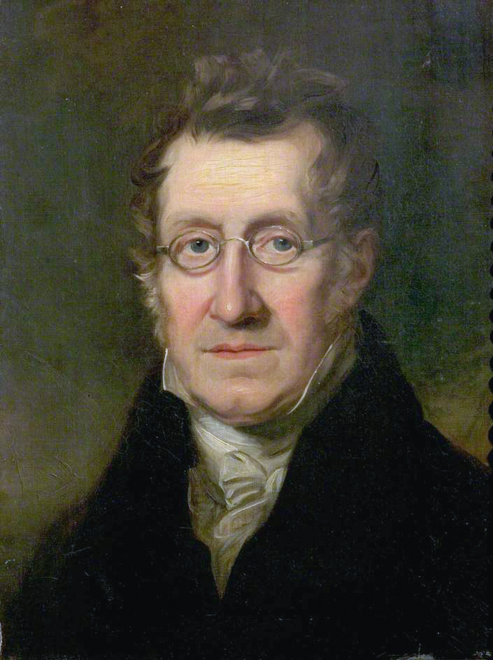
If you have not read very much about William Payne, you’re not alone. It seems no one who actually contributed to his biographies knew him personally. Few bothered to record Payne’s history when he was living. He is listed as being in over 100 art exhibitions, was a noted art instructor, developed innovative painting techniques and has a color hue named after him. And yet, he seems to have been underappreciated and dismissed by the art elite.
“Of William Payne but little is recorded: the place and date of his birth and death are forgotten.”
– Basil S. Long, January 1922 issue of Walker’s Quarterly (1)
Long, Basil S. “William Payne, water-color painter working 1776-1830” (London, Walker’s Galleries, 1922)., Public Domain
Long further writes that “he (Payne) was probably born in Devonshire” around 1755-1760. Long goes on to inform us that Payne worked as a civil engineer (supposedly a Second assistant of the Master Shipwright) at the Plymouth Government dockyard before moving to London and devoting himself exclusively to art around 1790. The first documented display of Payne’s artwork was at an art exhibition in Grosvenor Square in 1776 (5).
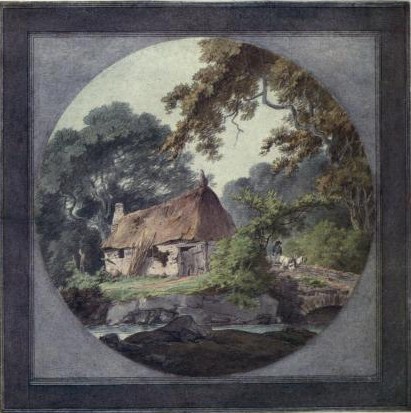
Being true to his dedication to art, Payne began offering art instruction and continued to display his landscape paintings and etchings. He was sought after as a teacher and “…almost every family of fashion we anxious that their sons and daughters should have the benefit of his tuition.” (5) This is likely due to his departure from the typical techniques of the time, as Payne is cited for his innovative painting methods, such as “dragging” or smudging paint across the watercolor paper with a rag or bread to create sunlight and atmosphere. His unconventional painting techniques include the use of a split, worn brush to create foliage, texture, and shadow. He abandoned the common practice of outlining watercolors in pen and ink.
Circa 1820 – By William Payne
(c.1760–after 1830) – Art UK, Public Domain
Although William Payne managed to be successful in selling his work, he never really reached a level of status as an “important” artist of the time. During the final chapter of his life, Payne’s painting style went through an unsuccessful degression, with the result as somber as the color he created. According to the Dictionary of National Biography, “…his art had degenerated into mannerism. He was surpassed by better artists, and forgotten before he died.” William Payne died (presumedly) in 1830, which coincides with his last reported gallery exhibition (6).
ONTO THE COLOR MIXTURES!
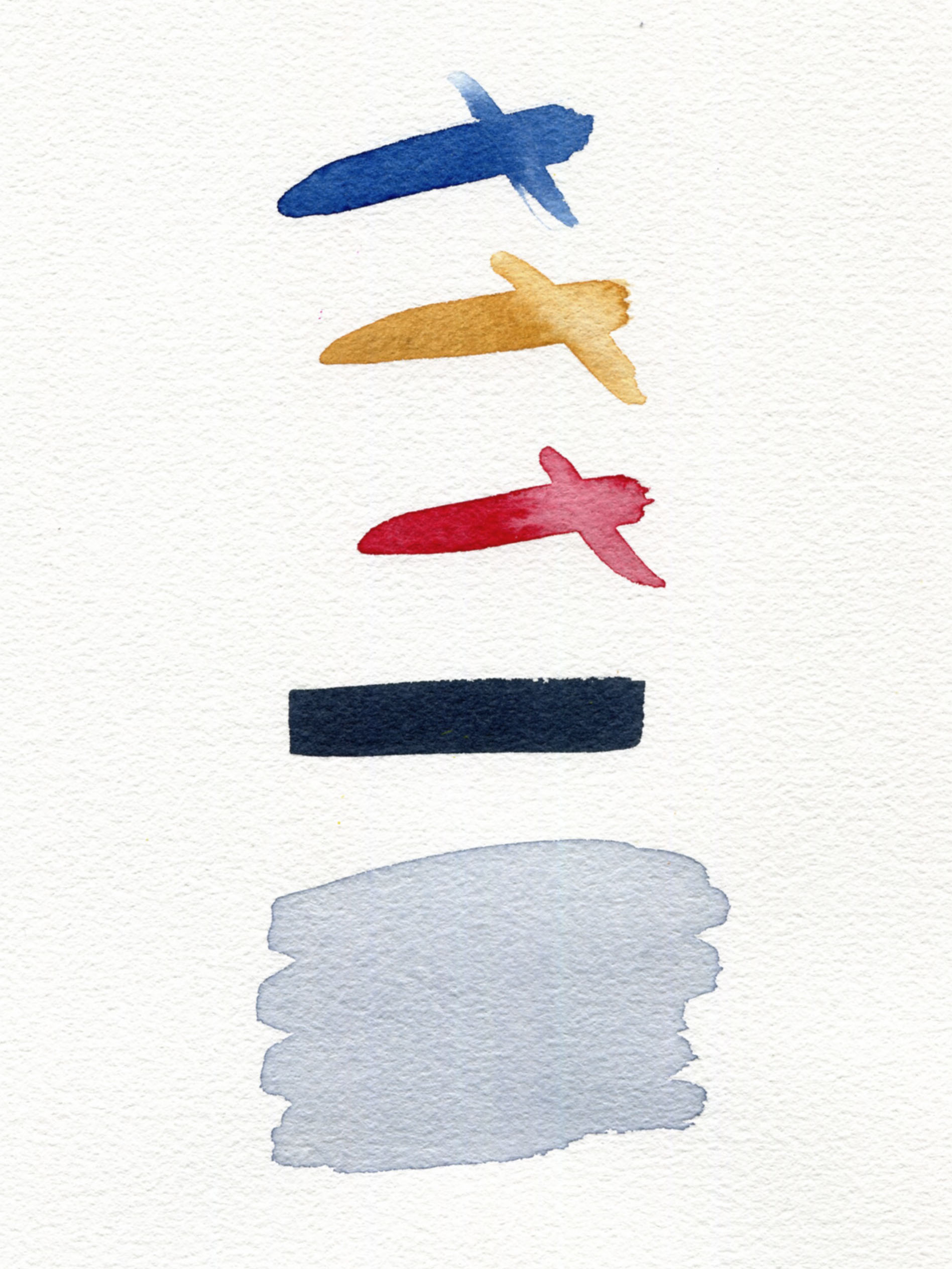
The ambiguity of William Payne’s life and career are surpassed by the supposed original recipe he used to create his namesake color. In 1804, J.W. Alston states that William Payne used a combination of Indigo, Raw Sienna, and Lake. A “Lake” colorant is usually an inert clay base to which a dye is attached. The most commonly used red lakes were Rose Madder or a Carmine, Scarlet or Crimson made from Cochineal. (9).
The first premixed version of Payne’s Gray is listed in the 1861 Winsor & Newton paint catalog, and later by Reeves in 1872, Rowney around 1885, Standage in 1887, and Seward in 1889. The actual colorants used by Winsor & Newton were not revealed until 1896 as being Indigo, (Cochineal) Lake, and Carbon Black. Reeves stated theirs to be Ultramarine (Blue), Carbon Black, and Alizarin. (8). The premixed commercial products were not only varied by the manufacturer but by paint type. Watercolor paints were more likely to be created using crimson, ochre, blue, and sometimes black mixtures, whereas by 1901, oil paints companies began moving towards the use of Ultramarine Blue and a black pigment, often Ivory due to the improved permanence (9). QoR and several other watercolor brands currently use a mix of Phthalo Blue (green shade), Carbon Black, and Quinacridone Violet. GOLDEN Acrylics and Williamsburg Oils use the Ultramarine Blue with Black mixture. Interestingly enough, William Payne was after a neutral gray.
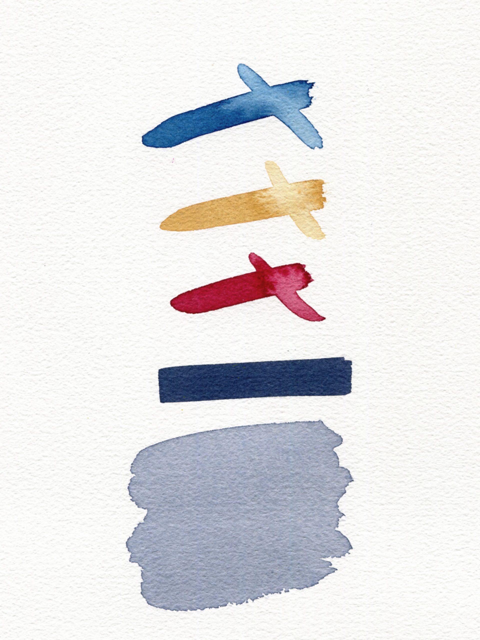
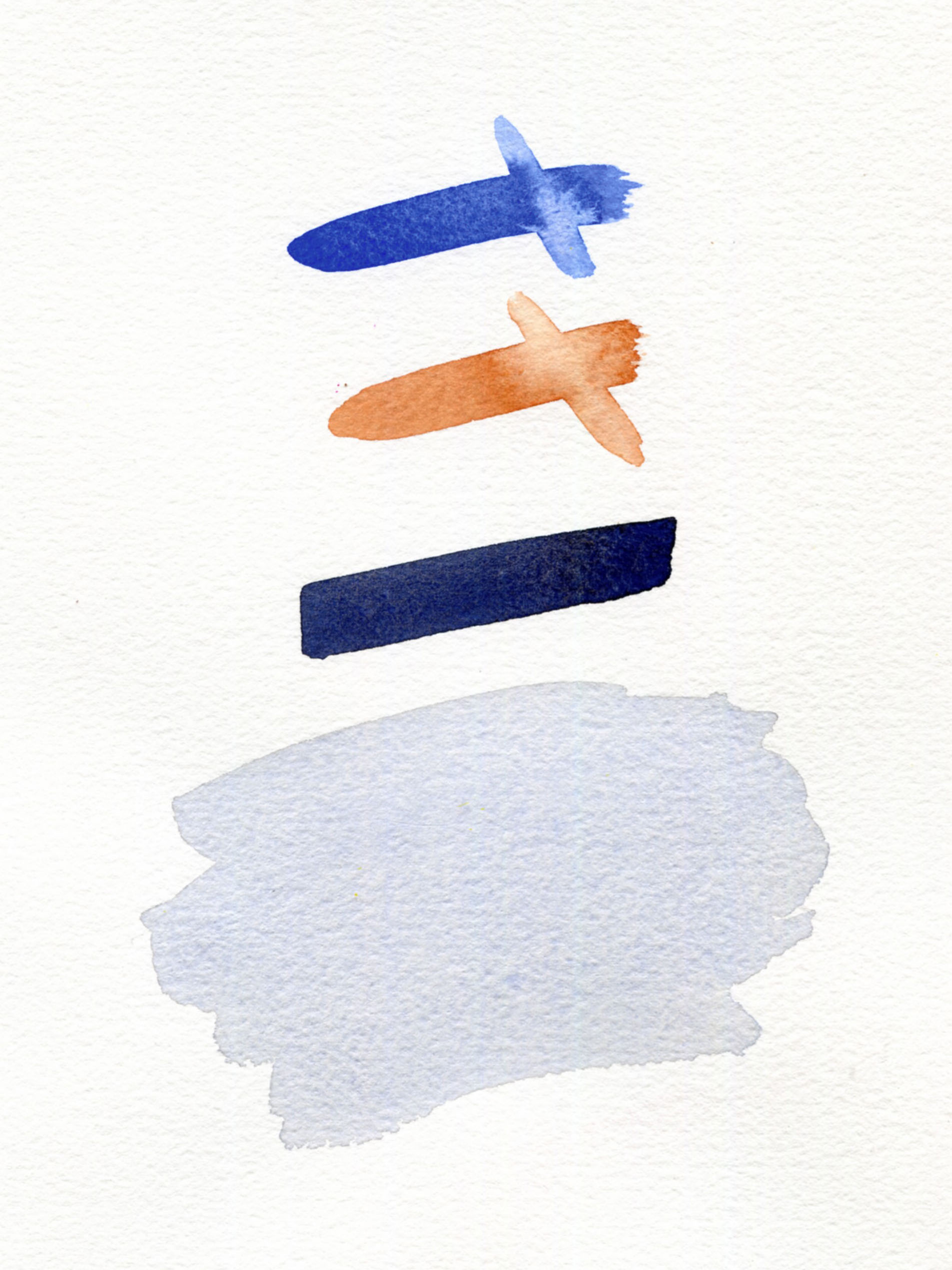
“THE ORIGINAL?” RECIPE #1
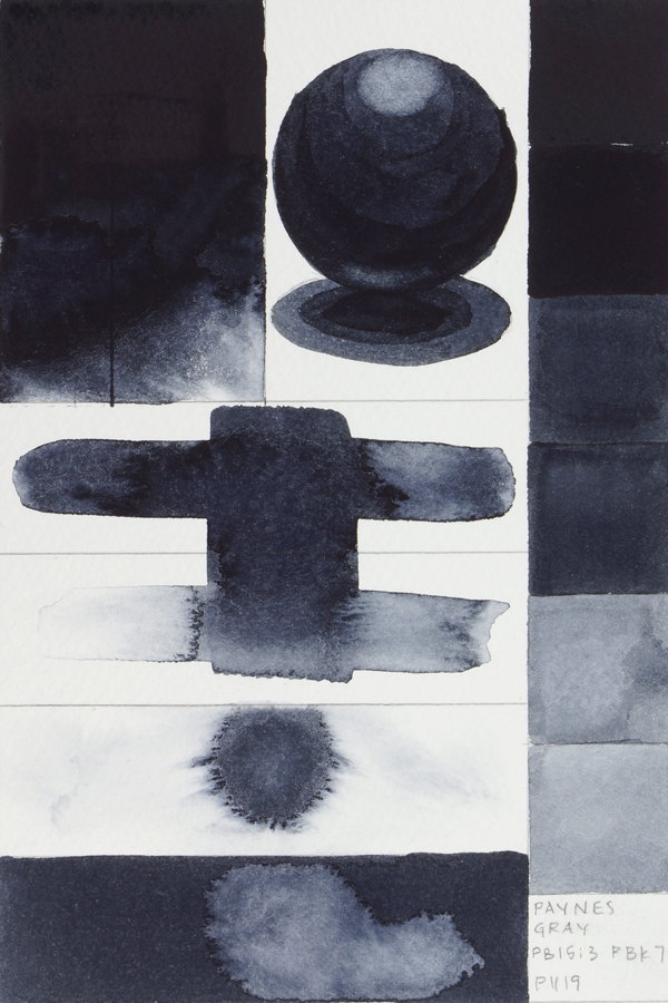
Background: Background: In the 1885-1900 edition of the Dictionary of National Biography, William Cosmo Monkhouse drearily described Payne’s recipe: “He was surpassed by better artists, and forgotten before he died… the invention by which he is best known is a neutral tint composed of indigo, raw sienna, and lake” (2). Since there isn’t a true Indigo or Lake, and QoR Indigo Color is a blend of PB15:3, PBk7, and PV19, we’ll use Indanthrone Blue (aka Anthraquinone Blue) instead. Then we’ll use our Permanent Alizarin Crimson (PR 177, also known as Anthraquinone Red) to mix with our QoR Raw Sienna to get things started.
Result: This combination produces a lovely purplish gray that seems to represent a proper Payne’s Gray.
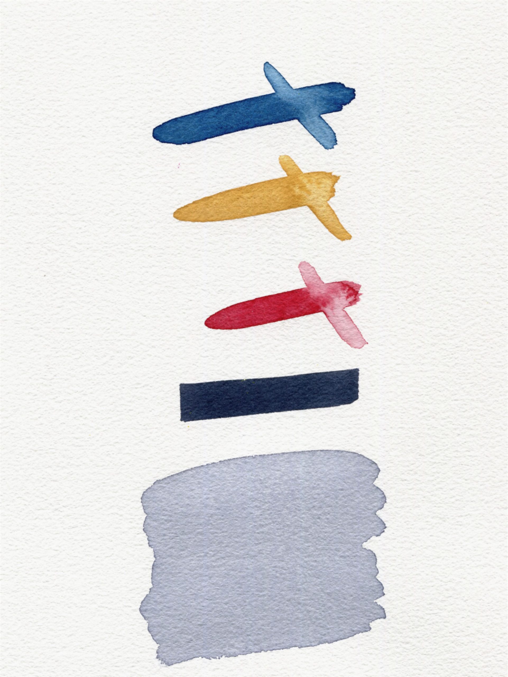
RECIPE #2
Background: According to Handprint.com, William Payne “…developed Payne’s Gray as a mixture of iron blue (PB27), yellow ochre and a crimson lake, used as a dark violet shadow color.” (4) Iron Blue is another name for this same pigment which these days is more commonly known as Prussian Blue. Prussian Blue was first discovered accidentally by the Berliner Diesbach in 1704 when he was trying to create a Florentine Lake. (3). In this example we combine the Prussian with QoR’s lightfast Quinacridone Crimson (PR 122/PR206), which is a blend of Quinacridone Magenta with Quinacridone Burnt Orange (PR206).
Result: Having Prussian Blue helped achieve a darker color, but the Quin Burnt Orange kicks out into the lighter wash, which takes away from the overall hue.
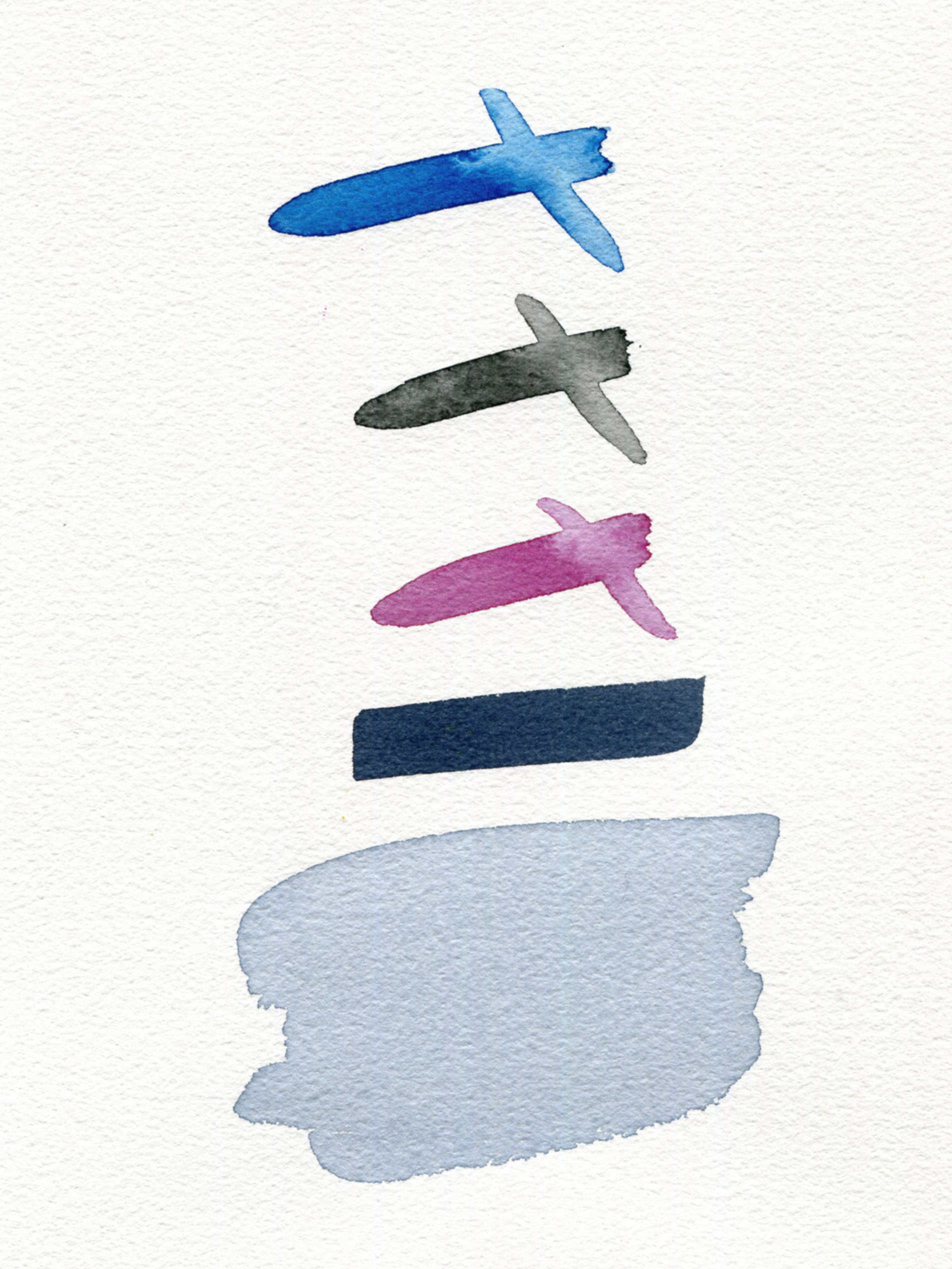
RECIPE #3
Background: Katy Kelleher references this mixture in her 2018 “Color Stories” article regarding all things Payne’s Gray. “Payne made his namesake gray by mixing a good deal of Prussian Blue with a smidge of yellow ochre and a dab of crimson lake.” (1) The use of Prussian Blue and Permanent Alizarin Crimson with Yellow Ochre gives a harmonious balance of mixing properties.
Result: This mixture results in a smooth, uniform wash, allowing a solid-toned black, and yet can still be pulled into the soft lilac direction in weaker, more transparent washes. Adjusting the pigment ratios allows for a great range of grays and neutrals and also works really well as a primary set if you don’t mind ochre as your yellow. This combination proved to be quite successful, due to the ability to match other Payne’s Gray blends coupled with a greatly improved lightfastness.
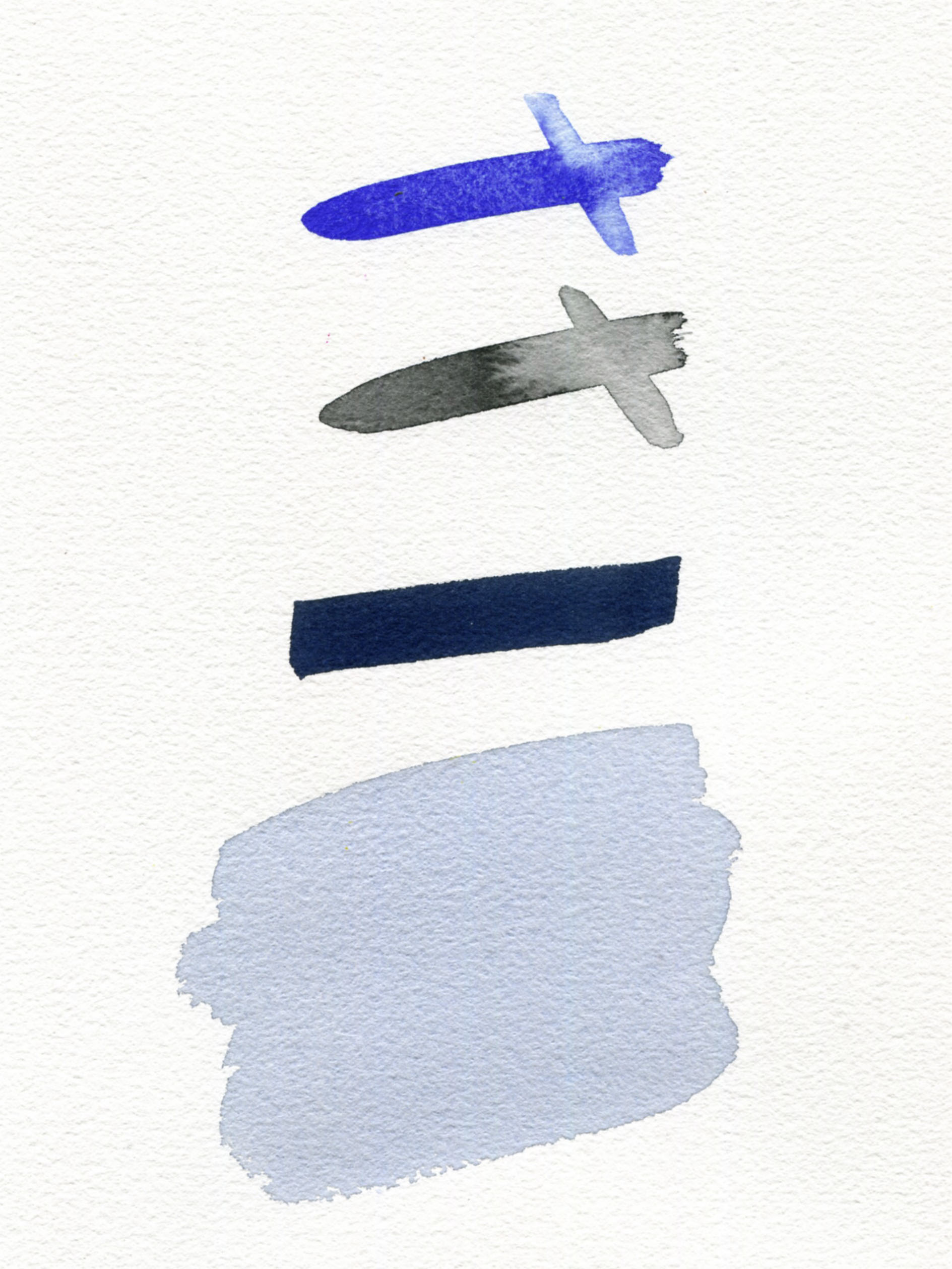
RECIPE #4
Background: Since we are using QoR Modern Watercolors for our evaluations we will start with the base pigments Phthalo Blue Green Shade (PB15:3), Carbon Black PBk7) & Quinacridone Violet (PV19) used to create QoR’s version of Payne’s Gray. This blend yields an intensely dark color that results in washes with a subtle bias towards bluish-purple. Other paint brands use a very similar combination.
Result: It’s easy to see why this mixture is so popular; the intense full strength gives way to thunderstorm cloud grays with ease. See the above image of QoR’s Payne’s Gray.
RECIPE #5
Background: Black and Blue-based blends are used in most of today’s premixed Payne’s Grays. Some companies use Ultramarine Blue or Phthalo Blue (or both) and combine them with Lamp Black, Carbon Black, or Ivory Black (a.k.a. Bone Black). Regardless, the resulting color ends in a similar conclusion
Result: It’s an easy mixture to create, but lacks character. It seems ironic that a color that was invented to be a great alternative to using black is now most often made using black. Still, lowering the intensity of pure black paint to shade other colors is very helpful. It’s very easy to overshoot the amount of Carbon Black in any mixture, and why Ivory/Bone Black is likely more commonly used for the pre-mixed offerings.
RECIPE #6
Background: Ultramarine Blue combined with Burnt Sienna is quite popular with artists that like to blend their own Payne’s Gray, especially those seeking to avoid the use of black pigments.
Result: Result: This mixture just feels right and in line with the three tri-color blends without any black. It’s softer, and perfect for watercolorists that love their granulating colors. The mottled mixture allows you to read both pigments, creating more interest in washes.
SUMMARY
There are many artists who devote time, paint and paper, who post their personal discoveries online and in print, confirming the interest and value of this color is still relevant today. Which version each artist gravitates towards is based on their unique perspective, and therefore there’s no true “right” or “wrong” recipe. It is a fascinating exercise nonetheless and gave us a reason to attempt to uncover what we think would be familiar to William Payne. And of course, an “update” to using more lightfast colors is important as well.
As always, post your comments and questions! – Mike Townsend
Note: QoR Modern Watercolors were used to recreate the versions of “Payne’s Gray”. Other brands, including what is used for the GOLDEN Acrylic and Williamsburg Handmade Oil Colors might not use the same pigments as QoR. Therefore, mixtures using other brands may or may not create the same hue in this article.
Bibliography
- https://www.theawl.com/2018/01/paynes-gray-the-color-of-english-rain-and-henry-millers-paris/#:~:text=He%20even%20told%20The%20Guardian%20that%20Payne%E2%80%99s%20gray,Shaw%2C%20Payne%E2%80%99s%20Grey%20II%202007-2008%20%C2%A9%20the%20artist
- https://en.wikisource.org/wiki/Dictionary_of_National_Biography,_1885-1900/Payne,_William_(fl.1800)
- JustPaint.Org “Some Historical Pigments and their Replacements” https://justpaint.org/some-historical-pigments-and-their-replacements/
- Handprint.com http://www.handprint.com/HP/WCL/waterw.html
- https://archive.org/stream/williampaynewate00longuoft/williampaynewate00longuoft_djvu.txt
- https://archive.org/details/williampaynewate00longuoft/page/n1/mode/2up
- https://www.winsornewton.com/uk/paint/watercolour/professional-watercolour/?attribute_pa_wn_colour_name=paynes-gray&attribute_pa_wn_colour_size=half-pan&sku=094376550535
- Alston, J.W., Hints to young Practitioners in the Study of Landscape Painting, London, n.d. [c.1804]
- https://en.wikipedia.org/wiki/Kermes_(dye)

Subscribe
Subscribe to the newsletter today!
Thank you for this outstanding analysis of this color. I will enjoy mixing my own using the recipes provided.
Thank you for letting us know that you enjoyed this article, Millie! I am fortunate to have been able to play with around 30! mixes before I arrived at these offerings. The biggest surprise for me was how dark of a mix is achievable using Yellow Ochre as a component. I’m sure you’ll have a grand time!
– Mike
It’s very interesting to read about the background and subsequent pigments that were (are) used to create Payne’s Gray. It was also curious that most of the formulations have a cool tint when he actually wanted a neutral gray.
I spent many years as a film and video colorist and learned quickly that a true neutral gray looks warm to most people. It wasn’t until I added some form of blue that clients would think it was “neutral.”
Thank you for your comments, Daniel.
The neutral tints that are less lilac-toned are achievable with the first 4 recipes. We use this mix in QoR for our Neutral Tint and the Indigo color as well. The GOLDEN and Williamsburg Neutral Grays were designed to be Acromatic and we use our spectrometer when making each batch to assure they are actually neutral. Most people will see them as “too warm” but as you state, it is measurably accurate.
– Mike
Thanks for another fascinating art/paint-related article. I recently bought M. Graham Brand’s Oil Payne’s Gray. And it was no good for my uses. When thinned with solvent it would turn into blue! I wound up washing with blue instead of an awesome dark gray like I wanted. Oops.
M. Graham’s version of Payne’s Gray, at least at that time, was Thalo Blue and Carbon Black. I’ve heard Thalo Blue has powerful tinting strength, but week covering strength, so I guess thinnned the blue overpowers the black destroying the color. This color now is supposedly formulated with Ultramarine Blue instead.
I think the only reason the Ultramarine and Black mixture is the most popular is simply because it’s the cheapest to make, and those who would complain about it instead would be the types to mix up their own.
Hello Dave,
The blue and black mixes are very common and your reasoning for Ultramarine Blue with Blacks’ popularity is valid. I would also add that 2 color blends are by far easier to color match compared to a tri-color mixture. The non-black blends were fun to mix with many surprises. The mix we have in QoR’s Payne’s Gray is also used to create our Indigo and Neutral Tint, so it has a great range.
– Mike
I was introduced to paynes grey by my watercolor instructor in art school a long time ago. Since that day, none of my palettes has been without it (them).
I remember that the instructor called it the watercolorist’s “black” because it stubbornly maintained a transparency that the other watercolors demanded.
The different recipes explained why the slight warm-cool not quite violet hue of that first W-N watercolor tube has not always been present in the many other paynes greys I’ve used. It is truly a remarkable color and thanks for taking us down this rabbit hole.
Can’t wait to jump into the next one with you.
Enjoyed learning about the forgotten creator of such a useful color. Thank you for this excellent info, so well written and laid out.
Nina
Nina.
Thank you for the kind words. I appreciate your reply! Hopefully we’ll be able to continue finding factual tidbits about William Payne so his legacy can continue on!
– Mike
Recipe #6 – Ultramarine Blue & Burnt Sienna is available as a premixed watercolor from Daniel Smith. Named “Jane’s Grey” after the artist Jane Blundell who has published numerous studies of pigments, pallettes, and mixtures on her website. Here’s an article she wrote about Jayne’s Grey: https://janeblundellart.blogspot.com/2019/02/janes-grey.html?m=1
Thank you for your comments, Jon.
I did visit Jane Blundell’s Blogspot while researching this article. This blend is a favorite for many artists. Cathy Jennings, our in house watercolor and paper maven, makes a blend of Ultramarine Blue and Transparent Pyrrole Orange that is truly amazing to see!
– Mike Townsend
Lovely, thank you 😊 I’m going to try out these mixes now for fun, and see what I like best!
Delila,
Thank you for your kind words and you are most welcome! I was pleasantly surprised with the range of the tri colors similar to what Payne mixed.
– Mike
Interesting article thank you! I have always assumed that Paynes Grey was a mix of Ivory Black, Ultramarine Blue, and Raw umber. That is a mix I use anyway and it produces a nice warm blue-grey colour. It seems like the commonality in the various tints, is essentially black with blue and a warmer colour.
Thank you so much for this informative article. Excellent in every way!
Thank you, Martin!
It is great to hear from you. It’s been a while since the days of “Groop”. I hope you are doing well!
– Mike
Amazing piece of content, Thanks for putting everything under one roof!
Thank you, Sheila!
– Mike Townsend
This is the first time I have read a Just Paint article. Other than religious icons which I have done for 10 years, I am an amateur and a kind of intuitive dabbler. No formal training. I read a few books by artists whose approach is informative and inviting – Stephen Quiller and Nita Leland. It was in one of Nita Leland’s palettes that I discovered the use of Payne’s Gray as a blue. I chose Payne’s Gray as the black in the palette for my grandchildren. I am now teaching my grandchildren – ages 15, 12, and 10 – using a book called “Learn How to Paint in Acrylics with 50 Small Paintings” by Mark Daniel Nelson. The oldest completes an almost perfect reproduction of each small painting. The other two, 12 and 10, are messier in their approach. At first, I tried to guide them to work more like their older sister, because I thought their messiness came from inexperience. I’ve stopped doing that because with the last painting, no matter what I told them, they persisted with their individual approaches. Tongue-in-check, the 12 yo is a budding Miro and to 10 yo is insisting on bold strong strokes a la Van Gogh – although I don’t think either of them is aware of these particular artists. The painting they were attempting is called The Big Blue Sea and the point of the lesson was to learn how to produce a gradient of a color – cobalt blue hue – from light to dark (shore to horizon), I shut up when I realized that despite following their own impulses, they had achieved the gradient and a very attractive and interesting interpretation of the original subject.
Thanks for the great read and the recipes for Payne’s Gray.
Thank you so much for this! It is as you correctly say Payne’s **Gray** NOT Payne’s **Grey**.
Merci pour votre commentaire, Melany.
Si vous avez une référence historique pour cette affirmation, nous serions ravis de la connaître !
Michael