Introduction
In 2024 we introduced 13 pigment-containing watercolors to the QoR line and 8 Interference and Iridescent paints. We wanted a way to share the potential of these new colors with you in a manner that suggests what it might be like to have one or more on your palette. To provide this information, we decided to focus upon the mixing potential of our new pigmented colors. This article shows and discusses mixing tests where each color was blended with the same three primaries from QoR. Hopefully the tests we share below will give you a sense of what you might find when you discover these colors on your own.
The Mixing Partners
We selected QoR Ultramarine Blue (PB29), Quinacridone Magenta (PR122), and Nickel Azo Yellow (PY150) as the mixing partners. Ultramarine Blue is an often-used granulating color found on many watercolor palettes, and familiarity might help artists understand the mixes it creates. Quinacridone Magenta is one of the QoR superstars, bright and strong in color, and is familiar to many artists using QoR. Like Ultramarine Blue, Quinacridone Magenta leans slightly toward purple in color bias. Finally, Nickel Azo Yellow offers an amber-like masstone, which changes to a bright yellow when diluted in washes. This yellow leans slightly towards green. Both Quinacridone Magenta and Nickel Azo Yellow are transparent staining colors, while we rate Ultramarine Blue as semi-transparent and semi-staining. All three colors provide ASTM Lightfastness I or Excellent lightfastness (our equivalent to LF I).
The Format
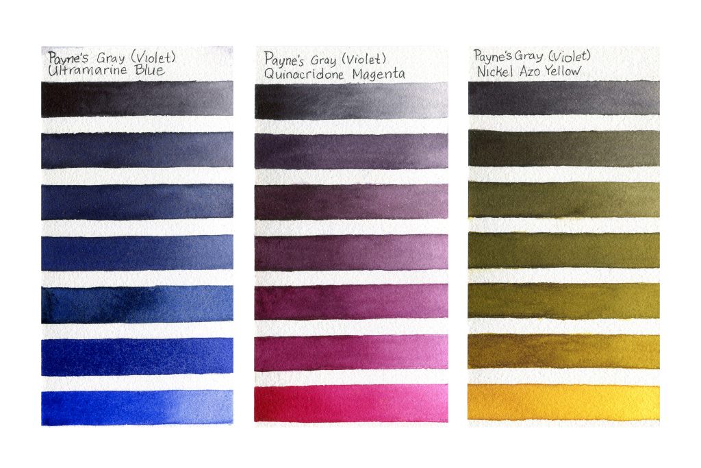
Earlier articles have used mixing charts to demonstrate the potential when two colors are blended. This time we decided to try a new approach: a vertical stack of seven horizontal stepped color changes. The top stripe of paint is the new color, and the bottom stripe is the primary. Ideally, the center is a mixture where neither of these colors dominate. Each step down provides approximately the same shift in color. At the same time, dilutions change from the left where less water is used, to the right where greater dilution creates a more transparent wash. We hope this new format will offer a more complex understanding of the potential each new QoR color provides as a mixing partner.
The New Colors and Their Mixes
Payne’s Gray (Violet)
PBk7, PV29, and PB15:3, LF Excellent, non-granulating, opaque, staining
Our original Payne’s Gray leans slightly towards blue, and this new color is biased toward red-violet. Since this is a dark gray to begin with, it can mute saturation and create a range of chromatic grays. Mixing with Ultramarine Blue (UB) introduces granulation and the potential for shadowy blue-grays. Combining with Quinacridone Magenta (QM) allows for reddish grays with a pink undertone, which might work well for a warm shadow on a dark surface. Nickel Azo Yellow (NAY) blends provide mixes from ashy gray-greens to muted yellow olive greens.
Ultramarine Turquoise
PB29 and PG7, LF I, granulating, semi-transparent, semi-staining
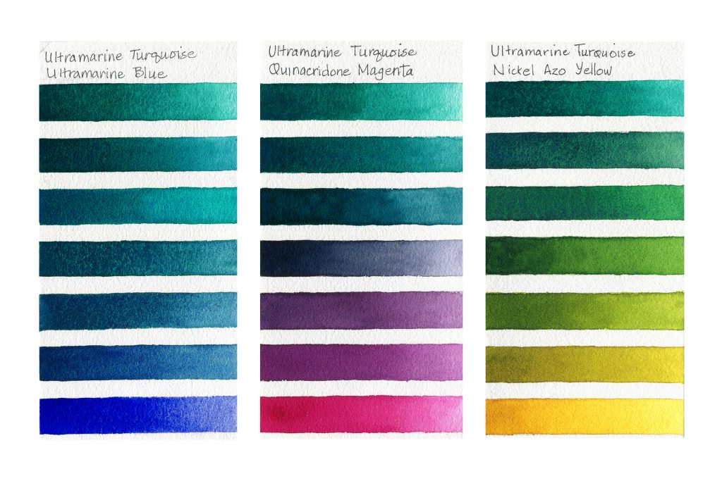
This gorgeous blend of Ultramarine Blue and Phthalo Green (Blue Shade) is a granulating green-blue color. When mixed with UB, granulation increases as does the range of possible blue-greens. With QM, mixes move from muted green-blues, to an intense gray, and then cool red-violets. NAY and Ultramarine Turquoise create blue-greens, green-greens, and yellow-greens. Color is clear and transparent. At the moment, QoR Ultramarine Turquoise is only available as part of the Ali Cavanaugh Portrait Colors set.
Phthalo Blue (Red Shade)
PB15:0, LF Excellent, non-granulating, transparent, staining
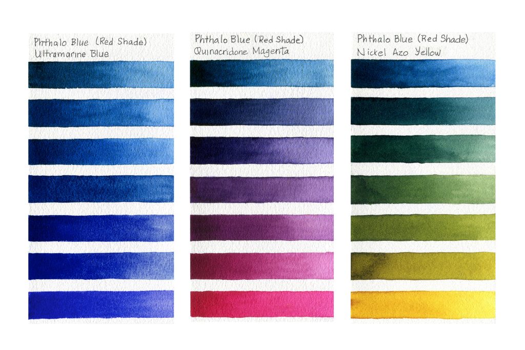
We received requests that we add this color to the QoR line, and here it is! Phthalo Blue (Red Shade) is a more violet-leaning version of Phthalo Blue (Green Shade). Both are very strong in mixing power, and a little goes a long way. It will mix a lovely range of blues that become warmer and more granulating the more Ultramarine Blue is in the blend. Using QM with this blue creates a range of blue-purples, purples, and red-purples. Nickel Azo Yellow and Phthalo Blue RS create a range of lovely, slightly muted greens.
Ultramarine Pink Dark
PV15, LF I, granulating, semi-opaque, semi-staining
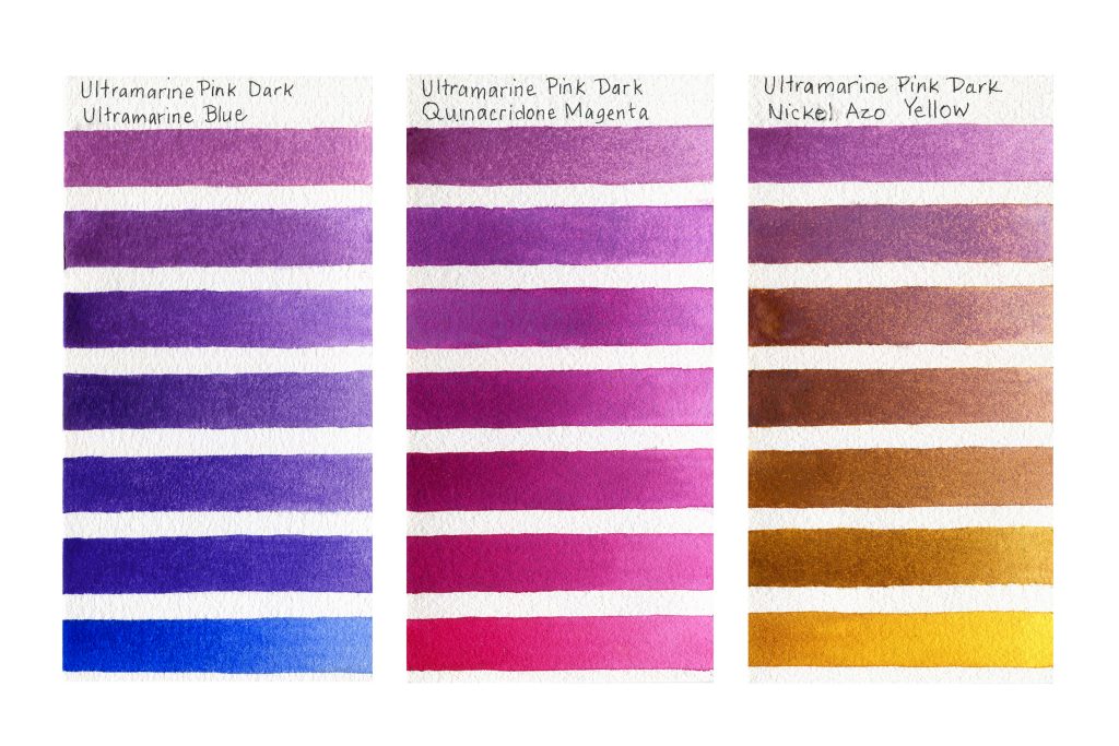
Ultramarine Pink Dark occupies the general color space of our discontinued Ultramarine Pink, but is slightly darker. This is one of our few new granulating colors. With UB, mixes range from a more violet version of UB through to a soft red-violet, all of which granulate. Blending with QM creates a range of pinks and magentas. NAY and Ultramarine Pink Dark together create granulating muted brownish yellows, browns, and pinks with a slight orange undertone.
Cadmium Purple
PR108, LF I, granulating, semi-opaque, semi-staining
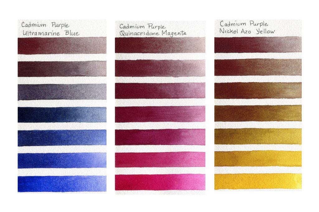
Cadmium Purple is a dark brownish-reddish-purple that granulates beautifully. This can lead to separation in washes when mixed with other colors. When diluted greatly, the color may look a little like cool tarnished silver. Blended with UB, this cadmium can create lovely shadowy brown-grays, navy-grays, and navy blues. All of these granulate. QM mixes create a range of magentas with warm brownish-gray granulation. When NAY is combined with Cadmium Purple, they create a range of reddish browns and yellowy tans that granulate and separate.
Perylene Violet
PV29, LF Excellent, non-granulating, semi-opaque, staining
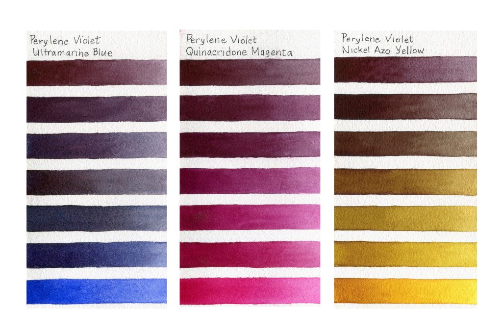
This is a dark reddish-brown violet with low color saturation, which makes it great for shadows and neutralizing other colors. Mixing with UB creates a range from muted red-violets to blue-violets. With QM, red-grays, wine-reds, and darker magentas are possible. Blending with NAY allows for muted reddish browns, gray-browns, and yellow-greens.
Perylene Crimson
PR179, LF I, non-granulating, semi-opaque, staining
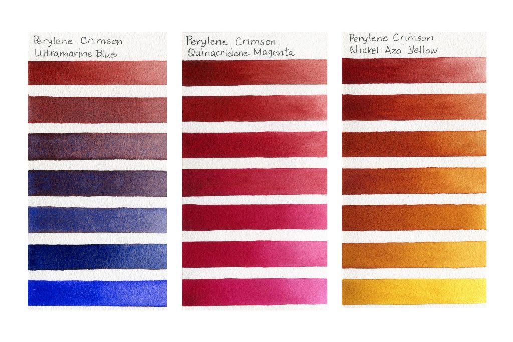
Perylene Crimson is redder than Perylene Violet, which shows in the mixes it creates. Blending with UB offers a range of brownish-reds with blue granulation, and darker grayish blues. Since Perylene Crimson and QM are both red, a range of beautiful reds from a more saturated version of Perylene Crimson to a slightly darker magenta can be created. With NAY, brownish reds and amber yellows with glowing undertones are possible. This is one of three new QoR colors included in the Ali Cavanaugh Portrait Set.
Benzimidazolone Burnt Orange
PBr25, LF Excellent, non-granulating, transparent, staining
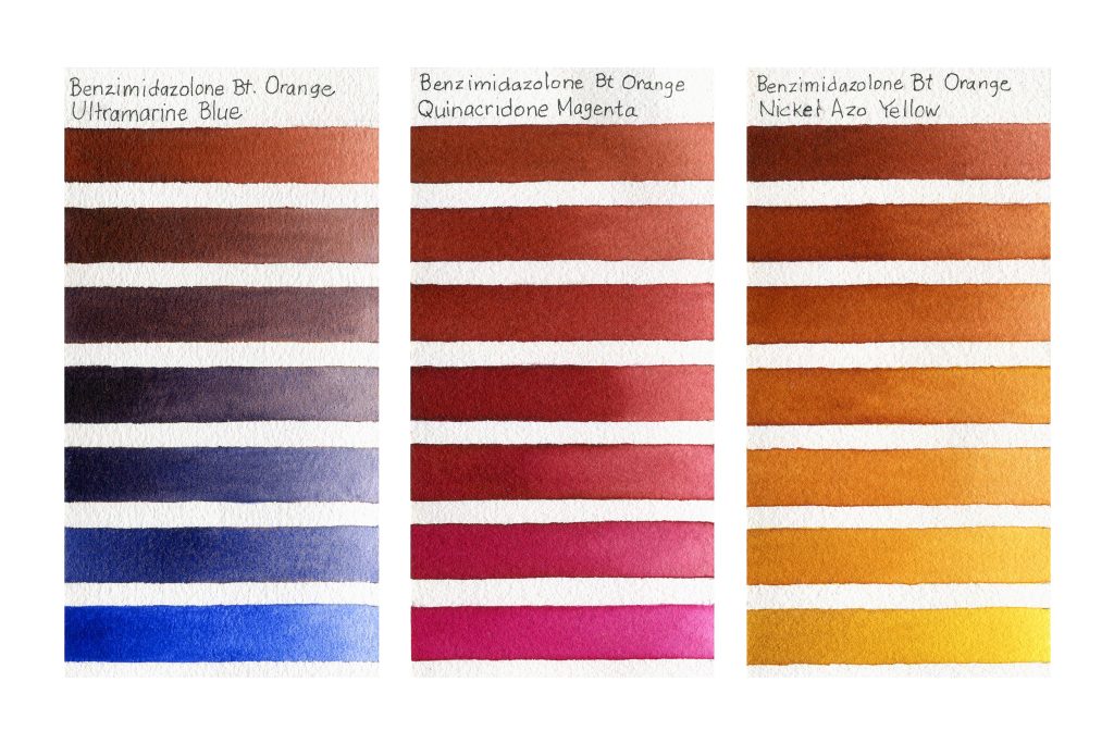
Benzimidazolone Burnt Orange is a strong transparent rusty orange-red. In washes it seems to be a transparent version of QoR Venetian Red, which is opaque. With UB, we have rusty browns with blue granulation through to dark inky blues, all slightly muted in color. Mixing with QM provides us with pinkish browns that transition into slightly brown magentas. With NAY, we again have browns with a yellow undertone and yellow-ambers. There can be a slight color shift with mixes when pigments in blends separate as washes dry.
Brown Umber (Natural)
PBr7, LF I, granulating, semi-opaque, staining
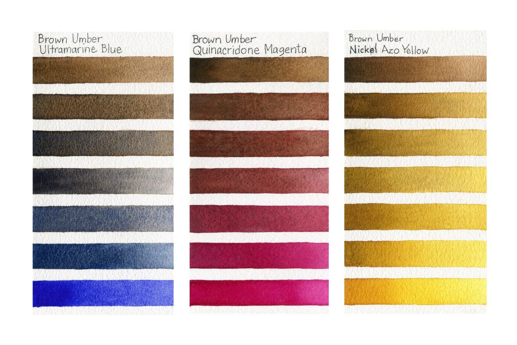
Brown Umber is a lovely granulating introduction to the QoR umber family, with a range from dark brown in opaque masstone to a slightly yellow brown in washes. Mixing with UB creates the traditional umber and UB mixing range from darker browns, to chromatic blue-gray-brown washes, and finally muted blues. All are dappled with darker browns or blues from granulation. When blended with QM, this color creates a range of reddish browns and brownish reds all with a pink undertone that varies in strength depending upon which color dominates the mixture. The brown granulation is especially lovely in the intense washes of the three middle mixes, where the transparent pink of the magenta seems to glow around the darker speckles of brown. NAY and Brown Umber create strong browns with a more muted yellow undertone and brownish-yellows with yellow undertones. All have the beautiful brown granulation.
Naples Yellow Deep
PBr24, LF I, non-granulating, semi-opaque, semi-staining
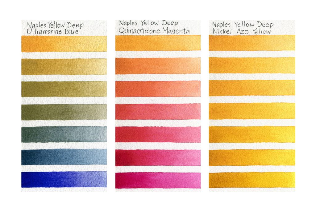
This single pigment paint is more saturated and orange in comparison with our original Naples Yellow. It is fairly opaque and might work well as a gouache. Mixing with UB produces yellow greens, neutralized blue-greens, and olive-greens of varied opaqueness. Pinks and peachy-oranges result when mixed with QM. Blends with NAY are increasingly opaque and yellow-orange as more Naples Yellow Deep is added, but they retain at least a little of the bright yellow undertone for which NAY is known.
Isoindolinone Yellow
PY110, LF I, non-granulating, semi-transparent, semi-staining
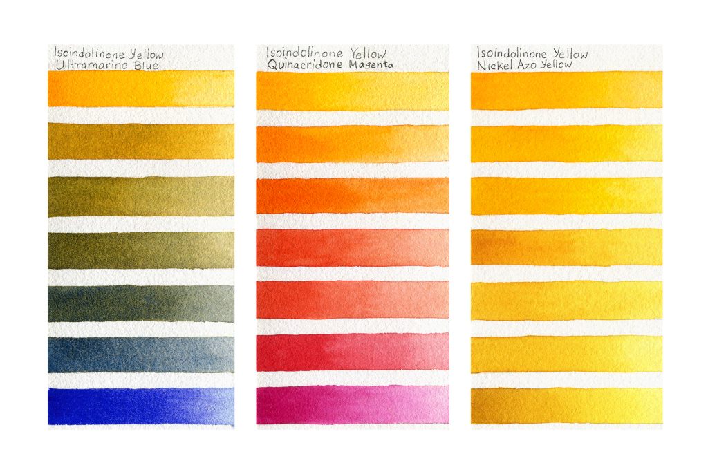
This is a strong intense yellow-orange that has been described by colleagues as orange peel and sunshine. In terms of color, it could be considered an intensely saturated version of Naples Yellow Deep, as the two create a similar range of colors with PY110 being more intense in chroma. In UB mixes, beautiful orange-greens, olive-greens, and blue-greens with blue granulation are possible. With QM we again have a range from orange to red to pink, with some coral and salmon in the more diluted areas. Blending with NAY can provide a range of vibrant yellow-orange and yellow washes.
Pyrrole Orange
PO73, LF I, non-granulating, semi-opaque, staining
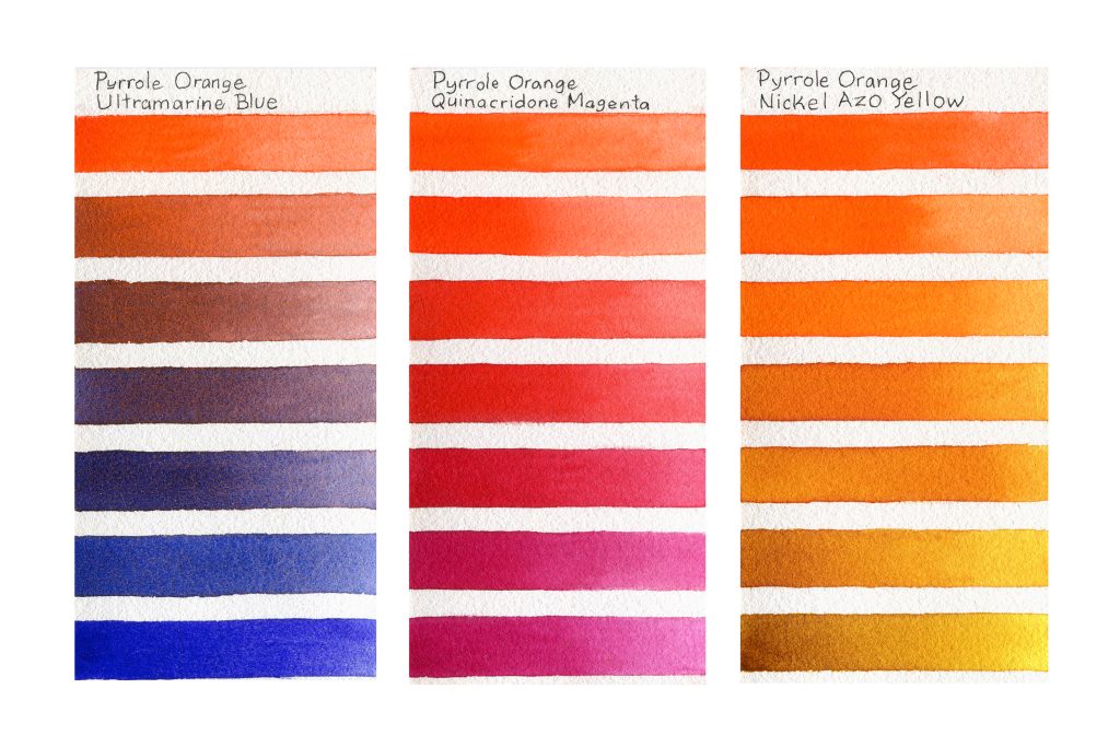
This is a semi-opaque bright orange with a salmon or coral color in dilute washes. It leans a little more to red than our Transparent Pyrrole Orange (PO73). When mixed with UB, we have a range of muted brownish oranges and purples with blue granulation. QM allows for a range from red-orange, to red, to magenta. NAY creates orange-ambers which shift more yellow in dilute washes. Pyrrole Orange might have a place on any palette needing intensely saturated paints that can also neutralize other colors, and is one of three new QoR colors included in the Ali Cavanaugh Portrait Colors set.
Disazo Scarlet
PR242, LF Excellent, non-granulating, semi-opaque, staining
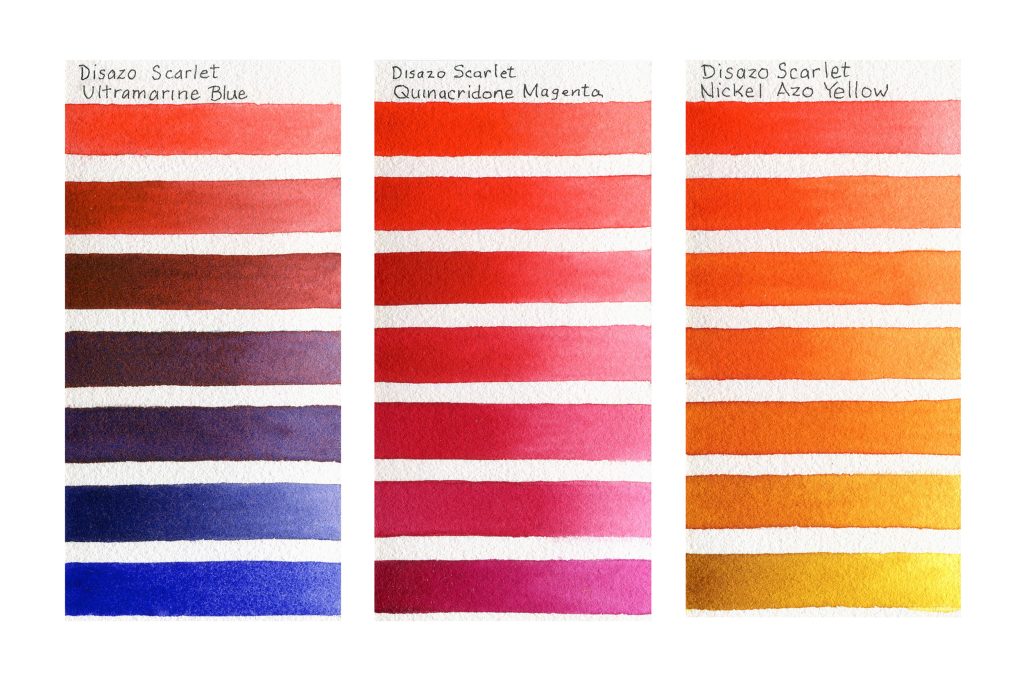
Disazo Scarlet is an intense semi-opaque orange-red. Mixed with UB, we have a range from reddish browns through purples to a dark warm blue. Granulation is less as the red dominates. With QM, we have intense red-oranges and reds that, in dilute washes, provide a range of pink and salmon colors. Blends with NAY create a robust range of oranges and orange-yellows, with lighter washes appearing more yellow. This red might work well on any palette seeking saturated color.
Conclusion
The color of a mixture depends upon the personality of the paints used, which color dominates the mixture, and the amount of dilution. However, other things can also impact the results. Pigments in a wash can separate, leading to color changes while the paint is drying. One of the clearest examples of separation can be found when colors are mixed with Ultramarine Blue, resulting in areas of blue surrounded by the mixing partner. Further, as we have seen with Nickel Azo Yellow, the color of a diluted application might have a slightly different chroma than a more opaque application does. Paper can also make a difference in results, and in this case all mixing tests were painted on 140 lb/300 gsm cold pressed Hahnemühle The Collection watercolor paper. We hope these tests are helpful, and we encourage you to pick up a tube or two and experiment with new mixes to see what might happen!
About Cathy Jennings
View all posts by Cathy Jennings -->Subscribe
Subscribe to the newsletter today!

You have no idea how helpful this article and color samples are to a partially color-blind watercolor artist. Having each the samples labeled so clearly help me to ‘see’ what happens when the colors are mixed. I can recognize colors in other artists’ work that I love but I have no idea how to create them. Thank you for sharing!
Hello Becky,
Thank you so much for your comment. It makes us so very happy to hear that our articles are useful for artists! We wish you great success and enjoyment with your painting.
Warm Regards,
Cathy
Ditto! And you can probably how much I really appreciate hearing a fellow shade-blind gifted person share their perspective. I concur vehemently and I wish that more pigment manufacturers and bloggers would include this level of information, which is what I need. Hiyu masi ~ Big Thanks 🪶
Hello Jeff,
We are so glad you find this mixing article helpful! Thank you for letting us know, since reader response can help guide the content of future articles. Just in case it is helpful, if one of the mixing images is clicked, a larger view of it should open for you. If you click the larger image, an even larger image should open. This can help with looking at individual mixes. Depending on how the initial image is clicked, the image file will open in a new tab (on a PC with mouse, right click and select ‘new tab’) or in the tab where the article had been (left click on the article’s image to do this). In the latter case, use the back arrow to return to the article. On an iPhone, holding your finger on an image will bring up the menu to open in a new tab. You can then zoom into the image, and even download it if that is of interest.
Happy painting,
Cathy
Love the colors!
Did you create a new color tin with small tubes of these colors?
I would consider buying one!
Hello Maya,
We like the colors too! We do not have a set of the new QoR colors, although the six-color Ali Cavanaugh set does contain three of them (Ultramarine Turquoise, Perylene Crimson, Pyrrole Orange). We will let Marketing know you are interested in a set of new colors.
Warm regards and happy painting,
Cathy
Good Day/Evening, Ms. Cathy.
Amongst the newly-added pigments to your watercolor range, I love your Pyrrole Orange, Isoindolinone Yellow, and Naples Yellow Deep the most. As you may already know, I tend to use QoR more as gouache than watercolor due to the flexibility of the resulting films upon drying- even when applied thickly. Based on Bruce McEvoy,s pigment recommendations, I’ve known that Naples Yellow Deep(PBR24) can easily function as gouache even when relatively dilute, but I was pleasantly surprised that even Pyrrole Orange(PO73) is opaque enough to be used on its own bodycolor (provided it is thick enough). One of the hardest chores in the world of gouache is finding a single-pigment, non-Cadmium based, non-toxic, permanent, bright medium orange paint; now, my wish has finally been answered thank to your effort. And even though Isoindolinone Yellow Deep(PY110) is to transparent to function as a single-pigment Indian yellow paint, mixing a small amount of it with Pyrrole Orange can make sufficiently-opaque yellow-oranges; Conversely, combining it with the canary yellow-hued Benzimidazolone Yellow Medium(PY154) can turn it into acceptably-opaque Indian Yellow paint.
Hello Clarence,
What a lovely comment you left for us! We are so glad you find the opacity and intensity of the new QoR Pyrrole Orange helpful for your painting palette. Should you be interested, we have a QoR chart that is sortable by traits like Opacity/Transparency. Simply click on that in the header, and all of the colors will be sorted from opaque to transparent (or the opposite).
Once again, thank you. We wish you great joy and success in your gouache painting.
Cathy
Although the names of the colors are hard to remember, the colors created are lovely. They would be hard to recreate with other paints, I’d love to try a tube or two in my renderings,
Hello Lois,
We are glad you find the colors attractive. Unfortunately we do not have samples of the new QoR paints. We hope you do decide to try one or two to see what mixes they can create for you.
Warm regards and best wishes for happy painting,
Cathy
Wow what an absolute beautiful way to show these wonderful mix’s. I have the granulating set and you answered all the questions to what I should add to my empty pans. I really want to be forced to start mixing my own colors, this awesome set will do that!
Thanks again
Hello Michelle,
Thank you so much for your kind words! We are glad you found the article helpful, and encourage you to start mixing your own colors. Mixing can be so fun!
Warm Regards,
Cathy
Really spectacular calibrations. Thanks.
Thank you, we hope you find the mixes helpful!