
If you’ve ever wondered where it makes sense and is safe to cut corners on art supplies, while maintaining a high standard and ensuring longevity of your artwork, this article is for you. We’ll share a few simple tips on how you can make the most of your art supply budget while using professional artist grade materials.
Limit Palette to Low Series Colors
All GOLDEN paint lines are grouped into 9 distinct Series, which are price categories, depending on the cost of the pigments used in each color of paint. Series numbers can be found on paint labels and in our online color charts (Heavy Body, Fluid, High Flow, SoFlat). Using a limited palette with colors in the low Series, for instance 1-3, is a great way to start reducing costs.
- Series 1-3 palette list
- Primary colors & visuals

Series 1 -3 colors
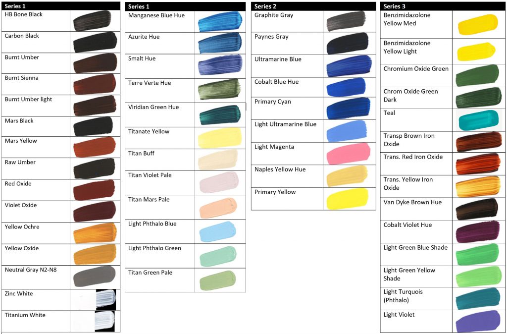
Using a limited palette has many benefits: it helps improve color mixing, since one is forced to mix hues rather than reaching for a paint tube that is ‘pretty close’ and it is easier to keep control over color temperatures using fewer pigments.
Stretching Paint
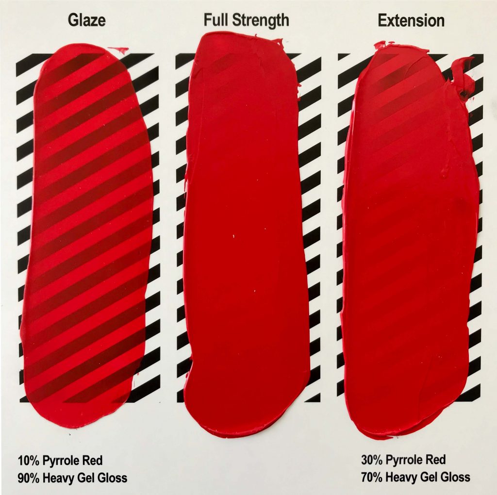
Although you can get such an amazing variety of less expensive pigments through series 3, you may need to also invest in higher series colors. For example, the first three series, have no real bright reds. You can still paint on a budget by picking up one or two of the more expensive colors and simply extending them with acrylic mediums. While other manufacturers may use non-colored materials like chalk and barium sulfate to bulk their student grade paints and thus lower the price of manufacturing, our concern is entirely with the function and quality of the product. Therefore, GOLDEN paints are usually on the higher end of the price spectrum. Stretching paints with mediums and pastes basically allows you to create your own student grade paints, which are simply paints mixed with large amounts of filler; only now you have the additional benefit of having full control over pigment load, transparency and consistency of the paint. A student grade paint cannot be turned into an artist grade paint, but an artist grade paint can be stretched into a student grade one to whatever extent you choose. All GOLDEN Mediums, Gels and Pastes have been tested for compatibility with all our paint lines. Products that are particularly suitable for stretching paints would be:
| Clear Mediums | Gloss Medium, Glazing Liquid, GAC 100, GAC 500, Fluid Matte Medium |
| Clear Gels | Soft, Regular, Heavy, Extra Heavy Gel |
| Opaque Pastes | Molding Paste, Extra Heavy Molding Paste, Fine Pumice Gel |
Stretching paints with mediums, gels, pastes, or water is a great way to make your paint go further and teasing out the subtleties of undertones. Below is an example of Heavy Body Pyrrole Red being stretched with Heavy Gel Gloss to a translucent glaze using 90% Gel. An addition of 70 % Gel still creates a semi-opaque paint layer.
For more information on how GOLDEN mediums, gels and pastes work, please review the following videos:
- What, Why & How: Painting with GOLDEN Fluid Acrylic Mediums
- What, Why and How: Painting with GOLDEN Acrylic Gel
- What, Why & How : Painting with GOLDEN Pastes
Product Sizes & Product Care
Buying larger containers of your staple products is economical and this applies to all product categories. GOLDEN products have no expiration date and to help you enjoy them until it’s all used up, we have an article for you on product care here.
Palette Management
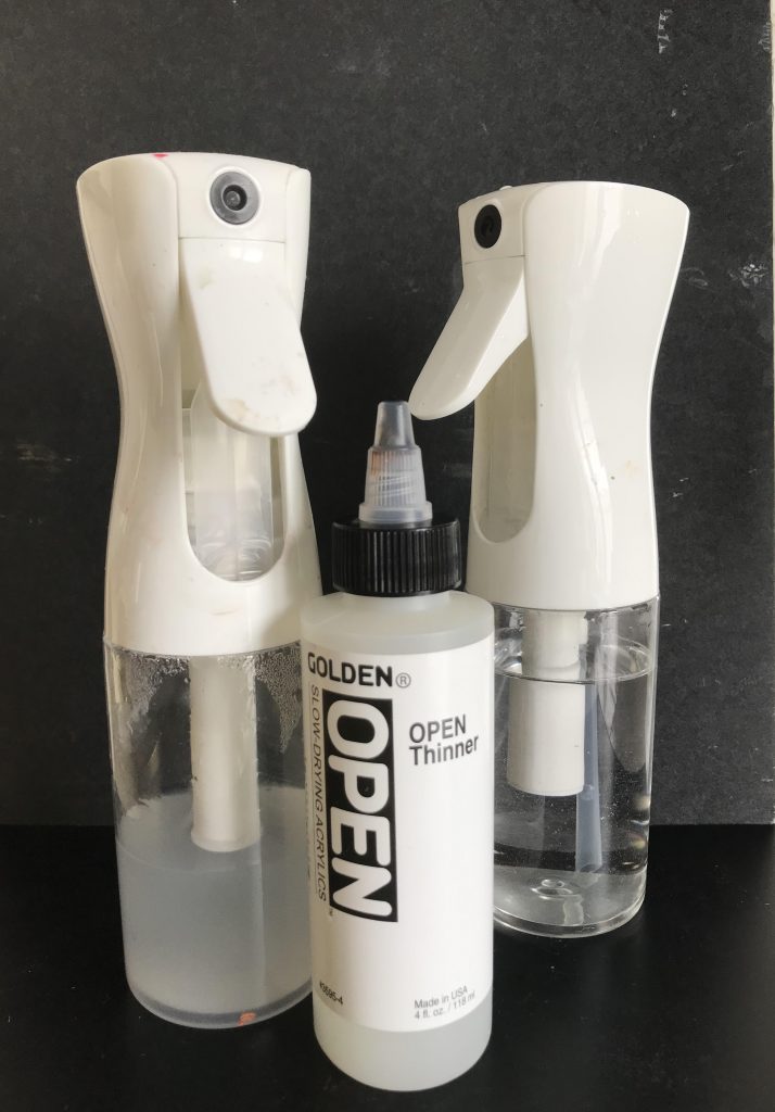
Reducing dried out paint on the palette is another easy way to save a little. During painting sessions the palette can be spritzed with a spray bottle or atomizer filled with water and some OPEN Thinner, or just water. Distilled water will reduce the risk of bacterial growth and OPEN Thinner will retard the drying process. Depending on the type of spray bottle, the amount of water needed to dilute the OPEN Thinner can vary. Start with 30% water and add more water until it sprays smoothly. Rather than transferring paint from the palette back into paint containers at the end of a painting session, cover the palette with a plastic wrap and store in an airtight bag or box. Alternatively, use the paint to create practice paintings that can be used later on for experiments.
Substrates
Substrates for painting can range significantly in price and you might want to paint on scrap pieces that you have lying around in your house or studio as well. When we work on scraps we’re often relaxed, because we’re just playing around and having fun. That can show in the work and, wouldn’t you know it, it can turn out to be some of our best work! Then we might wish we had used a proper support. The most common issue with inadequate substrates is adhesion failure. Therefore we recommend coating cheaper pre-primed canvases or canvas boards with a layer of GOLDEN Acrylic Gesso and possibly give the surface a light sanding beforehand. Archival paper is a great substrate for sketches, as it is durable, easy to store, inexpensive and if desired, it can be mounted to a canvas or panel later. You might also recycle all sorts of materials as well. Take a look at our JPE How do I paint on ______? Preparing Surfaces for Painting and Display Indoors for brief preparation guidelines.
Conclusion
Making time to paint can be hard enough for some of us. So, when we finally do get some studio time, it’s nice to be able to enjoy it with high quality materials. Nonetheless, we are convinced that creativity can and should be expressed with all possible means, regardless of budget. We hope these tips will help you make the most of your art materials. Leave a comment or send an email to [email protected] if you have questions or want to share your own studio hacks.

Subscribe
Subscribe to the newsletter today!
No related Post
That was super useful info to me. Thanks!
Can you please give links to the color charts on the Golden website? I’d like to see how the numbering actually works and can’t tell just from product numbers. Are there prefix numbers on all of the codes? Thanks –
Hello Julia,
below are the links to the online color charts. When clicking on a color, a small window opens up with more detailed information on that color. At the bottom of that window you will find the series number in parentheses. The series number isn’t reflected in the color index number, product number or batch code.
Heavy Body: https://goldenpaints.com/products/colors/heavy-body
Fluid Acrylics: https://goldenpaints.com/products/colors/fluid
OPEN: https://goldenpaints.com/products/colors/open
High Flow: https://goldenpaints.com/products/colors/high-flow
SoFlat: https://goldenpaints.com/products/colors/so-flat
Thanks for this article about how to use Golden paints in an economical way. I also appreciated the link to storing the paints and mediums properly so they don’t dry out.
This is quite interesting to learn.
1. There are “low series colors” that are less expensive. I never thought to look at the series.
2. Even 70% medium gives a semi-opaque film.
3. Using OPEN thinner to spritz your palette while working retards drying. Never ever thought of that.
One thing missing is a genuine red. Trans. (transparent?) Red Oxide and, strangely, Mars Yellow are the only red. Light Magenta isn’t in the running. A real, potent red in a low series would be a plus for we artists on a budget.
Hello Richard,
thank you for sharing your aha moments! You are right, we don’t have a bright red in a lower series yet. We are always on the lookout for good pigment to add to our paint lines, but as artist paint manufacturer we are to some extend dependent on the demand of larger industries. Our senior chemist Ulysses explains that well in thisconversation, in case you are interested in learning a bit more about how the cookie crumbles in the pigment/paint industry: https://www.youtube.com/watch?v=prBa4QjZALw.
Just a quick comment on your nr 2:
It totally depends on what your starting colour how transparent the result will be.
Golden used to have a very nice quick guide on the back of the tubes that showed properties of the colour – the really important one for this would be “tinting strength”.
(The numerical values on the website is much less useful, it even takes a while to figure out that a lower number means “stronger” and a higher “weaker”.)
Hello Antonia,
thank you for your comment. You are absolutely correcting in pointing out that the way a color extends with clear mediums depends on the tinting strength and opacity/transparency of a color. Unfortunately we can only provide limited information on tube labels due to lack of space. Safety regulations are also require that we use more and more space on the labels to meet current standards. A survey of over 1,200 artists indicated that the color swatch, lightfastness, opacity, pigment Color Index Name and Chemical Description are the top 5 most important pieces of information artists look for on labels and we are focusing on these aspects on our labels. The 1:1 and 1:10 glazes in our online color charts informs quickly how a color changes when extended- in this case with Soft Gel Gloss: https://goldenpaints.com/products/colors/heavy-body.
Thank you for this great article – very helpful for my work.
I also did not know about the 9 paint series differentiated by price. I tried to check my fav colors online and do not see the ‘series’ listed. The chart you have above is helpful, is there a download somewhere to get the whole 9-series list?
thanks again for this article, I will be referring to it often.
Thank you for your feedback, Carol. We don’t have a pdf of all colors sorted by series number yet, but we’ll start working on that soon. Thank you for expressing your interest!
Thank you!
I would like to know more about the best way to mount an acrylic painting on paper onto a panel.
Hello Sabine, thank you for your comment. we have instructions for that in our video here: https://www.youtube.com/watch?v=ggB1veQmwNU&t=9s
Thank you very much, I really appreciate how much support and information Golden provides for it’s customers. Well written article and easy to follow.
This was really nice!
I haven’t tried the OPEN Thinner (+water) for preserving paint on the palette, only using Glazing liquid to “cover” paint if I’m interrupted. Which works very well for interruptions of 10-120 minutes. Keeping a big bottle of Glazing liquid handy for when the phone rings is always a good idea 🙂
How about a similar article comparing colours in series (1-)4-5 to the more expensive series 8-9?
Like the napthol reds (cheaper) vs the pyrroles (expensive) – and when would a Quin red be the best compromise?
Hello Antonia,
thank you for your comment and suggestion to create a follow up article. It’s a great idea. We’ll take that into consideration.
Interesting blog and very well define. Thanks for share it.
I specifically appreciate your suggestion of stretching more expensive pigments with Golden gel medium! Brilliantly helpful!
I’m an old painter who has mostly been self-taught (some college art classes), always with student grade products, who is now free of family and career responsibilities to spend much more time on zeroing in and really LEARNING by doing.
I’ve decided to follow the on-line classes and tutorials of Will Kemp of Will Kemp Art School. I’ve chosen to pay close attention to him and his practices because I’m done taking bits and bobbles from all over with limited success. His style of painting and incredible teaching skill have won my heart
Will teaches using (mostly) Golden products and practices and teaches economy by using fewer, as in (the best) brushes and artist grade limited palettes, though I’m sure he goes beyond those. So in the interest of quality, I’ve been zeroing in on Golden also and pushing out the tubes of student grade “others.”
I just discovered Golden’s website and subscribed to “Just Paint,” and look forward to using it as a major resource.
Thank you for sharing your recent insights, Jennifer. Learning about art materials can be a long and ongoing process, regardless of wether one has visited an art school or not. Glad to hear that you have found a teacher who motivates and inspires you. Enjoy the course!
What spray bottle do you recommend? For the open and for the water?
Hello, Janetta.
A “continuous mist” spray bottle works great and they are not very expensive. Here’s the original one that we often use in the Applications Room: – Mike Townsend
A Sta Wet palette is a must for acrylics, keeps paint wet for weeks.
I think a palette of Iron Oxide, Titanate Yellow or Yellow Ochre, Manganese Blue Hue and white could be a good starting point for landscapes and still life that are a bit muted.
Otherwise, in order to get as close to the primary colours as possible without paying a lot of money,
primary yellow would perhaps be swapped with titanium yellow.
Instead of magenta, go with Cobalt Violet Hue and Iron Oxide and primary blue and white.
But I think the primary colours are for a similar budget in a 6 starter set with small tubes it costs around 37-42€ on offer.
That’s really a good price and there is even a good brown, which is not available in a starter set from many other manufacturers.
For that price, I can also get over the bluish Phtalo green, which I’m not a fan of,
because it’s not as practical for me when painting as the yellower version of it, perylene green or green gold, if we want to stick with a colour made from one pigment.