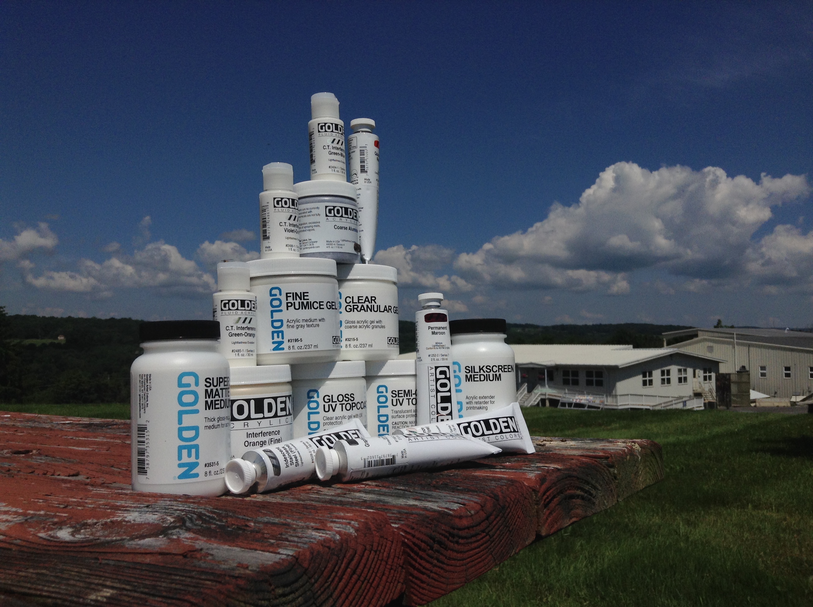
Golden Artist Colors has created hundreds – if not thousands – of products since the initial startup in 1980. We tend to think of our acrylic-based materials as tools. Like most garages, sometimes a few tools go missing. Many times during our search for a specific tool we actually re-discover a long forgotten apparatus along the way! I encourage you to go through your painting supplies and experiment with one or two products you’ve hardly used. If it’s color, tint it with white, extend it with a Medium, or use it in place of a go-to color and see what a difference it makes to your color mixtures.
As with specialized shop tools, there are painting products that could have been the perfect contrivance for your painting had you only known about it. We’re not talking about one of a kind custom products (we offer this service, by the way) or even our “standard custom” products. There exists a number of items that are in fact current off the shelf products, which most artists have never heard of before. Until today.
In this article, I’ll review these distinctive GOLDEN acrylic products, and shed light on what makes each one unique if given a chance! Join me in a review of some painting tools that really should garner more attention from artists.
Heavy Body Acrylic Colors:
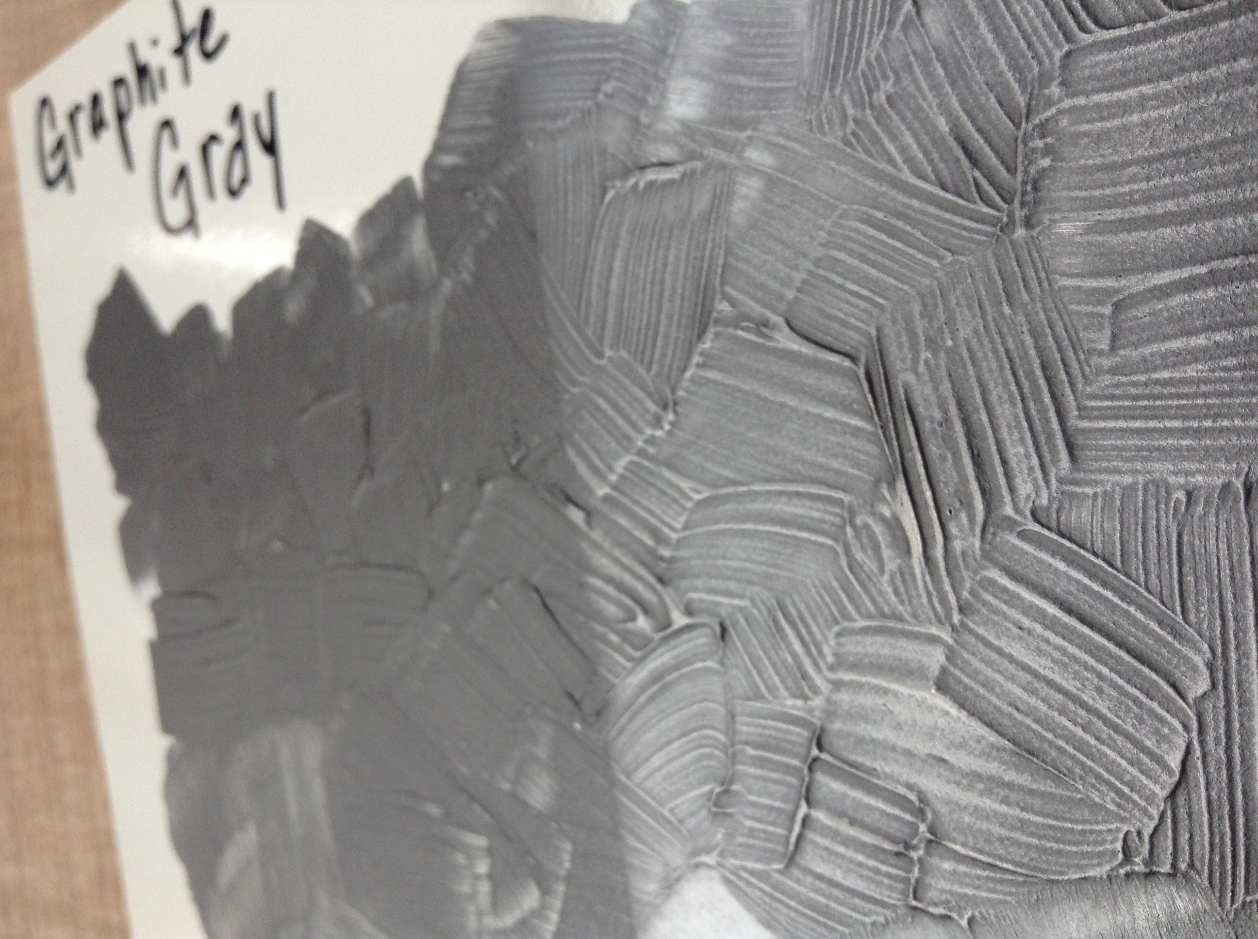
Graphite Gray (#1160): Did you know that this acrylic-based, buttery thick paint is made from the same kind of graphite used in pencils? Did you also know you can “burnish” or polish this Graphite Gray paint just like a pencil drawing? It’s our only paint that can be buffed to a high luster.
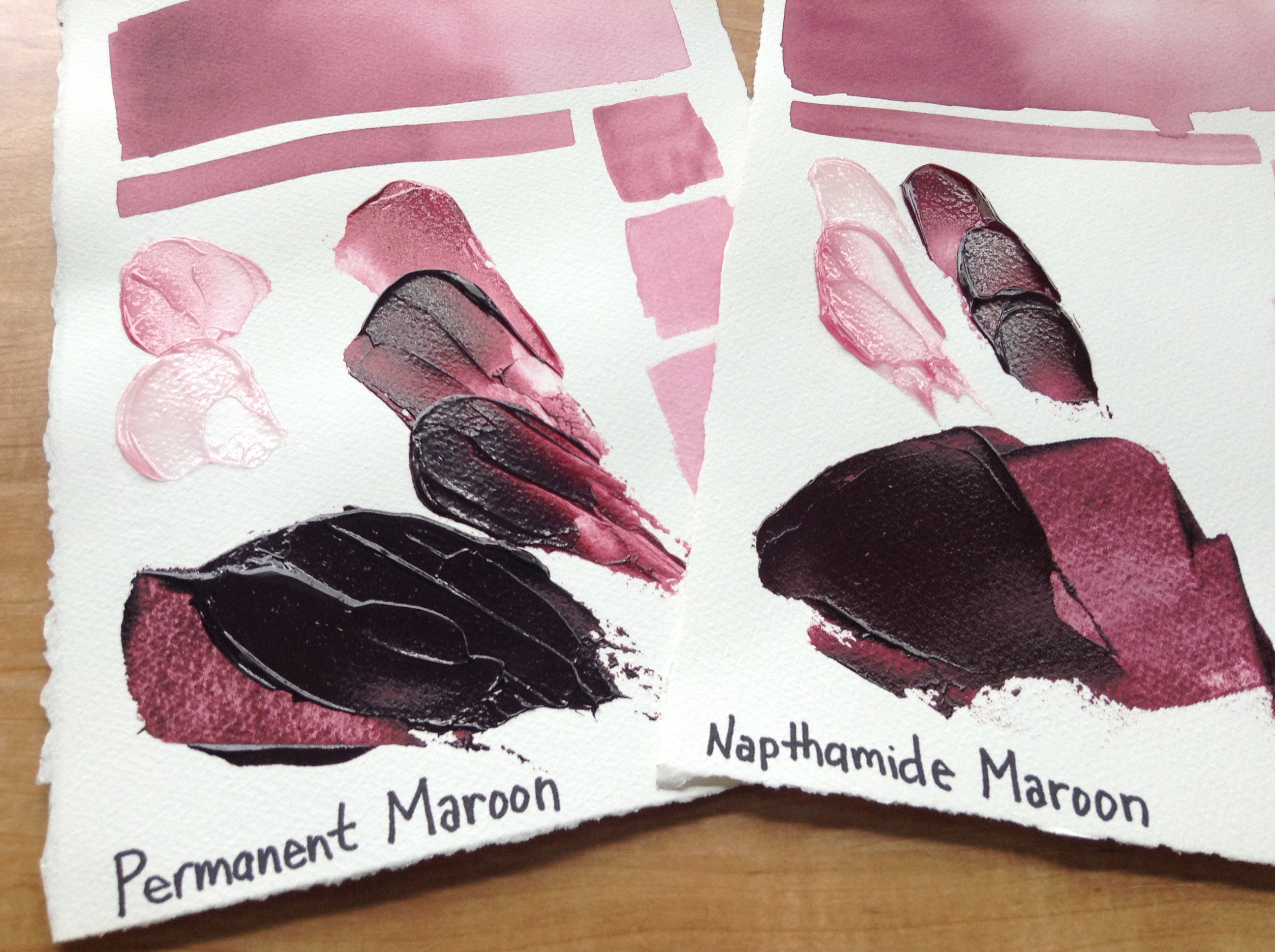
Permanent Maroon (#1252): A hundred years ago – ok, twenty years ago – we had a great paint named Naphthamide Maroon. It was the hue of an aged Cabernet Sauvignon. Then the pigment manufacturer discontinued it so having no choice, so did we, and every artist using it freaked out and scoured the globe in search of the last remaining batches. We even sent our retained Quality Control lab samples to some artists that just wouldn’t give up the search! Permanent Maroon is our answer to this lost pigment. This new blend may read more to the tune of a fresh Pinot Noir, but it’s pretty tight to the discontinued color.
Shiny Stuff:
Interference Orange (#4055) and Green (#4050): Everyone loves Interference Gold, Blue, Violet, and Red. No one ever buys Interference Orange and Green. They are more subtle in their shimmer, but they still have a great opalescent quality in the right light.
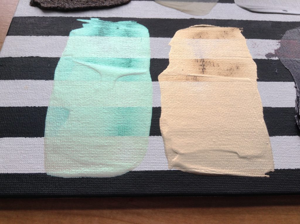
Color Travel (CT) Interference Colors (Green/Blue #2484), (Green/Orange #2485), (Violet/Green #2486) – One color shifts from Violet to Green! Another color shifts from Green to Orange! Yet another one shifts from Green to Blue? Incredible! You probably have never heard of these paints, but there they are in all of their flip-flopping glory. For the strongest effect, apply over black or dark colors.
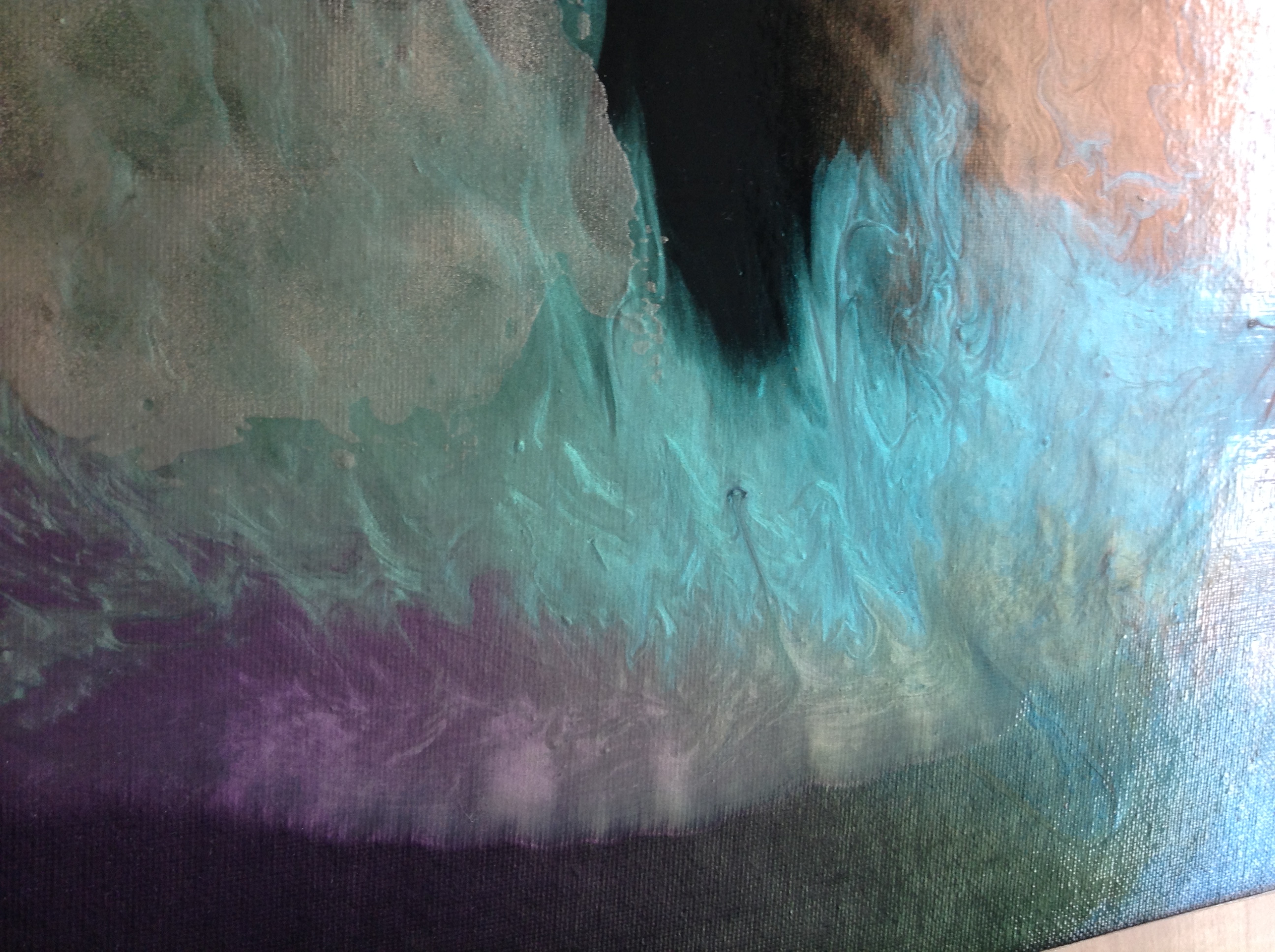
Heavy Body Iridescent Stainless Steel Coarse (#4027) and Fine (#4028): This acrylic paint is actually made from ground-up bits of steel! But it doesn’t rust. It won’t fade or change in all of the years we’ve tested its permanence. This paint can be influenced by magnetic forces!
Gritty Stuff:
Fine Pumice Gel (#3195): Artists like big grit. Huge chunks of a dormant volcano rock are used in our Coarse and Extra Coarse Pumice Gel, and they get all the attention. Fine Pumice Gel uses a “finer” particle size of the same pumice. It’s just toothy enough to receive drawing media and predates the Pastel Ground as our response to multimedia artists’ desire for a surface that accepts chalk pastels, graphite, and charcoal. Pastel Ground users may even prefer the oh-so-finer particle size for detail work. Adding some water makes it near invisible over an underpainting.
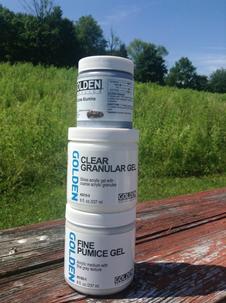
Coarse Alumina (#4082): According to www.aluminum.org, bauxite ore is mined to create Alumina Oxide, of which approximately 90% is refined and made into aluminum and 9.999% is used for making abrasives and sandpaper. GOLDEN Coarse Alumina is made using 0.0001% of it. Actually, I have no idea how accurate that last figure is, but I do know we’re the only paint company using it to make a painting texture. The gritty gray particles are blended with acrylic gel to make it easy to spread onto a surface. The texture is unique and rough and compliments iridescent paints with its dark appearance. Be the envy of your local art community!
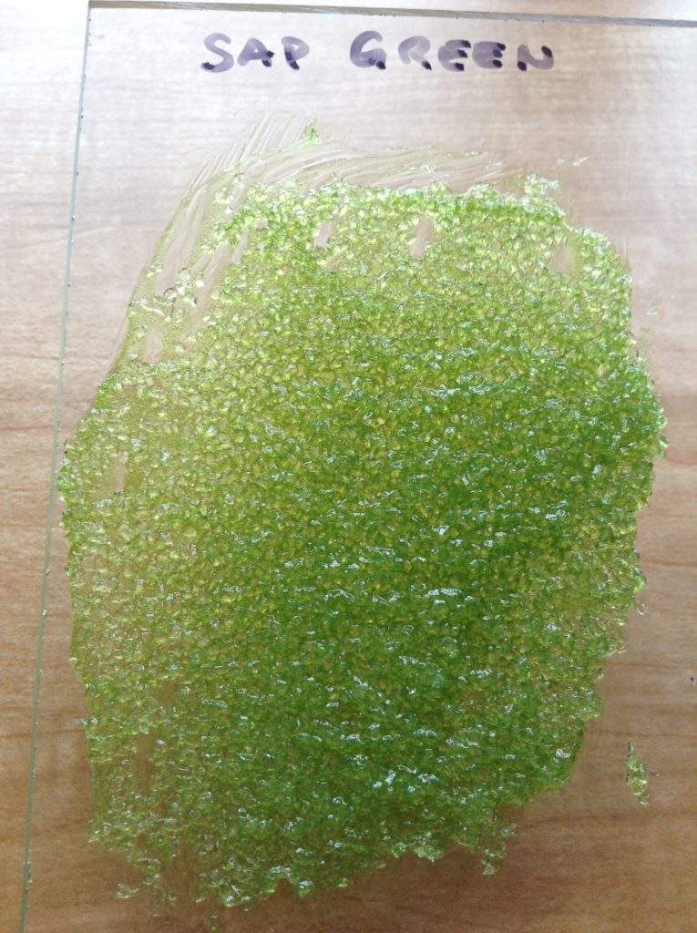
Clear Granular Gel (#3215): Sure, Glass Bead Gel gets all the attention with its optical reflectivity, but these irregularly shaped bits of acrylic resin are also visually interesting. If you add White Gesso, it will look like cottage cheese. If you add Black Gesso, it looks like model railroad coal. Imagine if you were to add a couple of drops of Fluid Acrylic to create translucent color glazes (or just look at the image below with Sap Green Hue).
Gel Mediums:
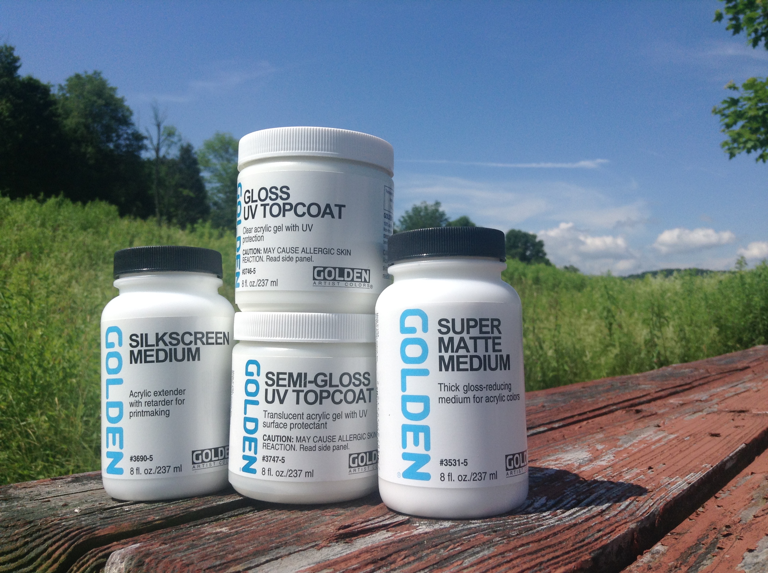
Silkscreen Medium (#3690): If you do a lot of silkscreen printing, you probably use commercial products such as UV-curable inks or plastisol based inks. If you only occasionally screen print or just need to do a short run, then Silkscreen Medium might be the right product for you. Blend equal parts (or more) with Heavy Body or Fluid Acrylics for use on paper, wood, canvas and other non-launderable materials. Silkscreen Medium can also be used as a slow-drying painting medium.
Super Matte Medium (#3531): Some acrylic paints, gels, and mediums are just too darn shiny. But you already bought and paid for them, so you might as well use them. Adding Matte Medium or a Matte Gel to the paint can only somewhat lower the gloss unless you add a very high percentage. But just 10-20% Super Matte Medium can make glossy paint quite matte, quite quickly. Super Matte Medium is a safer alternative compared to dry and fluffy powdered matting solids.
Gloss (#3746) and Semi-Gloss (#3747) UV Topcoat: Perhaps artists don’t know what a topcoat is. Perhaps they expected this topcoat to be liquid, like varnish. Whatever the reason, this is still a great painting medium. We’ve added the same ultraviolet light stabilizers as what’s in our varnishes. UV Topcoat can be used over water-resistant ink-jet prints, collage and multimedia work, or whenever you’ve used not-so-lightfast materials in your artwork. Although intended to create brush and tool marks due to its thickness, it can also be thinned with water to create a thinner, more leveling medium.
If any of these products interest you, give them a try. They are all products available on the 2019 U.S. Price List. Contact your favorite store to see if they have the one you want in stock. Alternatively, contact our Customer Service Department and ask them to assist you with procuring your new bauble. And as always, if you have any sort of paint product question, call the Material & Applications Department, or email [email protected].
About Michael Townsend
View all posts by Michael Townsend -->Subscribe
Subscribe to the newsletter today!
No related Post

Wow, thanks for all the interesting info! A much needed mini refresher course!
Thank you, Karen!
When we were reviewing the range of products that are slow sellers, some were truly amazing to discover.
– Mike
Hello I am just starting out and would love to become a product tester. Can you please help me with the steps to take to become a tester. I would love to start teaching young children to young adults, to give them an outlet from the daily stress. Any help would be appreciated.
Respectively
Alene Patrick
Hello, Alene.
Thank you for reading the article. I will have to refer you to our Marketing Department regarding becoming a product tester. I’ll forward your information and this conversation with them so they can contact you when able. – Mike Townsend
A very interesting article Thank you
You are most welcome, Graham!
– Mike Townsend
Permanent Maroon is one of my favourite colours. I will get some of the Quin Red Light, because that pink is lovely. Great idea to highlight these items, thanks!
Thank you, Janine! I think you will love the Quin Red Light. It’s rather unique and not easy to blend otherwise.
– Mike Townsend
Do you plan offering an OPEN version of it at some point?
Hello Mano! Thanks for your comment. Which product are you referring to? Are you looking for a particular color or consistency of OPEN? If you would like, please feel free to e-mail us at [email protected] and tell us more about what you are looking for and we would be happy to assist you in more depth.
Thanks Adrienne,
I was actually referring to Quin Red Light, but I see that it’s completely gone by now. Oh well.
Thankyou! I’m sure I have some of these products still around! I will check and see!
Thanks. Great info on backing boards for canvases in the email and this info on products is helpful. Now I have to get the CT Interference Colors!
You are most welcome, Chris. We appreciate you letting us know!
– Mike Townsend
You guys are the best! The constant experimentation, the specialized stuff.. all pushing the envelope of the possible. It’s exciting and reassuring to know you’ve got our backs, and that we can actually communicate with you so easily about our needs as painters, and your responsiveness- we are very lucky! Not to mention that it’s all of the highest quality.. I feel blessed for sure. Thank you!
And I too was missing my Napthamide Maroon- just used the last of what i had so nice to know there’s a good substitute 🙂
Thank you for your kind words, George.
the Permanent Maroon is a very close match to Napthamide Maroon, so we hope you’ll find it’s a quality replacement for you.
– Mike Townsend
Fantastic info,thank you.
How did you do that!? Just yesterday I was looking at pics of houses (with possible future purchase in mind). One house had a lot of features that were appealing, but the kitchen grossed me out. It was a mishmash of elements that did not work together and were unsettling. One item was a lovely patterned tin backsplash. The granite counter worked well enough, the sink was acceptible, but the cabinets were tacky modern (the doors could be exchanged for plain), and the walls… the walls were a very modern deep salmon orange. I was think how a nice strong neutral grey on the lower part would bring the elements together, with a lighter color on the upper part and ceiling. I was thinking that the right color would be like my drawing pencils. And then I thought about burnishing and wondered if that was even a possibility. Now how did you DO that? Your post today about Graphite Grey floored me. PERFECT. I sort of doubt we’ll buy that house- moving is at least a year in the future. But now I am entranced by Graphite Gray and thinking of ways of using it in my paintings. And betcha someday I use it in my house as well.
Hello Annie.
Maybe you had your cell phone next to you when you thought about this idea? (I’m kidding of course!)
In all seriousness, the surface of Graphite Gray burnishes readily after it dries, just like when using a pencil on paper. I applied heavy brush stroke textures down to a thin scumble, and it all polished easily with a soft cloth. Let us know if you have any other questions!
– Mike Townsend
Thank you Mike! I was unaware of that Graphite Gray could be buffed. Wow! I always learn something new about Golden products when you share information.
Thank you, Martin.
I’m very pleased this article is helping shed light on some really useful products that otherwise seem to have gone unnoticed!
– Mike
Glad to hear you have Quinacridone Red Light! I thought that was discontinued and missed it. I remembered it did make the perfect pink. Thank you Mike!
Thanks, Nancy.
I remember Jim Walsh was the first artist to introduce Quin Red Lt. many years ago. It’s just such a great color and it would be a shame to lose this one due to low interest. Great to see it’s in good hands!
– Mike Townsend
Quinacridone Red Light is an incredibly beautiful, subtle, shade of pink and not mixable to boot. It has been a total love affair for me and I often suggest it to students. Wondering why it doesn’t come in the Fluid Line?
Hello, Tina.
Thank you so much for your comments. I’m glad to hear of other artists that love Quin Red Light as much as we do! The reason we do not offer this color in Fluids is because it doesn’t remain stable in a thinner (low viscosity) formula. We have tried without long term stability. Some pigments are just stubborn! Burnt Umber is another pigment that we constantly are at odds with. Test batches of Fluids of these colors thicken up to the consistency of Heavy Body and that would pose an issue when trying to squeeze it out of the bottle!
– Mike Townsend
Great article! Great writing! Made me laugh, made me think about how to use these products. I’m a lil bit scared of mediums. Need to use them more and now I have some ideas. Thank you!
Thank you very much, Laura.
The key to working effectively with acrylics is learning the various mediums and gels and what they offer you as the artist.
– Mike Townsend
fun little “Trick” with Heavy Body Iridescent Stainless Steel Coarse,mix a little with your watercolor water..the con to it,it will make your yellows and reds a little Muddy..the pro to it, it will make all your watercolors sparkle. you just have to learn your balance to how you what your outcome..
Thank you for your suggestion! Bear in mind that although you may be able to mix acrylics with watercolors, there may be a “shock” that causes speckles in the watercolor, as well as the binder of the acrylic is likely to reduce the ability to reactivate the paint layer and lift it from the surface.
– Mike Townsend
This article came up randomly in my Google news feed. Though I’m not a painter, I am the son of one, and I keep busy with my hands as a woodworker and model maker. I just wanted you to know I read it with great enthusiasm. It’s heartening to know there is such imagination and curiosity inside your company walls. Odd that I’d never thought of that. Both the article and the comments (and the unusual products) got me inspired to (finally) take a class on color mixing and learn to paint.
Hello Chuck.
Thank you for your kind words that the article and products were inspiring enough to start painting! Many artists have yet to discover the myriad of materials that comprise the current offerings. Let us know if you need any assistance on your journey!
– Mike Townsend
Loved the article.
Are the coarse interference paints available? If so, where?
Hi Jerry,….We do not have any coarse particle Interference Colors. We have Coarse ( larger mica pigments ) in our Irid Copper, Irid. Pearl, Irid Gold and Stainless Steel. And we have Large Flake Irid. Gold where the mica flakes are visibly quite large.
Thank you for the info on Fine Pumice Gel vs. Pastel Ground. I was hoping to find a ground that was a little finer than Pastel Ground for use with colored pencils … and here it is! I just knew I could come to Just Paint and find what I was looking for. Can’t wait to try the Fine Pumice Gel!
The info you all provide is amazing and is one of the reasons I always use Golden and QoR! There is no other company that communicates with customers the way you do.
You are most welcome, Lori! Thanks for your comments and praise of our company. From fine texture to more coarse, I would rank the products at Matte Medium, Fine Pumice Gel, Pastel Ground. All three should have no problems with colored pencil work on top. In fact, here’s another great just paint article (be sure to scroll to the additional images, they are really helpful for choosing products to draw upon) https://justpaint.org/make-a-mark/
– Mike
I love to use your heavy body micaceous iron oxide as a ground for pastel painting; it has just enough grit. I was wondering, do some of your iridescent paints have enough grit to act as a pastel ground? What about the stainless steel product?
Hello Susanne. Thanks for contacting us with your questions.
The Iridescent Stainless Steel would be similar, but testing the Fine and Coarse to see which one is better suited for your needs is recommended.
Mike
This is such a fabulous article with some excellent use illustrations – thank you Mike!