Neutral colors are those with little or no color saturation. Although often overlooked, neutrals play a vital role in the success of a composition. A neutral color is one without a strong chromatic hue. White, gray and black occupy the core neutral zone, and watercolor paints of these colors can be purchased. However, if we create our own neutrals from the colors in a painting’s palette, the mixes have a built in harmony with the composition. We can then expand our idea of ‘neutral’ to encompass the ‘almost neutrals’ and explore a quietly lively, subtle, and varied world of often overlooked colors. This article will introduce the idea of mixing chromatic neutrals with QoR Watercolor.
Vocabulary
First, it might be helpful to understand what is meant by ‘neutral.’
Chromatic paints have a hue, for example the primary and secondary colors on an artist’s color wheel. These paints can be highly saturated with intense color – high in chroma – or more muted and desaturated. When compared with one another, QoR Transparent Pyrrole Orange can be considered a saturated orange with high chroma and Burnt Sienna, a desaturated orange with lower chroma.
An achromatic neutral has neither chromatic hue nor a bias toward a hue. Classic examples are the colors black, gray and white in their idealized forms. In comparison, a chromatic neutral leans toward one or more of the hues.
Pre-made neutrals may be purchased, or the artist can create endless varieties by mixing colors together. To create chromatic neutrals, color can be added to a black paint or combinations made by mixing complements from opposing positions on the color wheel.
Ready-made Neutrals and Hue Biases
If you have ever tried mixing colors, you know that paints often have color mixing biases. For example, there are reds that lean toward orange, and reds that lean toward purple. The same biases often can be found in the ‘neutral’ black and gray paints you might purchase at your local art retail store.
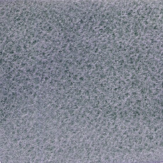
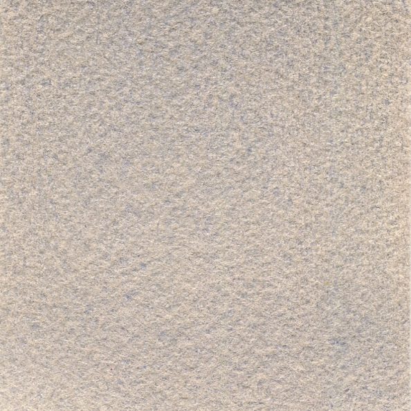
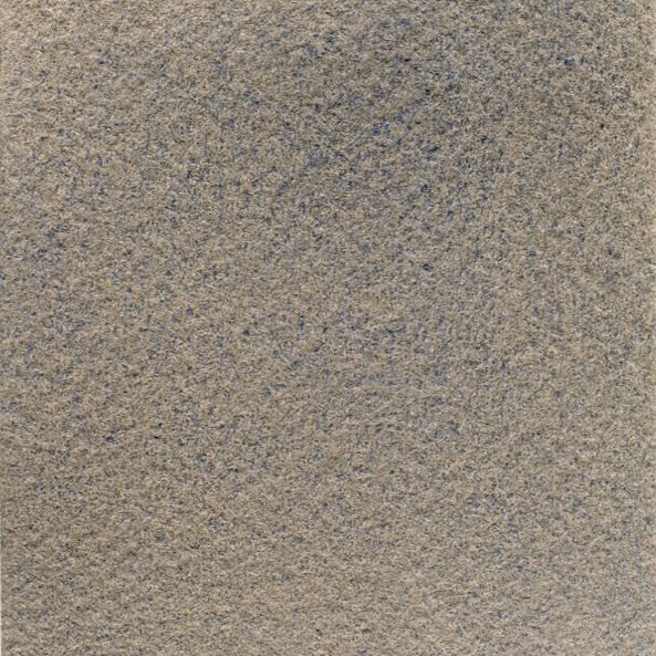
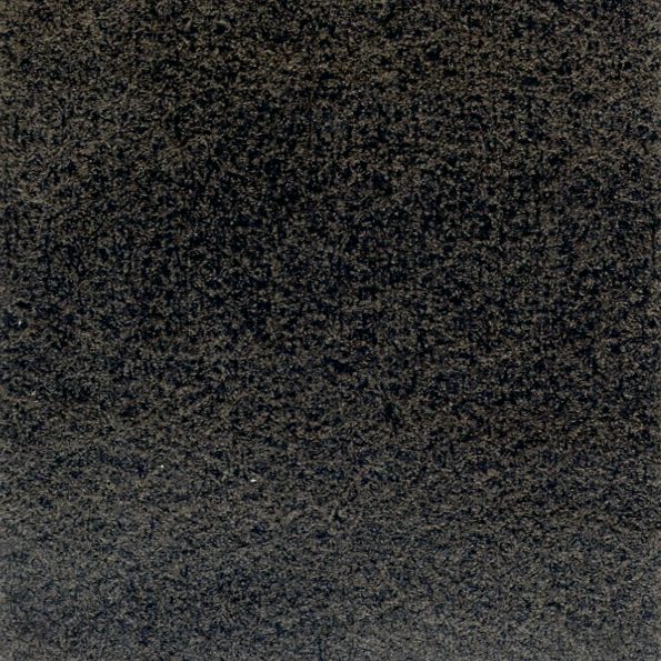
QoR has two single pigment black paints, Carbon Black and Ivory Black and a single pigment gray, Ardoise Gray. Carbon Black comes closest to an achromatic neutral, and the addition of water for dilution and your paper for white can provide an achromatic palette. Ivory Black’s pigment leans slightly toward brown – which is a desaturated red or orange – and Ardoise Gray is a beige-gray color as you can see in the images below. Ivory Black and Ardoise Gray granulate, while Carbon Black does not.
These black single pigment paints often create a fairly flat visual appearance, although Ivory has lighter and darker areas due to the granulation. Ardoise Gray takes this dappled look even further since it granulates beautifully with some color variance.
As mentioned previously, there are blended multi-pigment gray watercolors available, and these often have an inherent color bias. QoR Payne’s Gray leans toward blue, and QoR Neutral Tint leans slightly toward red or brown. These convenience mixes can be very helpful. However, also think of these colors as inspirations for trying your own chromatic neutral mixes from the paints on your palette!
Chromatic Neutrals: Why?
Why mix chromatic neutrals when there are ready-to-go black paints and pre-mixed convenience grays? Such mixes are beautiful. Mixed chromatic neutrals allow for subtle interactions and finesse that might not be possible with a black paint. Using the watercolors on your palette to mix grays may help the restful, quiet, and dark areas of a composition have more life and resonate with other sections of vibrant color. This may increase the overall visual harmony of a painting. Further, slight changes in the mixing balance provide limitless options to shift the color bias slightly as needed to play off of the surrounding colors. In comparison, diluted Carbon or Ivory Black grays are often visually plain or ‘flat’ when dry. Below are examples of two mixes from an often overlooked pair, Chromium Oxide Green and Dioxazine Purple.
Mixing Chromatic Neutrals
As we have seen, chromatic neutrals are paints which have a little bit of chromatic color. Almost desaturated colors can be made by adding a hue to a black or gray, or by creating a low-chroma mixture from complements. In traditional transparent watercolor applications, the watercolor paper itself provides the white which shows through veils of applied color. Varying the water dilution ratio stands in for the addition of white paint, and creates a range of grays from pale (more dilution) to dark (less dilution).
Keep it Simple
Start by doing some tests with only two paints. When intending to mix a neutral, first think about the nature of the colors you have at hand. Try to identify two paints with colors that fall opposite one another on a traditional painted color wheel: blue and orange, red and green, and yellow and purple. These are the ‘complementary pairs’ of paint mixing, and in an ideal world mixing a complementary pair together would create an achromatic black. Thankfully, our goal is a chromatic black or gray, and the possible results are endless in their variety and subtle beauty.
The Tried and True
Among the most used gray mixes in watercolor are a combination of Ultramarine Blue or French Ultramarine Blue and Burnt Sienna, Burnt Umber, Raw Sienna, or Raw Umber. The earth colors function as lower chroma oranges, and so often fit within the blue-orange complement category.
Due to color variances in pigments from different sources, one or another of these earth pigments might best neutralize your particular Ultramarine Blue – but all can create beautiful chromatic neutrals in a range of tonalities depending upon which in the pair takes precedence. These combinations tend toward granulation, which is visible in the dappled quality of the color in the mixes.
Learn From Your Paints
The inherent characteristics of the watercolor paints used in a mixture will influence the nature of the result. Among these traits are the hue, saturation, and lightness or darkness of the respective colors being mixed, whether or not the paints granulate, their tint strengths, staining potential, and inherent transparency or opacity. Further, slight changes in the mixing balance or dilution amount provide limitless options to shift the color bias and value slightly as needed to play off of the surrounding colors. In comparison, diluted Carbon or Ivory Black grays are often visually plain or ‘flat’ when dry. Below are examples to highlight the potential awaiting artists wishing to explore the fascinating world of chromatic neutrals.
First row: Left, Carbon Black (PBk7); Center, Prussian Blue (PB27) mixed with Venetian Red (PR101); and Right, Viridian Green (PG18) mixed with Permanent Alizarin Crimson (PR177). Second row: Left, Cobalt Green (PG26) mixed with Quinacridone Violet (PV19); Center, Cobalt Green (PG26) mixed with Ultramarine Pink (PV15); Right, Cobalt Green (PG26) mixed with Dioxazine Purple (PV23). Third row: Different dilutions of Ultramarine Blue (PB29) mixed with Transparent Pyrrole Orange (PO71).

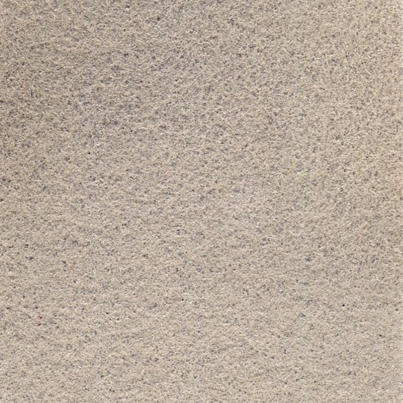
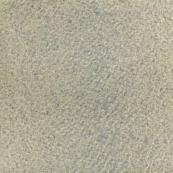
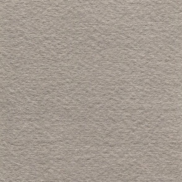
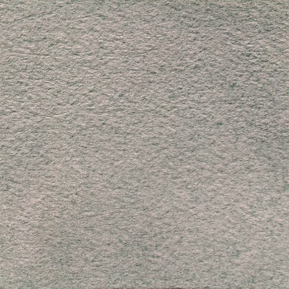

I really enjoyed your article on mixing neutral colors. I am always looking for the perfect “sand” color to paint beaches. No more buff titanium for me!
I love QOR watercolors.
Thank you for your kind words! We are glad you found the article useful. We think mixing chromatic grays can be both endlessly informative and a lot of fun.
Happy painting, Cathy