
Introduction
A limited palette is a color mixing approach that could benefit your studio practice. It is an effective way to simplify mixing for beginners and provide a challenge for experienced artists who find themselves reaching for the same colors repeatedly. Color mixing can be overwhelming, especially with the wide range of colors offered by most manufacturers. At Golden Artist Colors, we offer 150 GOLDEN Heavy Body Acrylics, 173 Williamsburg Artist Oils, and 97 QoR Artist Watercolors (at time of publication). While collecting a wide range of colors can offer many possibilities, reducing the number of colors on your palette can also be a powerful and practical choice.
What is a Limited Palette and why use one?
The use of a limited palette is an age-old technique of choosing a reduced number of paint colors to create a certain range of color mixes, sometimes surprisingly broad. Limited palettes provide a foundational color mixing experience by training your eye to see tonal nuances, subtle color temperature shifts, and learning more about color relationships and color harmony. Consider the possible emotional impact of a palette. Is the color scheme dark and moody or light and airy?
Using a limited number of colors on your palette can mean fewer tubes of paint to purchase and fewer tubes to take with you when plein air painting. As practical as this tool can be, it can also be a fun challenge. Experiment, switch up your choices and be open to discovery.
How do I get started? How many colors and how to choose?
Starting with a simple three-color limited palette can help to build confidence in color mixing before gradually expanding your palette. A traditional way to set up this simple limited palette is to start with a triad (set of three) of primary colors: a yellow, a red, and a blue. A quick way to improvise and explore additional palettes is to choose different primary triads or by replacing just one color at a time. Try switching the red to a warmer or cooler version and observe how this effects your mixes. There are a myriad of combinations to try.
In this article we will explore three limited palettes based on different primary triads. Our first two limited palettes are influenced by Rembrandt van Rijn (1606-1669) and John Singer Sargent’s (1856-1925) oil and watercolor palettes respectively. Our third limited palette is inspired by the invention of acrylics themselves. It explores modern colors that became available to artists starting in the mid to late 20th century and are still used today. To express these limited palettes visually, corresponding color wheels were painted.
Why a color wheel?
Color wheels are an organized way to show the mixing potential of three colors. A color wheel will not show you every possible mixture but can become a quick snapshot of what mixes one could expect from the choice of limited colors. The wheels primarily show color-to-color mixing results leading to the creation of orange, violet, and green secondaries. In addition, we have formatted the wheel to allow for opaque and translucent applications as well as tints created by adding white.
Color potential can shift depending upon the technique, so an opaque application of the paint straight from the tube, a translucent glaze with the ground or color underneath showing through, and a tint mixed by combining the color with white will all provide different color possibilities explored in these color wheels.
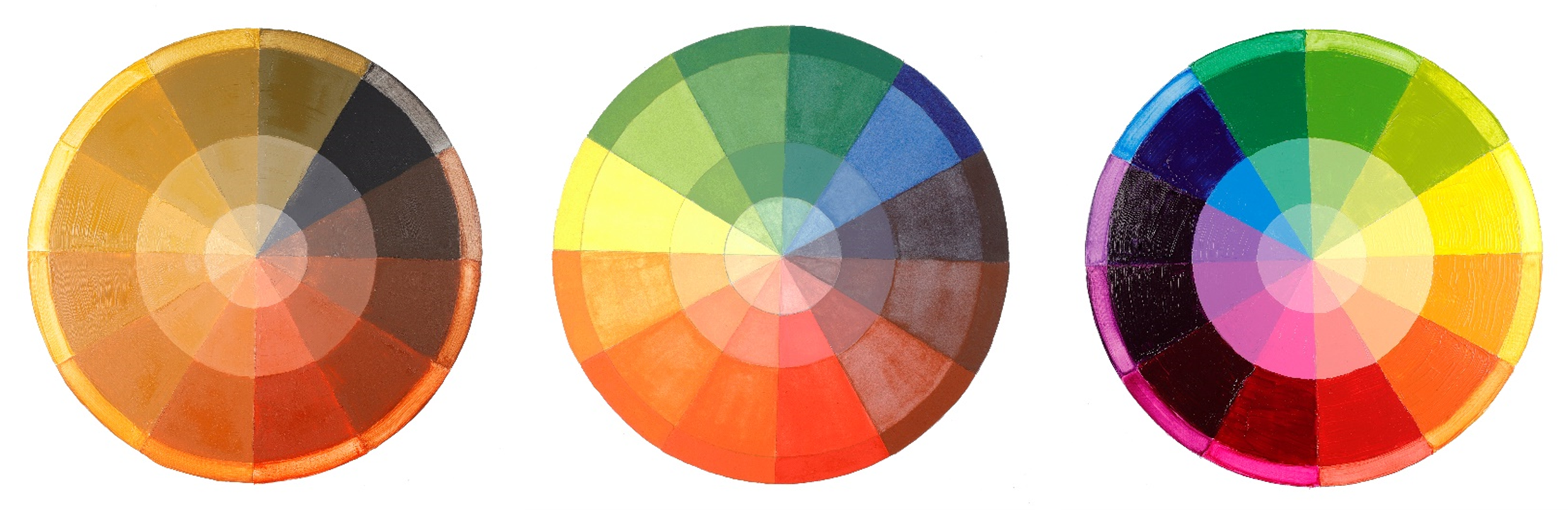
Left: An earth tone triad inspired by Rembrandt.
Center: A bright triad in watercolor inspired by Sargent.
Right: A vibrant triad of modern synthetic organic pigments.
Rembrandt: Bone Black, Yellow Ochre, a natural earth red, and Lead White
A 2006 publication through the National Gallery in London, Art In The Making Rembrandt, has a detailed section on the artist’s palette by Ashok Roy and Jo Kirby. The authors describe his staple colors being lead white, bone black, and earth pigments such as ochres, siennas, and umbers. The writers describe Rembrandt’s creative use of a limited number of pigments.
“The range of pigments Rembrandt employed involves no arcane knowledge, no secret formulae, but instead falls firmly within the mainstream of painting practice in Holland in the seventeenth century, His palette is entirely made up of pigments that were commercially widely available…”
“….the total number of pigments he regularly used was not large, especially if the natural earth colours which contribute substantially to the palette were treated as a single group; but the way in which they were used, combined with the complexities of pigment mixture and elaborate paint layer structure gave Rembrandt access to an extremely impressive range of effects, particularly in translucency and texture, but also in the variety of colours employed.” 1
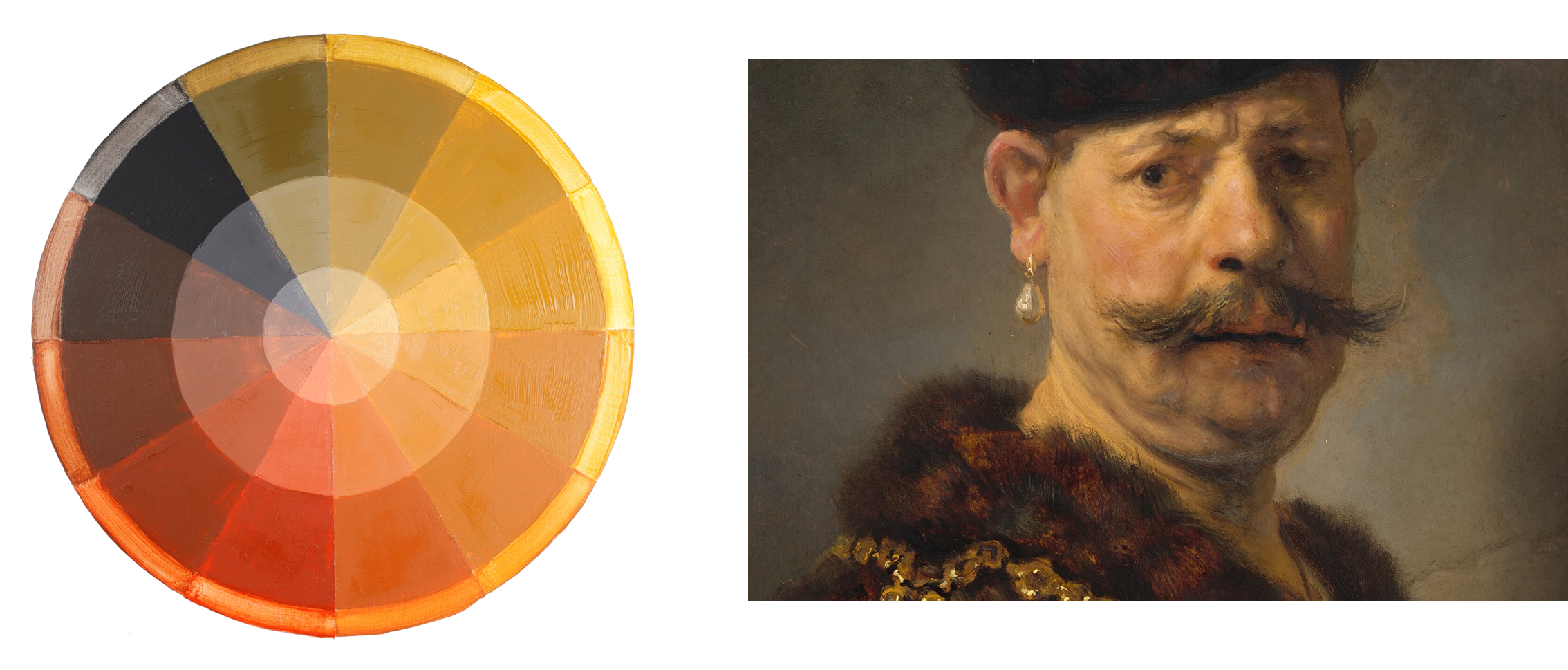
Right: A Polish Nobleman by Rembrandt van Rijn
We hope you find this description of Rembrandt’s technique as inspiring as we do. An oil painter who made exquisite paintings without the array of pigments available today prompted us to create our first limited palette using our oil paint line, Williamsburg Artist Oils. This palette is informed by Rembrandt’s extensive use of Bone Black, Lead White and earth tones.
Williamsburg Oils: Ivory Black (PBk9), Yellow Ochre Domestic (PY43), Italian Pompeii Red (PR102), and Flake White (PW1)
- Ivory Black is the “blue” in this limited palette, creating cool dark mixtures.
- Yellow Ochre, in this case Domestic, seems to have always been a staple on artists’ palettes. It lends its warm influence to over half of our color wheel.
- We chose Italian Pompeii Red as the earth red to approximate the rosy, warm skin tones. Substituting other reds could be tested. For example, we know Vermilion was manufactured at the time (though not used much by Rembrandt) so you may want to try replacing the earthier red with a brighter red like Cadmium Red Vermilion (PO20, PR108). This would become more in line with a popular limited palette often called the Zorn palette.
- We have used Flake White in this limited palette to more closely align with Rembrandt’s palette. Flake White is a lead-based white. For a lead-free option, try replacing it with Titanium White (PW6). Titanium White is cooler and will create mixes with more bluish and purple tones.
This limited palette can be a great exercise in painting overall warm muted tones, which in turn leads to a warm painting. Mixing these tones can help you appreciate subtle tonal shifts from muted green yellows to orange reds to deep browns. Note the overall golden tone in Rembrandt’s portrait above.
Are you interested in using this palette in watercolor or acrylic? Try these suggestions below.
QoR Watercolors: Ivory Black (PBk9), Yellow Ochre (PY43), Venetian Red (PR101), and Titanium White (PW6)
GOLDEN Heavy Body Acrylics: Bone Black (PBk9), Yellow Ochre (PY43), Red Oxide (PR101), and Titanium White (PW6)
Sargent: Prussian Blue, Vermilion, Cadmium Yellow, and Zinc White
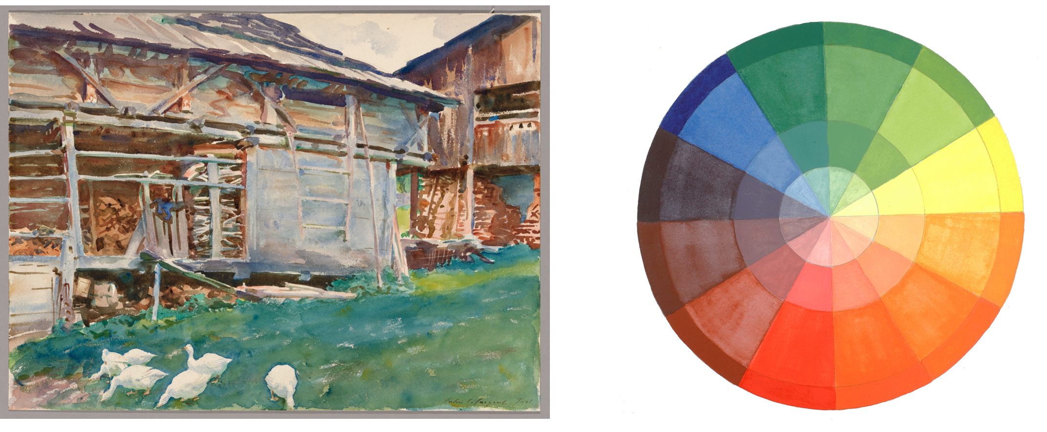
Right: QoR Watercolors Bright Triad Color Wheel
John Singer Sargent was a prolific painter in both oil and watercolor. We like to think he would have appreciated the clarity, strength, and vividness of our QoR Watercolors. To create a limited palette from pigments Sargent used in his watercolors, we looked at research done in support of the 2018 exhibition John Singer Sargent and Chicago’s Gilded Age at the Art Institute of Chicago.2 Their conservation department surveyed over 300 Sargent watercolors from various collections and performed a technical analysis of eleven watercolors from their own collection. This technical analysis included the use of specialized conservation science tools, such as Gas Chromatography Mass Spectrometry, Surface Enhanced Raman Spectroscopy, X-ray Fluorescence Mapping, and Hyperspectral Imaging.
The main pigments Sargent used to create these eleven works were: Prussian Blue, Cobalt Blue, Ultramarine Blue, Vermilion, Iron Oxide, Yellow and Red Ochre, Umber, chromium-based green (estimated to be Viridian), Cadmium Yellows, chromium-based yellows, and Zinc White.3
We used one of these eleven Sargent watercolors from the collection of the Art Institute of Chicago, Woodshed, Tyrol, to narrow that selection down to three primary colors plus white. Prussian Blue provides those lovely cool blues and greens, while the Cadmiums provide the warm shadow tones.
QoR Watercolors: Prussian Blue (PB27), Cadmium Red Light (PR108), Cadmium Yellow Light (PY35), and Chinese White (PW4)
- QoR Prussian Blue helps to produce the cool blues and greens seen in this image, from the shadows in the buildings to the cold blue shadows on the grass.
- QoR Cadmium Red Light is a bright, warm red that approximates Vermilion.
- QoR Cadmium Yellow Light is a cool yellow that mixes with the Prussian Blue to create bright, cool greens.
- QoR Chinese White is Zinc Oxide. This is more translucent than Titanium White. Sargent used the paper as a bright white and used Zinc White tints for more opaque effects.
- If you would like an alternative to the Cadmiums try Bismuth Vanadate Yellow and Disazo Scarlet; both have excellent lightfastness and match the transparency/opacity of their Cadmium counterparts.
Notice that this color wheel is slightly different than the others. Traditionally watercolor is greatly diluted with water and applied to paper in translucent washes and glazes of color, and we reorganized the color wheel to showcase that application. QoR watercolor may be applied with less water to achieve a more opaque film like gouache.
Consider trying this palette in oil or acrylics, see our color suggestions below.
Williamsburg Oils: Prussian Blue (PB27), Cadmium Red Vermillion (PY20, PR108), Cadmium Yellow Light (PY35), and Titanium White (PW6)
- Why Titanium White and not Zinc White? We recommend Titanium White because research shows that Zinc can become brittle in oil films. See the Just Paint article, Zinc Oxide – Reviewing the Research | Just Paint
GOLDEN Heavy Body Acrylics: Prussian Blue Hue (PBk9/PB15:0/PV23), Cadmium Red Light (PR108), Cadmium Yellow Light (PY35), and Zinc White (PW4)
- Zinc is not problematic when combined when used in acrylic or watercolor paints. Zinc Oxide: FAQ | Just Paint
- A hue of Prussian Blue is used to provide a similar color. Prussian Blue is alkaline sensitive, so it is not used in acrylic paints.
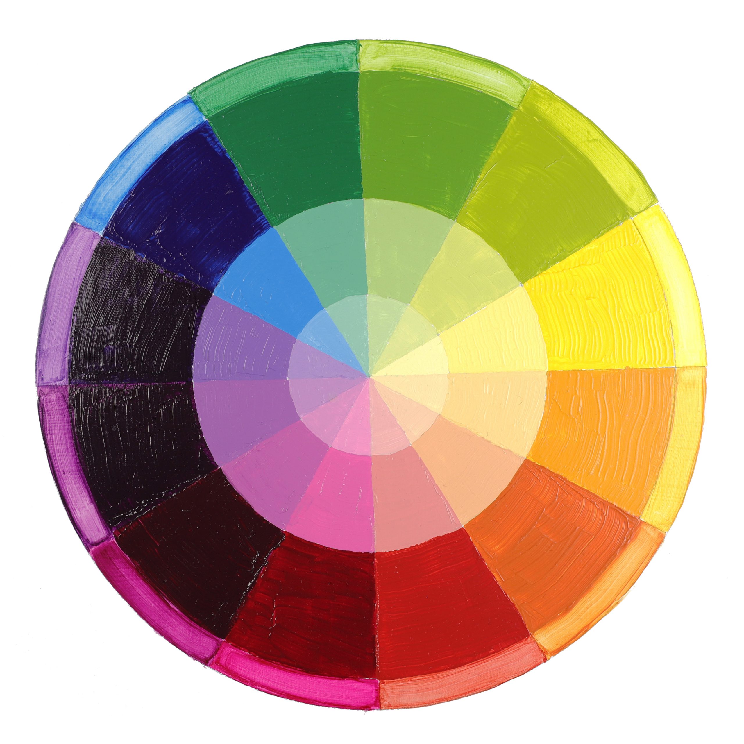
Modern Pigments: Benzimidazolone Yellow Medium, Quinacridone Magenta, Phthalo Blue (green shade), Titanium White
Rather than choosing a modern master to represent this triad, we are highlighting the magical combination of the 20th century invention of acrylic paints and modern synthetic organic pigments. The invention of acrylic resin in the 1930’s led to the creation of the Magna paint, mineral spirit-based acrylic paints invented by Leonard Bocour and Sam Golden in the late 1940’s. This new type of paint, different from oils and watercolors, coincided with the introduction of Phthalocyanines, Quinacridones, and Benzimidazolones.
Phthalocyanine pigments were the earliest of these synthetic organics, developed around the 1930s, followed by Quinacridones, first sold as pigments by DuPont in 1958. Benzimidazolone pigments quickly followed, being first introduced to artist paints in the 1960s. These pigments were widely used in many areas besides artists’ pigments. In fact, these pigments were developed for larger industries like automobile coatings, printing and plastics. Paint makers are still subject to color trends and production needs for these types of manufacturing that use much larger quantities of raw pigment.
Early acrylics were part a shift of interest to modern materials. Artists were attracted to the bold, bright colors offered by these new synthetic organic pigments but also to acrylic paints that provided quick drying which led to new, non-traditional techniques. The bold, bright properties of this new medium attracted the attention of many well-known painters such as Helen Frankenthaler, Andy Warhol, David Hockney, and many more.
For our final limited palette example, we chose one color from each of these types of synthetic organic pigments to form our primary triad.
GOLDEN Heavy Body: Benzimidazolone Yellow Medium (PY154), Quinacridone Magenta (PR122), Phthalo Blue (GS) (PB15:3), Titanium White (PW6)
- A great advantage of these synthetic organic pigments is their clarity, vibrance, and clean mixing abilities.
- Benzimidazolone Yellow Medium mixes warm greens and oranges.
- Quinacridone Magenta is a cool red with a high tinting strength that produces vibrant purples and glowing oranges.
- Phthalo Blue (GS) is a cool blue with a high tinting strength that mixes bright cool to warm greens.
- Note the tint strength of these colors, mixing them one to one with Titanium White highlights this strength and clarity.
Another advantage these synthetics have over natural organic pigments is the manufacturing. They are consistent in color because these pigments are made rather than naturally sourced which can lead to variability in color.
The outermost ring on this color wheel shows the undertone of several of these very dark transparent colors. Seeing the undertone can help one imagine the mixing qualities and their use as glazes.
A good exercise would be to switch out one primary color at a time and observe the differences. Try replacing the Benzimidazolone Yellow Medium with Benzimidazolone Yellow Light, replacing Quinacridone Magenta with Naphthol Red Light and Phthalo Blue (GS) with Phthalo Blue (RS).
Here are suggestions for a modern, limited palette from two of our other paint lines:
Williamsburg Oils: Permanent Yellow Medium (PY74, PY65), Quinacridone Magenta (PR122), Phthalo Blue (PB15:3), Titanium White (PW6)
QoR Watercolors: Benzimidazolone Yellow (PY154), Quinacridone Magenta (PR122), Phthalo Blue (GS) (PB15:3), and Titanium White (PW6)
Conclusion
Whether you have been painting for decades or have just ventured into this world of color, experimenting with limited palettes could benefit your studio practice. It can help you understand and appreciate individual color personalities better, and lead to more intuitive color mixing and less frustration at the easel.
Be warned (and enticed!) that learning color mixing and color theory can easily be a lifelong endeavor. There is quite a bit of information available, and the history of color theory alone is immense, but ultimately it is another tool to enhance your painting practice.
Have you already tried a limited palette? We would love to hear about it. Do you love the color harmony it brings? Do you appreciate jumping right into a painting, having your palette pre-determined? Comment below with your experience.
Additional Resources
Virtual Paint Mixers | Golden Artist Colors
Williamsburg Modern Color Mixing Guide | Golden Artist Colors
Just Six Paints: the (almost) double primary approach to a QoR color wheel | Just Paint
Mixing with Some New QoR Watercolors | Just Paint
Color Mixing Modern – Acrylics | Golden Artist Colors
Defining Warm and Cool Colors: It’s All Relative | Just Paint
Footnotes
1. A 2006 publication through the National Gallery in London, Art In The Making: Rembrandt, essay Rembrandt’s palette (pgs. 35-47), by Ashok Roy and Jo Kirby
2. 2018 exhibition John Singer Sargent and Chicago’s Gilded Age at the Art Institute of Chicago the exhibition catalogue: John Singer Sargent & Chicago’s Gilded Age, specifically chapter 5 “Mastery of Materials: Sargent’s Watercolors at the Art Institute of Chicago” (pgs. 183-201) by Mary Broadway, Ken Sutherland, Veronica Biolcati, and Francesca Casadio.

Subscribe
Subscribe to the newsletter today!
This is great. More artist palette please 🙂
Hello James, we are so happy that you enjoyed this!
Is there any place to download the articles as PDFs? I would like to read them offline! Thanks!
Hello Shachar, once you open the article you are interested in, you should be able to right click on the page and get a pop-up menu with the option to print. If you have any trouble, email us at [email protected] and we can help!
Early on I learned of using limited palettes and adopted that approach. For the last 18 months my palette has been only Golden’s CAD Yellow med/or light, Quinacridone Red and Prussian Blue (+ black & white gesso). I’m loving the many, many amazing colour outcomes that maximize my painting expressions and there’s so much more still to be discovered!
Hi Ellen, thanks for sharing your experience with limited palettes and for sharing what colors you have been using on your palette recently. We also find it pretty amazing the breadth of hues that can be mixed from so few colors. Also, it is so fun to see how changing just one of the triad colors, like switching to a warmer red or cooler yellow, can shift the whole palette. Happy painting and enjoy your continued discovery!
I wanted to share my appreciation for this article and nothing more. Wonderful stuff and it’s fascinating to see the limited palettes used by others. Many thanks for this and other content you produce!
Hello Christopher, thank you for reading and for taking the time to comment. Limited palettes have long been a useful and lovely tool for artists. Happy painting!