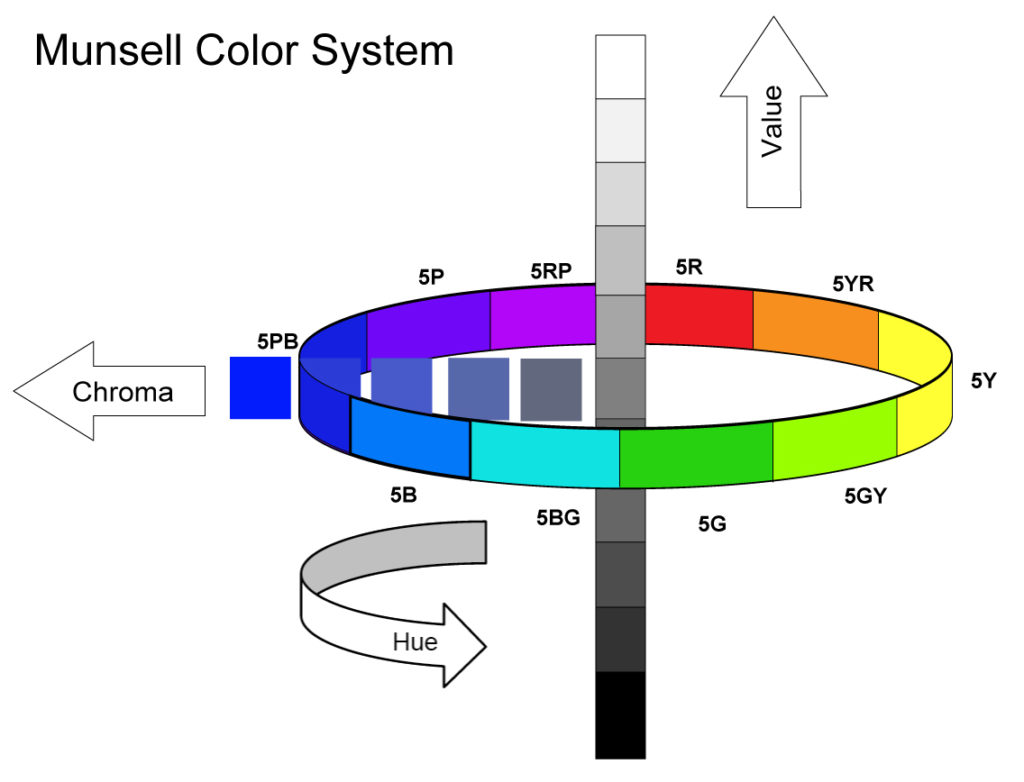
It’s summertime and Munsell is in the air. Or at least it seems that way, given the increasing number of requests for various Munsell notations that have recently come our way. And if you happen to be new to Munsell, a widely used standard for classifying colors since its debut in 1905, not to worry – there is plenty of information available online, and we share some of those links at the end. For now it’s simply important to know that the system measures colors based on three properties: Hue (color), Value (how light or dark), and Chroma (intensity or saturation):

To help with these inquiries we have decided to bring together all the Munsell notations for both our Williamsburg Oils and GOLDEN Acrylics, as well as the standard CIE Lab readings, and make them available as two separate PDFs. Having the CIE Lab readings alongside the Munsell is useful if wanting to translate or relate these readings to other systems since CIE Lab is used as the basis for most of those calculations.
Before jumping straight to the PDFs, it’s important to understand how the readings were generated, and some potential quirks in all this.
GOLDEN Acrylics Munsell Notations
These notations are all based on our Heavy Body Acrylics applied at two different thicknesses: 10 mil drawdowns (~3 sheets of paper) and 1/4″ discs. Keep in mind these are the thicknesses while wet, and by the time they dry they will measure closer to 5 mils and 1/8″ on average.
Because Munsell is standardized around solid, opaque films of color, these different thicknesses are important to understand and lead to very different results. The 10 mil drawdowns come closest to the thickness of a “normal” brushstroke, and is similar to the color you would see while brushing it out on a white surface. However, since very few acrylic colors are truly opaque at this thickness, the Munsell readings will usually trend lighter and with higher chroma, which is why the completely opaque, 1/4″ paint is included as a point of comparison. This will represent the color you see, for example, after building up multiple coats of the same color or after a thicker pour of paint.
Lastly, all the readings for acrylic paints are based on dried films. Many acrylic colors undergo some color shift while drying, becoming deeper and more saturated, so these notations are most accurate and best used as a guide for what a color will look after it is fully dry.
Williamsburg Oils Munsell Notations
The Williamsburg readings are based on 6 mil drawdowns (about the thickness of two sheets of paper) and read while wet by a non-contact spectrophotometer. However, just like acrylics, many oil paints also shift in value or color in the process of drying, so that should be taken into account when using the readings. In terms of opacity, most oil colors will read as opaque at a 6 mil thickness, with just the most transparent ones still appearing translucent and lighter in value. This means the Munsell notations should line up fairly well with what you see while working with the paint on the palette or canvas.
As always, if you have questions simply let us know by phone 800-959-6543 / 607-847-6154 or via email: [email protected].
PDF Files for Munsell Notations and CIE Lab Readings
- GOLDEN Acrylics Munsell / Lab Readings
- Williamsburg Oils Munsell / Lab Readings – Alphabetical by Color
- Williamsburg Oils Munsell / Lab Readings – Ordered by Munsell Notation
Links for More Information
- Golden Acrylics – Neutral Grays based on Munsell
- Williamsburg Oils Neutral Grays based on Munsell
- Official Site for Munsell Color
- Wikipedia – Munsell Color
- Munsell Color System – Bruce McEvoy’s Handprint Website
- Rational Painting – a moderated group dedicated to Munsell. Must register to participate.
About Sarah Sands
View all posts by Sarah Sands -->Subscribe
Subscribe to the newsletter today!

This article is truly amazing! Each paragraph has been thoroughly explained, making it easy for me to comprehend. Moreover, I have the opportunity to share my own perspective