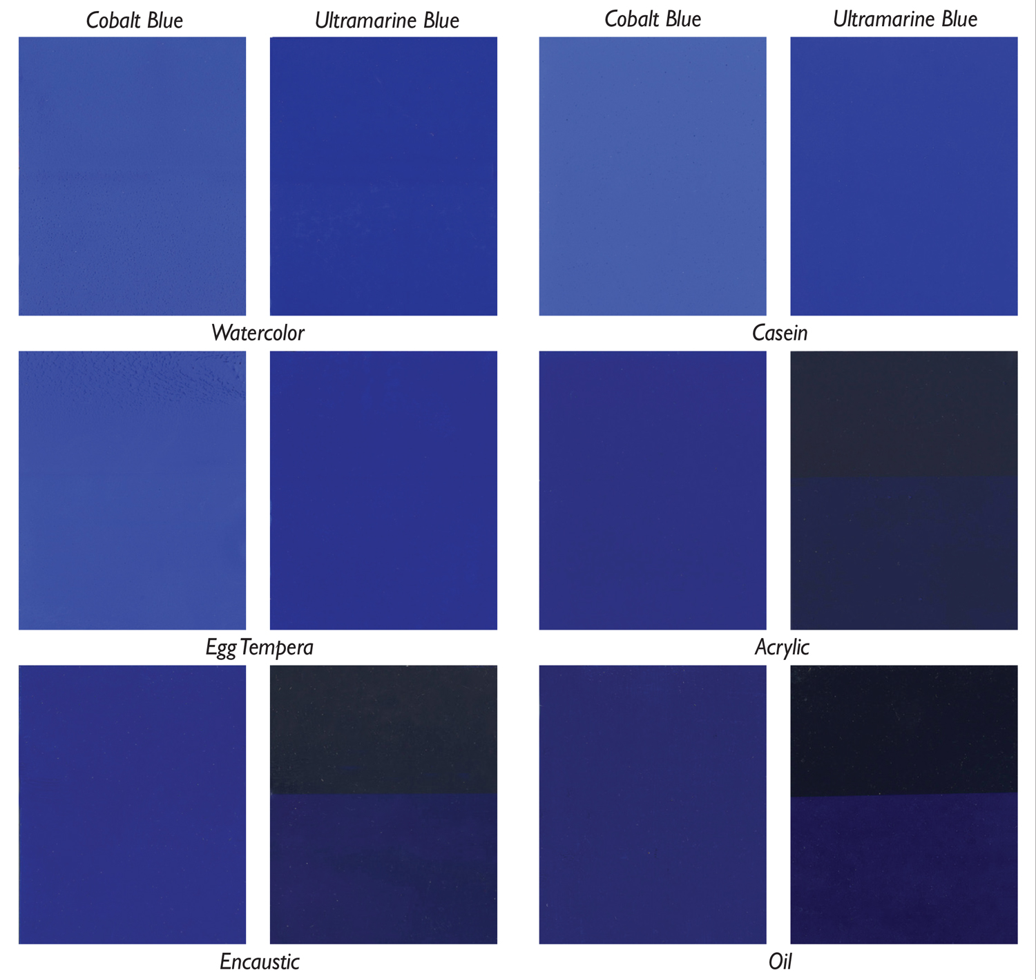
Williamsburg Welcomes 7 New Colors

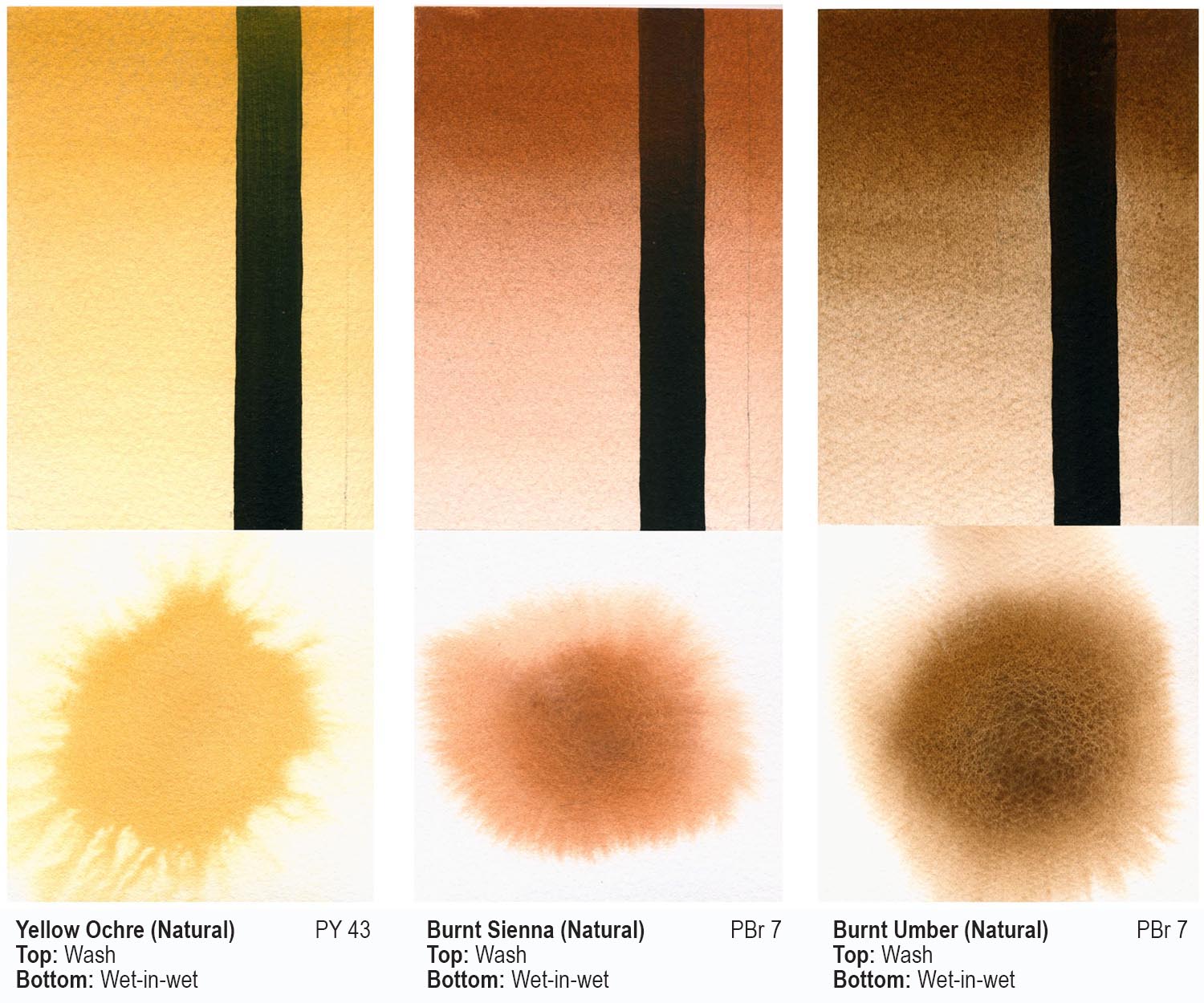
Williamsburg Handmade Oil Colors is excited to introduce seven new colors to its line-up: three warm, highly saturated hues, three transparent earth colors and a light color tint. Bismuth Vanadate Yellow, Pyrrole Orange, Pyrrole Red, Nickel Azo Yellow, Transparent Yellow Iron Oxide, Transparent Red Iron Oxide and Titan Buff all have ASTM lightfastness ratings of … Read more