While we often report on results from lightfastness testing, we have rarely paused to actually describe the process we follow. And let’s face it, for most people stating that our tests conform to ASTM D4303, Standard Test Methods for Lightfastness of Colorants Used in Artists’ Materials, does very little to fill in the blanks. In an attempt to solve that, what follows is a description of the main steps we take, as well as the ways we have sought to improve and make this type of testing more robust.
Sample Preparation
For acrylics we create 10 mil drawdowns over primed aluminum panels as well as lacquered test cards. 10 mils is about the thickness of 3 sheets of copy paper. The aluminum panels are used for samples placed in outdoor testing facilities, while the card stock is for accelerated indoor testing. Oil paints follow the same series of steps, but using a different primer for the aluminum panels and cast at a 6 mil thickness (~2 sheets of paper). Watercolors, on the other hand, are applied in a quickly drawn down wash over a specific type of filter paper for both indoor and outdoor testing.
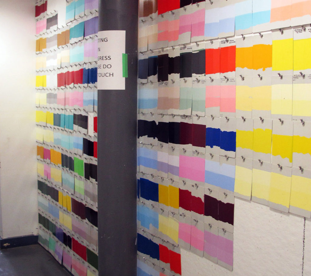
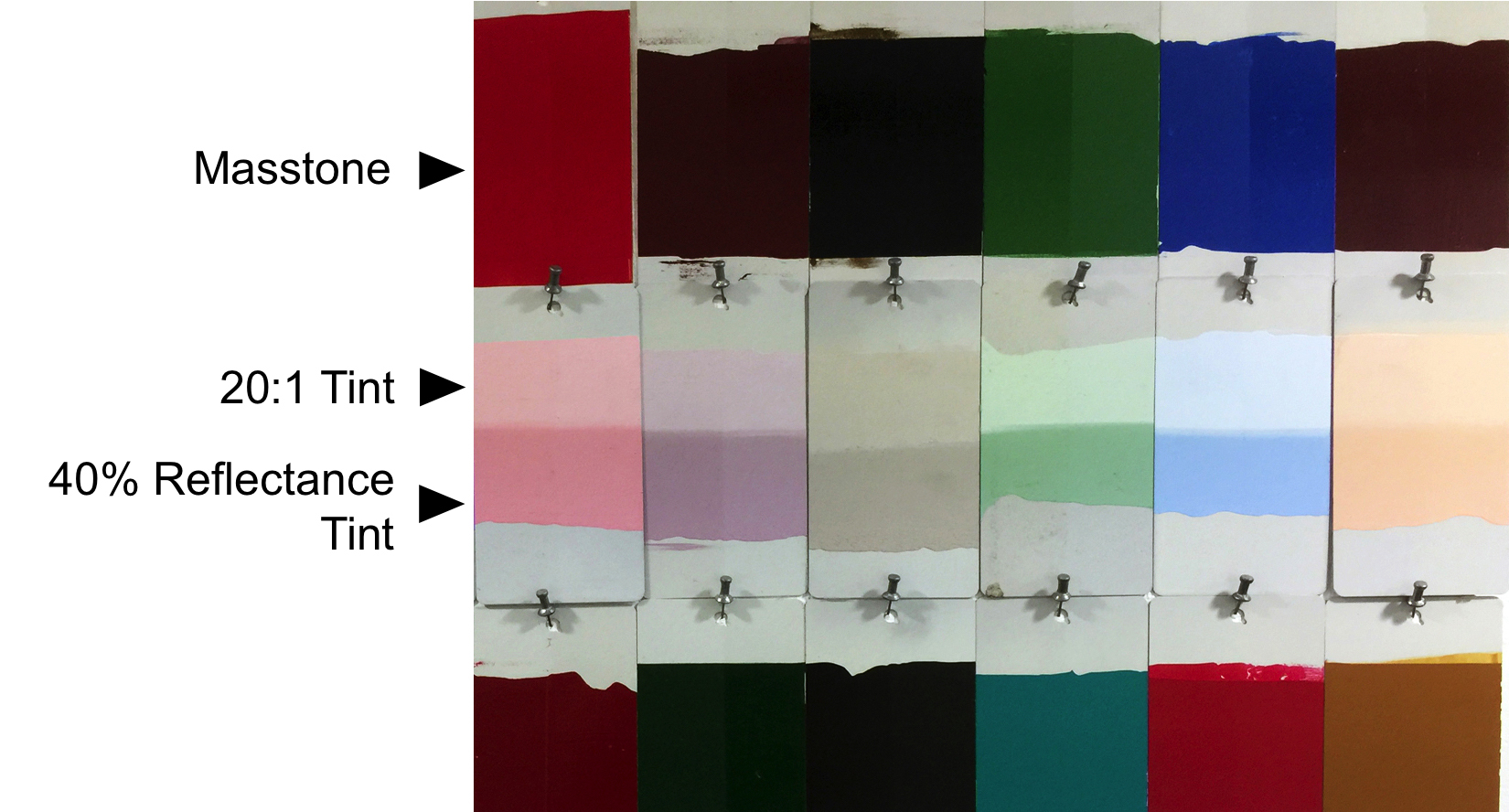
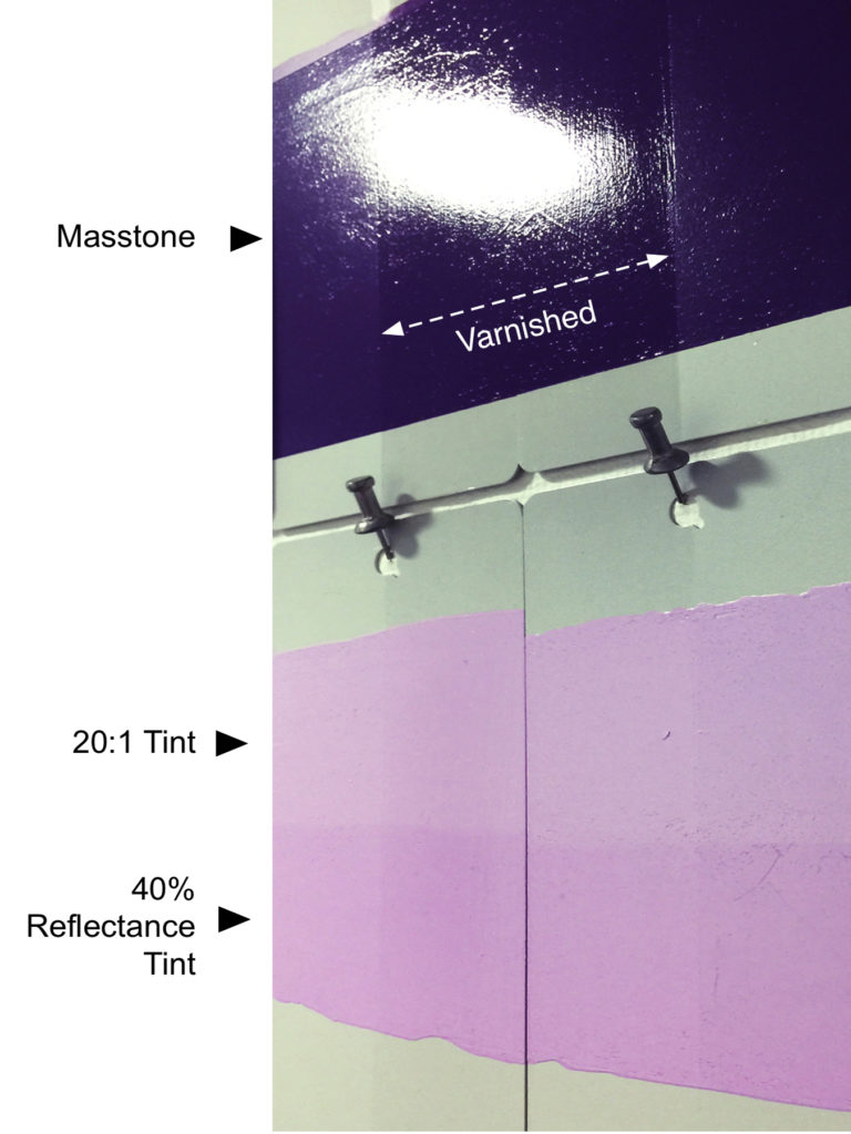
Something few people realize is that ASTM lightfastness ratings are always based on the tint and not the masstone of a color. The reasons for this are quite simple: pigments are generally more vulnerable in a tint, and you want to make sure they remain lightfast even when mixed with white. The level of that tint is also very specific. Oils and acrylics need to be mixed with enough white, or watercolors with enough water, to reach a 35-45% reflectance at the wavelength of maximum absorption. If that doesn’t conjure up a crystal clear picture in your mind, you are not alone! Hopefully this picture of test samples will help:
Number of Samples
For lightfastness testing ASTM requires a total of 7 identical tints for each color: one unexposed control, then three for outdoor and three for accelerated indoor exposure. However, when testing a new pigment, pigment supplier, or a significant change in formulation, GOLDEN will almost always include the masstones as well. On top of that, we have recently started to add in additional paler 20:1 tints, as well as areas coated with a UV filtering varnish. This greatly expanded set of samples gives us a much broader basis for evaluating a pigment and how a specific color might perform in different circumstances. But for ASTM’s purposes, only the results from those original tints truly matter. Everything else has been added by us to help understand a pigment’s performance at a deeper level.
Outdoor and Accelerated Indoor Xenon Light Exposure
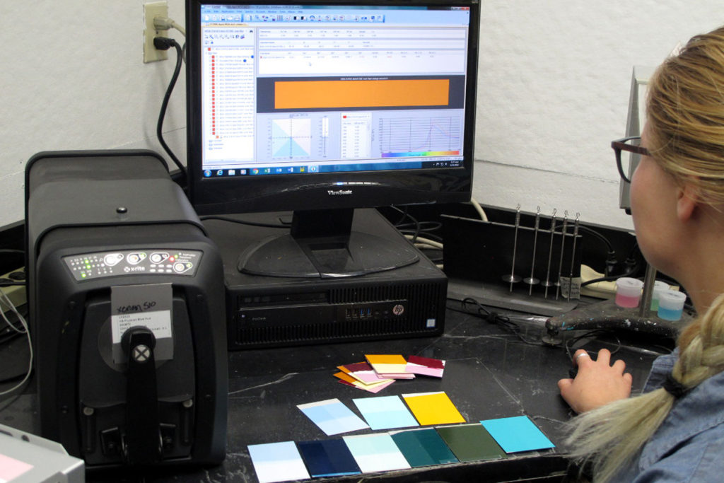
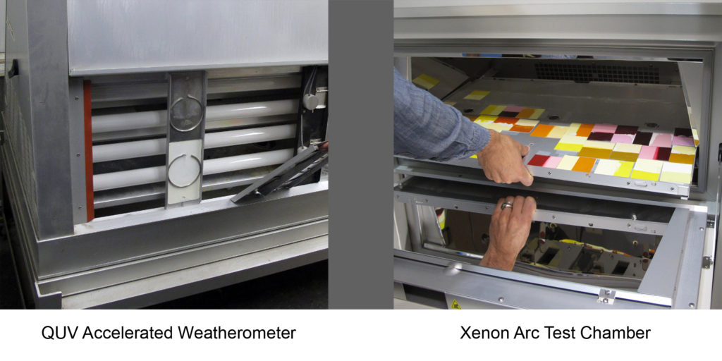
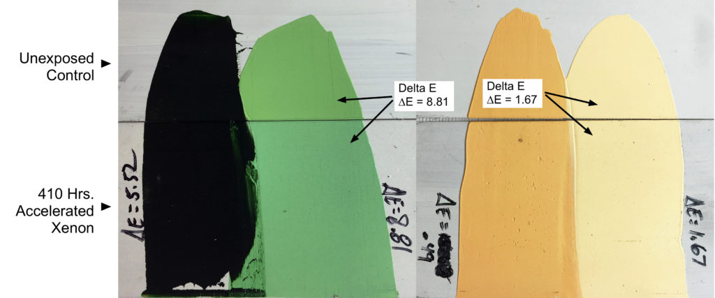
After they are fully dry, the samples are read by a spectrophotometer in three separate places, which are then averaged together to capture a record of the color at the start. The outdoor group will then be sent to a test facility in either South Florida or Arizona, where they are placed under glass at a 45 degree angle to the sun. The accelerated indoor group is placed in a Xenon Arc Test Chamber that simulates the same spectral curve as sunlight through window glass. The outdoor samples must be exposed sometime between October and March, and are left until they reach a total solar irradiance of 1260 MJ/m², which takes approximately 3 months. This specific level of exposure was originally chosen by ASTM because it gave results that corresponded to the degree of fading seen in various pigments, such as Alizarin Crimson and Rose Madder, found in historical paintings going back over a century. The samples in the Xenon Arc machine are exposed to an equivalent amount of UV as the outdoor samples, but in a more compressed timeframe, reaching completion in 410 hrs.
Evaluating the Results
After the samples have completed their tests, they are again read three times with a spectrophotometer and the readings averaged, and the degree of change from the original readings are then calculated. The results are then reported in units of Delta E (ΔE). In theory, a single Delta E is equivalent to the smallest amount of visual change a normal observer can distinguish. Colors with a Delta E between 1-4 are given an ASTM Lightfastness rating of I, Excellent; between 4-8, ASTM Lightfastness II, Good; and between 8-16, Lightfastness III, Fair. For more on this, please read our earlier Just Paint article, Delta E: A Key to Understanding Lightfastness Readings.
Other Lightfastness Testing
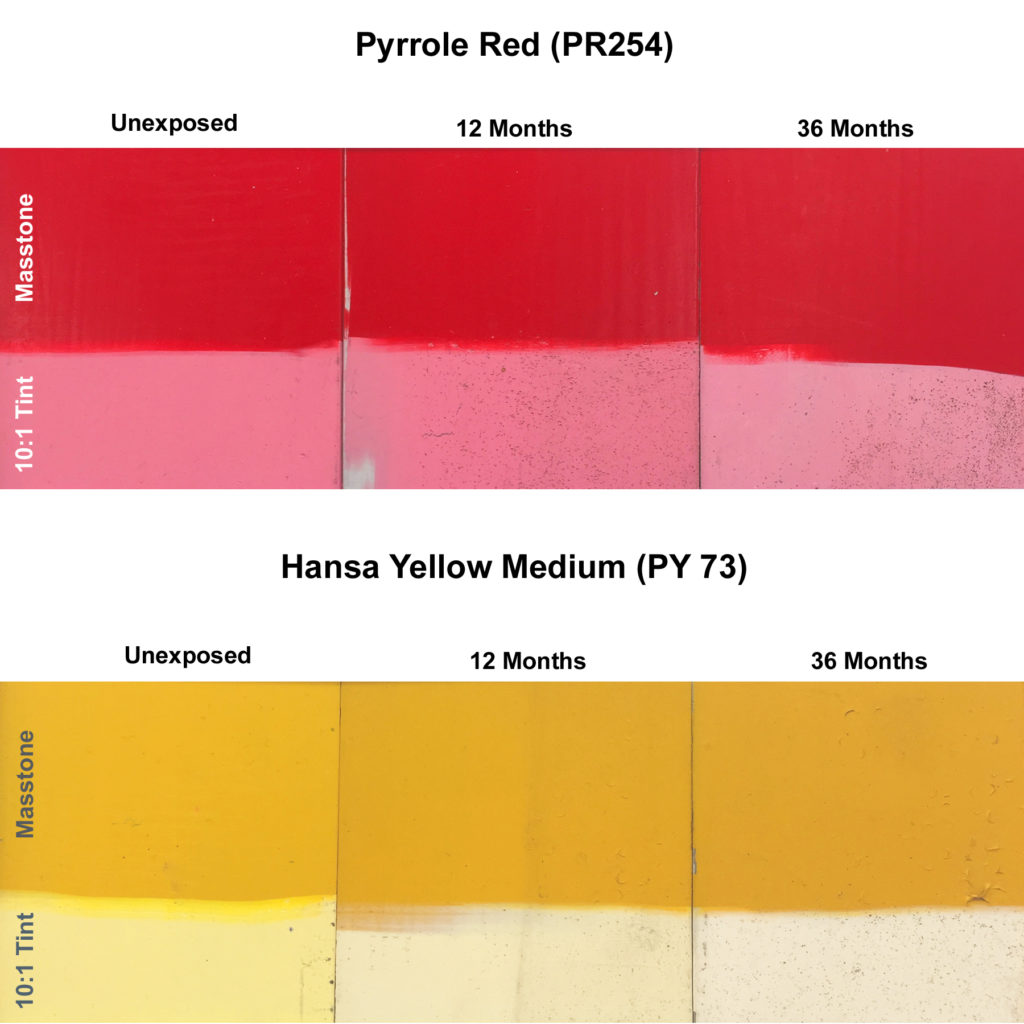
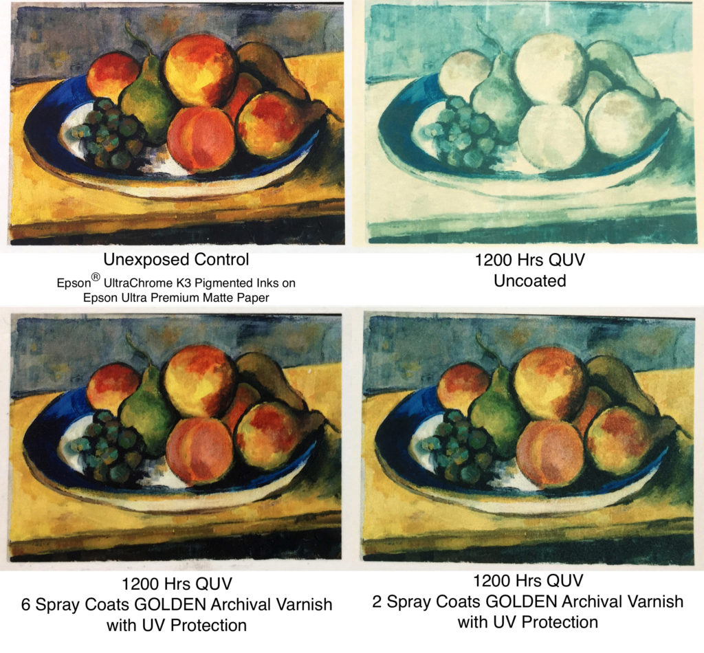
Beyond ASTM, GOLDEN carries out a host of other lightfastness testing as well. For example, to see how colors perform in exterior settings like murals, we regularly send multiple samples to South Florida where they are mounted without glass, completely exposed to a high humidity, variable outdoor environment. These are then evaluated at 6, 12, 24, and 36 month intervals. We also regularly run colors, varnishes, various collage and drawing materials, and test a wide range of other products through a different lightfastness test chamber, called a QUV, which exposes samples to light from special fluorescent UV-A bulbs. While these do not match the broad spectrum of outdoor sunlight or Xenon, they closely mimic the more destructive UV component of light through window glass. Samples are exposed to cycles of 400 hr., with 3 cycles giving results approximately equal to what we see in both outdoor and Xenon testing.
Going Beyond What Is Required
After describing all of this you might find it surprising to learn that none of this testing is actually required of a manufacturer. While we strongly believe every manufacturer should conduct these tests, ASTM Standards allow paint companies to simply use a lookup table to assign Lightfastness Ratings to their products. This table includes pigments that have gone through ASTM testing at some point and were assigned a Lightfastness Rating by the committee. However, the majority of those tests were carried out more than 30 years ago and often using only a single source of pigment or brand of paint. Drawing from our own experience of testing paints regularly since the early 80s, we believe this is inadequate. Pigment quality can be variable, and tests from so long ago, and from such a limited selection, might not represent what any one manufacturer is currently using. In the end, GOLDEN believes it is critically important for every company to carry out these tests to make sure their products are truly lightfast.
About Sarah Sands
View all posts by Sarah Sands -->Subscribe
Subscribe to the newsletter today!

Excellent article. As both a painter using Golden acrylics and an engineer who works daily with electromagnetic phenomena, I commend Golden for your keen interest in testing and maintaining high levels of quality.
Thanks Eric – we appreciate it!
Thank you for this information. Most will probably not read it but I will just say- this and so much more that happens at Golden is why, when I contemplate making a painting (which is often but not exactly regular as befits my mode of working), it is Golden that goes on the surface I’m working on.
Hi Stephen – Thanks! We SO appreciate that we are your go-to choice when you paint and that this type of testing is something you value.
I really appreciate this information. I especially liked the pigment print testing.
I have been working exclusively with Golden Acrylic Paints for over 25 years. As a professional artist I want to give my clients the best product and all the information they ask for when questioning the lightfastness of my work – Golden has always provided me with this knowledge to pass on. Would love to see an article on varnishes with pictures of test results. When talking to other Acrylic painters we all seem to wonder if it’s worth it.
Hi Leona – Thanks for the warm feedback and appreciation! And also for you 25+ years of support! We have done some articles on varnishes and their effectiveness, such as these two
GOLDEN Archival MSA Varnish Over Transparent Watercolor on Paper
Don’t Fade Away – Recent Testing of Protective Coatings
but not focusing – it is true – all that much on acrylic paintings and lightfastness concerns. That is certainly something we can look at doing at some point. If using our acrylics the lightfastness concerns are not huge, since the vast majority of them are Lightfastness I and a few are Lightfastness II. But certainly our Fluorescents would present concerns, and any use of other possibly fugitive materials – as often happens in multimedia pieces – can also be a factor. The main argument for using a varnish with acrylic paints would focus less on the UV and more on the fact that acrylics are relatively soft, so vulnerable to surface abrasion, imprinting of texture from other materials (called ferrotyping), and in warmer weather, the pickup of dust and dirt. So removable varnishes in all these cases provide a physical and removable layer of protection that helps cleaning and repair – if they are ever needed – go much easier and with less risk of damage. The filtering of UV is something of an added bonus, but not to be dismissed by any means – UV remains the most damaging factor when fading occurs and limiting UV exposure is always a good thing.
👍 excellent read, question and response….plus reassuring to know. Kind thanks.
I thought that this was a very informative technical, article. It is a question for all serious artists, will the color change with time? I am curious of the broader results of this kind of testing. For example has anyone compared the lightfastness of paints of different companies. Also, I sometime use commercial color papers or board in my work yet I have know idea of their lightfastness..
Ted
Hi Ted – We definitely appreciate the compliments, so thank you! You are correct that very few articles or studies show the lightfastness results of different brands. Definitely you can find various people doing this on their own and reporting results, but these are often not done in a very controlled way or following a rigorous standard like ASTM’s D4303, so you always want to be aware of that. And certainly asking a company if they can speak to the lightfastness testing they do, and if they can share the results, can tell you a lot as well. As for the lightfastness of commercial color papers and boards, the best thing to do is probably set up some test panels of your own, where you place one sample in a south facing window (preferably) and another is used as a control for comparison and kept in a drawer. Then compare the two side by side after 3, 6, and 12 months and see if you notice any changes. That will at least give you some sense of what you might expect. For more information about carrying out your own lightfastness testing, you might like this article we published a while back:
https://justpaint.org/how-to-test-for-lightfastness/
This would require you to obtain a blue wool test card to be able to estimate the amount of exposure and the rating category. these can be purchase on the internet. Just do a search for ‘blue wool test cards’ and you will see several suppliers.
I’m surprised how much PY73 faded in tints considering it’s rated as ATSM I
Thank you so much for the information. I’m an oddity among artists in so far that I love the technical and scientific aspects of my craft. Please, keep the information coming. It is valued. Thanks so much.
Thanks, Keith! As long as we have fellow oddities among the artists in the world – as we would describe ourselves that way as well – you can feel confident we will keep the technical information coming!
Hi Sarah,
Is it possible that the original and exposed colour measurements can be listed (RGB or LAB, etc..) so that we can see the difference, as well as judge the Delta E more accurately than a lightfastness rating?
One reason I ask is because if a colour fades in intensity then I personally do not judge that as bad as if a colour darkens which would affect the value structure in the painting.
Hi Richard –
Just for clarity, do you mean sharing the Lab readings just for the examples in this article? I might be able to do that, but reporting out this data for all colors becomes a greater challenge and a lot more work. I also would want to caution against something that is not well understood by most – namely that accelerated lightfastness results are not meant to be predictive. That can be frustrating for many artists because of course that is exactly what they are hoping to know – will this or that color fade in this or that way after, say, 100 years. But that degree of certainty just does not exist in these types of tests for a range of complex reasons.
If you let go for a moment the sense that accelerated testing results predict what you will see after x number of years, and simply say that if you put a set of colorants through these test protocols, and certain ones do better than others, then it probably makes sense to bet on those doing better in the long run. Just don’t make a leap to that meaning a specific result after a specific length of time. Reality is too complex, and materials too variable, but at some level we all need to make choices and I think the smart money is on whatever colorants change the lease in these tests.
Anyway, let me know what you were hoping for and of course if you have any questions.
Hi Sarah,
Thank you for your reply. I thought that Golden would already have all the original and accelerated samples measurements stored already in Lab (or another colour space) format? Isn’t that how you would calculate the Delta E anyway?
I can understand that retesting all of them would be a big job, I just thought the raw data would already be saved in a database by your lab so it would just be a case of listing them 🙂
I paint in oils so I was thinking mainly of Williamsburg oil paints. But I imagine measurements from Golden Acrylics would be useful to other artists too.
I understand that these lightfastness results are not meant to be predictive but could be used as a rough guide.
Hi Richard –
We definitely have everything in CIE Lab – and yes, that is the color space required for calculating delta and lightfastness. The problem is simply that they are spread out as part of various projects over various years. So the labor is really just that – gathering everything together in one place and making sure that they represent the most current formulations, etc. Let me look more closely into this to better understand what might be possible to do and then will let you know.
Thank you Sarah 🙂
HI Sarah, i’m wondering if you can help me –
I recently painted with Golden Flourescent Blue (lightfastness – Poor)
of course, I have a buyer for this one painting, I used the blue, with Golden glazing liquid and it’s probably a tint of about 15% of the original color.
What are the chances of this blue fading fast over time?
should I consider not selling the painting?
regards,
K.
Hi Kelly – Whether or not you sell it is not something we can comment on, although we think it is always a good practice to record the materials that were used and note any issues of concern around lightfastness. It is true that fluorescents will fade relatively quickly, especially in a thin glaze. How quickly will depend on a lot of factors, but the largest will be the amount and intensity of light exposure. If forced to guess, we would expect changes to be noticeable in a matter of years rather than decades. You can get a good sense by looking at Table 3 (scroll down slightly) in this article by Stefan Michalski, Agent of Deterioration: Light, Ultraviolet and Infrared:
https://www.canada.ca/en/conservation-institute/services/agents-deterioration/light.html#det5
Fluorescents would be considered in the High sensitivity category. As for light levels, for a typical living room with no direct window light, would use 150 lux for a low estimate 500 lux as a higher one.
Hope that helps at least provide some estimate.
Hello Sarah,
Thank you for your very interesting articles.
I would like to make swatches of Golden Heavy Body acrylic colors for lightfastness testing.
Which white should I mix the colors with to obtain the tints?
Hi Zeeyoung – You should use Golden’s Heavy Body Titanium White. And if there is anything else we can do to help just let us know.
Thank you Sarah for your answer. I am a painting conservator at a museum and my colleague conservator uses Golden’s Heavy Body Acrylics for retouching ceramics. The color she uses the most often is Titan Buff and we want to expose a dry sample in a xenon arc lamp chamber(custom-made). This color has a ASTM I rating according to your website. We were surprised to see that during a pre-test in the xenon chamber, it turned darker very quickly. We want to run the test again by mixing the Titanium White but since Titan Buff has already a relative reflectance of approx. 40%, do you think it would be necessary to mix the white? Thank you again for your time!!!
Hi Zeeyoung. We have sent a response to you via email in order to allow us to communicate technical information more easily. As we state there, while we have seen some darkening, the levels were small enough (less than 3 Delta E overall) for the color to be classified as ASTM Lightfastness I. Anyway, take a look at the email we sent and perhaps we can continue the conversation in order to understand what you might be seeing.
Sarah! How amazing to see you here!!!!! You might remember me as the tall artist singer at Jane Higgin’s years ago – aND we took an Elizabeth Nields tIle courselves together.. I’m visiting because of my intense hunger for pink after this lon winter – in watercolor not acrylic – which of course has trapped me in a happy spiral with Opera Pink – Daniel Smith… I’m having a great time in my journal – but… is there any hope in coating an Opera watercolor with UV protection – whaddaya say? Warmest regards Jennie Williams
Hi Jennie!! Great to hear from you as well – it has been ages but I definitely remember!
In terms of your questions, the best article to look at would be this one:
GOLDEN Archival MSA Varnish Over Transparent Watercolor on Paper
If you look through that at the results listed for the fluorescent watercolor, that should be the same or at least very close to what you would see with Opera. As you can see, the fugitive fluorescent watercolor did best under TruView UV Glass or with a minimum of 4 coats of our Archival varnish. Just realize that 4 or more coats of our varnish can start to leave the paper feeling coated. If you want to limit that, then read through the following articles on varnishing watercolors:
Aesthetics of Varnishing Transparent Watercolor: Creating the Least Change
Aesthetics of Varnishing Transparent Watercolor
Hope that helps – but if you still have questions, don’t hesitate to ask!
Warmest regards right back ‘atcha! 🙂